Core i7 Giveaway Winner, AT on Kindle, Site Redesign Preview and More
by Anand Lal Shimpi on November 13, 2009 12:00 AM EST- Posted in
- CPUs
We have a winner to our Core i7 giveaway from last week: Gregory Peng from California (user name Possum). Congratulations Gregory! I've just sent you an email to confirm your details, drop me a response and I'll get this out to you.
Below are the specs of the iBuypower system that Gregory won:
| iBuypower Core i7 System | |
| Case | Chimera Inferno |
| CPU | Intel Core i7 870 |
| CPU Cooler | Asetek Liquid Cooler |
| Motherboard | ASUS P7P55D-LE |
| Memory | 4GB DDR3-1600 |
| Video Card | ATI Radeon HD 4890 1GB |
| HDD | Intel 80GB SSD, 1TB |
| Optical | LG Blu-ray Reader |
| PSU | NZXT 800W |
| Media | 12-in-1 Card Reader |
| OS | Windows Vista Home Premium 64-bit |
| KB & Mouse | iBuypower Keyboard & Mouse |
| Monitor | ASUS 23.6" Widescreen LCD Monitor |
We're already working on gathering hardware for the next giveaway, so this won't be your only opportunity to win. Thanks again to Intel and iBuypower for sending in the hardware for this giveaway and thanks to all of you for entering.
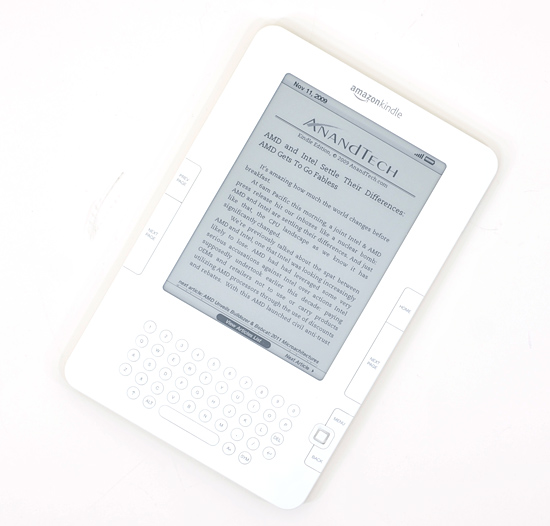
Next on the Agenda: AnandTech is now Available on Amazon Kindle Devices
I'm a Kindle 2 owner and I have to admit, it's sort of exciting seeing AnandTech on the device. Our 10 most recent articles are available for reading (subscription required) on the Kindle through Amazon's Kindle Store. If you've got a Kindle, check it out.
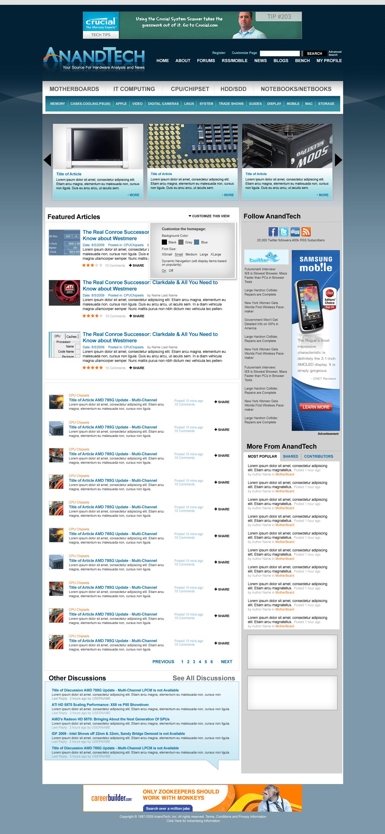
The AnandTech Redesign
I mentioned this a while ago, but we're finally at a point where we can give you guys an idea of what's coming. Have a look at the new AnandTech and be sure to leave your feedback in the comments section. We haven't implemented it in HTML so there's still room to tweak.
Not all of the ad placements are in (something I want to get your input on shortly) and there's going to be a ton of customization options offered as well. So keep those two in mind. The main carousel up top with three big article images will actually automatically rotate through a set number of articles so you'll be able to get a good idea of the past several articles on the main site without any scrolling.
Our main goal here was to make the site look and feel a lot more modern, as well as bring its functionality where it should be for 2010. There's a lot of cool stuff coming with more giveaways, more content and more categories of Bench next year. Here it is, constructive criticism is always appreciated :)
Coming Soon: A Call for Writers
It's a bit premature but I just wanted to give you all a heads up that we'll be looking for some new writers in the near future. If you've ever wanted the chance to get into the industry, it may be time to start polishing off your writing skills. Get those writing samples ready folks!
More details soon...
Anand Goes to India?
From 12/1 - 12/15 I will be traveling to India for the first time in 10 years. If you're an AnandTech reader in/around Mumbai, Delhi or Jaipur let me know. If we can get enough folks together we might do a reader meetup :)


97 Comments
View All Comments
Griswold - Saturday, November 14, 2009 - link
Why dont you zoom in then? Any decent browser will do that for you. Things will become larger and the "wasted" space reduced. If you're using a really good browser, you can even save the setting on a per page basis...imaheadcase - Saturday, November 14, 2009 - link
I can zoom in sure, but it does not save per page with the latest version of firefox. In fact if you zoom in it will retain that for every session. So if i visit a site that does scale correctly i have to zoom back out.imaheadcase - Friday, November 13, 2009 - link
btw anandtech does that now to. I have 4 inches of screen space on each side of grey.Naton - Friday, November 13, 2009 - link
Is the carousel at the top of the page intended to be flash based? I dislike not being able to choose how to open new pages (new tab, new window etc).I don't mind the comments system apart from the fact that it reloads the whole page when you just want to see the next lot of comments.
yacoub - Saturday, November 14, 2009 - link
Yes, definitely stay away from Flash for menus when CSS and DHTML provide a much more useful design. I often right-click links to open in a new tab so i can continue clearing the page I'm currently reading before moving on to the first link of interest.Trisagion - Friday, November 13, 2009 - link
Although, I think the Anandtech logo should retain the same font that you use currently. It sort of has a historic significance. I also hope you use more Ajax programming especially for the comments (and maybe the articles as well?).As for writers, I hope you get a permanent writer to cover Linux related articles.
marc1000 - Friday, November 13, 2009 - link
I don't know if the main bar (the links to motherboard/cpus/etc) is very clear.. at least I believe the "tabbed" design is more obvious to the reader. perhaps a new tabbed design, instead of "hard blocks" would be cool.BTW, nice colors. Oh, and please be sure to make it compatible with Chrome, I believe more and more people are using it. These textboxes on the comments section, for example, always causes some minor bugs in Chrome.
regards,
Mauricio
yacoub - Friday, November 13, 2009 - link
The "big five" links at the top of the white content box, above the rest of the smaller-sized sections in light blue, doesn't make sense. (e.g., Why would Motherboards be among the "big five" but not "Video"?) So I am assuming that "big five" list is customizable?Either make it customizable via a per-user setting, or make the "big five" links more logical (i.e. no specific piece of PC hardware should be among the big five, unless you have the five links be Motherboards, CPU, GPU/Video, HDD/SDD, and RAM/Memory, given those are the five primary components within a system.
The mish-mash in the example - three PC hardware items and "Notebooks" and "IT Computing" - is not going to please anyone because there is something there every person doesn't care about and absolutely would not want in the top-five menu. Not to mention it isn't even in a logical order (not even alphabetical order).
I highly recommend rethinking that "menu" setup at the top.
Otherwise the comp looks pretty good.
Regards.
nowayout99 - Friday, November 13, 2009 - link
+1 the previous post. The "Big 5" aren't logical.I would also MUCH prefer DailyTech headlines to a twitter feed. Srly. Do not sink to the level of pushing a twitter feed on a site like this.
Not convinced the Popular/Shared/Contributors section is necessary. That plugin is the new keyword cloud -- "cute" but mostly useless and redundant.
Overall looks decent.
nowayout99 - Friday, November 13, 2009 - link
Reply to myself -- It's fine to have a twitter feed, but I'd move it to the bottom and add a DailyTech feed on top.