The iPhone 5 Display: Thoroughly Analyzed
by Chris Heinonen on September 27, 2012 12:00 AM ESTWhen Apple rolled out the iPhone 5, they announced that it had a full sRGB gamut, which the new iPad almost achieves and would be a substantial improvement over the 4 and 4S displays. The slight increase in screen resolution and size means we are looking at a new panel than the previous generations used as well, with the new panel being speced at 800:1 contrast ratio and 500 nits of brightness. I don’t have a 4S to test, but used my iPhone 4 that was bought on launch day and has been in use since then for comparison. Numbers were run using CalMAN 5 software, and a SpectraCal C6 colorimeter that was profiled from an i1Pro spectrometer. All readings are the average of three measurements from the C6, except for very dark readings where ten measurements were taken for more accuracy.
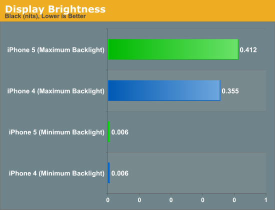
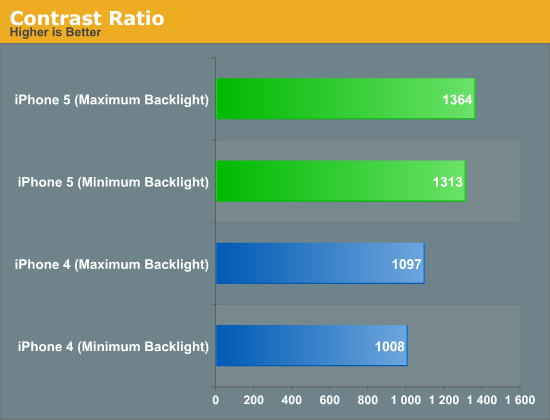
For comparing the minimum black and white levels in the iPhone 4 and 5, I set the brightness to the minimum level where I could get a reading from a black screen. At the minimum value I couldn’t get any reading, which indicates that it’s below the 0.001 threshhold that the C6 is capable of reading. Both phones had a minimum black level reading of 0.006 nits, but the iPhone 4 had a white level of 5.669 nits compared to the iPhone 5 and its reading of 8.303 nits. This gives us contrast ratios of 1008:1 for the iPhone 4 and 1313:1 for the iPhone 5. Both are ahead of the specified numbers, but the iPhone 5 is clearly better here.
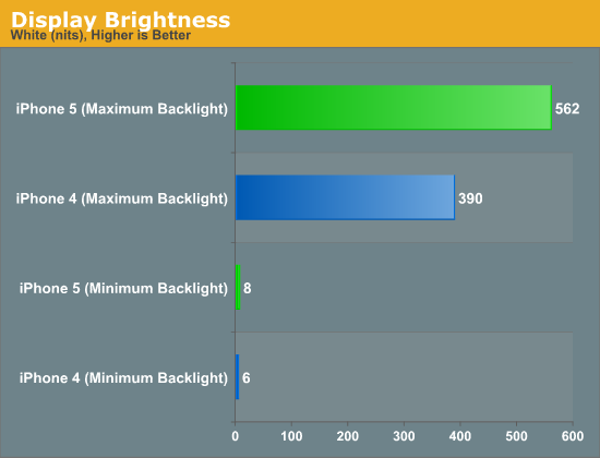
At maximum brightness, the iPhone 4 has a maximum white output of 390 nits, and the iPhone 5 clearly trumps that with 562 nits. The backlight of the iPhone 4 could have become slightly dimmer over time, but using LEDs it really should not have faded much. Black levels for the phones are 0.355 for the iPhone 4 and 0.412 for the iPhone 5. This gives us contrast ratios of 1097:1 for the iPhone 4 and 1364:1 for the iPhone 5. Clearly contrast levels have been improved here, despite the move to a larger screen that sometimes can affect them.
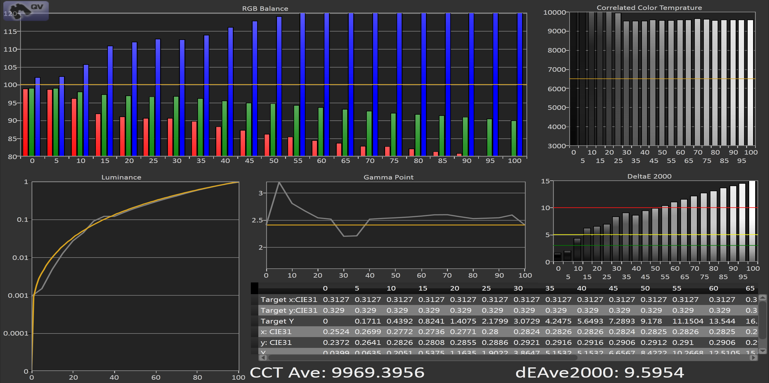
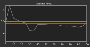
Looking at the grayscale, the iPhone 4 puts out an average dE2000 of almost 10 across the spectrum. The grayscale has a very noticeable blue shift that can be seen in the numbers, and a CCT that is close to 10000K and not the 6500K that is the sRGB standard. The gamma also shows a clear spike at the bottom when we target the sRGB gamma curve. If we target a gamma of 2.2 that spike goes away, as the sRGB gamma is linear at the bottom end. Overall the grayscale of the iPhone 4 would be rated as very poor if it was a desktop display or a television.


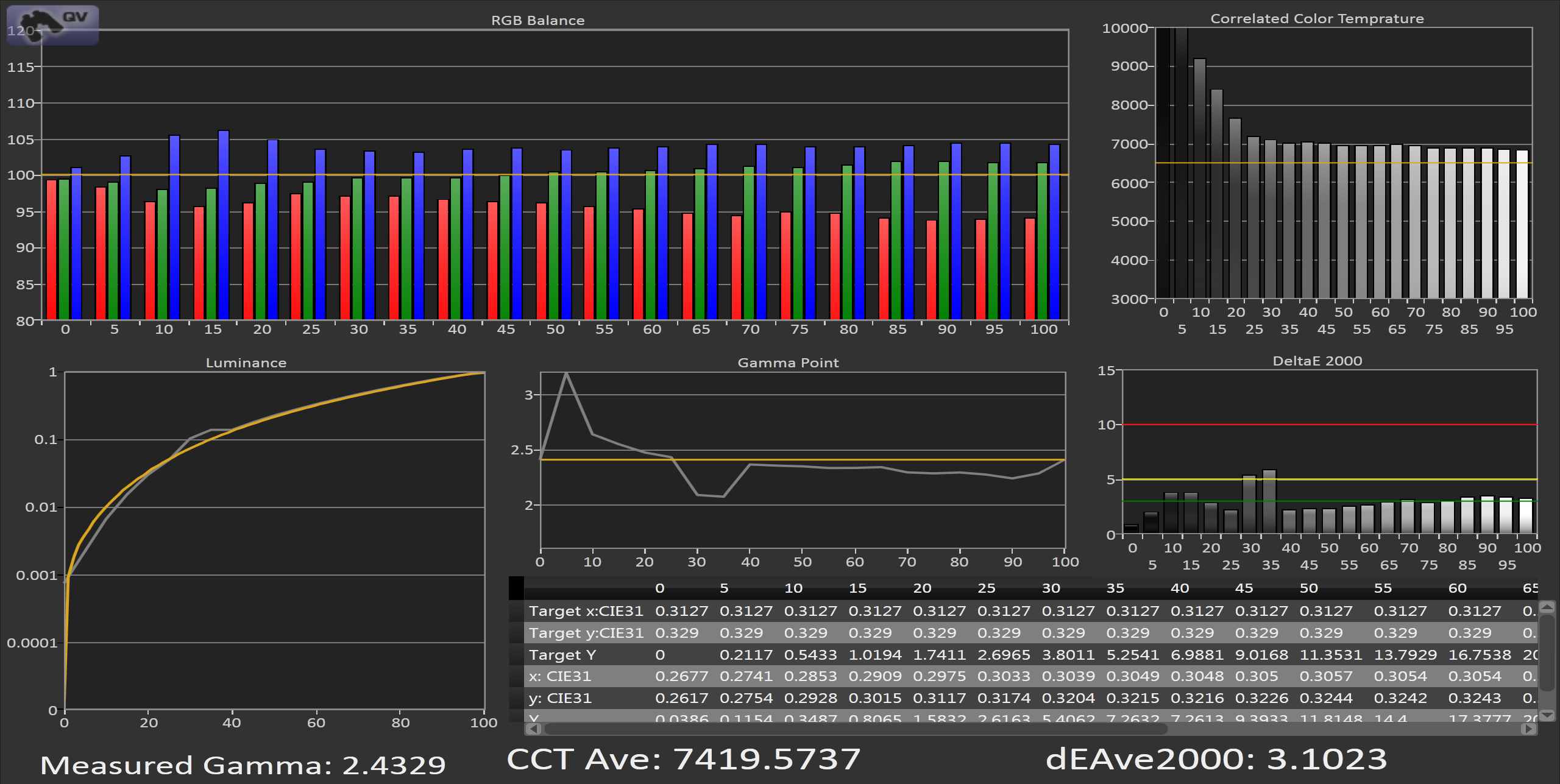
Looking at the iPhone 5, we see a totally different story. There is still a lack of red in the grayscale, but it’s much lower and the average dE2000 is a very respectable 3.1 across the spectrum. The gamma is again targeting 2.2 instead of sRGB which you can notice at the bottom end, but other than a couple outlier numbers at 30 and 35% stimulus, we have a grayscale that is almost entirely below the visible error line on the chart.


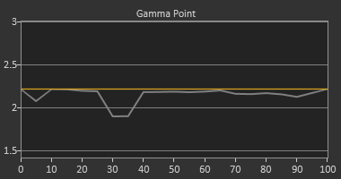
If I change the Gamma target to 2.2 from sRGB, you can see that the line is much flatter across the spectrum and that bump at 5% is eliminated. Since Apple uses 2.2 as the default target gamma on their computers and not the sRGB standard, I'm not too surprised to see that their phone would also target 2.2 as well.
sRGB Gamma Target
2.2 Gamma Target
Overall the grayscale performance of the iPhone 5 is outstanding, and a world ahead of the iPhone 4 in performance.
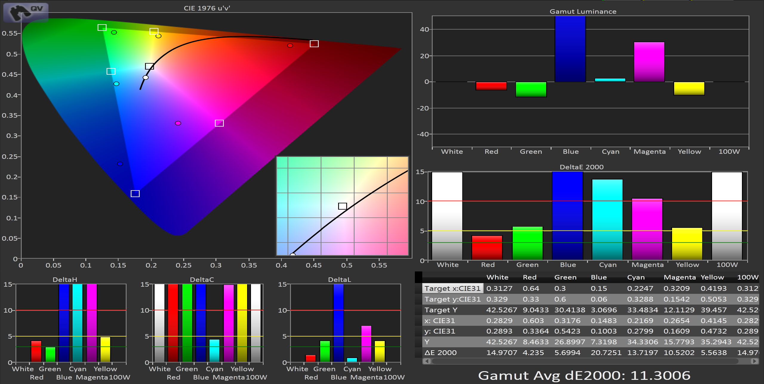
Moving onto the color gamut, on the iPhone 4 using the CIE 1976 uv chart, we see that we clearly lack full saturation in Red, Green, and Blue in the color gamut, which leads to the secondaries also being under-saturated. Our dE2000 numbers are low for green and red, but blue is over 20 and pushes our average dE2000 over 11. This gives us errors that are clearly visible in normal use and means that many colors that fall inside of the sRGB gamut will not be rendered correctly as we can’t display the full area.


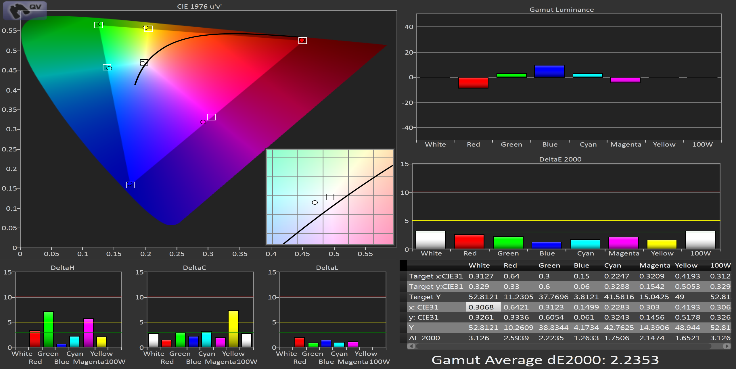
In contrast to this, the iPhone 5 covers almost the entire gamut. Red, Green, and Blue all have dE2000 values of 2.6 or less, and the average dE2000 value is 2.2, for a fantastic result. Unlike the charts for the iPhone 4 where not all of the data was visible, here we just see very small errors across the spectrum, with no individual dE component being higher than 8.


This improvement is very easy to notice on the iPhone 5 even without running numbers. Colors like the yellow in the eBay app icon are much more vivid and saturated than before, and blues have far more shades available than previously. The entire sRGB gamut is now available on the iPhone 5 and the result is outstanding.
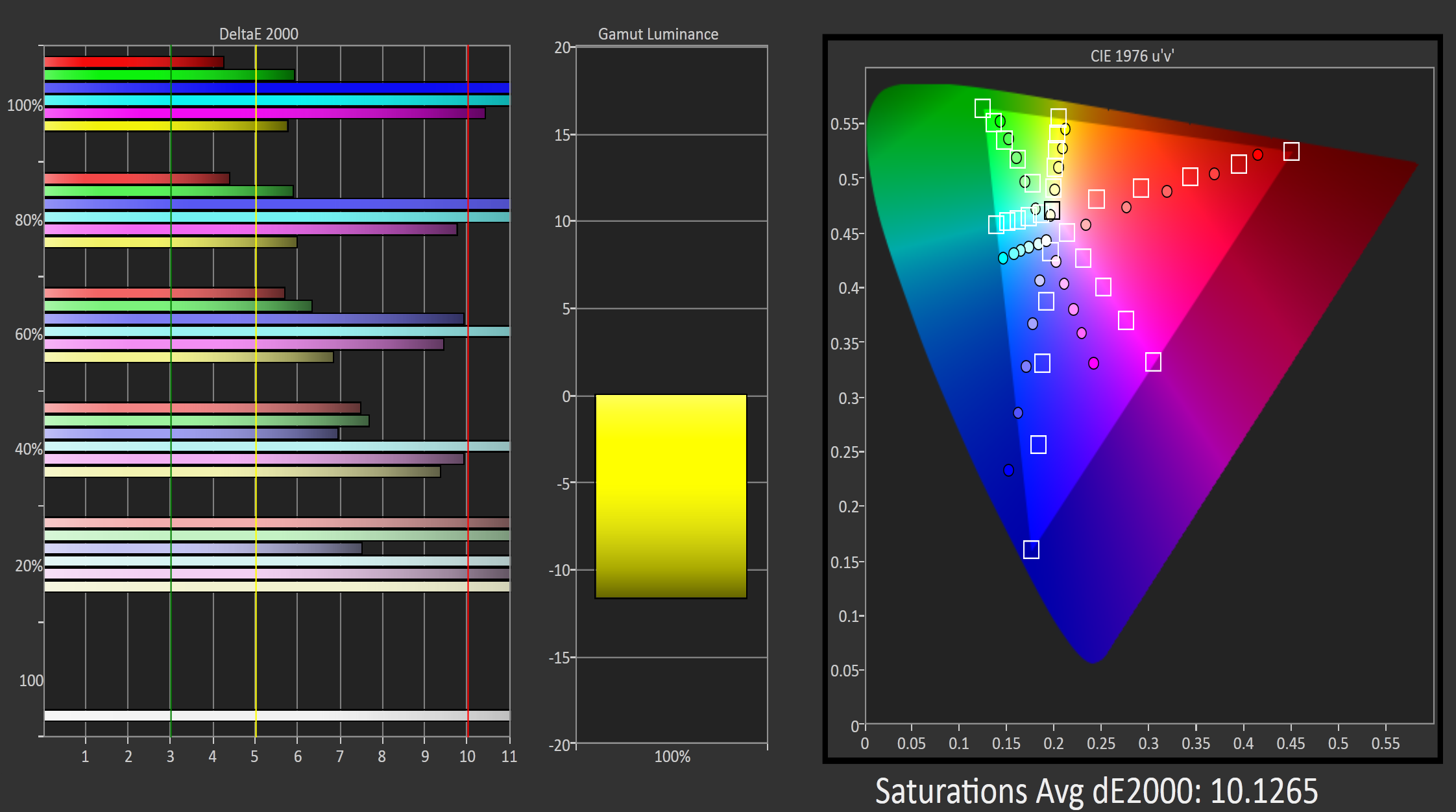
Measuring how the phone handles saturations is another important step. While we know the iPhone 5 can reach the full saturations for each color, how well can it render those saturations that are less than 100%? Looking at the iPhone 4 quickly, we see that with its under-saturated gamut, we have very high dE2000 numbers across the board. Even lower saturations are way off the target and have high numbers. In the end this is better than those being accurate, as then anything beyond what the iPhone could display would be rendered identically so 60% blue and 100% blue would look the same, instead of both having errors that make them distinct to the eye. Of course this doesn’t excuse having an error over 10 across the whole spectrum, but that’s the choice that was made with the screens at the time.


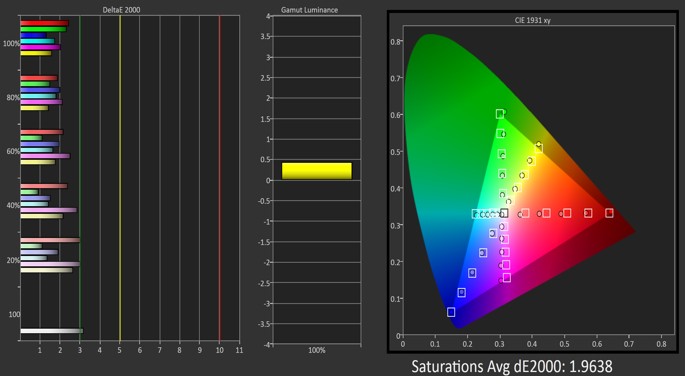
Now looking at the iPhone 5, our numbers are even better than on the straight gamut charts. The average dE2000 drops below 2, and no single reading extends beyond 3 except for white. Across the whole spectrum of colors on the iPhone 5 you can expect accurate, well saturated colors that will look as accurate as they would on a reasonably calibrated desktop IPS display. I would be quite happy if desktop monitors and TVs were shipped this accurate.


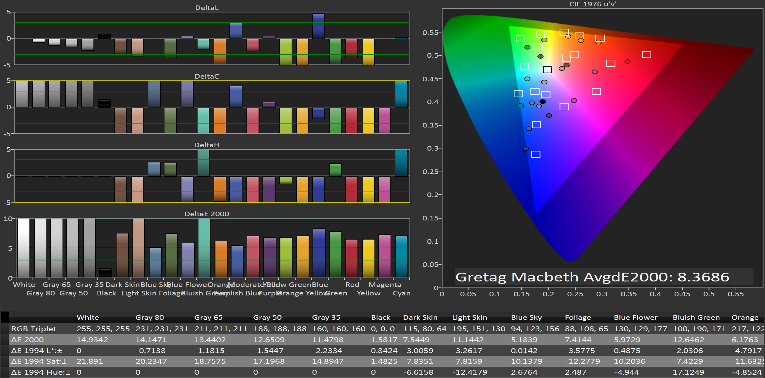
Finally I now have the ability to run the Gretag Macbeth color checker chart on a phone to see how well they perform with non-primary and secondary colors. Since the iPhone 4 has such an under-saturated gamut, we would expect it to have a large error on the Gretag Macbeth chart and we are correct. The average dE2000 is over 8, and many of the numbers are off the charts. The only color without a visible error (below the yellow line) is black, and that really would be awful if black had a visible error. Overall the performance here is pretty mediocre, though somewhat in line with computer monitors as they are shipped to consumers.


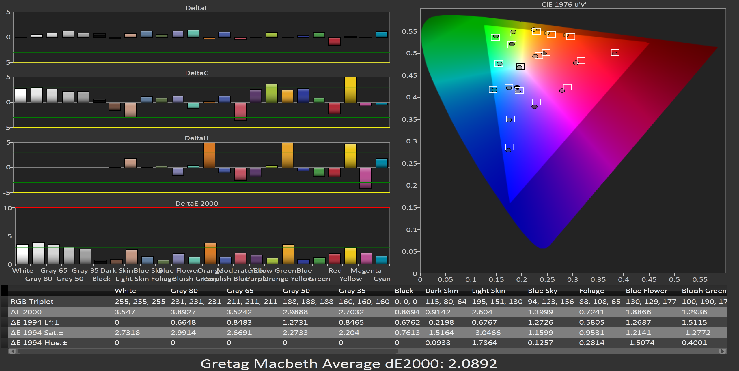
With the iPhone 5, we see an average dE2000 of only 2.09, which would make it the best LCD monitor I would have reviewed at AnandTech to this point (in terms of out-of-the-box performance). Only a couple shades of orange creep above the green error line, and nothing moves above the yellow line that would make it clearly visible to a user. Every color point at least comes close to hitting its target, and there are no errors that are excessive or that you will notice even during color critical use.


Wrapping up, the iPhone 5 display is a quantum leap better than the display on the iPhone 4. Contrast levels and light output have both been increased, and color performance is astonishing. The full sRGB gamut is present here, and color errors are remarkably low even for a high end desktop display. While many were hoping for a move to OLED or some other screen innovation, this really is a huge step up that is very easy to quantify. To put this in perspective, in the past few years I've reviewed probably 30-40 different displays, from PC monitors to TVs to projectors. Not a single one, out of the box, can put up the Gretag Macbeth dE numbers that the iPhone can, and perhaps one projector (which listed for $20,000) can approach the grayscale and color accuracy out of the box.
Apple obviously has very high control over what parts they use and what comes off their assembly lines. I don't know if they are having the displays individually adjusted after they are assembled, or if the quality control is very strict, or if I just got a remarkably lucky sample. I do know that if TV and PC Monitor vendors were able to provide displays that looked like this out of the box, professional calibrators would lose a good amount of business. The new panel in the iPhone 5 is simply remarkable in quality and if it were a PC monitor, I'd give it a Gold Award on the basis of its performance.


100 Comments
View All Comments
Alucard291 - Sunday, September 30, 2012 - link
By really thick and/or large you mean like the 4s then? :)Because that was a brick with exactly the same battery life as 5. So yeah a year went past. They used better tech process in chip manufacturing, reducing size and power drain and thus basically keeping the battery life almost identical to 4s.
To be honest if it was "better" engadget - the apple sponsored webby - would have long published a review praising it, since they still haven't I'll trust my sources
Great achievement? Nah.
Especially since they paid for the size and weight with quality of the build and quality of the materials. And lack of unibody of which they were so proud previously - that probably helped too :)
serversurfer - Friday, October 5, 2012 - link
Actually, when Engadget did their "standard battery rundown test " on the iPhone 5, they got 11h15m of battery life.This compares with 11h25m for the RAZR Maxx, and 8h for the iPhone 4S.
I would call a 41% improvement in battery life over the previous model "better," but maybe that's just me. /shrug
jefffeely - Thursday, September 27, 2012 - link
Clearly.http://thesaurus.com/
I had to stop reading half way through (the review, not the thesaurus).
mavere - Thursday, September 27, 2012 - link
It's a technical review with technical terms. Other than that, there's literally no fancy prose or liberal wordplay.I apologize it's not Dr. Seuss.
Biln3 - Thursday, September 27, 2012 - link
Does all this really matter that much on a tiny 4" screen? No one is gonna be doing anykind of serious graphical work on these things. Ofcourse better screens are better to have, it just seems weird to me.André - Thursday, September 27, 2012 - link
I agree, we should move back to a monochrome 1-line display, like we used to have in calculators and still have.That's the way forward!
darkcrayon - Thursday, September 27, 2012 - link
I could see it mattering for some things. Imagine clothes shopping from your phone and the color blue of that knit sweater on the screen is the same color when it comes in the mail ;)steven75 - Thursday, September 27, 2012 - link
The smartphone has become the most commonly used camera for those that have them.Accurately displaying what you just took a picture of seems pretty dang useful regardless of the display size.
cheinonen - Thursday, September 27, 2012 - link
To me the main thing is that it can help push the idea of an accurate display into the minds of consumers and that they then might start to want it for other products. It may start with a phone, and then move to a tablet, and then move to laptops or monitors after that. Most people have no idea what a calibrated display is, or even knowledge of the concept, so if this makes people more aware of it and the differences it can make, then it only helps going forward in my opinion.Pazz - Thursday, September 27, 2012 - link
QC cannot be measured from just one piece. Assuming that all other devices will exhibit the same degree of screen performance is naive.I take, for example, that there is significant discussion on mac rumours slating the standard of the iphone 5 finished product with regards to poor anodisation, chips in the bezel, scratches from sealed units etc