iPad mini Review
by Anand Lal Shimpi & Vivek Gowri on November 20, 2012 6:10 PM ESTDesign & Smart Cover
The smaller screen of the mini is joined by the super-slim industrial design from the fifth generation iPod touch that debuted a couple of months ago. I’m actually a pretty big fan of the direction Apple’s mobile design teams have taken recently, the overall visual style is much cleaner and focused now, with less pronounced radiusing and more rectangular profiles across the board. The edges are rounded enough for a very smooth in-hand feel, but the front edge has the same highly polished, chamfered ring around the bezel as the iPhone 5.
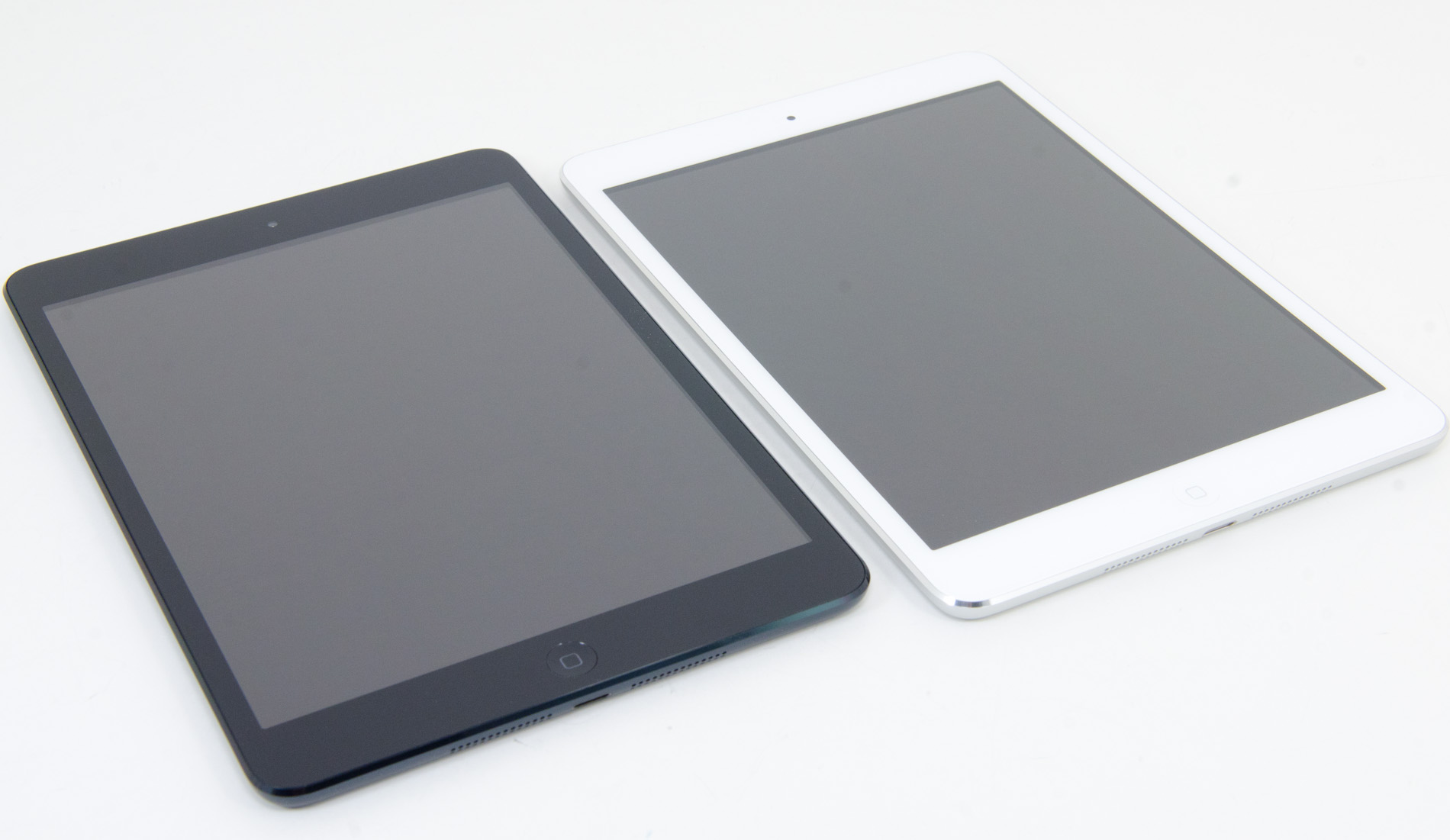
The dark monochromatic look is very sleek; combined with a brightly colored Smart Cover like the red one, the effect is pretty striking. The white/silver colour scheme, as on the iPhone 5, is elegant, but nowhere near as visually striking as the uniformly dark mini.
The face should be very familiar to iDevice users - a front facing camera centered at the top, an ambient light sensor to the left of it, and a home button at the bottom. The home button has been shrunk, though it’s set far enough away from the screen that I feel like they could have easily kept the same home button that is used in the other iDevices. I’m assuming there’s a reason for the downsizing, probably relating to the placement of the hardware around the display, because this isn’t the type of thing typically overlooked by Jony Ive and Co.
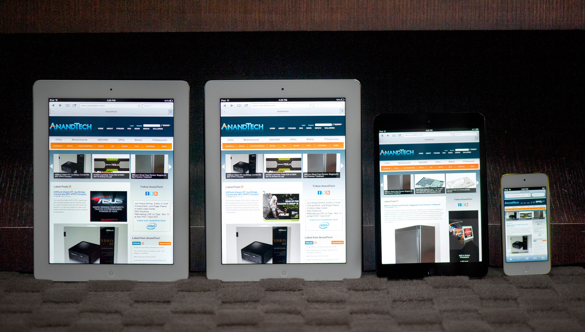
From left to right: iPad 4, iPad 2, iPad mini, iPod Touch (5th gen)
The bezel has been reduced considerably in size in all four directions, but more so on the sides than to the top and bottom. The result is a device with a slightly different physical aspect ratio than the 9.7” iPad - 4.45:3 instead of 3.90:3 (where, in both cases, the display has an aspect ratio of 4:3). The narrower bezel looks good - cleaner and more modern, and I think the iPad mini is better proportioned aesthetically. Of course, the smaller footprint is also one of the main factors in the awesome in-hand feel, so it’s a functional decision as much as an aesthetic one. Surprisingly enough, the lack of bezel on the sides of the mini doesn't impact normal use. Apple tweaked iOS a bit to improve touch rejection along the edges of the mini.
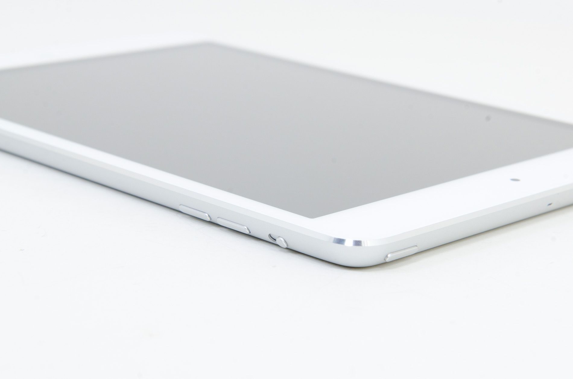
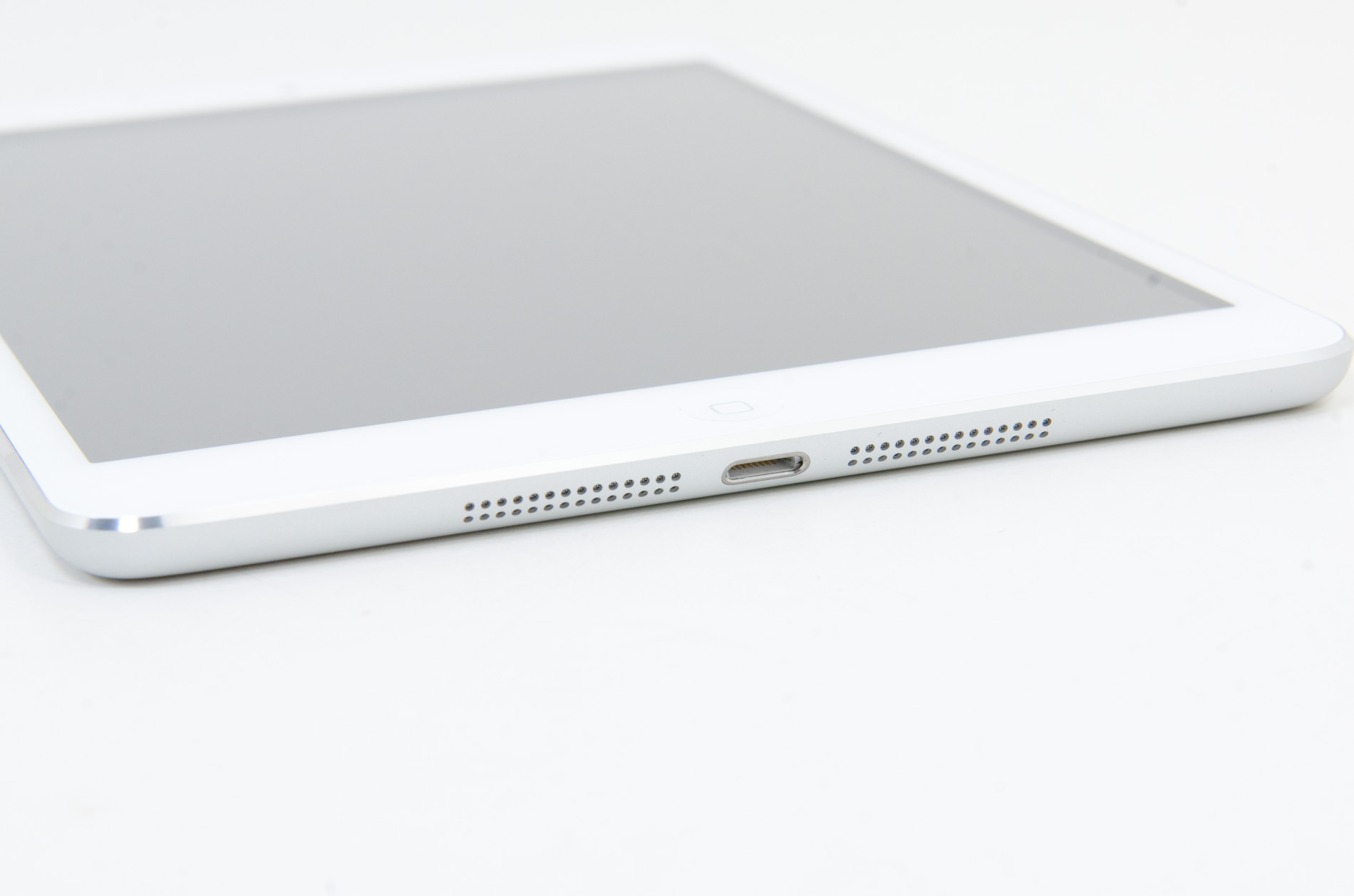
Button and port placement is identical to the preceding iPads, with a few minor but important changes. The silence/rotation lock slider in particular feels much more robust than in previous editions. The top edge has the power button on the right and headphone jack on the left, with volume buttons on the right edge, next to the camera. The buttons themselves are now metal, and offer better feel and feedback than the plastic buttons of the 9.7” iPad.
Coming around the edge to the bottom, we see that the 30-pin dock connector has been replaced by the new Lightning port, centered as always. The mono speaker in the right corner of the back is now gone, superceded by a pair of speakers set on either side of the Lightning port. That’s right - the iPad finally has stereo speakers, and they’re actually pretty decent. Clean sound output, and loud enough to fill a 400 sq ft room without distorting at high volumes. As with most mobile devices, the sound is a bit thin, but a decent improvement over my admittedly low expectations.
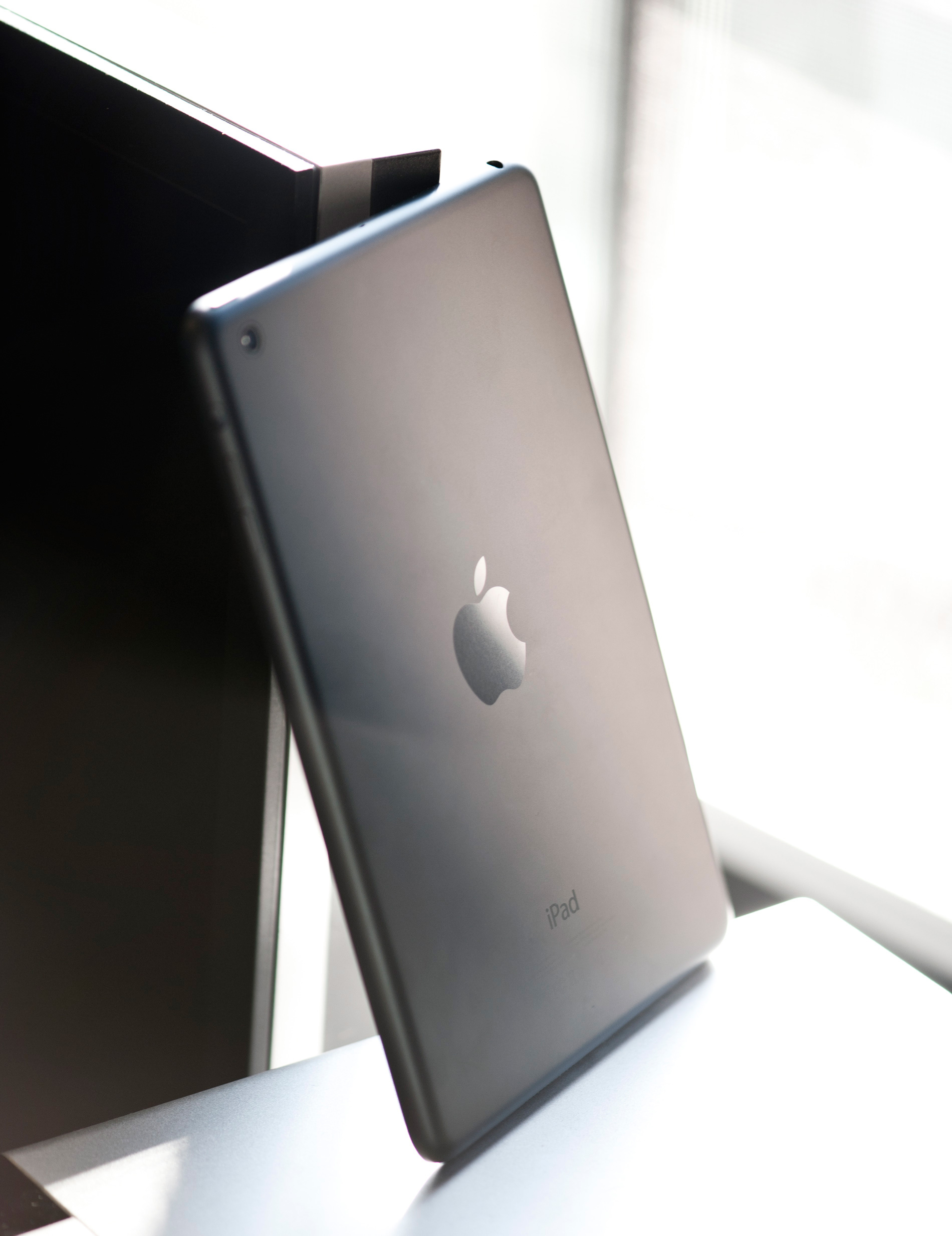
Given that the iPad mini shares the same colors and materials as the iPhone 5, I was curious to see whether the paint would be as fragile and whether we’d see a repeat of the quality control issues Apple had with it at launch. Thankfully, the anodization seems far more robust and significantly more resistant to scratching, even on the polished aluminum band at the front. I didn’t see any material or paint defects when I unboxed it, even after a thorough going over, and through two weeks of not particularly gentle use, I haven’t seen any scratching. It’s a very different experience than my iPhone 5, which came out of the box with the front panel not properly clipped into the aluminum frame and scratched whenever I looked at it wrong. This isn’t a device that needs any other kind of case unless you plan on abusing it, and I feel like a larger case would undo some of the benefit of the ultralight chassis.
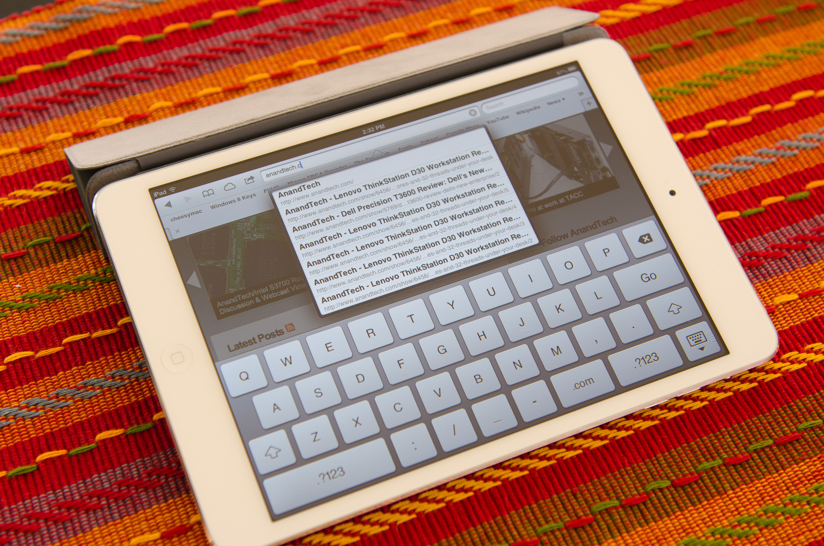
Apple does built a custom Smart Cover for the mini, available in a number of colors. Unlike the bigger Smart Cover, the mini's cover integrates the magnetic hinge into the same material as the rest of the cover, resulting in a very cohesive design:

The big benefit of the Smart Cover is the ability to use it as a stand:
The angle of the folded Smart Cover is considerably larger than on the standard iPad, making the iPad mini lean back more vs. standing upright on the bigger model:
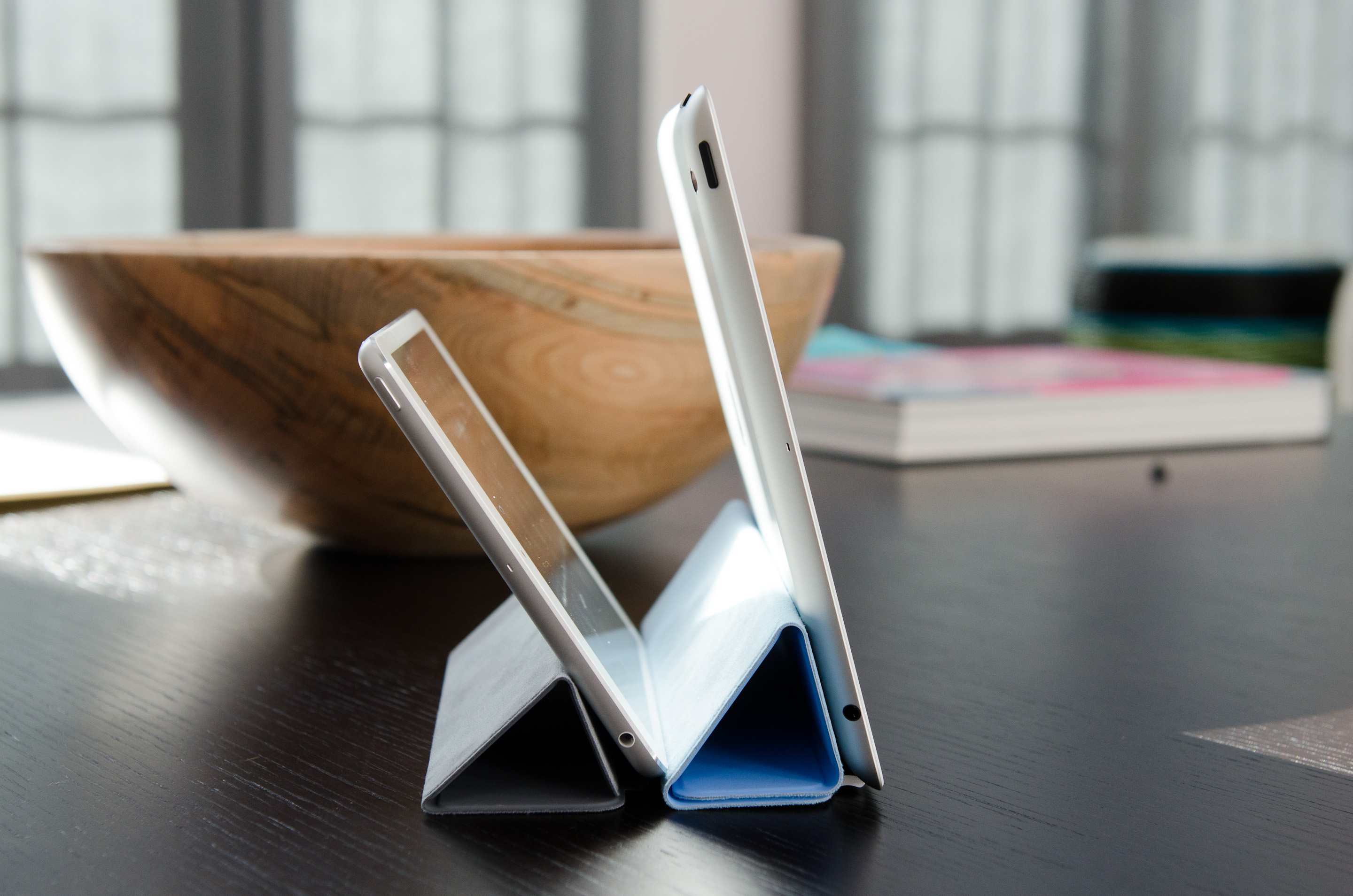
I would recommend getting a Smart Cover for the versatility of the stand and to have some form of protection for the screen. Plus, the black iPad mini + red Smart Cover combination just looks awesome.


140 Comments
View All Comments
Anand Lal Shimpi - Tuesday, November 20, 2012 - link
That's not exactly true, the iPad mini was launched nearly a month ago, our review of it is very late. In the interim I have published articles on Intel's SSD DC S3700, Microsoft's Surface, the Titan Supercomputer at ORNL and Samsung's Cortex A15 based Chromebook.Take care,
Anand
Alucard291 - Wednesday, November 21, 2012 - link
No offence but you could have just said - "same soc as ipad 2. Same display as ipad 2 except smaller so pixels are slightly denser Its lighter than ipad 2 and has the same form factor but smaller."There I wrote the review for you.
Instead you guys put out this monster - showing tests? Of the same soc? Again?
Well one more review site feels the need to get some apple advertisement revenue.
And I approve how you compared it to mini cooper. Yeah great comparison especially since mini cooper is a car for people who can't afford a decent one but really want to seem cool...
So yeah. What makes this product great is the apple logo on the back. As usual.
Jakers Ugly Brother - Thursday, November 22, 2012 - link
It would be so nice to read one single tech thread without running into a paranoid "Oh noes another site has sold out to Apple" screed like yours.But no, you haters have to spread your sick, sad bile across everything you see.
Thanks for lowering the signal to noise ratio of yet another comment section.
ltcommanderdata - Tuesday, November 20, 2012 - link
Anandtech's Microsoft Surface review was up 3 days before the device was on sale and their Windows RT review was up the day before it shipped. The iPad Mini review comes 18 days after the tablet went on sale and they aren't or haven't yet done an iPad 4 (18+ days) or 5th gen iPod Touch (36+ days) review. From this you conclude that Apple reviews get done right away and Microsoft reviews take forever?Ryan already explained why they aren't doing a massive review for Windows 8 and are doing more focused articles instead, which doesn't seem unreasonable.
blacksamurai30 - Wednesday, November 21, 2012 - link
I don't see the reasoning behind your dissapointment. I've been reading for years (despite my only just making an account haha); they are easily the most informative on the internet. The crew here does stellar indepth reviews for pretty much everything. Don't use your own personal misgivings against Apple in an attempt to discredit the hard work that goes into reviewing these products, or the invaluable service it does for the internet and consumer knowledge.Keep up the good work Anandtech!
Anand Lal Shimpi - Tuesday, November 20, 2012 - link
Wow, honest mistake, let me reshoot that real quick. I shot that before I left for SC12 and didn't catch it in my final assembly of the article today.If anything, the photo I posted is contrary to the point I make in the text above. Things are bigger on the iPad compared to the Nexus 7.
Give me a few and I'll get a better photo up.
Take care,
Anand
Kepe - Tuesday, November 20, 2012 - link
The same thing happened in two pictures. On pages 4 and 11, although that's the same image file.http://images.anandtech.com/reviews/tablets/apple/...
Anand Lal Shimpi - Tuesday, November 20, 2012 - link
Fixed in both places. Thank you!seanleeforever - Tuesday, November 20, 2012 - link
and now you have to update the tags..for example. the last page, ipad mini is actually on the right. i am sure no one would mistaken those two, but still.
Anand Lal Shimpi - Tuesday, November 20, 2012 - link
Fixed. The black mini wasn't mine so I no longer had that for comparison, had to use the white model for this shot - but I hope this better shows the difference. I also exported the full size shots at 2800px wide if you want to get a better, up-close look between the N7 and iPad mini.I included two shots on the display page, but here's a link to all 4 I just took:
http://images.anandtech.com/reviews/tablets/apple/...
http://images.anandtech.com/reviews/tablets/apple/...
http://images.anandtech.com/reviews/tablets/apple/...
http://images.anandtech.com/reviews/tablets/apple/...
Take care,
Anand