iPad 4 (Late 2012) Review
by Anand Lal Shimpi on December 6, 2012 4:40 PM ESTDisplay Analysis
The 4th gen iPad retains the same Retina Display as its predecessor. The 9.7-inch 2048 x 1536 display looks just as good as it did earlier this year. Brightness, black levels and contrast are all very good. The real advantage however is color accuracy thanks to Apple's factory calibration on all of its devices with an integrated display.
As with all of Apple's other Retina Displays, software support is made easy through integer scaling. The 2048 x 1536 resolution is an increase of 2x in both dimensions over the standard iPad/iPad mini resolution. App developers simply have to provide 2x scaled assets in order to make the most of the Retina Display. Deciding what image to load (standard res or 2x scaled) is handled automatically, the developer just needs to ensure that it's supplying both sets of images for the best user experience. Games can run either at the panel's native resolution, or run at a non-native offscreen resolution and simply scale up to the panel resolution if the title's performance requirements are too high (more on this later).
All first party apps and most of the 3rd party iPad apps I use on a regular basis are already Retina aware.
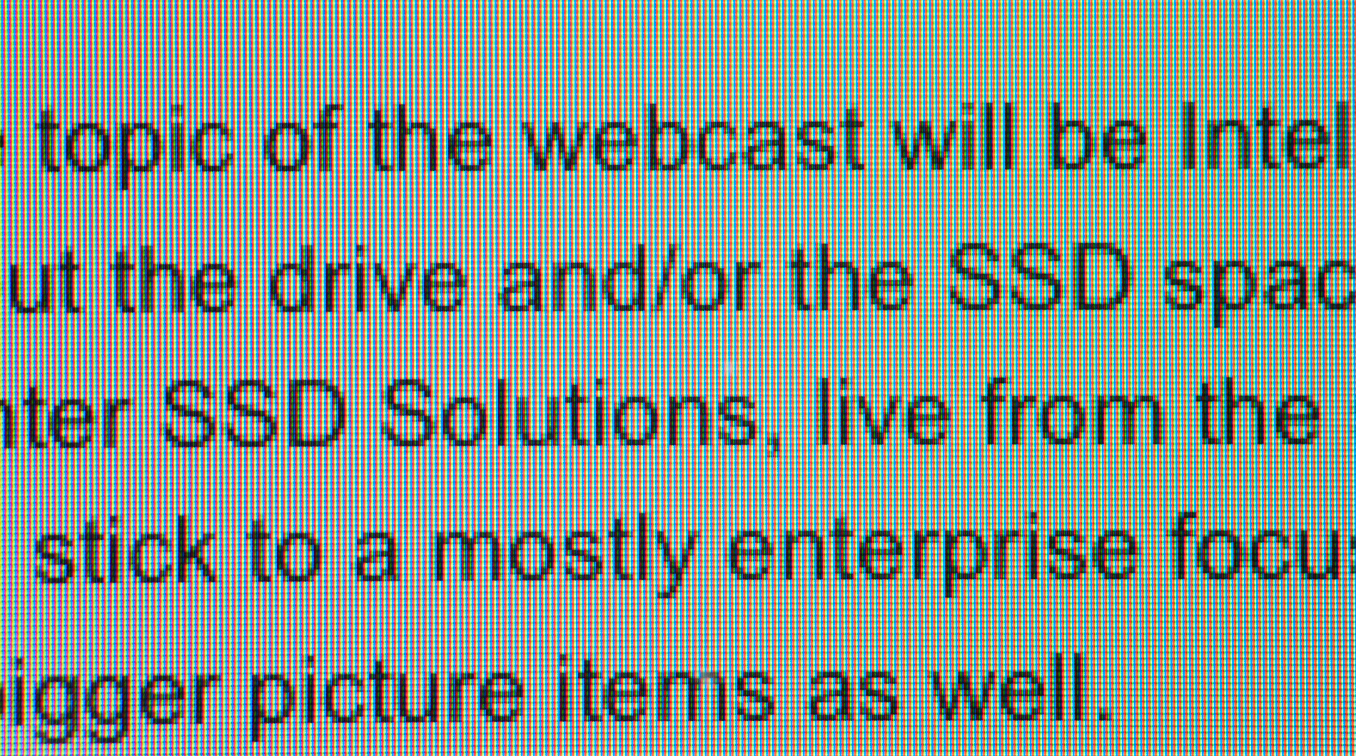
The big advantage the Retina Display offers over other iPads is a much better text reading experience. Individual letters look so much smoother:

I borrowed the paragraph shots below from our iPad mini review to give a better idea of how much of an improvement the Retina Display delivers when reading text:

iPad 2,4
iPad mini

iPad 4
Images also benefit from the Retina panel, but the advantage here ends up mostly being the accuracy of the display rather than the pixel density.

iPad mini (left) vs. iPad 4 (right)
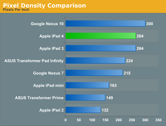
With the exception of the 3rd generation iPad, only the Nexus 10 boasts any real competition to the iPad 4's display. I don't have a Nexus 10 on hand but Brian ran our suite of display tests on his review unit. Let's see how the two stack up in basic brightness and contrast measurements:
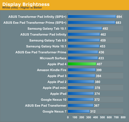
It's amazing to me that 400 nits on a nearly 10-inch display is simply middle of the pack now in modern tablets. This is just awesome. Look at any of our value notebook reviews and you'll find a bunch of displays that typically max out at sub 300 nits. It's no wonder that tablet sales are doing very well among consumers.
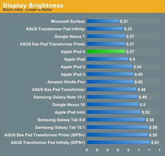
Black levels are good on the 4th generation iPad. Microsoft still holds the clear lead in black levels with its Surface RT, thanks to the tablet's bonded coverglass and display stack.
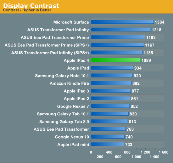
Overall contrast ratio is very good on the iPad 4. I measured a significant improvement over my iPad 3, although I suspect that has to do more with improvements to panel manufacturing than anything more deliberate.
Maintaining good brightness while pushing pixel density is only part of the equation. What made the iPad 3's display so great was that it shipped well calibrated from the factory. I assumed the same would be true for the 4th generation iPad, but I still needed to test to confirm.
To evaluate color accuracy I turned to our own Chris Heinonen's CalMAN smartphone/tablet workflow. We'll start off by looking at the calibrated white point for these tablets. What you're looking for here is a number close to 6500K:
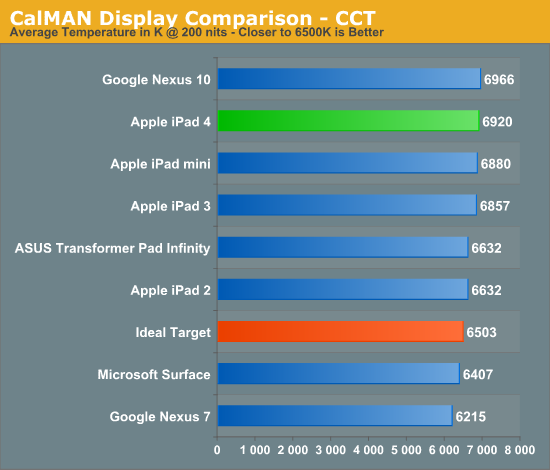
Apple has been drifting north of 6503K for a while now. Variation in white point does seem to track well with individual panel makers in the iPad, so you may see numbers move around here depending on your luck of the draw. We've seen this in other iDevices in the past where whites will range from yellow to blue depending on what panel you end up with.
The next three charts look at accuracy represented as a difference between various source colors and what's reproduced on the display. The results are presented as average dE2000, with lower numbers being better.
First up is Grayscale performance, here we're looking at the accuracy of black, white and 19 shades of gray spread in between the two extremes:
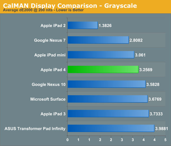
The 4th gen iPad does pretty well here, just edging out the Nexus 10 but losing to the iPad 2 and mini. Pretty much all of the tablets do a good job here at accurately reproducing grays.
First in our color accuracy tests is a saturation sweep. Here we're looking at 20%, 40%, 60%, 80% and 100% saturations of red, blue, green, magenta, yellow and cyan.
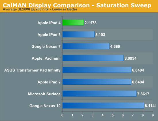
This is what you get with the iPad's pre-calibrated Retina Display: appreciably better color accuracy than any other tablet on the market today. I even measured an improvement in color accuracy compared to last year's iPad 3, however my iPad 3 was from the initial runs of production. I have noticed pretty significant variance between color accuracy between iPads. The results are always good, but some are definitely better than others.
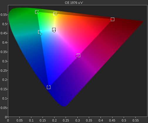
Gamut CIE Chart
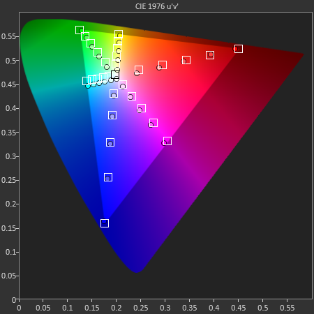
Saturation CIE Chart
For our final accuracy test we're looking at the difference between a Gretag Macbeth colorchecker chart and the rendered swatches on these displays. Once again, lower numbers are better.
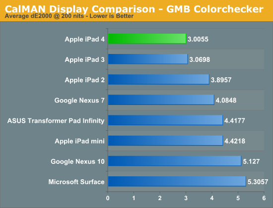
Many of the panels used here are actually good panels, the difference really boils down to calibration. Apple continues to dominate in terms of calibrated color accuracy. The 4th gen iPad's display remains the best in the industry from a color accuracy standpoint.
GMB Color Checker


113 Comments
View All Comments
vkn - Friday, December 7, 2012 - link
I for one appreciate these tests. There is no easy way to judge displays in showrooms. I now have a system of playing the the same hd videos on each device and evaluating subjectively (which sucks)darwinosx - Thursday, December 6, 2012 - link
You don't know anything. Apple has been doing this on displays for a very long time. Since you are obviously a teenager, probably longer than you have been alive.jabber - Friday, December 7, 2012 - link
Yes funny that.I saw this with NFC.
Before the finer points of the iPhone5 came out tech journos were all "NFC!!! NFC!!!! ITS THE FUTURE!!!"
Then the 5 came out with no NFC and it was overnight a switch to "Oh......NFC isn't really all that important! Whats NFC again?"
name99 - Sunday, December 9, 2012 - link
Really? Show us RESPECTED tech journalists who were, to use your language "all NFC! NFC! NFC!" about the iPhone5.I don't remember Gruber obsessing about this. I don't remember Anand saying this was an essential iPhone5 feature. I don't remember Horace Dediu caring about this.
Apple has made it quite clear, since they shipped the iPhone 4S, that they view BT4 as a better solution for most of the things that NFC is supposed to do. Given the extreme lack of interesting things being done with NFC, that seems like a good call.
Your claim is as ignorant as being surprised that the new iMacs shipped without an optical drives.
Death666Angel - Saturday, December 8, 2012 - link
Me personally, I don't agree with Anand. The eyes are pretty good at adapting to colors. So unless you have a calibrated PC monitor or something to compare to, you will not notice when colors are off, unless they are off by a big, big margin. I haven't seen a lot of that in the android camp and when it crept up, there were easy fixes by the community.cheinonen - Sunday, December 9, 2012 - link
Eyes are very adaptable to what is put in front of them, just like ears are with sound over time. That's why all the measures are done by instruments that aren't subject to the adaptability of our vision system. The dE numbers are designed to tell you how visible an error is. With the older 1976 and 1994 formulas, any dE below 3 was thought to be invisible in motion, with < 1 invisible when side-by-side. The dE2000 formula used in these charts is more accurate (in terms of weighing luminance, hue, and saturation errors), but smaller errors are more visible, so a dE of 3 is now worse than a dE of 3 in the old formulas. The dE numbers have a basis in vision science, though, and let you know if an error is visible.How well you'll notice, or care, about a color error likely depends on your exposure to correct colors. If you've spent years looking at a calibrated display, then you'll notice the errors almost instantly. If you've never seen one, you won't notice as you have no idea what it should look like. The whole point of calibration is just so when you see something, or design something, everyone else sees it the same way.
Also, a global fix for color errors isn't likely to work well, as all displays are slightly different and would need to be calibrated individually. You could make some adjustments, but not make them perfectly accurate.
name99 - Sunday, December 9, 2012 - link
To add to this point, I am not an obsessive about color. I don't do design work, or know Pantone numbers by heart or anything. But it was obvious enough to me that colors (in particular photos of faces in Contacts) looked different on my mac and my iPhone 1 that I submitted a bug to Apple about it.This is, to put it bluntly, the difference between Apple and other people. Other (supposedly technical) people see that a photo of a friend looks slightly different on their phone from their computer --- it's a little too dark or too red or whatever --- and they shrug and say "well, it's always been like that". Apple people say "Why the hell should we put up with this? It's possible to do better." It's this mindset that leads to useful improvements based on actual use cases, as opposed to useless improvements based on spec-boasting.
Focher - Saturday, December 8, 2012 - link
Not sure what the problem is. Everything is tested and reported. It's up to you to decide which attribute(s) matter to you.If anything, we should really appreciate that AnandTech reviews those attributes. In addition to Apple actually making the display quality a market differentiator for vendors who play in this space, AnandTech deserves credit for ensuring we see which manufacturers are delivering improved display attributes.
name99 - Sunday, December 9, 2012 - link
It's silly to claim that Apple has "just started" promoting color calibration.Color calibration was added to the original Mac OS in 1993 (ie WAY before OSX) and every year since then Apple has worked to move it a little pervasively into the system as CPU and GPU speed increases have allowed for more on the SW side, and as tighter control of manufacturing have allowed for more on the HW side.
sprockkets - Thursday, December 6, 2012 - link
Screw the ipad. We want the Nexus 10 review!