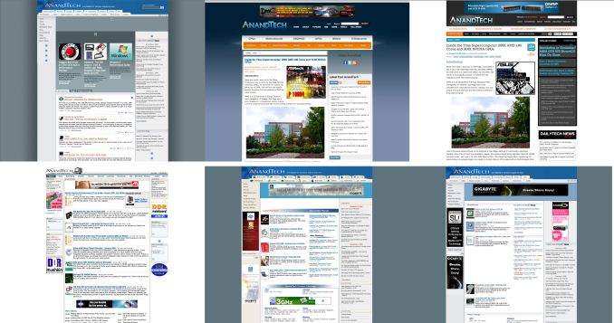
Welcome to AnandTech's 2013 Redesign
by Anand Lal Shimpi on March 9, 2013 1:16 PM EST- Posted in
- Site Updates

In 2010 we went through the single largest redesign in AnandTech history. We modernized the site, finally moved to a tag based architecture and made a number of other tweaks. The web moves a lot quicker than it did even just 3 years ago, so last year we started working on another significant redesign. Today marks the debut of that design.
Going into the redesign we wanted to accomplish three major goals. First, we wanted to have a design that put our smartphone and tablet coverage on equal footing with our traditional PC roots. The redesign consolidates our coverage areas into four major categories: PC Components, Smartphones & Tablets, Desktops & Notebooks and finally Enterprise. The super categories are largely self explanatory and you can drill down into each one of them for more specific navigation.
It's important that our site design reflects our internal focuses. We are as committed as ever to our PC component coverage, but we also devote an equal amount of time to what we're doing in the new mobile space. From my perspective, whether it's a smartphone or a server, we're still talking about some form of computer - just in a different case.
Our second major goal with the redesign was to more prominently feature Pipeline, our short form content section. We launched Pipeline in late 2011 as a way of dealing with content that either didn't demand our full review treatment or that we didn't have time to dedicate deep analysis to. Since then Pipeline has become a very important part of the site, and we wanted to elevate its position on the front page as a result. Pipeline stories on the right are ordered from newest to oldest, with even older pipeline stories appearing under the 2x2 grid of featured articles.
Finally, we wanted a design that would be more accessible and speak to the broader nature of our audience. While you all know why you come to AnandTech, it's very important to our continued success and ability to remain independent that the site accurately reflects the diverse audience. Whether you're coming to us for motherboard reviews, analysis of the latest microprocessor architectures or to figure out which smartphone or tablet to buy, you're likely a person relied on by dozens of others for recommendations. We remain an independent website, which comes with its own challenges when it comes to proving our worth to the agencies and marketing organizations that help keep us operational. Looking the part is just as important as having the content to back it up.
We made sure not to take away any features with the redesign. We still include our well used Print View on all articles, but now allow you to use it both for single page reading as well as for actual printing. The previous Print View didn't have all of the styling of our article pages since it was purely optimized for printing, now we have both modes.
Other features have been enhanced as well. The View All Comments button now actually lets you view all comments on a single page, rather than just showing you 50 comments per page. You can also now permalink to individual comments. I'm always humbled by just how awesome your comments are, now we can finally link directly to individual ones.
We now support larger images inline (we will be adding site-wide retina/hi-DPI support soon!) and our graph style has been updated as well, which you'll start seeing us take advantage of with all new content going forward. The review body text is also larger and hopefully easier to read, which should help when we post some of our ultra long form content.
The Podcast now has a permanent link at the top of the page as well - thanks to all you who have been asking for that.
The Twitter feed on the front page now includes tweets from a number of staff members including Brian, Ganesh, Jarred and myself. We've also made it easier to follow us on Twitter and Facebook with direct links in our header (hint: it helps us tremendously if you do). Our most recommended content on Facebook is also nicely streamed in to the right of the site as well.
There are more functional changes that we'll be introducing throughout the new year. We just had to get the redesign out of the way first so we could start building on it.
I hope you all enjoy the site redesign. I know big changes aren't always easy to get used to, and as always you have my commitment to fix/improve anything that truly needs it. I'd love to hear your feedback on the design in the comments below.
I'd like to close with a thanks to all of you for continuing to read and support the site. I've always said that AnandTech is your site and I do firmly believe that. We are here to serve you and you are what make this site possible. Thank you for reading, and thanks for making the past 16 years possible. If you are a relative newcomer, please be sure to check out our About page that helps explain the philosophies that drive us.


465 Comments
View All Comments
kgh00007 - Monday, March 18, 2013 - link
Please bring back the old Anandtech, this is shit :-( looks terrible on my nexus 7, text is too small and the pictures are too small :-( why take a step backwards? I didn't think it was possible to turn me off Anandtech, but you have managed it!Oreoscrumbs - Tuesday, March 19, 2013 - link
I don't mind the redesign. I think it looks fine. I scanned the front page just like I always have, and I didn't notice anything missing. For those complaining about widescreen whitespace, ctrl-+ in Windows or cmd-+ in Mac zooms the site, and, on FireFox at least, keeps track on a site-by-site basis. That might also help with the font sizes some are complaining about. At work I am fortunate enough to have a second screen in a portrait orientation, so that is what I do most of my browsing on, to eliminate scrolling. The site looks fine on that screen, 1200 x 1920, with no issues. Sliding it to the landscape screen only means that I have to hotkey the zoom 4 times to fill the screen.I really think most of the desktop users complaints are a non-issue, if people take a little time to make some adjustments. I also set my brightness at 30, so even a full white screen is less harsh on my eyes.
Beenthere - Tuesday, March 19, 2013 - link
From personal experience testing on a variety of desktop and laptop PCs, I can tell you the issue is not user "adjustments", which is why I pointed out in my comment above that what some folks are seeing is not the same as what other folks are seeing, which makes you wonder why the obvious differences from from similar hardware and O/Ss. In addition adjusting the screen settings doesn't change the layout or significantly improve the type fonts and how they display, shaded boxes, cut-off text, etc.PCMerlin - Tuesday, March 19, 2013 - link
Revisiting this, it looks like the overall background has changed to a slight grey, rather than a full solid white. That seems to tone down the "in your face" brightness that was here initially.I've also viewed the site on a 4:3 ratio monitor where the white space on the sides does not exist (I'm assuming that is the way it appears on the iPad and other tablets, too) and that also helps considerably in viewing the site.
Could you confirm that the overall background has changed, or it is just the screen I'm using to view it from?
GreenLoco - Wednesday, March 20, 2013 - link
I can't put this off any longer, this redesign sucks !risa2000 - Thursday, March 21, 2013 - link
After several days, I do not know anymore, what I have already read and what I did not. Completely lost in the page broken into incoherent areas with no easy way to follow.ghitz - Thursday, March 21, 2013 - link
I'm only checking AnandTech twice a week now with this crap layout, as opposed to twice a day. Is this what you guys hoped for?FH123 - Wednesday, March 27, 2013 - link
I was also a frequent reader and I agree. The previous design was more blog-like, with the articles strictly sorted by date and time. This was ideal to see what's new and pick the content I wanted to read. The new design seems inspired by bigger news outlets, but you're not one of those. If you were putting up dozens of new articles a day, it would make sense to pick highlights on the home page and generally organise the site in a more hierarchical fashion. But what you're about is a small volume of really high-quality articles. Listing them side by side is disorienting. Which was published first? Have I read it? Where's the new stuff? Is it sorted or do I have to hunt for it? What's a pipeline story and why should I care?It's the big in-depth articles that are your forte and what I'm here for. Those are, naturally, fewer and less frequent, but the previous design had them, rightfully, front and center. Even though I don't think that has objectively changed much, the new design feels like it's cluttered with garbage. I think the use of serif fonts and perhaps too cramped line spacing may be contributing to that impression. A redesign is always bound to elicit criticism from people like me, because it takes time to get used to. Even so I feel there is something about the new fonts and font sizes that results in a very cluttered and unfocused look, where headlines compete with each other on an equal footing when they shouldn't.
yourbestcritic - Friday, April 19, 2013 - link
I couldn't agree more. Well said!Harkonnen - Friday, March 29, 2013 - link
While I like the redesign it is causing a minor annoyance for me. Firefox will keep asking me for my master password with the dialog box anytime I click on a new page. Even though I am already logged in. I am thinking it is from Firefox automatically trying to login to Facebook or twitter, maybe Dailytech as well.I wish I knew how to stop this.