Introducing AnandTech Mobile: A Responsive Design Update
by Anand Lal Shimpi on July 15, 2013 9:47 AM EST- Posted in
- Site Updates
For the past couple of months our ad sales team has been engaged with Box, an enterprise file sharing and cloud content management company. Box was looking for a way to increase its exposure and brand awareness, and we had a platform to do just that. Rather than rely on typical advertising, Box was thinking of something a little more, er, outside of the box.
Box is absolutely amazing to work with. Rather than asking what we could do for them, they asked us what they could do for us. What immediately came to mind was the overwhelming number of requests for a responsive version of AnandTech. We presented the idea of sponsoring the design and creation of AnandTech Mobile to Box, and they loved it. Over the past month we've been modifying AnandTech and preparing the first responsive implementation of the site. Today, AnandTech Mobile is live.
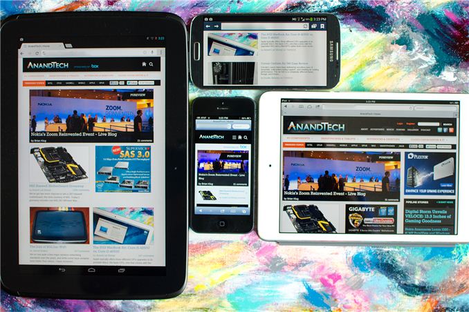
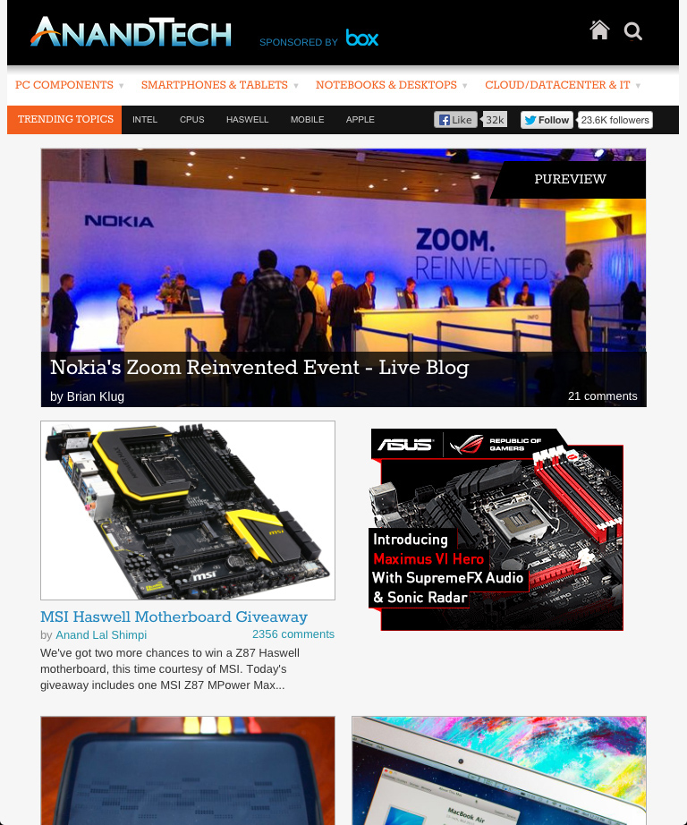
Our mobile web strategy is built entirely around a responsive design. We now effectively have four views that are dynamically presented depending on browser resolution: smartphone portrait (320px), smartphone landscape (321px - 767px), tablet (768px - 1000px) and desktop. The smartphone portrait and tablet views are below:

You don't have to go to a separate URL to hit any of these views, they present themselves based on what resolution your browser reports. Keep in mind that high DPI displays usually advertise their resolution as some fraction of the actual resolution, so even if you have a 1080p smartphone you'll be presented with one of the smartphone views by default rather than a tiny desktop view.
All of the pages on the main site are now responsive thanks to Box's sponsorship. Any URL you open will present you a styled version of the site optimized to the device you're reading it on. Even our live blogs work, as does Bench - our performance comparison tool. In the mobile views of Bench we had to change the way we present two product comparison data to deal with more limited screen real estate. The result is pretty cool:
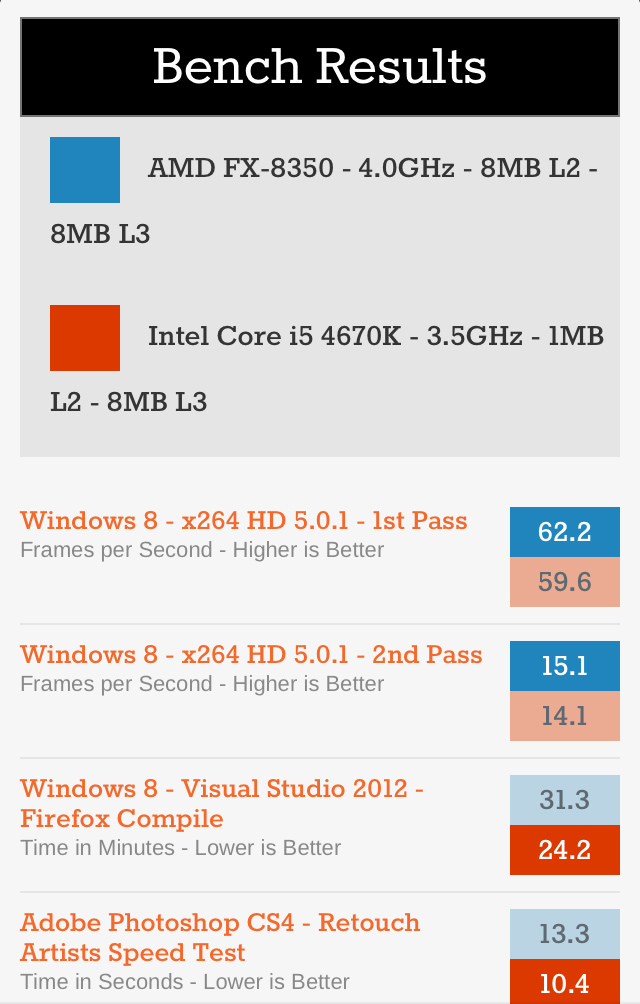
Rather than presenting bars, you get color coded boxes with the benchmark scores inside. For each benchmark, a darker colored box implies better performance. This is actually a bit of an improvement over what we do in the desktop view because you can easily tell which product wins a particular benchmark without having to see whether lower or higher results are better.
If for whatever reason you want to disable the mobile view you can do so in the About area of the mobile design at the bottom of the page, and can similarly re-enable it at the bottom of the desktop page. This toggle is cookie based so you'll need to have cookies enabled for it to work.
I'm really pleased with the way all of this turned out. It was a huge effort on behalf of our designer and developer but the end result looks great. I can't stress enough just how instrumental Box was in making all of this happen now. Box wanted to enable something good for the AnandTech readers and that's exactly what they've done. If you find the new mobile views of AnandTech useful, please show Box your appreciation in the comments and if you'd like to sign up for a free personal or business Box account I'm sure that wouldn't hurt either.


 Facebook
 Twitter
 RSS
RSS


98 Comments
View All Comments
MassiveTurboLag - Tuesday, July 16, 2013 - link
The font size is too small. I still find it better to use Reader on my 3rd gen iPad.Red Storm - Tuesday, July 16, 2013 - link
I guess I'm the only one that does not like this new look at all. Maybe it's more view friendly for smaller iPhone screens, but I prefer the desktop view over this by far. Now the forums button is gone, as is the Pipeline and DailyTech boxes on the right.Red Storm - Tuesday, July 16, 2013 - link
And now I can't even skip the mobile site and force load the desktop version by choice! :(Kill16by9TN - Wednesday, July 17, 2013 - link
That's what I thought at first, too. You need to increase your browser's window width until the right-hand column pops back up. Strangely there is no H-scrollbar showing up, when the width is insufficient to display everything at once, instead stuff then just disappears.As a mostly desktop (fHD) user, I don't like this new behavior either, since I now am forced into overlapping side by side windows.
amicrozen - Thursday, July 18, 2013 - link
Beautiful job. Finally a website which looks correct regardless of the device or orientation.djorgen - Thursday, July 18, 2013 - link
Tested this on my Nexus 4, and the site looks & works very well! Great job Box & AT! :-)MadMan007 - Thursday, July 18, 2013 - link
I didn't read all the comments to see if it was mentioned elsewhere, so here goes...It's nice to have a mobile-friendly layout, but on my Nexus 4 some of the articles get *really* screwed up by ads that don't scale at all. So there will be a few words along the left, then a huge ad picture that takes up the rest of the screen, then the rest of the article text. It just looks horrible and makes the mobile site frustrating to use. Could you please move to real mobile ads instead of just putting the desktop site ads into the mobile version?
PalmerWoodrow - Friday, July 19, 2013 - link
"Responsive" to what?