Introducing AnandTech Mobile: A Responsive Design Update
by Anand Lal Shimpi on July 15, 2013 9:47 AM EST- Posted in
- Site Updates
For the past couple of months our ad sales team has been engaged with Box, an enterprise file sharing and cloud content management company. Box was looking for a way to increase its exposure and brand awareness, and we had a platform to do just that. Rather than rely on typical advertising, Box was thinking of something a little more, er, outside of the box.
Box is absolutely amazing to work with. Rather than asking what we could do for them, they asked us what they could do for us. What immediately came to mind was the overwhelming number of requests for a responsive version of AnandTech. We presented the idea of sponsoring the design and creation of AnandTech Mobile to Box, and they loved it. Over the past month we've been modifying AnandTech and preparing the first responsive implementation of the site. Today, AnandTech Mobile is live.
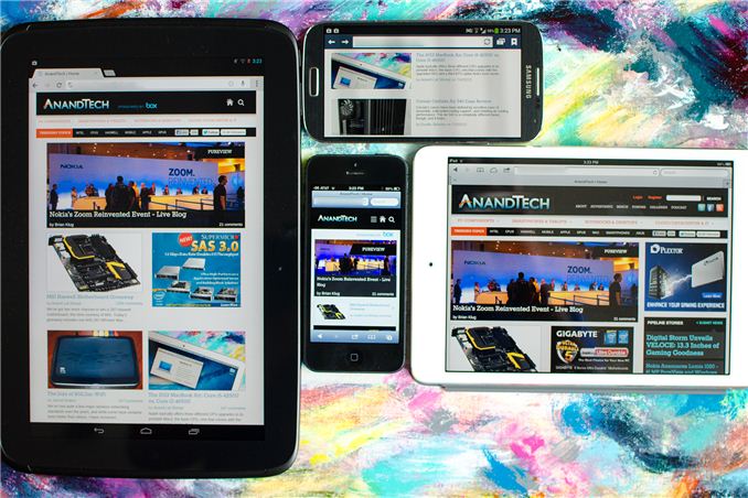
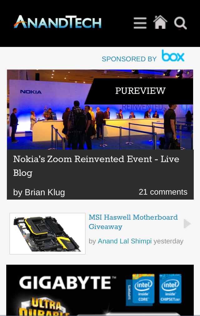
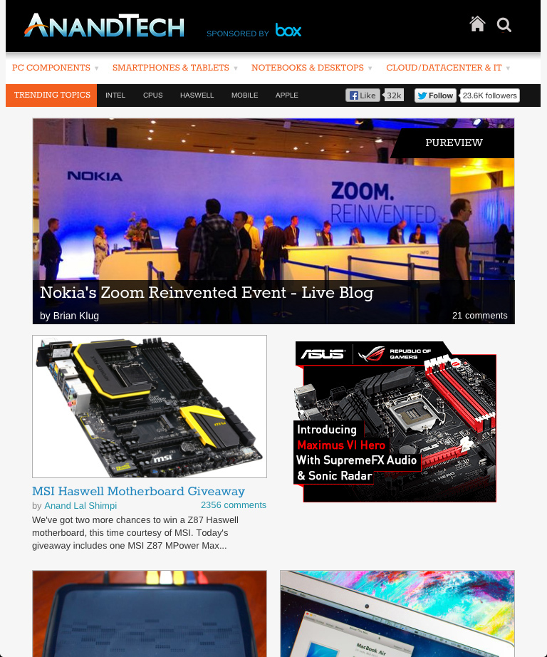
Our mobile web strategy is built entirely around a responsive design. We now effectively have four views that are dynamically presented depending on browser resolution: smartphone portrait (320px), smartphone landscape (321px - 767px), tablet (768px - 1000px) and desktop. The smartphone portrait and tablet views are below:
You don't have to go to a separate URL to hit any of these views, they present themselves based on what resolution your browser reports. Keep in mind that high DPI displays usually advertise their resolution as some fraction of the actual resolution, so even if you have a 1080p smartphone you'll be presented with one of the smartphone views by default rather than a tiny desktop view.
All of the pages on the main site are now responsive thanks to Box's sponsorship. Any URL you open will present you a styled version of the site optimized to the device you're reading it on. Even our live blogs work, as does Bench - our performance comparison tool. In the mobile views of Bench we had to change the way we present two product comparison data to deal with more limited screen real estate. The result is pretty cool:
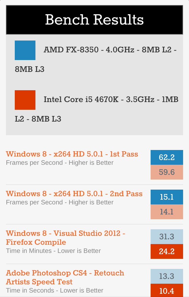
Rather than presenting bars, you get color coded boxes with the benchmark scores inside. For each benchmark, a darker colored box implies better performance. This is actually a bit of an improvement over what we do in the desktop view because you can easily tell which product wins a particular benchmark without having to see whether lower or higher results are better.
If for whatever reason you want to disable the mobile view you can do so in the About area of the mobile design at the bottom of the page, and can similarly re-enable it at the bottom of the desktop page. This toggle is cookie based so you'll need to have cookies enabled for it to work.
I'm really pleased with the way all of this turned out. It was a huge effort on behalf of our designer and developer but the end result looks great. I can't stress enough just how instrumental Box was in making all of this happen now. Box wanted to enable something good for the AnandTech readers and that's exactly what they've done. If you find the new mobile views of AnandTech useful, please show Box your appreciation in the comments and if you'd like to sign up for a free personal or business Box account I'm sure that wouldn't hurt either.


 Facebook
 Twitter
 RSS
RSS


98 Comments
View All Comments
Anand Lal Shimpi - Monday, July 15, 2013 - link
It is indeed purely responsive - we are restyling/hiding content on the fly, which is what enables you to see both tablet and desktop views depending on how you orient something like the iPad mini. The only exception are the ads which are loaded based on initial resolution target to avoid serving ads that will never be seen.ananduser - Monday, July 15, 2013 - link
Anand...no more pipeline section. Make it all a single wall that would perpetuate as you scroll. Like the blog view of Gizmodo or Cnet's "load more stories" button or Tumblr's auto scroll. Why clutter the front page with different sections. Simple is best. Thanks!blacks329 - Monday, July 15, 2013 - link
Fantastic job with the redesign and responsiveness, but I do find it a bit odd that it goes between desktop and mobile versions of the site when changing orientations.I would much rather have the mobile design continued in landscape orientation on something like my iPad rather than it going to the desktop version.
But nonetheless, a welcome change to consuming AT on my phone or tablet. Kudos to everyone involved in the process.
makerofthegames - Monday, July 15, 2013 - link
This is cool and all, but I'm disabling the mobile view for now.I often browse in a half-window - effectively 960x1080. On the desktop version, that just means I have to side-scroll a bit to see the pipeline stories (which I only need to do if they're new - I can spot ones I've already read just from the fragment).
With the responsive design, though, instead of letting them be cut off, it just hides them. They're not moved anywhere, they don't get merged in with the other articles, they're just gone.
Until that gets fixed, I'm sticking with the desktop version. On my desktop, at least.
ashita - Monday, July 15, 2013 - link
The first link to Box's site is missing the "http://" (1st paragraph) :)uhuznaa - Monday, July 15, 2013 - link
Beautiful, responsive (in more than one way) and very well done. Until now I hated reading Anandtech on any mobile device, this will be different now.chesterzen - Monday, July 15, 2013 - link
Maybe I'm alone in this, but I just hate when websites force me into some downgraded experience because I went there on my phone. I feel like I'm being punished for using a mobile device. The regular site works just fine on my gs3... I'm baffled why I would want a lesser version or why effort goes into that at all.meh.
Touche - Monday, July 15, 2013 - link
I agree. Why can't they respect my user agent setting?! I hate mobile versions with a passion. I hated them on my 2.6" N95 and I hate them now on my large smartphone. If I set a specific user agent, respect the damn thing. And I can't even change the setting in the About section because it doesn't work in Opera Mobile I'm using.Anand Lal Shimpi - Monday, July 15, 2013 - link
What device/OS/version of Opera Mobile are you using?Touche - Monday, July 15, 2013 - link
Samsung Captivate Glide/2.3.5/Opera 11.50It is an older version of Opera, but the smoothest one. I don't expect everything to work on it, as Opera is known for compatibility issues, but user agent should be respected. Dolphin's one wasn't respected either, but at least the About section works there.