Introducing AnandTech Mobile: A Responsive Design Update
by Anand Lal Shimpi on July 15, 2013 9:47 AM EST- Posted in
- Site Updates
For the past couple of months our ad sales team has been engaged with Box, an enterprise file sharing and cloud content management company. Box was looking for a way to increase its exposure and brand awareness, and we had a platform to do just that. Rather than rely on typical advertising, Box was thinking of something a little more, er, outside of the box.
Box is absolutely amazing to work with. Rather than asking what we could do for them, they asked us what they could do for us. What immediately came to mind was the overwhelming number of requests for a responsive version of AnandTech. We presented the idea of sponsoring the design and creation of AnandTech Mobile to Box, and they loved it. Over the past month we've been modifying AnandTech and preparing the first responsive implementation of the site. Today, AnandTech Mobile is live.
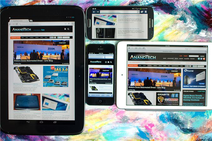
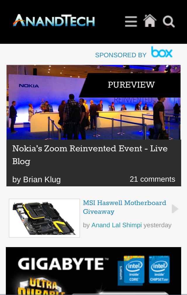
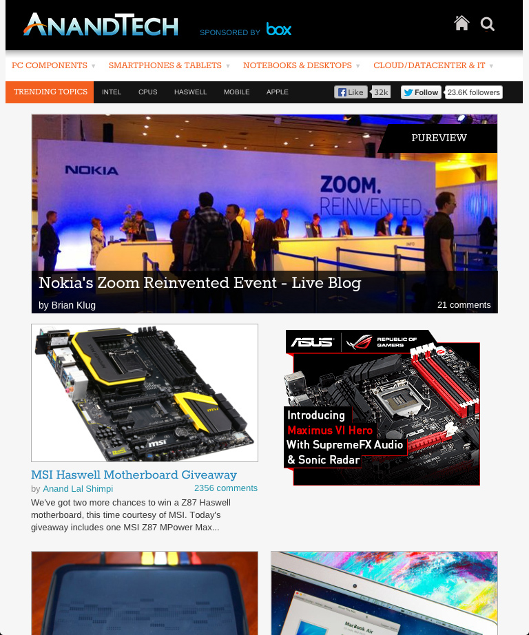
Our mobile web strategy is built entirely around a responsive design. We now effectively have four views that are dynamically presented depending on browser resolution: smartphone portrait (320px), smartphone landscape (321px - 767px), tablet (768px - 1000px) and desktop. The smartphone portrait and tablet views are below:
You don't have to go to a separate URL to hit any of these views, they present themselves based on what resolution your browser reports. Keep in mind that high DPI displays usually advertise their resolution as some fraction of the actual resolution, so even if you have a 1080p smartphone you'll be presented with one of the smartphone views by default rather than a tiny desktop view.
All of the pages on the main site are now responsive thanks to Box's sponsorship. Any URL you open will present you a styled version of the site optimized to the device you're reading it on. Even our live blogs work, as does Bench - our performance comparison tool. In the mobile views of Bench we had to change the way we present two product comparison data to deal with more limited screen real estate. The result is pretty cool:
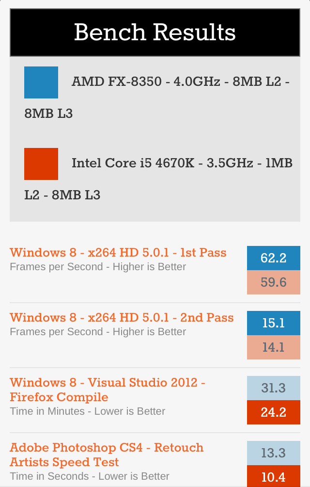
Rather than presenting bars, you get color coded boxes with the benchmark scores inside. For each benchmark, a darker colored box implies better performance. This is actually a bit of an improvement over what we do in the desktop view because you can easily tell which product wins a particular benchmark without having to see whether lower or higher results are better.
If for whatever reason you want to disable the mobile view you can do so in the About area of the mobile design at the bottom of the page, and can similarly re-enable it at the bottom of the desktop page. This toggle is cookie based so you'll need to have cookies enabled for it to work.
I'm really pleased with the way all of this turned out. It was a huge effort on behalf of our designer and developer but the end result looks great. I can't stress enough just how instrumental Box was in making all of this happen now. Box wanted to enable something good for the AnandTech readers and that's exactly what they've done. If you find the new mobile views of AnandTech useful, please show Box your appreciation in the comments and if you'd like to sign up for a free personal or business Box account I'm sure that wouldn't hurt either.


 Facebook
 Twitter
 RSS
RSS


98 Comments
View All Comments
Zandros - Monday, July 15, 2013 - link
Agreed. Double-tapping the text column worked perfectly well with the old design in portrait view, with the added benefit that I could zoom further to get a better look at pictures, slides and graphs.Since I can't zoom now, graphs are virtually unreadable on my iPhone 5 in portrait, and I don't think turning it to horizontal every time is a good solution.
Anand Lal Shimpi - Monday, July 15, 2013 - link
This is exactly why we allow for the ability to force the desktop view at all times. Scroll down to the bottom of the mobile view, under about you should see an option for requesting the desktop view.Zandros - Monday, July 15, 2013 - link
Yeah, I got that (I might be misremembering, but it seems somewhat different to what it was before, double tap leaves a bit of the sidebar in view for some reason). I still think that it would be useful to get a good look at the graphs in portrait mode with the responsive design somehow.Moizy - Monday, July 15, 2013 - link
Awesome! Nice work, thank you!quiksilvr - Monday, July 15, 2013 - link
Where is the podcast option? I have to go to full site in About and click it on the top right on my phone.quiksilvr - Monday, July 15, 2013 - link
Nevermind, had to click the home button which brings up a drop down menu. Odd placement but its better than going into desktop mode.twin-pt - Monday, July 15, 2013 - link
Finally, my only complaint about Anandtech's site is over! Brilliant!GauravDas27 - Monday, July 15, 2013 - link
Finally! I was getting tired of using Currents on my phone.geniekid - Monday, July 15, 2013 - link
Looks really good. Way better than a lot of other "mobile" sites457R4LDR34DKN07 - Monday, July 15, 2013 - link
I miss the dailytech headlines :(