The iOS 7 Review
by Brian Klug & Saumitra Bhagwat on September 19, 2013 1:25 AM EST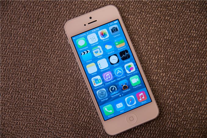
There’s no doubt about it, this iOS update is one of the largest in Apple’s history. In the wake of the iPhone 5 launch, there was a considerable amount of criticism that iOS’ visual design was beginning to get stale. The core of the interface hadn’t really changed in either visual appearance or function. With iOS 7, those pundits get their wishes granted, as almost every part of the OS gets some kind of change.
The new UI is a dramatic reimagining of the core of Apple’s mobile operating system for iPhones, iPod Touches, and iPads. The most obvious superficial change is a completely new visual appearance with a new emphasis on minimalism and simplicity. At the same time, iOS 7 is always in motion, with transitions and other effects almost everywhere you look in the OS. It’s a change that’s bound to be jarring and solicit mixed reactions initially like all redesigns are, but our thoughts have solidified since running the earliest betas up until the latest GM.
New UI
Apple’s designers were no doubt faced with a huge challenge with iOS 7. The platform has to remain familiar enough to be immediately usable and recognizable to iOS 6 and prior users, while at the same time accomplishing the goals of both modernization and cleaning up the cruft that has accumulated in some places over the past 6 major versions.
iOS 7 (Left), iOS 6 (Right) on iPhone 5
The other reality is that smartphone users no longer need a UI that emulates real-world analogues to real objects for them to be able to discover and learn the interface. Things like controls (switches, sliders, and buttons) that emulated actual buttons no longer have to appear that way to be immediately obvious. Textures and other surfaces no longer need to mimic the real world either. Instead these can now give way to something that’s minimalist and new. The educational phase is over, and for the most part smartphones are now largely mainstream rather than an enthusiast novelty or niche market. iOS 7 is the result of all that change.
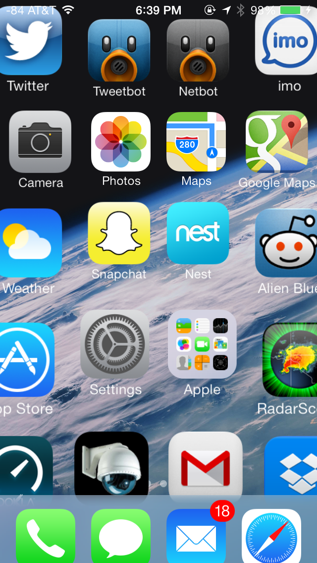
There are some obvious changes that stick out immediately, like app icons that are now a slightly larger size, a status bar area that’s now smaller and more customizable for developers, mandatory retina quality assets, new folder appearance, borderless buttons everywhere, different fonts (Helvetica Neue) and dynamic size, and a host of other first party changes.
Color Scheme
There’s really no way to avoid it, but iOS 7 moves to a completely different color palette than other releases. If there’s one thing that sticks out at me, it’s that the iPhone 5c really is the canonical correct device for iOS 7, as those devices essentially define the emphasis on color that’s visible throughout the whole OS. Each application gets a tint color that carries through it – ideally this color is used in the application icon in a very obvious way, then throughout the application to indicate interactivity.
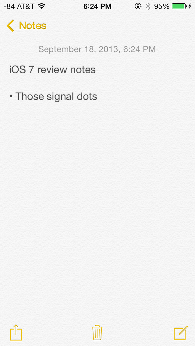
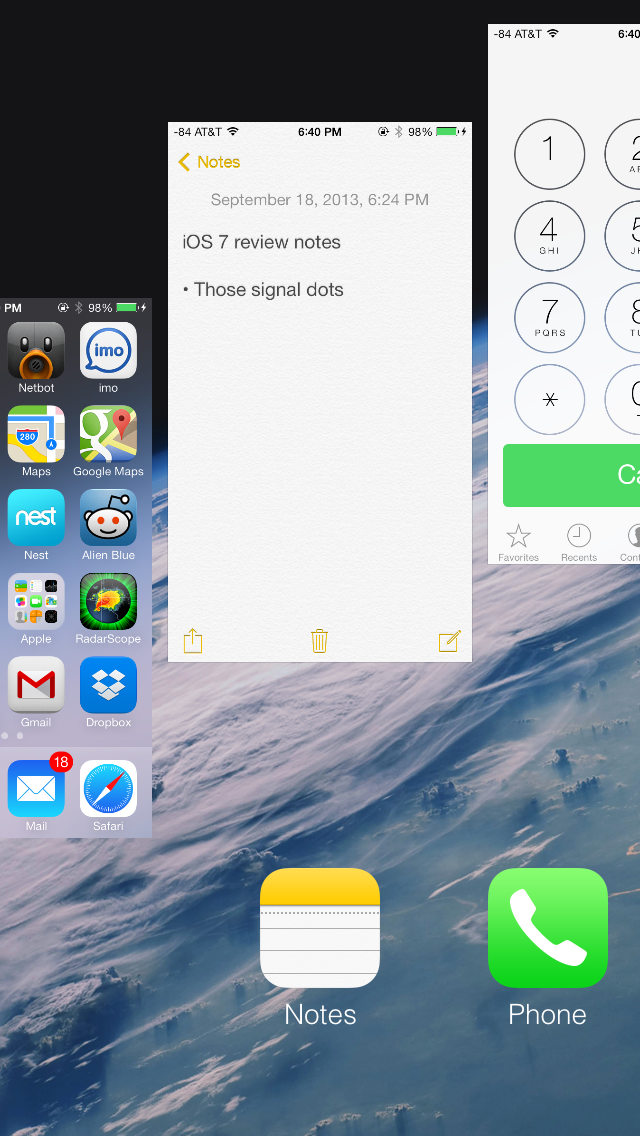
Yellow in the notes app icon, yellow interactive elements inside
Calculator has orange function buttons on the icon, inside these buttons are still orange. Notes has a yellow strip like a notepad, inside the icon tint is yellow. Calendar has the date written in red, inside almost all the elements are red. Camera has a tiny yellow dot for the camera flash or LED AF assist, inside all the text and interactive elements are yellow. Without the shiny rounded buttons or sunken indicators everywhere, this tint color is really the only good way to know whether a certain element is actionable, and it’s a big theme in iOS 7.
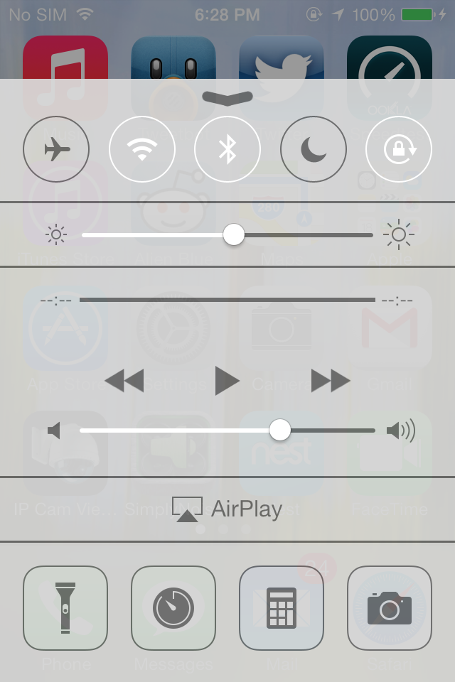
Transparency
Heading into iOS 7 there was a lot of discussion about how computer interfaces were largely going “flat.” To many, that meant completely devoid of any sense of depth or z-height, to others that meant elimination of the kind of rounded, 3D buttons that previously cued users on what elements were actionable or not. While I’ll leave the discussion about what “flat” really means to human computer interface scientists, the reality is that iOS 7 isn’t really flat, and one of the most obvious places you can see that is with its use of translucency and parallax.
Transparency is everywhere in iOS 7
Translucency is a big deal in iOS 7 for two reasons. First, it’s part of the “constant motion” theme of the design, for example while scrolling a page in safari or a dialog in messages you’ll see content move behind frosted glass elements. Second it gives hierarchy cues without being obvious about it or wasting space on drop shadows. There’s a certain depth that comes with the transparent effect that makes things understandable, especially for things like the notification center and control center shades. This allows certain views to be separate in an obvious kind of way. Alerts used to be one of the last bastions of Apple’s prior love of big rounded faux–3D elements, and now are translucent. Apps also now are supposed to draw the entire view all the time, even when the keyboard is up, as it now is transparent as well.
I was a huge fan of transparency in Windows with aero glass, iOS 7 pulls off translucency and this frosted glass appearance very well, with just the right amount of opacity. There’s certainly a part of it that’s eye candy, but it does make a lot of sense in this “flat” world.
iPhone 4, iPhone 4S, respectively
The transparencies are great, but definitely computationally intensive on the GPU and obviously adds to an overdraw tax. As a result not every device that iOS 7 supports gets transparency and a blur effect, some devices just get transparency. On the iPhone side, the iPhone 4 lacks the cool blur effect in a number of places (notification center and control center are the most obvious), and iPad 3 does as well.
Fonts
iOS 7 moves to Helvetica Neue for the system font, with frequent use of the ultra light and light weights of that particular font. Apple is so proud of its change in fonts, it changed the “iPhone” font on the back of the iPhone 5s and 5c to match. It’s a not so subtle change, and iOS 7 also now places more emphasis on being typographically-centered. Much the same way that color is a theme that runs through iOS 7 applications, typography with a color tint applied is now supposed to define most of the user interface elements on their own.
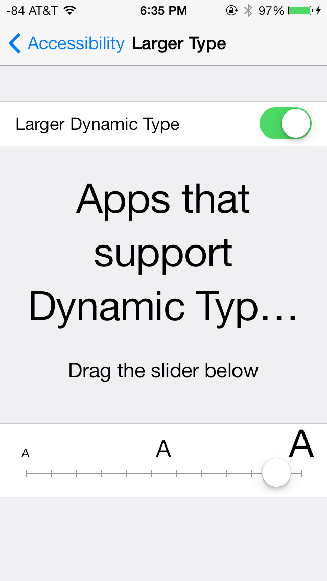
A new feature is dynamic type (through the new Text Kit set of UIKit classes), which essentially is an accessibility feature that enables users to change the font size bias system wide and in applications that use the UIFont method to get a font size. This automatically adjusts weight, character spacing (kerning) and line height, and seems like an awesome change for users who need larger font sizes for elements to be readable.

From early beta to release, font weights did change around
One of my initial big concerns was the legibility of a number of iOS 7 UI elements based on what was shown at WWDC, such as the lock screen. Initially I saw stuff like light weight fonts on a light lock screen background and low contrast between font color and what was around it, stuff that any designer would never stop screaming about. To Apple’s credit, a lot (but not all) of these pain points have been addressed now that iOS 7 is ready for wide release, but a few could still pose readability issues outside of 20-somethings with good eyesight. Apple fixed a number of these elements by just moving to bigger weights, but I suspect there will inevitably be some additional adjustment and tweaking.
The good news is that dynamic type makes it really easy to just change everything system wide or enable the bolder weight fonts through accessibility options, which moves font weights up one notch.
Transitions
iOS 7 brings motion to a whole new level, with a bunch of motion effects and gamification through both Sprite Kit and UiKit Dynamics. The short story is that these new frameworks allow developers to build applications with interactions that mimic real world physics, for example reacting to gravity or mass and user-input that triggers acceleration.
The new UI in iOS 7 uses this framework throughout for things like spring loaded animations when opening apps or going into multitasking, dismissing tabs in safari, and so on.
App tiles fly in, dismissed apps fly off the top
iOS 7 is very animation heavy, almost everywhere you go there’s either a subtle bounce-back (like on the passcode entry screen) or some transition. Applications float in when you go back to the home screen, notification center bounces accordingly depending on how fast you flick it down from the top of the screen, and applications zoom into or out of their icons when launched or closed respectively. It’s all a lot to look at, and iOS has always been home to design that wasn’t afraid to demonstrate how much stuff it could throw at OpenGL ES in the pursuit of making things look pretty without having FPS drops.
The only issue is that after a while some animations start being a lot to sit through each time, especially the multitasking interface animations and app fly-in. Some of these issues have been offset by making the touch targets active while the notifications are playing, but I find that it’s still not enough – going back to the home screen the app targets work, as does multitasking, but you still have to physically sit through the animation, then the action happens. It’s disconcerting flicking apps up to dismiss them and having the UI stutter and play the slide animation after the action happens.
One of my big use case is switching between messaging and the web quickly, and it just feels tedious waiting for things to happen while an animation plays. At some level animations clearly are masking loading times, and just like in OS X these will be removed slowly to make the platform feel faster, I just wish there was an option in the UI to speed things up.
App Interfaces
iOS 7 presents a fresh take on the system-wide UI, and has completely done away with the textured, gray app interface in use since iOS 1. UI elements in iOS 7 predominantly feature bold, basic colors mostly on a plain white background. Other background elements, such as those used for Spotlight, Control Center and Notification Center are varying shades of frosted gray, designed to adapt to the underlying wallpaper and user content. Iconography has also been simplified; a bit too excessively in some cases, but is applied uniformly across the OS. The in-app icons align with color scheme applied to the app (i.e yellow for Notes, red for Calendar and Music and blue for apps such as App Store, Phone and Messaging). A uniform set of icons provides for an extremely cohesive UI throughout the OS.
The UI for selecting the date, setting alarms and selecting items from drop down menus in Safari is quite bland and could have looked better with borders or other supporting UI elements. In some cases, especially on the iPad, this leads to excessive white space.
Apple has also introduced a new swipe gesture to efficiently navigate apps with hierarchical interfaces. Swiping right from the left edge of the screen takes users back to the previous screen, essentially acting as a back button. The gesture is especially useful in Safari and Messaging, allowing much faster navigation. Given the small display size of the even the flagship iPhones however, edge gestures are easy to activate inadvertently.
Swipe to delete has also been reversed in iOS 7. Rather than a left to right swipe to bring up a delete button, it’s now a right to left swipe.
The new system font, coupled with predominantly white colored backgrounds, use of transparent layers and a bouquet of bold colors applied throughout, have given iOS fresh and vibrant look, one which it desperately needed for some time now. The use of transparencies gives a sense of place within the OS, but also offers nearly infinite ways to keep the OS looking new, just by changing the wallpaper.
Lock Screen
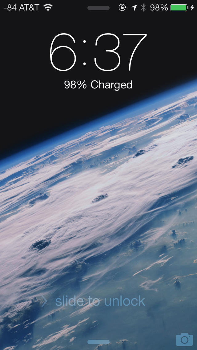
At a high level, the lock screen on iOS 7 is immediately familiar looking. There’s still the time and date displayed in large characters up top, and slide to unlock at the bottom. The shortcuts that worked before in iOS 6 also still work here, you can launch the camera by pressing and holding on the camera icon at bottom right and dragging up, for example.
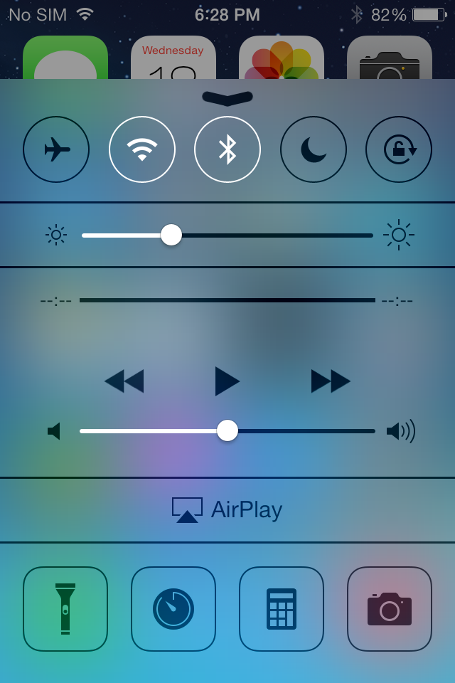
What’s new is the addition of two new small rules which launch control center and notification center from the top and bottom. These quick access shades overlay themselves on the lock screen.
Notifications that have come in while the device was locked still fill in underneath the time and date, and are actionable by sliding to the right just like they were before. Only the top notification is displayed at 100 percent opacity, the others are slightly greyed out but still visible, so you focus immediately on what’s newest. When a notification has popped in there’s also a transparency which appears behind it, making it easier to read the latest notification on top of your lock screen wallpaper.
The top status bar is also enlarged relative to its appearance throughout the rest of iOS 7. Icons and font size are increased here ostensibly so they’re more glanceable. There’s no longer a huge battery icon visible when the iDevice is plugged in and charging either, so this larger status bar obviously takes the place of it.
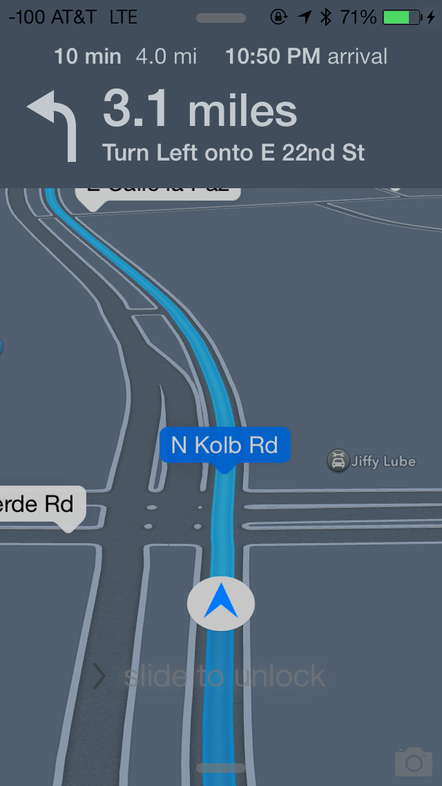
Turn by turn directions are still presented behind the lock screen while in use, now there’s less clutter in the way. Slide to unlock and the other shade and camera toggles remain, but are subtle in comparison.
The lock screen really is a microcosm of the changes that are made to iOS 7. Functionally not a lot is changed, so the existing workflows still work, there’s just tweaks to the visual appearance.


144 Comments
View All Comments
Impulses - Sunday, September 22, 2013 - link
I just read the Verge's review and while they don't go anywhere as in depth as Anandtech (really, who does?) it did seem more cohesive at a high level. It drew far less direct comparisons between OS yet you always knew when David seemed to think iOS was ahead or behind the competition in any aspect. I won't say it seemed more objective cause I think this kinda review is inherently subjective, but less enthusiastic about minor cosmetic changes for sure.akdj - Tuesday, October 1, 2013 - link
It's 2013 and you're running a new OS from late 2013 on a almost three year old device. It's bound to run a bit slower and show its 'age'. We've got an iPad 2 and we won't be updating from iOS 6.Krysto - Thursday, September 19, 2013 - link
How can translucency be a "step in the right direction"? I think it belongs more in the past, right there with gradients. Same for the parallax effect, which is just cheese, and has always been cheesy.B3an - Thursday, September 19, 2013 - link
I agree. iOS 7 looks very cheesy. But pretty much everything Apple design looks cheesy as they've always had tons of gradients and tacky effects (atleast they've got rid of drop shadows now), all that stuff came from the early to mid 2000's. As a designer i used to design stuff like it myself, but this was around 7 - 12 years ago and things have moved on. Funny how Microsoft now lead in modern design, who would have thought.star-affinity - Tuesday, September 24, 2013 - link
”But pretty much everything Apple design looks cheesy as they've always had tons of gradients and tacky effects”Don't agree at all. Especially in OS X I don't think there's much ”tackiness”. And the only really thing I found really tacky in iOS 6 was Game Center.
What in Microsoft's designs are better you mean? A few examples?
CBone - Friday, October 4, 2013 - link
OSX looks pretty slick. iOS 7 still looks tacky to me. I still don't like the "every app ever barfed up on the screen so it looks like my mother-in-law's XP desktop ultra busy this-is-just-an-app-drawer" look.Wolfpup - Wednesday, September 25, 2013 - link
That's nonsense. Those ideas were developed for a reason, not arbitrarily. Removing them is fad, fashion, and has nothing to do with functionality, which is diminished.akdj - Thursday, October 3, 2013 - link
'Functionality....diminished?' How so?I'm incredibly blown away by the incessant negativity to iOS 7. It's unreal. It's amazing how just a month ago....thru the past three years Apple's taken constant flack on skeumorphism and 'cheese'. iOS 7, while completely different than 6 is one HELL of a makeover. Perhaps it's because we are using an iPhone 5 and 5s...iPad 4s and minis...but I've lost absolutely NO functionality. The minimalist design UI is a HUGE breath of fresh air and it's apparent to me why so many design 'experts' on this board and many others are crying foul. 'So yesterday'. 'Dated'. Blah blah blah blah blah
What an absolute joke. To decry the new UI, it's incredible fluidity....even on two year old hardware, the simplicity...added functionality (control center, camera, notifications, background updates...there are literally DOZENS of examples of extended functionality....it truly makes me question and wonder who these anonymous design experts are behind the anonymity do their keyboard. Ridiculous.
I guarantee Apple will win not one, two or even six awards for this UI overhaul/design. They'll win a dozen or more. A TRUE design expert would realize this. Is there areas of improvement to be made? Sure! Absolutely....but that's been the same since iOS 1.0 (was that a version? I can't remember even after owning each iPhone). The complaints of 'boring' and analog symbols and UI with the skeumorphic design through iOS 6 was tiring. And ubiquitous. And everywhere...all the time. Now, they change it and it's not what you want. Hilarious. There are plenty of choices on the market if you don't like it. android isn't android. It's TouchWiz, Sense, and dozens of other launchers to set it up the way you like it. If Windows crappy UI is so intriguing, why are you slamming iOS 7? Why aren't you buying a Lumia?
It's tiring. And boring. Especially reading all the bullshit from the so called and most likely unemployed 'design experts'. I don't suppose anyone has explored so many of the other excellent updates, ala error and spelling correction, fast swipe to rid a reminder, excellent new options for sounds, font size and 'thickening' if you find it bothersome....and to call parallax effects cheesy just exemplifies the thin knowledge some posters have when it comes to UI design, simplicity and fluidity. It's easy to put out a crappy, glitchy and slow UI. Look at Samsung and the new S4 (I have one. We develop for both Android and iOS and have just started to learn the ins and outs with Windows mobile). That is a phone with some of the fastest hardware on the market and in comparison with either the '5' or the '5s' it's obliterated when it comes to speed, fluency and doing what it's designed to do...a springboard, launching platform for your apps and software.
Rant over...sorry, just tired of all the bullshit. Pardon my Cantonese
akdj - Thursday, October 3, 2013 - link
I meant to also mention, Apple designing this new UI and as trouble free and fluent as it is...is almost miraculous. It's hard as HELL to create a simple user experience. One that's easy to understand and operate. As mentioned before...TouchWiz is a perfect example of how tough it is even with current hardware to achieve this level of performance.CBone - Friday, October 4, 2013 - link
If all you want to do is ultraslurp Apple UI and react poorly to people giving opinions contrary to yours on it, you probably shouldn't read many opinions. Why is it so hard to accept that people might love the phone but hate the UI?