Dell 2707WFP: Looking for the Middle Ground of Large LCDs
by Jarred Walton on April 4, 2007 10:00 AM EST- Posted in
- Displays
Brightness and Contrast Ratio
For those who have a need to match colors between their computer displays and their cameras and printers, what works well for computing purposes often isn't the best suited for doing other image related work. To help people who work in such areas match their computer colors to their paper colors better, some standards were established. Generally speaking for print work the standard is a gamma of 2.2, a black point of 0.60 cd/m2, and a white point of 100 cd/m2. We attempted to calibrate all the monitors for these settings as well.
Finding the appropriate OSD settings to reach these levels can be a time-consuming process for some of the displays. It may require numerous iterations through the calibration process to end up with the desired white point, and on some LCDs it might not even be possible to reach a satisfactory result. The nature of LCDs is such that we were unable to get both an accurate white point and an accurate black point according to printing requirements (our black levels always ended up darker than they were supposed to be), but we did manage to get near the desired 100 cd/m2 white point on all of the tested displays. This required adjusting the individual color levels on most of the displays, and the following table shows the settings we ended up using:
Like the Gateway FPD2485W and Dell 2407WFP, dropping just the brightness on the 2707WFP did not allow us to reach the desired white point. We also found that dropping the brightness level to zero and then further reducing the color levels did not generate desirable results. We were most successful when we set the color levels to a moderate value and then tweaked the brightness and color levels as necessary to get the desired result. Here's how the brightness and contrast ratios changed with these tweaks. For reference, we have included the target values in the following graphs, so the greater the deviance of a display from the targeted value, the less suitable a display becomes for print work.
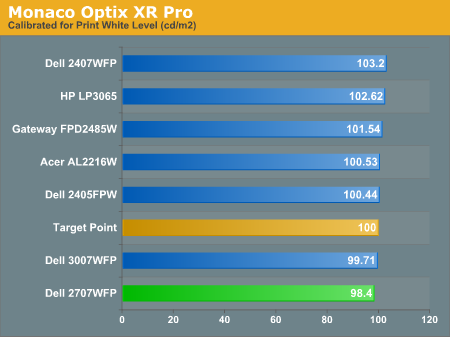
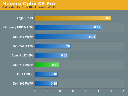
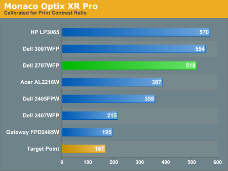
Since very slight differences in brightness are not a huge deal, we did not attempt to get 100% accuracy on the white point, but further tuning of the various displays would have likely made it possible to get closer to 100 cd/m2. The primary goal was to merely get the white point near 100 cd/m2. The target black point is nearly impossible to achieve once we have reached the target white point with any LCD that we have used. Due to the reduced brightness, contrast ratios are also lower, but that is expected with print material. Having calibrated the displays for printing, let's see how they actually fare.
Color Accuracy
Given the importance of accurate colors for printing work, we have adjusted the Delta E scale appropriately. A Delta E of less than 1.0 is definitely the goal here, and 1.0 to 2.0 is merely acceptable. Scores above 2.0 basically mean that a display is not fit for printing professionals.
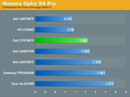
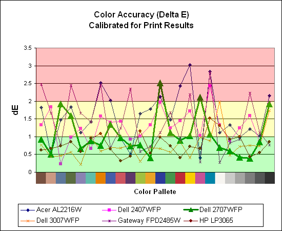
The 30" displays are clearly ahead in this particular test, not only because they are far easier to calibrate (you just turn down the brightness level) but also because they score very well. The Dell 3007WFP and HP LP3065 are the best displays we have tested when it comes to printing work, with very low average Delta E scores. Whether it's the overall quality of the displays or simply the S-IPS panels on the 30" LCDs, the fact is that these displays appear to be targeted more at professionals than any of the others. Considering the cost, that's probably not too surprising.
Meanwhile, the 2707WFP places third in terms of average Delta E, but the individual scores again show several spikes. It's not a bad display for print applications, but considering the cost and the fact that 30" displays don't cost a whole lot more (especially some of the slightly older 30" models), and we would recommend that most print/photo professionals look elsewhere.
For those who have a need to match colors between their computer displays and their cameras and printers, what works well for computing purposes often isn't the best suited for doing other image related work. To help people who work in such areas match their computer colors to their paper colors better, some standards were established. Generally speaking for print work the standard is a gamma of 2.2, a black point of 0.60 cd/m2, and a white point of 100 cd/m2. We attempted to calibrate all the monitors for these settings as well.
Finding the appropriate OSD settings to reach these levels can be a time-consuming process for some of the displays. It may require numerous iterations through the calibration process to end up with the desired white point, and on some LCDs it might not even be possible to reach a satisfactory result. The nature of LCDs is such that we were unable to get both an accurate white point and an accurate black point according to printing requirements (our black levels always ended up darker than they were supposed to be), but we did manage to get near the desired 100 cd/m2 white point on all of the tested displays. This required adjusting the individual color levels on most of the displays, and the following table shows the settings we ended up using:
| Calibrated for Print Settings Gamma 2.2, White 100 cd/m2, Black 0.60 cd/m2 |
|||||||
| Acer AL2216W | Dell 2405FPW | Dell 2407WFP | Dell 2707WFP | Dell 3007WFP | Gateway FPD2485W | HP LP3065 | |
| Brightness | 80 | 50 | 100 | 30 | 25 | 100 | 91 |
| Contrast | 80 | N/A | N/A | 100 | N/A | 100 | N/A |
| Red | 40 | 7 | 49 | 50 | N/A | 32 | N/A |
| Green | 39 | 10 | 50 | 51 | N/A | 32 | N/A |
| Blue | 39 | 11 | 46 | 50 | N/A | 32 | N/A |
Like the Gateway FPD2485W and Dell 2407WFP, dropping just the brightness on the 2707WFP did not allow us to reach the desired white point. We also found that dropping the brightness level to zero and then further reducing the color levels did not generate desirable results. We were most successful when we set the color levels to a moderate value and then tweaked the brightness and color levels as necessary to get the desired result. Here's how the brightness and contrast ratios changed with these tweaks. For reference, we have included the target values in the following graphs, so the greater the deviance of a display from the targeted value, the less suitable a display becomes for print work.
Since very slight differences in brightness are not a huge deal, we did not attempt to get 100% accuracy on the white point, but further tuning of the various displays would have likely made it possible to get closer to 100 cd/m2. The primary goal was to merely get the white point near 100 cd/m2. The target black point is nearly impossible to achieve once we have reached the target white point with any LCD that we have used. Due to the reduced brightness, contrast ratios are also lower, but that is expected with print material. Having calibrated the displays for printing, let's see how they actually fare.
Color Accuracy
Given the importance of accurate colors for printing work, we have adjusted the Delta E scale appropriately. A Delta E of less than 1.0 is definitely the goal here, and 1.0 to 2.0 is merely acceptable. Scores above 2.0 basically mean that a display is not fit for printing professionals.
The 30" displays are clearly ahead in this particular test, not only because they are far easier to calibrate (you just turn down the brightness level) but also because they score very well. The Dell 3007WFP and HP LP3065 are the best displays we have tested when it comes to printing work, with very low average Delta E scores. Whether it's the overall quality of the displays or simply the S-IPS panels on the 30" LCDs, the fact is that these displays appear to be targeted more at professionals than any of the others. Considering the cost, that's probably not too surprising.
Meanwhile, the 2707WFP places third in terms of average Delta E, but the individual scores again show several spikes. It's not a bad display for print applications, but considering the cost and the fact that 30" displays don't cost a whole lot more (especially some of the slightly older 30" models), and we would recommend that most print/photo professionals look elsewhere.


39 Comments
View All Comments
JarredWalton - Thursday, April 5, 2007 - link
And here I preferred aperture grille over invar shadow mask in the CRT days. Again, it was the colors and overall brightness. Most CRTs look "fuzzy" to me, and I like the sharpness of LCDs. You look at black text on a white background and you can clearly see that every pixel is a direct mapping of the digital information. CRTs, you can get artifacts due to stretch and centering, not to mention rotation and pincushion... that stuff always irritated me. So yeah, I really do prefer LCDs.As for the "bright top and darker bottom", I don't notice that at all, even on 30" displays. It's probably there to a certain extent, but it's nowhere near as bad as any of the older TN+film panels (which are still common on notebooks). Turn down the brightness to a more moderate level, and everything is great for me. I truly do prefer the image quality on my 30" (or 24") LCD over any CRT I've used.
The final issue is that many (most? all?) developers are now using LCDs as well. I remember thinking Doom 3 was way too dark to the point of being almost unplayable. Then I got my LCD (a 2405FPW at the time) and suddenly the whole game changed. It still had flaws, but darkness was no longer one of them. I think id must have been using LCDs, so they never realized what the game would look like on a typical CRT. (Of course some CRTs are brighter than others; mine was not one of those.)
I can understand that some still prefer CRTs, but I'm definitely not one of them. Given the choice, I would always take a good LCD over a good CRT these days. I just hope stuff like OLED and some of the other technologies in development can make it out sooner rather than later. Give us a nice 120 Hz refresh rate with a bit faster response times, and I'd be very happy indeed.
TA152H - Thursday, April 5, 2007 - link
Jarrod,Even with the brightness turned down all the way, I found the LCD gave me headaches. That's why it became one with the air, and then the ground. I couldn't get used to it. I think people's vision has a lot to do with it. I remember when IBM came out with the 8514/A and we got them, I raised Hell because I got headaches from it (it was interlaced). They thought I was whining, but I could see the flicker really vividly and it gave me the worst headaches (incidentally, I just bought one on eBay for $5 :P). The LCDs are not only too bright, even turned down all the way, but it's like looking through a screen door at a picture, because I can see very easily the boundaries between pixels. It's not as smooth or rich as a CRT.
I don't play shoot 'em ups anymore, they bore me terribly. I prefer the strategy games, and even games like Civilization. I guess LCDs have become necessary for shoot em ups now, although it's kind of funny because they are so poor at it because of the slow response time. But, they have to develop to what people have, and LCDs are definitely more common. Why they are so bright is a mystery to me though. Maybe because they are so poor with respect to viewing angles and saturation, they try to make them extra bright to compensate.
I can see the differences in brightness so easily in LCDs it is surprising you don't have a problem with it. I think some of it is what you are used to. If I had these for years, my eyes would adjust to it and I would really see it. Remember the first time you saw a flat screen CRT? It seemed screwed up because your brain had adjusted to the curved screens. A lot of stuff we adapt to without even knowing it. Again, I do think we all see differently, and it's not just a matter of opinion. It's got a lot to do with how we actually see it. I know with respect to refresh rates it is, because I'd ask people to look at stuff, and they didn't see the flicker (normally it's easier from the corner of your eyes, probably our adaptation to seeing movement in peripheral vision well so we could see things sneaking up on us?).
The thing about CRTs I can't stand are the moire problems. CRTs seem to be extremely accurate in most dimensions at 800 x 600, but when you start getting higher there seems to be more distortion. And the size and weight. Ugggh. The mainstream CRTs are pretty foul too, but luckily I loaded up on the Eizos and they are much, much better than the Viewsonic, Sony, Dell, etc... rubbish. I was considering buying an Eizo LCD, but I don't know if all LCDs suck bad, or it's just the mainstream rubbish again. Eizo has a way of changing the rules, at least they did on CRTs. That's why I'd love to see a review on them, because at this point they are the only ones I'd consider. I guess I could put it on a server if I didn't like it, so I don't have to look at it for long. But, they are so expensive, I'm a little concerned I'd be throwing good money at bad, because the technology is so weak even they can't get it to work. Dell, et al, obviously aren't going to put out a very good product since the cost would preclude them selling enough. But Nanao, well, they might. Any chance of you reviewing one?
JarredWalton - Friday, April 6, 2007 - link
I can ask them and see if they're interested in sending one for testing. Honestly, though, I'm not sure my review would be of any use to you. I'm already happy with current LCDs, and you're not. This is one of those cases where you might need to see about testing one in person to see if the results are acceptable or not.I've always had a problem with low refresh rates on CRTs as well - anything less than 85 Hz I could detect a flicker, and while 75 Hz was tolerable the 60 Hz displays gave me headaches. That's one of the things I like on LCDs. The backlights are always on, and rather than having a beam scanning across the monitor at 60 Hz, the light is evenly distributed and there's no chance for a pixel to start to darken and then light up again.
I do know what you mean about adapting, though. The first time I used a 30" LCD I was like, "WTF!? It's too big!" Now I'm quite happy with the size and it no longer bothers me at all. When I go back to a 24" it seems small, relatively speaking. Heh.
TA152H - Friday, April 6, 2007 - link
Jarrod,It might be helpful. I want to like LCDs, mainly because of the footprint and power/heat issues with CRTs. But, I couldn't stand the one I had. I might have gotten used to the flaws and then hated the CRT flaws, but the brightness was such I got really painful headaches and couldn't spend the time on it to adjust to it.
So, if you get an Eizo and your review says it's much better than existing LCDs, it would at least be useful. On the other hand, if you say it's nice but pretty much the same, well, I'd probably pass and wait another couple of years before looking at one. Also, I think it would be very, very interesting for your readers, and probably even for you, to have an absolutely top quality display to review. It would be informative, because I think a lot of people don't even know they exist and think these mainstream brands offer the best displays. Who knows, maybe they do, and a review might point that out. If they are willing to send you one, and I'd have to think they are crazy if they don't (because they need the visibility since they are very poorly known), I think it would be a really interesting review for all those reasons, and not just to me.
strikeback03 - Friday, April 6, 2007 - link
Have you tried looking at a good LCD in a store? Most of the commonly available ones are cheap and not very good - they show the contrast gradient top-to-bottom you referred to. IIRC the review of the HP said they accept them back for pretty much any reason within the return period, so you could toss it back in the box instead of out a window if you don't like it. Just be sure to get a decent one, not a cheapie.I too would be interested in seeing the results of a test on an Eizo or an NEC W-series. I'd like to see how the calibration results of what are pretty much considered the top professional diplays look like compared to the mainstream/gaming displays.
LoneWolf15 - Thursday, April 5, 2007 - link
Having purchased the 2407WFP in mid-November at under $600 (not including the tax and the price for extending out the warranty to 5 years), the price on the 27" seems kind of steep. Maybe if Dell had upped the ante by adding HDMI, or a second set of component ins, it would put it over the top.I'm also a little disappointed that their card readers don't support xD Picture Card format, which is what my Fuji FinePix camera uses. Minor nitpick, but one that shouldn't be all that hard to fix.
anandtech02148 - Wednesday, April 4, 2007 - link
the gateway spec at 125watts and this is 95wtt..that's an efficient build for a 27in lcd.JarredWalton - Wednesday, April 4, 2007 - link
The Gateway lists 125W maximum I think, so typical power use is probably less. The 95W for the 2707WFP is after calibration (i.e. with lowered brightness levels).anandtech02148 - Wednesday, April 4, 2007 - link
is it exciting to review all these new fresh monitor? or do you get sored eye after all the calibration work.Again thanks for the calibrated file you upload.
JarredWalton - Wednesday, April 4, 2007 - link
Speaking of which, if anyone is interested, here are the http://images.anandtech.com/reviews/monitor/2007/d... 2707WFP Profiles.rar">2707WFP profiles used in this article. Standard "your LCD is not the same as the tested LCD" disclaimer applies.As for sore eyes, no, that's not a problem. The calibration isn't all that difficult to perform in most cases. It's the writing, graph generation, and photo editing that takes the most effort.