Dell 2707WFP: Looking for the Middle Ground of Large LCDs
by Jarred Walton on April 4, 2007 10:00 AM EST- Posted in
- Displays
Brightness and Contrast Ratio
For those who have a need to match colors between their computer displays and their cameras and printers, what works well for computing purposes often isn't the best suited for doing other image related work. To help people who work in such areas match their computer colors to their paper colors better, some standards were established. Generally speaking for print work the standard is a gamma of 2.2, a black point of 0.60 cd/m2, and a white point of 100 cd/m2. We attempted to calibrate all the monitors for these settings as well.
Finding the appropriate OSD settings to reach these levels can be a time-consuming process for some of the displays. It may require numerous iterations through the calibration process to end up with the desired white point, and on some LCDs it might not even be possible to reach a satisfactory result. The nature of LCDs is such that we were unable to get both an accurate white point and an accurate black point according to printing requirements (our black levels always ended up darker than they were supposed to be), but we did manage to get near the desired 100 cd/m2 white point on all of the tested displays. This required adjusting the individual color levels on most of the displays, and the following table shows the settings we ended up using:
Like the Gateway FPD2485W and Dell 2407WFP, dropping just the brightness on the 2707WFP did not allow us to reach the desired white point. We also found that dropping the brightness level to zero and then further reducing the color levels did not generate desirable results. We were most successful when we set the color levels to a moderate value and then tweaked the brightness and color levels as necessary to get the desired result. Here's how the brightness and contrast ratios changed with these tweaks. For reference, we have included the target values in the following graphs, so the greater the deviance of a display from the targeted value, the less suitable a display becomes for print work.
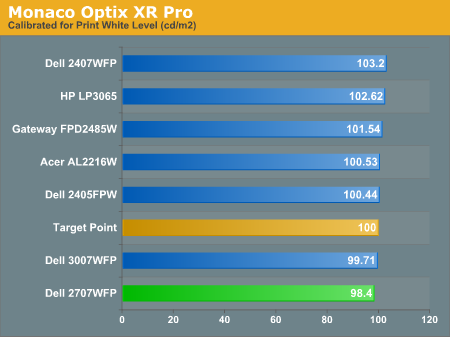
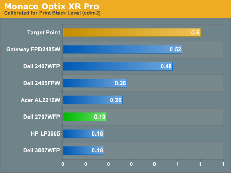
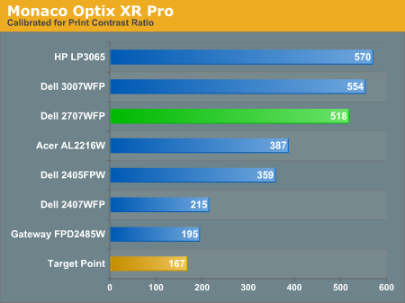
Since very slight differences in brightness are not a huge deal, we did not attempt to get 100% accuracy on the white point, but further tuning of the various displays would have likely made it possible to get closer to 100 cd/m2. The primary goal was to merely get the white point near 100 cd/m2. The target black point is nearly impossible to achieve once we have reached the target white point with any LCD that we have used. Due to the reduced brightness, contrast ratios are also lower, but that is expected with print material. Having calibrated the displays for printing, let's see how they actually fare.
Color Accuracy
Given the importance of accurate colors for printing work, we have adjusted the Delta E scale appropriately. A Delta E of less than 1.0 is definitely the goal here, and 1.0 to 2.0 is merely acceptable. Scores above 2.0 basically mean that a display is not fit for printing professionals.
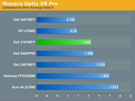
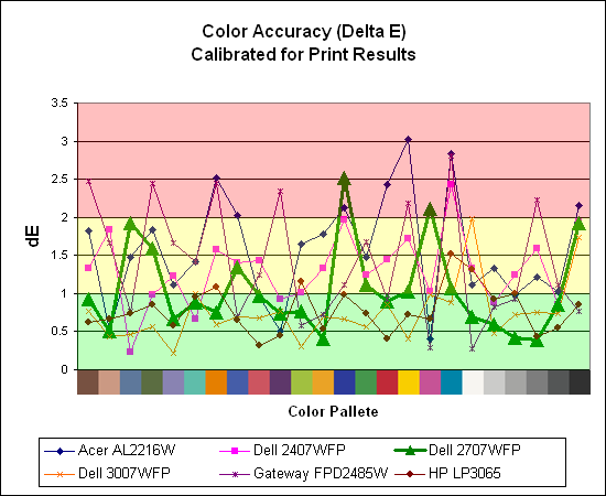
The 30" displays are clearly ahead in this particular test, not only because they are far easier to calibrate (you just turn down the brightness level) but also because they score very well. The Dell 3007WFP and HP LP3065 are the best displays we have tested when it comes to printing work, with very low average Delta E scores. Whether it's the overall quality of the displays or simply the S-IPS panels on the 30" LCDs, the fact is that these displays appear to be targeted more at professionals than any of the others. Considering the cost, that's probably not too surprising.
Meanwhile, the 2707WFP places third in terms of average Delta E, but the individual scores again show several spikes. It's not a bad display for print applications, but considering the cost and the fact that 30" displays don't cost a whole lot more (especially some of the slightly older 30" models), and we would recommend that most print/photo professionals look elsewhere.
For those who have a need to match colors between their computer displays and their cameras and printers, what works well for computing purposes often isn't the best suited for doing other image related work. To help people who work in such areas match their computer colors to their paper colors better, some standards were established. Generally speaking for print work the standard is a gamma of 2.2, a black point of 0.60 cd/m2, and a white point of 100 cd/m2. We attempted to calibrate all the monitors for these settings as well.
Finding the appropriate OSD settings to reach these levels can be a time-consuming process for some of the displays. It may require numerous iterations through the calibration process to end up with the desired white point, and on some LCDs it might not even be possible to reach a satisfactory result. The nature of LCDs is such that we were unable to get both an accurate white point and an accurate black point according to printing requirements (our black levels always ended up darker than they were supposed to be), but we did manage to get near the desired 100 cd/m2 white point on all of the tested displays. This required adjusting the individual color levels on most of the displays, and the following table shows the settings we ended up using:
| Calibrated for Print Settings Gamma 2.2, White 100 cd/m2, Black 0.60 cd/m2 |
|||||||
| Acer AL2216W | Dell 2405FPW | Dell 2407WFP | Dell 2707WFP | Dell 3007WFP | Gateway FPD2485W | HP LP3065 | |
| Brightness | 80 | 50 | 100 | 30 | 25 | 100 | 91 |
| Contrast | 80 | N/A | N/A | 100 | N/A | 100 | N/A |
| Red | 40 | 7 | 49 | 50 | N/A | 32 | N/A |
| Green | 39 | 10 | 50 | 51 | N/A | 32 | N/A |
| Blue | 39 | 11 | 46 | 50 | N/A | 32 | N/A |
Like the Gateway FPD2485W and Dell 2407WFP, dropping just the brightness on the 2707WFP did not allow us to reach the desired white point. We also found that dropping the brightness level to zero and then further reducing the color levels did not generate desirable results. We were most successful when we set the color levels to a moderate value and then tweaked the brightness and color levels as necessary to get the desired result. Here's how the brightness and contrast ratios changed with these tweaks. For reference, we have included the target values in the following graphs, so the greater the deviance of a display from the targeted value, the less suitable a display becomes for print work.
Since very slight differences in brightness are not a huge deal, we did not attempt to get 100% accuracy on the white point, but further tuning of the various displays would have likely made it possible to get closer to 100 cd/m2. The primary goal was to merely get the white point near 100 cd/m2. The target black point is nearly impossible to achieve once we have reached the target white point with any LCD that we have used. Due to the reduced brightness, contrast ratios are also lower, but that is expected with print material. Having calibrated the displays for printing, let's see how they actually fare.
Color Accuracy
Given the importance of accurate colors for printing work, we have adjusted the Delta E scale appropriately. A Delta E of less than 1.0 is definitely the goal here, and 1.0 to 2.0 is merely acceptable. Scores above 2.0 basically mean that a display is not fit for printing professionals.
The 30" displays are clearly ahead in this particular test, not only because they are far easier to calibrate (you just turn down the brightness level) but also because they score very well. The Dell 3007WFP and HP LP3065 are the best displays we have tested when it comes to printing work, with very low average Delta E scores. Whether it's the overall quality of the displays or simply the S-IPS panels on the 30" LCDs, the fact is that these displays appear to be targeted more at professionals than any of the others. Considering the cost, that's probably not too surprising.
Meanwhile, the 2707WFP places third in terms of average Delta E, but the individual scores again show several spikes. It's not a bad display for print applications, but considering the cost and the fact that 30" displays don't cost a whole lot more (especially some of the slightly older 30" models), and we would recommend that most print/photo professionals look elsewhere.


39 Comments
View All Comments
AnnonymousCoward - Friday, April 6, 2007 - link
Slightly off topic, but what's the easiest way to get color profiles to apply in games, and not just Windows?JarredWalton - Friday, April 6, 2007 - link
If you set a color profile, it applies to everything but overlay. So games automatically use it, AFAIK. It's only video content that has problems.AnnonymousCoward - Friday, April 6, 2007 - link
You're probably right, since I tried changing the color profile to make everything hot pink, and the game also looked that way.Whenever Windows is booting up, the desktop first looks slightly lighter, and after a second it seems like the color profile kicks in. When I run the game Dark Messiah, right before the screen switches to the game, the desktop switches back to that lighter appearance, so it doesn't look like it's using the profile. I've also seen a few sites indicate that profiles don't apply for games: http://www.hex2bit.com/products/product_mcw.asp">http://www.hex2bit.com/products/product_mcw.asp says "...to prevent other programs from changing the color profile Windows uses. This is especially important to gamers as most games will change the color profile Windows uses." and http://www.hardforum.com/showthread.php?t=1064124&...">http://www.hardforum.com/showthread.php?t=1064124&... someone said "Also, that color profile won't effect videos, games, or your mouse cursor. I calibrated through my spyder2..."
sm8000 - Wednesday, April 4, 2007 - link
"single-link with a very limiting 1280x800 resolution"Isn't single link's max res 1920x1200? I'm pretty sure it is. Is the article saying dual link panels by design won't display more than 1280x800 on single link?
JarredWalton - Wednesday, April 4, 2007 - link
Right. There are no scaler ICs for 2560x1600 right now, but apparently they can manage a simple doubling of resolution. If you use a 30" LCD with a single-link DVI connection, they will only support up to 1280x800. In the case of the HP LP3065, any other resolution ends up being garbled (i.e. the BIOS, POST, and boot sequence is illegible). Within Windows, you can change the resolution and apparently the GPU will handle the scaling, but outside of Windows you're basically out of luck unless you're running 1280x800.jc44 - Wednesday, April 4, 2007 - link
I feel the need to take issue with the assumption in the article that a denser pixel pitches must lead to smaller text. OK - that certianly happens by default, but it is possible to increase the number of dpi that windows associates with amonitor and that should increase the size of the displayed text. I'll admit that support is somewhat patchy with web pages being amongst the greatest offenders - but in general it works.Personally I'm a dpi junkie and normally use a 204dpi monitor which can lead to somewhat interesting results on applications & web pages that are convinced that all monitors in the world run at 96dpi!
These days you don't need to spend a lot on a graphics card to a a dual-link dvi connector - I'm not sure where the bottom of the range is but an nvidia 7600 costs less than £100 and can be found with one dual + one single link DVI connectors.
JC
JarredWalton - Wednesday, April 4, 2007 - link
Adjusting DPI is certainly possible, and I believe this is one of the areas that Vista is supposed to be a lot better than XP. (Anyone able to confirm that?) However, my personal experience with modifying the DPI has been less than stellar. I usually end up just increasing the font size in Firefox, using the magnification in Word, etc. There are plenty of other applications that have no respect for the Windows DPI setting.nullpointerus - Wednesday, April 4, 2007 - link
Vista is definitely better than XP in this regard, but there are still many areas that could use some polish. For example, Vista still appears to use tiny bitmapped icons, which do not scale very well on the high-dpi title bar and task bar. Moreover, many third-party applications and even many Microsoft applications still have icons and images that scale horribly without the standard 96-dpi setting.Nonetheless, font-handling and layout for non-Aero-native applications has improved dramatically since the early Vista RC1 release; instead of merely upscaling the fonts and controls into a blurry mess, the layout engine does proper spacing and the font engine draws crisp, high resolution fonts. Visual Studio 2005 shows *major* progress in this regard.
For anyone interested in getting a higher density display and using the Vista DPI setting, I definitely trying it first. You could enable 120 dpi on your old monitor and stand back an extra foot or so to mimic the effect of a lower pixel pitch. Or get a friend to do this if you do not have Vista on your own computer.
strikeback03 - Wednesday, April 4, 2007 - link
I always reduce the size of my windows icons anyway. they are huge in the stock setting.on a related note, anyone know how to change desktop icon size and spacing in Gnome/Ubuntu? do you need a whole new theme? icons for mounted drives are way large.
nullpointerus - Wednesday, April 4, 2007 - link
typo: I definitely recommend trying it first.