Dell 2707WFP: Looking for the Middle Ground of Large LCDs
by Jarred Walton on April 4, 2007 10:00 AM EST- Posted in
- Displays
Brightness and Contrast Ratio
For those who have a need to match colors between their computer displays and their cameras and printers, what works well for computing purposes often isn't the best suited for doing other image related work. To help people who work in such areas match their computer colors to their paper colors better, some standards were established. Generally speaking for print work the standard is a gamma of 2.2, a black point of 0.60 cd/m2, and a white point of 100 cd/m2. We attempted to calibrate all the monitors for these settings as well.
Finding the appropriate OSD settings to reach these levels can be a time-consuming process for some of the displays. It may require numerous iterations through the calibration process to end up with the desired white point, and on some LCDs it might not even be possible to reach a satisfactory result. The nature of LCDs is such that we were unable to get both an accurate white point and an accurate black point according to printing requirements (our black levels always ended up darker than they were supposed to be), but we did manage to get near the desired 100 cd/m2 white point on all of the tested displays. This required adjusting the individual color levels on most of the displays, and the following table shows the settings we ended up using:
Like the Gateway FPD2485W and Dell 2407WFP, dropping just the brightness on the 2707WFP did not allow us to reach the desired white point. We also found that dropping the brightness level to zero and then further reducing the color levels did not generate desirable results. We were most successful when we set the color levels to a moderate value and then tweaked the brightness and color levels as necessary to get the desired result. Here's how the brightness and contrast ratios changed with these tweaks. For reference, we have included the target values in the following graphs, so the greater the deviance of a display from the targeted value, the less suitable a display becomes for print work.
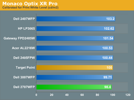
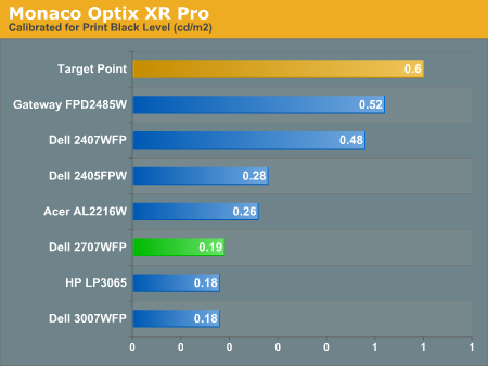
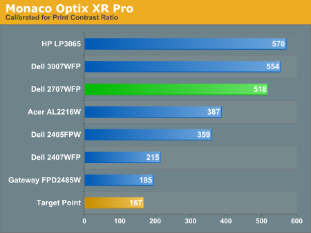
Since very slight differences in brightness are not a huge deal, we did not attempt to get 100% accuracy on the white point, but further tuning of the various displays would have likely made it possible to get closer to 100 cd/m2. The primary goal was to merely get the white point near 100 cd/m2. The target black point is nearly impossible to achieve once we have reached the target white point with any LCD that we have used. Due to the reduced brightness, contrast ratios are also lower, but that is expected with print material. Having calibrated the displays for printing, let's see how they actually fare.
Color Accuracy
Given the importance of accurate colors for printing work, we have adjusted the Delta E scale appropriately. A Delta E of less than 1.0 is definitely the goal here, and 1.0 to 2.0 is merely acceptable. Scores above 2.0 basically mean that a display is not fit for printing professionals.
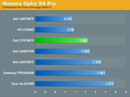
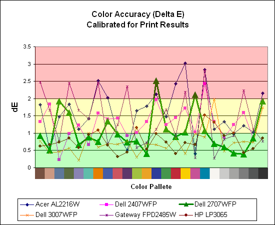
The 30" displays are clearly ahead in this particular test, not only because they are far easier to calibrate (you just turn down the brightness level) but also because they score very well. The Dell 3007WFP and HP LP3065 are the best displays we have tested when it comes to printing work, with very low average Delta E scores. Whether it's the overall quality of the displays or simply the S-IPS panels on the 30" LCDs, the fact is that these displays appear to be targeted more at professionals than any of the others. Considering the cost, that's probably not too surprising.
Meanwhile, the 2707WFP places third in terms of average Delta E, but the individual scores again show several spikes. It's not a bad display for print applications, but considering the cost and the fact that 30" displays don't cost a whole lot more (especially some of the slightly older 30" models), and we would recommend that most print/photo professionals look elsewhere.
For those who have a need to match colors between their computer displays and their cameras and printers, what works well for computing purposes often isn't the best suited for doing other image related work. To help people who work in such areas match their computer colors to their paper colors better, some standards were established. Generally speaking for print work the standard is a gamma of 2.2, a black point of 0.60 cd/m2, and a white point of 100 cd/m2. We attempted to calibrate all the monitors for these settings as well.
Finding the appropriate OSD settings to reach these levels can be a time-consuming process for some of the displays. It may require numerous iterations through the calibration process to end up with the desired white point, and on some LCDs it might not even be possible to reach a satisfactory result. The nature of LCDs is such that we were unable to get both an accurate white point and an accurate black point according to printing requirements (our black levels always ended up darker than they were supposed to be), but we did manage to get near the desired 100 cd/m2 white point on all of the tested displays. This required adjusting the individual color levels on most of the displays, and the following table shows the settings we ended up using:
| Calibrated for Print Settings Gamma 2.2, White 100 cd/m2, Black 0.60 cd/m2 |
|||||||
| Acer AL2216W | Dell 2405FPW | Dell 2407WFP | Dell 2707WFP | Dell 3007WFP | Gateway FPD2485W | HP LP3065 | |
| Brightness | 80 | 50 | 100 | 30 | 25 | 100 | 91 |
| Contrast | 80 | N/A | N/A | 100 | N/A | 100 | N/A |
| Red | 40 | 7 | 49 | 50 | N/A | 32 | N/A |
| Green | 39 | 10 | 50 | 51 | N/A | 32 | N/A |
| Blue | 39 | 11 | 46 | 50 | N/A | 32 | N/A |
Like the Gateway FPD2485W and Dell 2407WFP, dropping just the brightness on the 2707WFP did not allow us to reach the desired white point. We also found that dropping the brightness level to zero and then further reducing the color levels did not generate desirable results. We were most successful when we set the color levels to a moderate value and then tweaked the brightness and color levels as necessary to get the desired result. Here's how the brightness and contrast ratios changed with these tweaks. For reference, we have included the target values in the following graphs, so the greater the deviance of a display from the targeted value, the less suitable a display becomes for print work.
Since very slight differences in brightness are not a huge deal, we did not attempt to get 100% accuracy on the white point, but further tuning of the various displays would have likely made it possible to get closer to 100 cd/m2. The primary goal was to merely get the white point near 100 cd/m2. The target black point is nearly impossible to achieve once we have reached the target white point with any LCD that we have used. Due to the reduced brightness, contrast ratios are also lower, but that is expected with print material. Having calibrated the displays for printing, let's see how they actually fare.
Color Accuracy
Given the importance of accurate colors for printing work, we have adjusted the Delta E scale appropriately. A Delta E of less than 1.0 is definitely the goal here, and 1.0 to 2.0 is merely acceptable. Scores above 2.0 basically mean that a display is not fit for printing professionals.
The 30" displays are clearly ahead in this particular test, not only because they are far easier to calibrate (you just turn down the brightness level) but also because they score very well. The Dell 3007WFP and HP LP3065 are the best displays we have tested when it comes to printing work, with very low average Delta E scores. Whether it's the overall quality of the displays or simply the S-IPS panels on the 30" LCDs, the fact is that these displays appear to be targeted more at professionals than any of the others. Considering the cost, that's probably not too surprising.
Meanwhile, the 2707WFP places third in terms of average Delta E, but the individual scores again show several spikes. It's not a bad display for print applications, but considering the cost and the fact that 30" displays don't cost a whole lot more (especially some of the slightly older 30" models), and we would recommend that most print/photo professionals look elsewhere.


39 Comments
View All Comments
JarredWalton - Wednesday, April 4, 2007 - link
A perfect example of stuff that doesn't look right with a higher DPI setting is anything that uses a bitmap. All of the icons at 120dpi tend to look like crud in XP. There are just far too many areas of Windows and the applications that run on it that are built around pixel sizes, so changing DPI settings only sort of affects them.Anyway, the point isn't whether or not higher DPI is good or bad. You like it, others don't. That's the main idea behind that introduction: an explanation of why higher pixel pitch can be a good thing. I really do have poor vision (an irregular astigmatism that can't be corrected without a retina transplant, so I live with slight double vision). I find many of the high DPI screens to be undesirable, although I do like higher resolutions for image work.
kalrith - Wednesday, April 4, 2007 - link
Since we're discussing pixel pitch and poor eyesight, I thought I'd mention that one of my coworkers has such poor vision that he's using a 21" LCD at 800x600 resolution and thinks it's "just right".Also, out of the 10 19" LCDs we have, only one person runs hers at the native res. Everyone else uses 1024x768.
LoneWolf15 - Thursday, April 5, 2007 - link
This is one reason why I "downgraded" (the rest of the specs are similar, other than that I also shaved 2 pounds of weight) from a laptop with a 15" 1600x1200 UXGA display to a 14" 1024x768 XGA display. At 15", picture detail was incredible, but text for web browsing was giving me sore eyes and headaches. I wouldn't mind having 1280x1024 at 14" or 15", but since I'm not paying for it, beggars can't be choosers.It's also why I returned my Dell 2007WFP and exchanged it for a 2407WFP. Higher resolution, but larger pixel pitch as well.
kmmatney - Wednesday, April 4, 2007 - link
I'm another person who likes big pixels. Work tried to give me a 17" LCD, but I would have none of that. I then tried a 21" Samsung at 1600 x 1200, but it was still too small. Now I have a 20" LCD running native at 1400 x 1050 and its really nice. I have a laptop with small pixels that I use when I travel, but I'm much more productive when I can see everything clearly.I would love to have this display, but it really needs to come down in price.
strikeback03 - Wednesday, April 4, 2007 - link
my vision is awful uncorrected - way beyond not being able to see the big "E". But since I'm always wearing glasses or contacts anyway I like high-DPI displays. Love my thinkpad with the SXGA 15" display. The UXGA 15" would probably be hard to read though.My boss has a ~20" CRT that he runs at either 800x600 or 1024x768.
jc44 - Wednesday, April 4, 2007 - link
OK - I admit it - I'm stunned. With the exception of your colleague with the poor eyesight I find it hard to conceive how anyone would prefer (presumably) a slightly fuzzy (due to scaling artifacts) 1024x768 to a sharp 1280x1024 on a 19" LCD. I could simply not put enough information on the screen to be able to do my job at that resolution without resorting to a lot of printouts.Well horses for courses I guess - thanks
JC
xsilver - Friday, April 6, 2007 - link
lol - the amount of people that have their lcd monitors set to non native resolutions is insanely funny.but even more insanely funny is how many people say they cant see anything wrong with the scaling artifacts and fuzziness.
I haven't done much (any) testing on this in gaming though - is the distortion just as bad in gaming when running a non native res? getting a 20" lcd or above these days has pretty much required a high end graphics card to be purchased if any gaming wants to be done if you want to run native res.
still prefer crt atm myself but I realize it will be inevitable that i'll have to make the switch and need to figure out some options.
mitchell123 - Thursday, December 3, 2009 - link
hello FriendsThios is a nice article.......for everyone...........
==============
Mitchell
Tommyguns - Wednesday, April 4, 2007 - link
19" Viewsonic lcd here. you guessed it. 1024x768 and it suits me just fine. not that i have bad eyes at age 22 or anything, i just like being able to clearly see everything. I game hard as well and it works out just fine. i do have it in clone mode going to an aux 17inch crt thats about 20 feet away. higher res. is nice, but i prefer big letters, with out the squints sometimes.it would be nice to know what is around average in terms of gpu's, to be able to use these larger lcd's. average wasnt always a super highend 8xxx series card.