The Windows Phone 7 Review
by Anand Lal Shimpi & Brian Klug on October 20, 2010 7:00 PM EST- Posted in
- Smartphones
- Windows Phone 7
- Microsoft
- Mobile
The Best Smartphone for Music Lovers
To call it a Zune Phone would be a disservice. The Zune was a capable PMP that didn’t gain mainstream acceptance. Windows Phone 7 isn’t destined for the same obscurity. But the Zune icon is present on what Microsoft calls the Music + Videos Hub and it is more functional than the iPod app in iOS and Android’s media player.
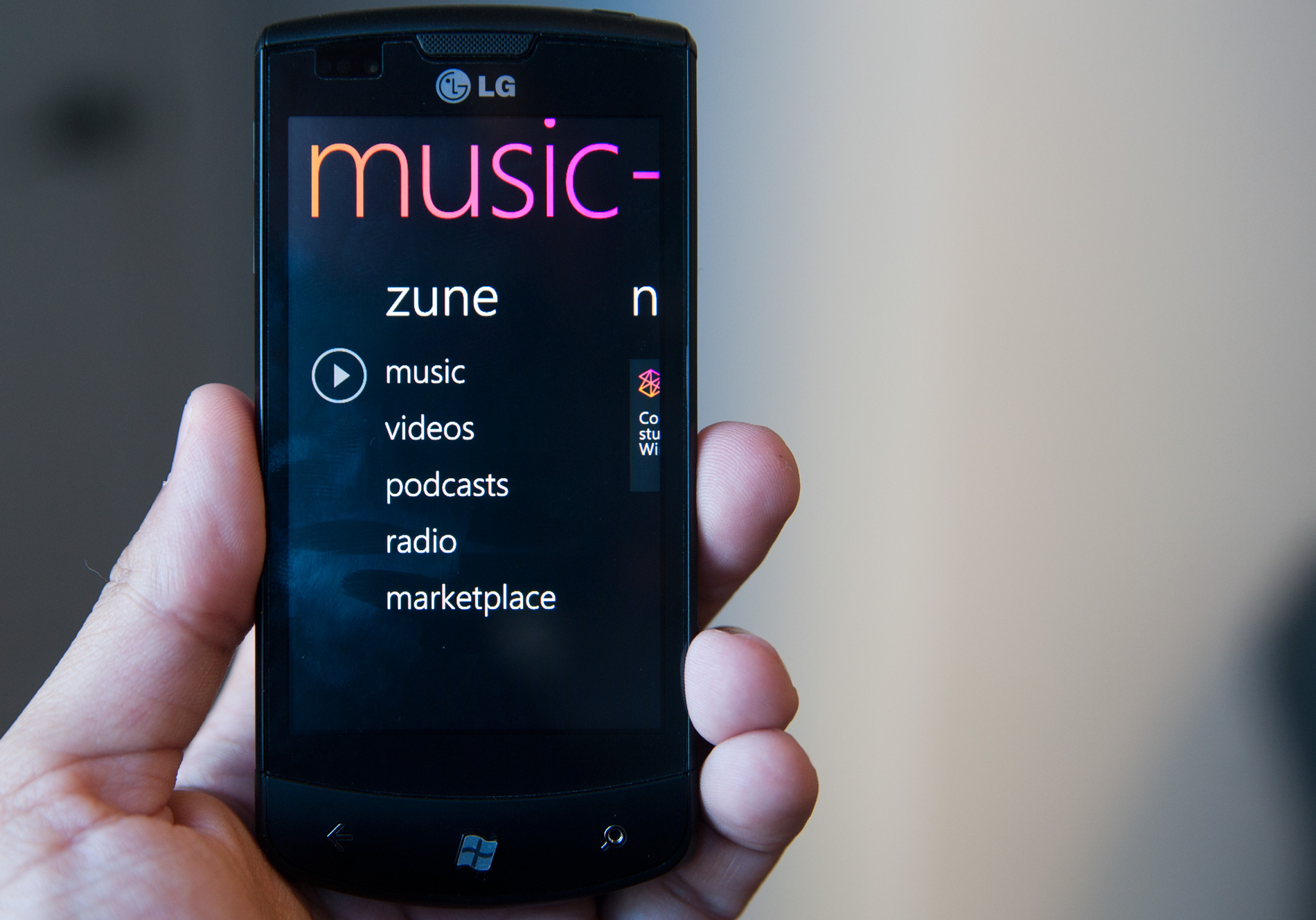
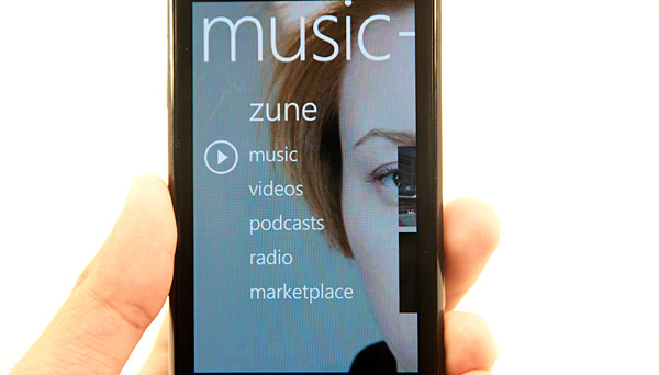
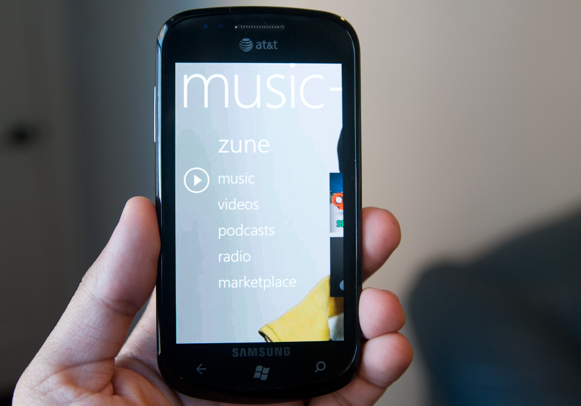
The first screen in the Music + Videos hub is the zune panel. Here you have access to your music, videos, podcasts, FM tuner and the Zune Marketplace.
Tapping on music will take you to your music. There are tabs for artists, albums, songs, playlists and genres. There’s a “now playing” playlist that you can add to in real time. Tap and hold over any album or song to add to the playlist. To view the now playing playlist just swipe over to the history tab and tap the current song.
The player interface is pretty slick. Swipe to flip through songs and you get back, pause and forward buttons for playback controls. It took me a while to find the shuffle playback option, which is revealed if you tap the album art in playback view.
Below the song you’re currently playing you get a list of the next three songs in the playlist.
So far I’ve described pretty basic features of any smartphone media player. Here’s where the Zune integration rocks. Viewing any artist or album you get a list of what you own on the device, scroll down and you’ll see a label for In Marketplace and a downarrow widget. Tap the widget and you’ll get a list of artists or albums in the Zune Marketplace.
From here, directly in the media player application, you can preview and buy songs over WiFi or the cellular network. If you have a Zune Pass, you can also play anything you find here right away without incurring any charge.


Zune Pass is the major sellingpoint of Microsoft’s Zune PMP. For $14.99 per month you get unlimited streaming of all songs in the Zune Marketplace. You also get 10 download credits per month to use on songs you want to actually own (DRM-free).

The Zune Pass integration in Windows Phone 7 is just awesome. You can play any song you’d like that’s in the marketplace, even if you’re on the road. You can also spend your 10 credits per month while connected to the cellular network.

The Zune Pass streaming works like an expensive Pandora, except you get to pick and choose the songs you want to listen to. Remember an album that you really like but don’t have synced to your phone? Just search for it in the marketplace and start streaming it immediately.
You can mix streaming songs from the marketplace along with songs you have synced to your phone in your “now playing” playlist.

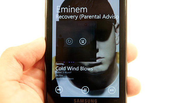
The whole interface is extremely fast and like the rest of Windows Phone 7, it’s very dynamic. Backgrounds in the Music app are dynamically populated by art pulled from the Zune Marketplace. You’ll get a picture of the artist you’re currently listening to as a background. Dithering can be an issue unfortunately.
Note the dithered background
Playback can continue while you’re in other apps. To access playback controls just hit the volume up/down buttons regardless of what app you’re in.
Navigating around the music app takes some getting used to, particularly if you’re expecting it to be like an iPod or fairly stripped down media player. Once you get the hang of it, there’s nothing like it. The back button always takes you to where you want to go, the UI is super fast and the mixture of your own content with the Zune Pass streaming content is just awesome for lovers of (legal) music. Dare I say the only thing that’s missing is some sort of social network integration for you to share your music interests with others on the device itself?
The Zune experience on Windows Phone is significantly better than what you get from both Android and the iPhone. If you buy a lot of music on iTunes, Zune Pass is probably a better deal. You get 10 song downloads per month plus unlimited streaming for $14.99 per month. You can also stream on your PC and Xbox 360 in addition to your Windows Phone.


125 Comments
View All Comments
Kentcomp - Friday, October 22, 2010 - link
I really appreciate you guys so thoroughly reviewing WP7. Your review was like reading a really well illustrated, yet candid owner's manual. Thank you!PS I find the home screen to be kind of boring too but I'll choose functionality over style 99% of the time. After all, the homescreen is just there to get you to where you really want to be.
Riccardo - Friday, October 22, 2010 - link
That's a remarkably in-depth review. Thanks guys!rye222 - Friday, October 22, 2010 - link
amazingly thorough article. i've been eagerly awaiting these phones ever since i bought the Zune HD and thought, "if MS made this into a phone, they would own". thanks Anand, great job as usual on your articles!lewchenko74 - Friday, October 22, 2010 - link
The interface is too minimalistic. Hate the massive two color icons. Just looks ugly.. and really not that functional if you have a lot of these 'icons' to wade through.Then there are the limitations that mean it isnt quite as feature rich as an iphone or Android in certain areas.
There is absolutely nothing compelling to sway me to this phone (at all).
Anyone with an app library (android or iOS) is hardly gonna part with their spent money on a new device and lose that investment... plus it barely has an app library yet.
I wish MS well as competition is important... but it really doesnt give an iOS / Android owner anything new, plus if I was buying fresh... I think that the iOS / Android phones and app-sphere etc are just more compelling.
Nice thorough review though.... just read a little too enthusiastically MS focussed at times, but a good read.
hakime - Friday, October 22, 2010 - link
"The UI is a thing of beauty. Microsoft got the style, customization and performance one hundred percent right on this thing. It makes iOS feel old and utilitarian. It’s funny to think that Microsoft was the one to out-simplify Apple in the UI department."This sentence summarize by itself how not objective and professional this review is. I mean no one on Earth being a little bit rational can think that this Metro interface is beautiful let alone functional or easy to use. I mean how a hell can a text based interface with half displayed text all around and ugly flat colors on top of black background can be called beautiful? This interface just lacks taste, it is different yes, but it is bad, it lacks interaction. You are so Microsft driven that you come to think that a different interface is necessarily easy to use and functional. Nothing is right here, the theme, the colors are ugly with little sense for giving some wish for the user to use the phone, there are too many steps needed to go to what the user wants to do, the tiles are a mess as they can be anything and hubs are an obscure UI concept that serve little interest. You want to browse through your apps, you are presented with only a list view and good luck with that. The calendar and SMS apps are a horrible vision for the users, they are just ugly. The email app looks like it was design by a bunch of students in GUI design with no clue on how to present the information to users. And everything else is just a mess in itself hidden behind a ton of useless animations.
In contrary, iOS just looks easy to use, clean, beautiful. You have your phone and that's it, not extra useless UI concepts and distractions. They are nice for a demo, but for daily usage, they rapidly get useless.
Then you continue with the Zune pass, noting that it is better than iTunes, but in what regard? You are strange enough to like the Zune pass, that does not make it better than the iTunes model. Again non objective argument.
Best integration of Facebook in WP7? Is it a big deal or even a nice feature? The question is if it is really a good thing. Why should I have all my contact and photos all mixed up in an almost uncontrollable mess? Someone objective would surely recognize that such exaggerated integration of Facebook just makes little sense. A well designed app is more than enough to access the Facebook content without having to have all the time friends and non-friends popping up with messages and photos. Distractive and useless like the UI of WP7.
And what about not being more reserved with the major shortcomings of WP7. How many times we have been told about the lack of multitasking in iOS? And now an os comes to a market where all the other mobiles os have multitasking and this is not called a deal breaker! It is a deal breaker, not having multitasking on WP7 is just inexcusable from Microsoft.
Same thing with copy and paste, in 2010 an smart phone should have an efficient copy and past implemented, and WP7 not having it is a total shame. Sure, most implementation out there sucks, and only the iOS has a real efficient and easy to use implementation, but that does not forgive Microsoft for that.
What about also the significant lack of unified mail box in the email app, the lack of robust security features, the lack of tethering, the clumsy Exchange support, the pour performing third party apps, the lack of universal search, the excessive $14.99 for zune pass, the inexcusable lack for support of HTML5 which is even more unacceptable as the os does not support flash either, no YouTube app, weird interface concept when you need to long press to reach some options and in-app menus, etc...
The list is long, WP7 is surely full of animations but it is little functional. And the authors fail to give an objective review of this system which is new but far behind the competition. Having a different UI style does not make this os more functional or even attractive. It just sacrifices too much on real usability for bringing useless UI concepts. The authors wishing so much that their lovely Microsoft brings something to save itself from the mobile market that they have forgotten what objectivity means.
dustcrusher - Friday, October 22, 2010 - link
It's a review. Reviews are inherently subjective. The only parts that aren't are the benchmarks, and even those are arguably not 100% objective. I think at points they were gushing over what worked well but there were other points where they did bring up some valid objections, even if they tinted them a little with rose-colored glasses.Thanks to this review, I learned enough to realize I'm probably better off going to an Android phone when I am able (disclosure: I'm on WinMo 6 right now). Android simply fits my wants and needs better. I don't see WP7 taking giant chunks of market share from Apple or Android, but I think it will do better than WinMo did.
Microsoft is trying to do something different; seems like they are trying to make a smartphone that is as easy to use as a featurephone. It's risky but it could pay off big time. If their sole intention was to cram all of Android and iOS's features into their new OS, it'd be closer to WinMo 6.6 w/HTC's UI shell on top.
A couple of reviewers decided they like the way WP7 does some things. You are clearly happy with your iPhone, so why are you letting it bother you so much? Do you really want to come off as a trollish fanboy?
cjl - Friday, October 22, 2010 - link
Have you read any of Anand's Iphone reviews? If anything, Anand is biased towards the iphone at the expense of pretty much anything else, so the fact that this review is so positive speaks volumes about the phone.Also, to everyone complaining about the interface, you should really try using a Zune HD sometime. It's amazing how natural the interface is.
headrush69 - Sunday, October 24, 2010 - link
There is a big difference between saying an interface is natural to use over saying it is a thing of beauty.Frankly many of the screen shots make elements of the interface look very basic, dated and rushed.
Example: plain square flat buttons on call screen, on/off toggles in setting screen.
Of course these things are pretty trivial to improve and I'm sure they will, but statements like this in the article
"The UI is a thing of beauty. Microsoft got the style, customization and performance one hundred percent right on this thing. It makes iOS feel old and utilitarian."
I just can't agree with and believe exactly the opposite.
Smilin - Monday, October 25, 2010 - link
Have YOU seen the UI? Not screenshot of it. Have you seen it? Used it?Your opinion is worthless.
Smilin - Monday, October 25, 2010 - link
smells like hater in here.Sorry man but this is the most comprehensive and *objective* review I've seen yet. Most of the things you're griping about are IN the article. Did you read it?