The Windows Phone 7 Review
by Anand Lal Shimpi & Brian Klug on October 20, 2010 7:00 PM EST- Posted in
- Smartphones
- Windows Phone 7
- Microsoft
- Mobile
The Best Smartphone for Music Lovers
To call it a Zune Phone would be a disservice. The Zune was a capable PMP that didn’t gain mainstream acceptance. Windows Phone 7 isn’t destined for the same obscurity. But the Zune icon is present on what Microsoft calls the Music + Videos Hub and it is more functional than the iPod app in iOS and Android’s media player.
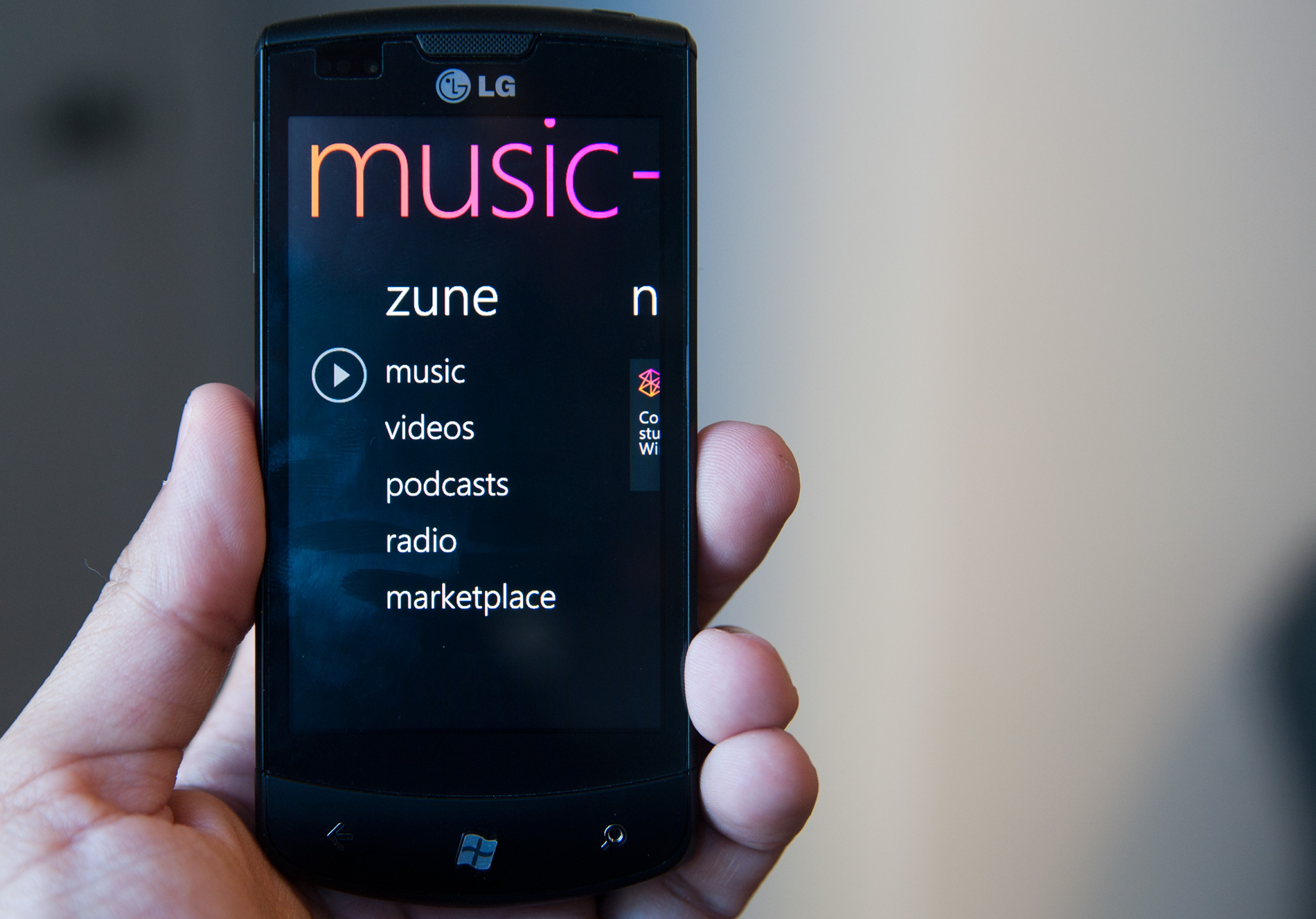
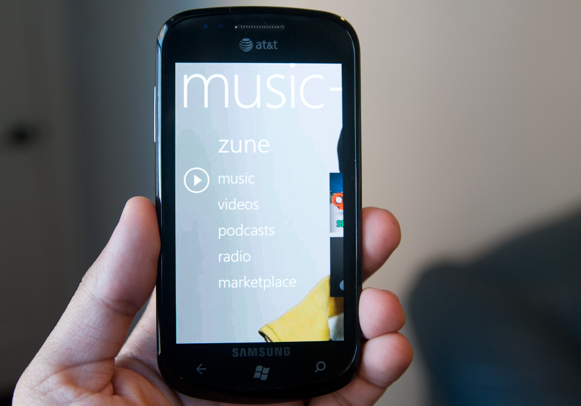
The first screen in the Music + Videos hub is the zune panel. Here you have access to your music, videos, podcasts, FM tuner and the Zune Marketplace.
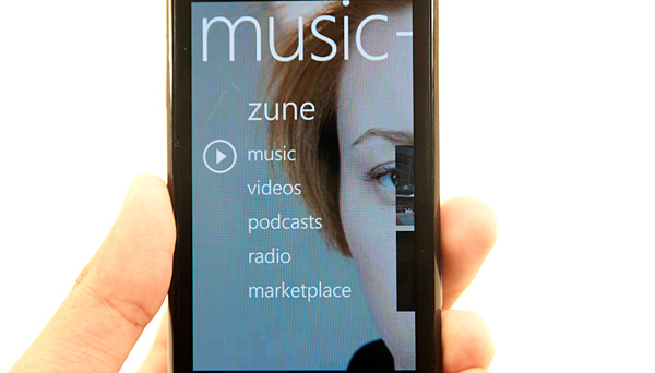
Tapping on music will take you to your music. There are tabs for artists, albums, songs, playlists and genres. There’s a “now playing” playlist that you can add to in real time. Tap and hold over any album or song to add to the playlist. To view the now playing playlist just swipe over to the history tab and tap the current song.
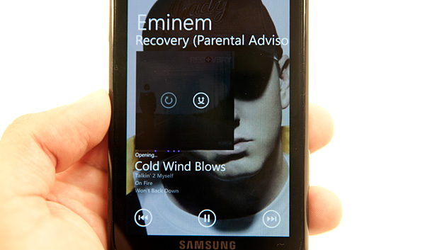
The player interface is pretty slick. Swipe to flip through songs and you get back, pause and forward buttons for playback controls. It took me a while to find the shuffle playback option, which is revealed if you tap the album art in playback view.
Below the song you’re currently playing you get a list of the next three songs in the playlist.
So far I’ve described pretty basic features of any smartphone media player. Here’s where the Zune integration rocks. Viewing any artist or album you get a list of what you own on the device, scroll down and you’ll see a label for In Marketplace and a downarrow widget. Tap the widget and you’ll get a list of artists or albums in the Zune Marketplace.
From here, directly in the media player application, you can preview and buy songs over WiFi or the cellular network. If you have a Zune Pass, you can also play anything you find here right away without incurring any charge.


Zune Pass is the major sellingpoint of Microsoft’s Zune PMP. For $14.99 per month you get unlimited streaming of all songs in the Zune Marketplace. You also get 10 download credits per month to use on songs you want to actually own (DRM-free).

The Zune Pass integration in Windows Phone 7 is just awesome. You can play any song you’d like that’s in the marketplace, even if you’re on the road. You can also spend your 10 credits per month while connected to the cellular network.

The Zune Pass streaming works like an expensive Pandora, except you get to pick and choose the songs you want to listen to. Remember an album that you really like but don’t have synced to your phone? Just search for it in the marketplace and start streaming it immediately.
You can mix streaming songs from the marketplace along with songs you have synced to your phone in your “now playing” playlist.

The whole interface is extremely fast and like the rest of Windows Phone 7, it’s very dynamic. Backgrounds in the Music app are dynamically populated by art pulled from the Zune Marketplace. You’ll get a picture of the artist you’re currently listening to as a background. Dithering can be an issue unfortunately.
Note the dithered background
Playback can continue while you’re in other apps. To access playback controls just hit the volume up/down buttons regardless of what app you’re in.
Navigating around the music app takes some getting used to, particularly if you’re expecting it to be like an iPod or fairly stripped down media player. Once you get the hang of it, there’s nothing like it. The back button always takes you to where you want to go, the UI is super fast and the mixture of your own content with the Zune Pass streaming content is just awesome for lovers of (legal) music. Dare I say the only thing that’s missing is some sort of social network integration for you to share your music interests with others on the device itself?
The Zune experience on Windows Phone is significantly better than what you get from both Android and the iPhone. If you buy a lot of music on iTunes, Zune Pass is probably a better deal. You get 10 song downloads per month plus unlimited streaming for $14.99 per month. You can also stream on your PC and Xbox 360 in addition to your Windows Phone.


125 Comments
View All Comments
bplewis24 - Thursday, October 21, 2010 - link
You call it smooth running and functional, which is fine. That doesn't dissuade me and the OP from feeling it is ugly and off-putting. You even say it doesn't have to be cluttered eye candy, but the review claims it is the most beautiful UI he has ever seen. The thing is big blue blocks. It is exactly what he explained on the first page that Windows typically does with any refresh of their OS: "make it bigger and bluer."It is definitely ugly, but if you only care about how functional and fast it is, then you will love it. I admit that I can't stand iOS cluttered eye-candy style either, so I'm with you on that. Give me functional, customizable and sleek and I'm in heaven. Glad somebody already figured out how to do that.
Brandon
geniekid - Thursday, October 21, 2010 - link
In my opinion, it's quite good looking and better than the default home screen on my HTC Incredible.Like you said, it's all a matter of taste. I will put myself out there and say the guy who thinks the "6 year old crackberry looked better" probably has poor taste.
Smilin - Monday, October 25, 2010 - link
It is the most beautiful UI I've seen. Mind you I've SEEN it. Have you? Screenshots don't do it justice. You have to see it moving and the text shifting in parallax. It's eerily 3D.iPhone and Android are beautiful too....if you're a Windows 3.1 progman.exe fan.
gstrickler - Friday, October 22, 2010 - link
It may be simple and functional, but that doesn't mean it has to be boring and ugly. I'm a huge proponent of simple and functional, but that screen looks like something out of the late 80's or early 90's. The tiles have too little to differentiate them from each other. A little use of color and better contrast would make it a lot clearer and faster to identify the icons, and it would look better.Note to MS, hire a usability consultant and put some of your graphic designers to work (I know you have graphic designers). It shouldn't look like just like Windows 7, but it definitely shouldn't look like it comes from Windows 2.0
inighthawki - Thursday, October 21, 2010 - link
That "ugly" home/start screen interface is one of the main reasons I'm interested in WP7. The other smartphone interfaces I've seen from others like iOS and Android are nothing more than glorified and eye-candy enhanced versions of every other phone out there IMO. And as someone who owns a Zune HD which has a very similar interface, I can tell you that it works really well, and is very nice.bplewis24 - Thursday, October 21, 2010 - link
There is no eye candy in Android. It's basically a blank slate desktop background. And obviously it's no surprise that a Zune HD user would prefer the Windows Phone 7 UI. It's also not a surprise you use subjective and vague justifications for your preference :)inighthawki - Friday, October 22, 2010 - link
I don't see why I have to justify a subjective decision. The bottom line is "I like it" and my entire point was that just because the OP thinks it's the ugliest home screen they've ever seen, there are people like myself that not only like it, but actually dislike the style they do. I am not trying to force my opinion on anyone.Smilin - Monday, October 25, 2010 - link
I agree with you FWIW.cknobman - Thursday, October 21, 2010 - link
I agree 100%Gigantic big colored tiles? Seriously?
What a waste of space and an overly boring-bland appearance!!!
Guspaz - Thursday, October 21, 2010 - link
I agree, the WP7 UI looks horrendous to me. Giant space-wasting bland UI components.My biggest concern is how HUGE the tiles are. Anand complained about iOS/Android cluttering screens with app icons, but it seems to me like WP7 will be incredibly worse.
Reducing the number of tiles on the screen so that you can only view 6 full tiles at a time, as WP7 has done (the bottom two tiles appear cut off in pictures) is a huge limitation. The iPhone displays 20 icons.
If I've got 50 apps, and I'm not using folders, an iPhone will give you three screens to scroll through. Android, I assume is similar. Windows phone 7 seems to require something like 8... And the lack of some sort of folder or grouping support is only going to make this worse.
My prediction is that, if WP7 takes off and starts getting a decent number of apps, they're going to have to rethink the home UI or it'll be unusable.