The LG G3 Review
by Joshua Ho & Anand Lal Shimpi on July 4, 2014 5:00 AM EST- Posted in
- Smartphones
- LG
- Mobile
- Laptops
- G3
Software
Lately, there’s been a significant trend towards flatter, simpler UIs. While HTC jumped on the trend early with Sense 5 launching on the One (M7), the Korean OEMs have been noticeably slower to move towards this simplification. In this case, Samsung refreshed TouchWiz for the Galaxy S5, and LG has done the same for the G3. While I had very little trouble getting around LG’s UI before this refresh, it definitely struggled in the aesthetic department. LG previously had a strongly skeuomorphic UI, which meant that the UI elements were designed to resemble physical objects. While this may have helped back when computers were a novel invention, it doesn’t make quite as much sense now. Thankfully, LG has gotten far away from this. Overall, there’s very little unnecessary depth to the user interface, and the result is definitely aesthetically pleasing, although opinions may vary. I definitely feel like this interface is very close in aesthetic design to the Galaxy S5’s TouchWiz UI, although the functionality is different. The only real criticism I have here is that the odd shadow effect on icons should go away, although it doesn’t truly affect the overall design.
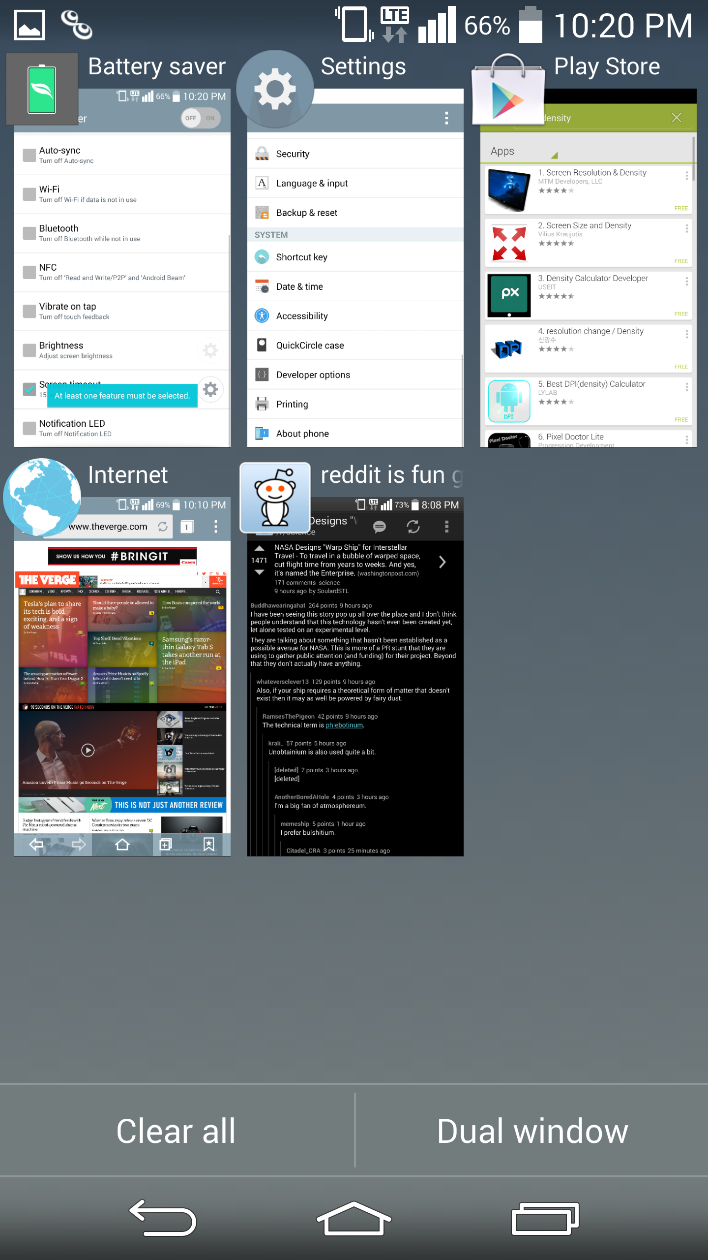
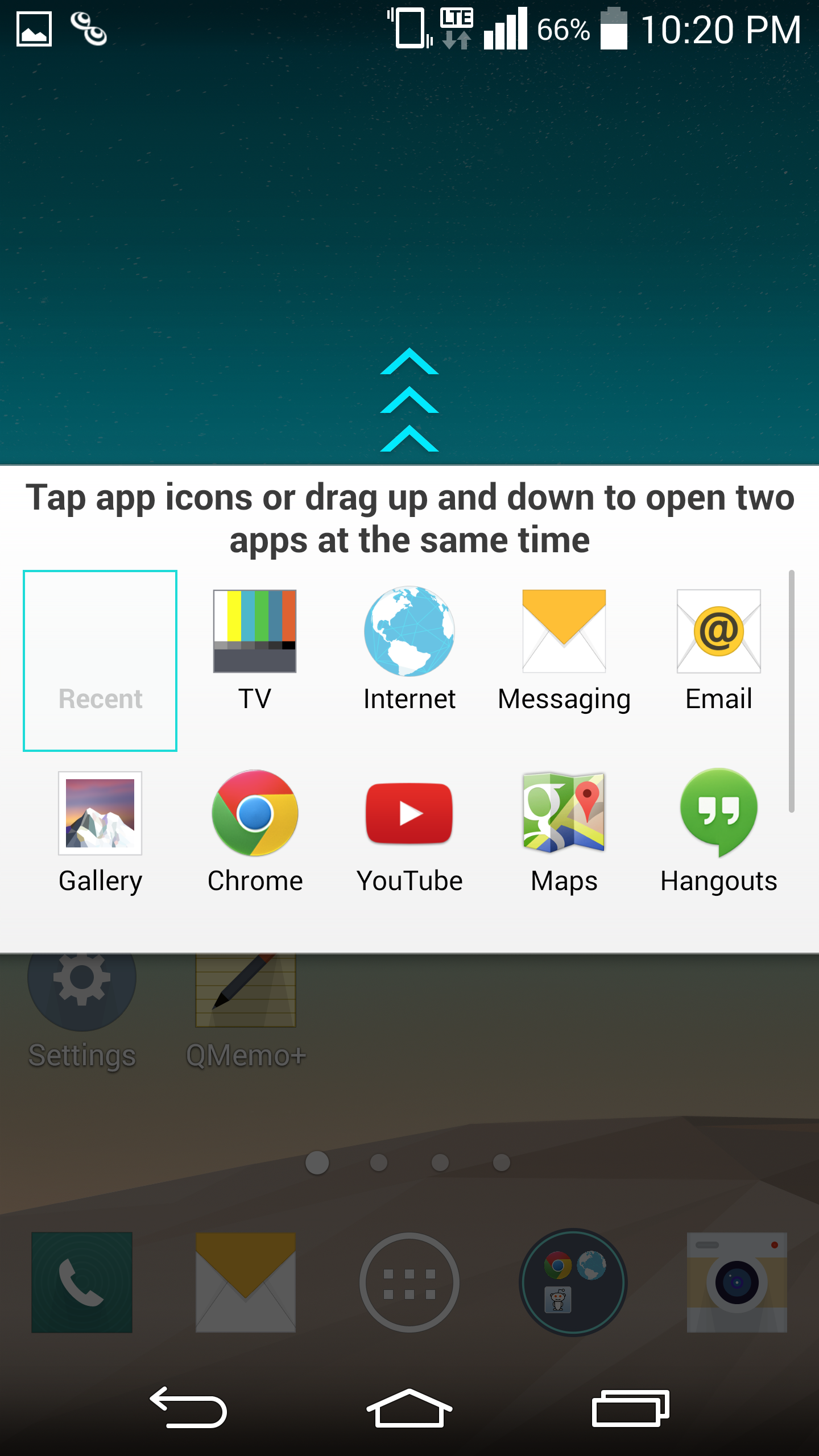
While opinions on how a UI works (or doesn’t) are mostly subjective, in my experience there have been far fewer friction points in the G3 UI when compared to TouchWiz in general. The best example of this is the multiwindow mode in the G3. While Samsung has done a great job of getting widespread developer adoption for their interface, LG has clearly put more thought into the user experience here. Instead of requiring the user to mentally keep track of whether to use Android’s task switcher or the multiwindow option, the multiwindow toggle is in the task switching menu, which means it’s far more likely that it will be used as needed. The multiwindow functionality also allows for switching immediately to the last two windows used to save time. The only issue I have here is that manipulating open windows isn’t as easy as it should be. This is because closing one of the windows is done by tapping the tab separating the two rather than simply swiping up or down. It does make sense once you learn how it works, but may confuse some at first.
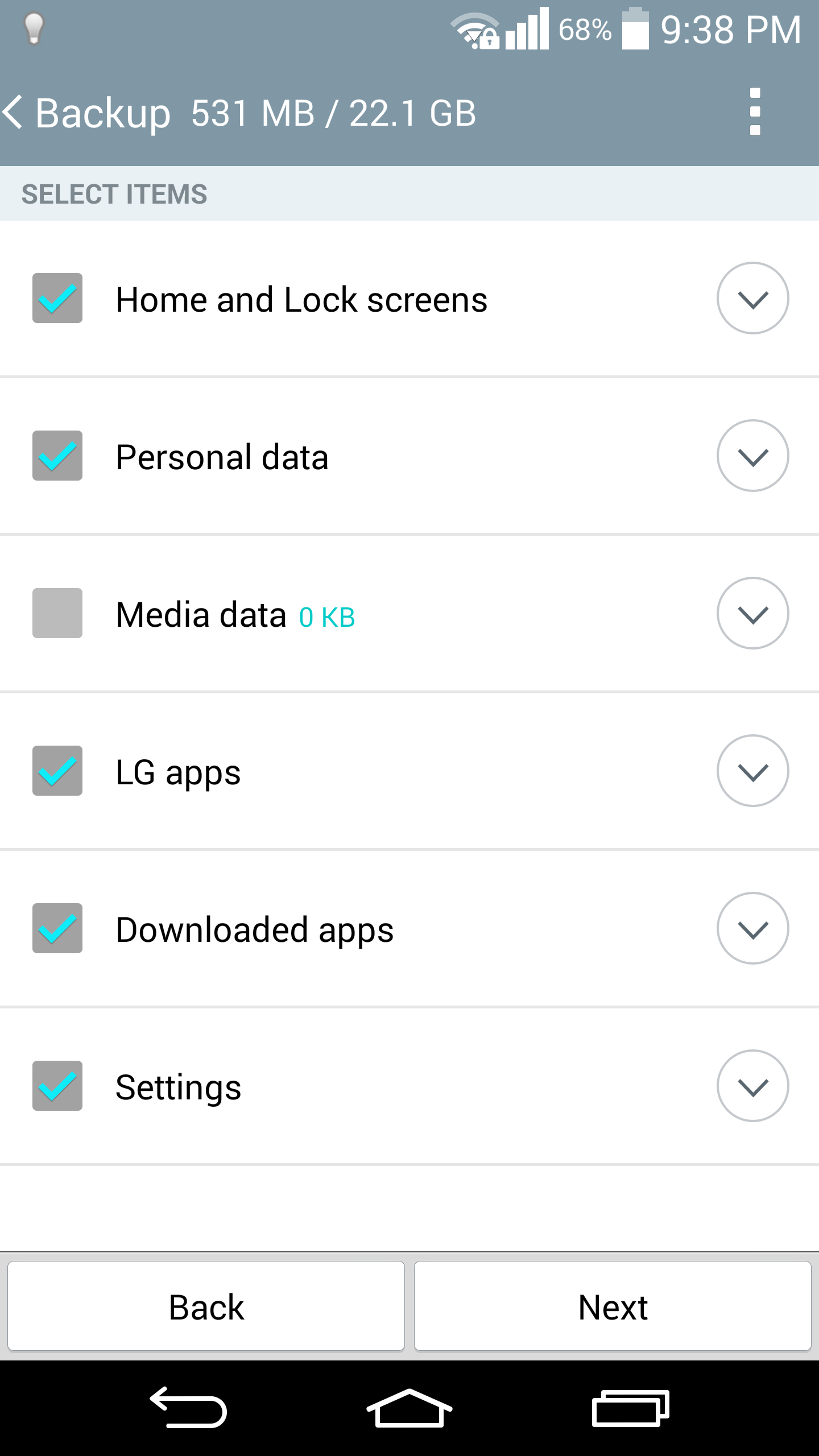
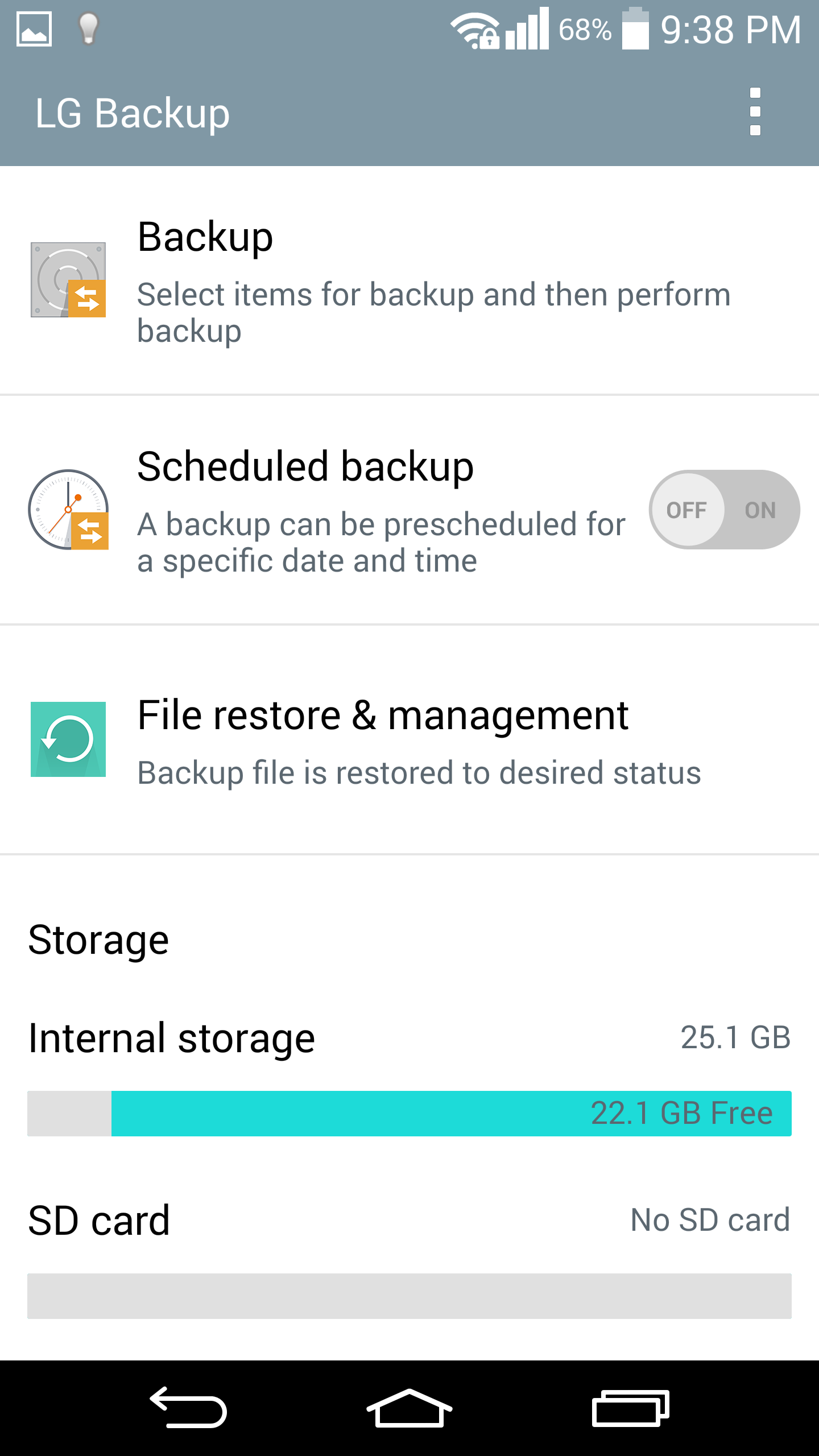
LG isn’t perfect at this though, there are some issues such as the email client. Specifically, email providers like Hotmail/Microsoft don’t work properly if set up as a POP/IMAP account, and rely on the user to know that they have to set up Hotmail as an Exchange account. For the most part though, these issues are rare. LG seems to have done a good job with their applications, with cohesive design throughout that utilizes Google design guidelines. Things like the smart cleaning application in settings, and the LG backup application are all ways that LG has actually improved the user experience. There really aren’t a lot of friction points in the usability of stock applications, other than the ones clearly designed for SKT or are otherwise Korea-only.
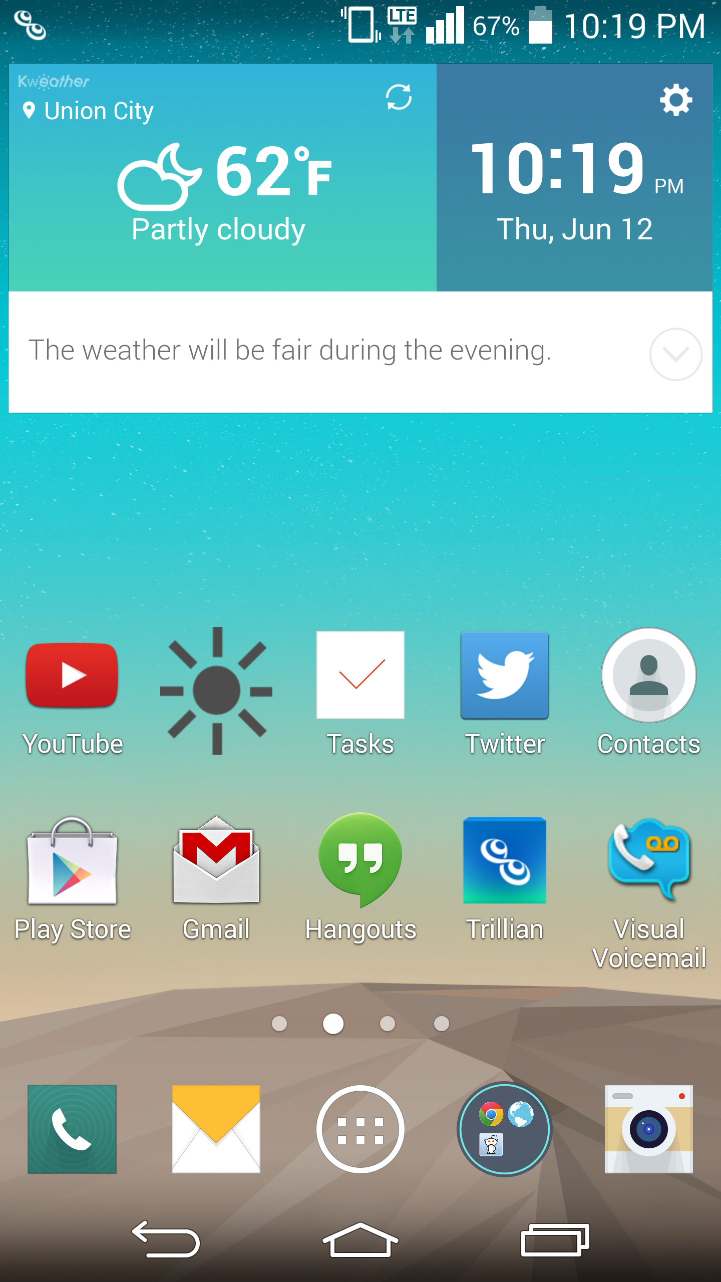
Of course, LG’s “gimmicks” also tend to be more useful as well. While I struggled with some unreliability on KnockCode for the G Pro 2, the G3’s version is great in practice. KnockOn and KnockOff both work as expected too. These features are all easy to grasp as well, with very little learning curve. The same isn’t necessarily true for features that ship with the Samsung Galaxy S5, such as the fingerprint sensor. It's not all perfect though, as Smart Notice doesn’t seem to be useful most of the time. Fortunately, it won’t get in your way and it’s integrated well into the clock/weather widget. While both LG UI and TouchWiz have a largely similar experience, I think that LG ends up with a less frustrating one. There are some issues with clutter in the notification bar though, as out of the box there’s almost no room for actual notifications. Althought annoying, it's easily solved by toggling away most of the unnecessary settings.
Overall, I’m happy with LG’s UI. The annoyances are few and far between, and LG has adopted a solid aesthetic design for this generation. While I didn’t notice a significant delta in overall performance compared to the One (M8), I did notice that the G3 had more issues with stutter in animations overall. I suspect that this has relatively little with the UI design itself, as most animations are simple panning movements without 3D effects.


174 Comments
View All Comments
ZeDestructor - Friday, July 4, 2014 - link
I can't see individual pixels on my 24" 1920x1200 screen (~97ppi), but I can EASILY tell the difference between 1920x1080 on a 5.0" phone compared to 1280x720 on a 4.7" phone at 30cm view distance.Hell, when the iPhone 4 came out with 326ppi, I could see the grid at around 15cm view distance, probably more - some of us have better eyes than others.
Not seeing the pixel grid doesn't mean it's past ocular limits.
SleepyFE - Friday, July 4, 2014 - link
If it looks like a perfect circle it can't look any more like a perfect circle. Can it?ZeDestructor - Saturday, July 5, 2014 - link
The eyes is very good at spotting aliasing. It doesn't jump out at you, but you get the inherent feeling that it's just not right, and with someone like me, that breaks down to peering closer, and closer, and closer, then suddenly microscope D:jeffkibuule - Friday, July 4, 2014 - link
We must stop this silliness that "not seeing pixels" is the only goal of a display when there are several other metrics at play. You'd still be able to tell the difference between aliased and non-aliased fonts at 12 inches because our brain does a lot of "massaging" of the raw data our eyes capture before we interpret it in our visual cortex. Or more simply put, "the eye is not the be-all end-all of human vision".SleepyFE - Friday, July 4, 2014 - link
I didn't say not to alias fonts. That has nothing to do with resolution, PPI or PPD. The point is that when you can't tell the difference anymore, you can't tell the difference anymore. Aliasing and proper color reproduction and so on are different problems.mkozakewich - Saturday, July 5, 2014 - link
Just because you can't see them doesn't mean other people can't. I could see the tiny spaces *between* pixels on my desktop monitor, and hairlines were still really thick. On my 1080p 10.5" screen right now, I can still make out two parallel lines from two feet away, and can see the jaggedness of an aliased 1px line drawn diagonally. At least the white background of this page doesn't look like a big mosquito net at this density.In short, we can see a *lot* of detail, and I know it's not enough for me as certainly as you know it's enough for you.
We really shouldn't need any kind of antialiasing. Until our screens are of high enough resolution, though, they make good stopgaps.
phoenix_rizzen - Friday, July 11, 2014 - link
And PPD stands for ... ? And it compares to PPI how ... ?kaelynthedove78 - Friday, July 4, 2014 - link
"The laser appears red to my eyes, but a camera with a poor IR filter sees the laser as purple, which suggests a spread of spectrum rather than a single wavelength."kaelynthedove78 - Friday, July 4, 2014 - link
Lasers are single wavelength sources, so what are they actually using? Does the phone come with the mandatory laser safety class certificate/sticker that lists the power and wavelength?soccerballtux - Friday, July 4, 2014 - link
did you get the placemat you used for the photograph background at Target? ;)