The Meizu M3 Note vs. Xiaomi Redmi Note 3 Review: Comparing Notes
by Matt Humrick on July 12, 2016 8:00 AM EST- Posted in
- Smartphones
- Mobile
- Xiaomi
- Meizu
- Redmi
Display
The era of 720p or lower resolution screens with poor brightness seems to be over in the $150 to $200 price range. Both the Meizu M3 note and Xiaomi Redmi Note 3 come with large 5.5-inch 1080p (1920x1080) displays (as do many of their peers). This gives them a pixel density of 401ppi—the same as an iPhone 6s Plus—which hits the sweet spot for IPS LCD panels, whose RGB stripe subpixel arrangement avoids the inherent issues caused by the PenTile technology used in most AMOLED panels.
While these phones use big 1080p panels just like expensive flagships, it’s unrealistic to expect the same level of performance; lower-cost, lower-performing panels are a necessity to hit their intended price target. The Redmi Note 3, for example, uses a Tianma panel that does not support panel self-refresh, a common feature we see on flagships that helps conserve power when displaying static content. Are these panels missing other features, and how do they actually look? To answer these questions we turn to our X-Rite i1Pro 2 spectrophotometer and i1Display Pro colorimeter, along with SpectraCal's CalMAN 5 software to manage the data.
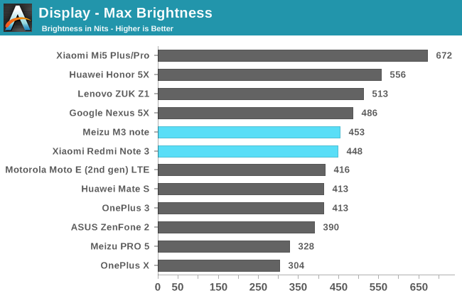
Both the M3 note and Redmi Note 3 reach a respectable 450 nits peak brightness, a little less than the 500+ nits we’d like to see for viewing under the sun, but bright enough to handle most situations. Of the phones in its price range, only the Huawei Honor 5X outshines either device by a significant margin.
Using these phones in low light is not an issue, with the M3 note dimming to 3 nits and the Redmi Note 3 going as low as 1 nit, making both suitable for use in even a completely dark room.
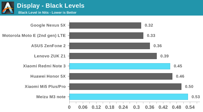
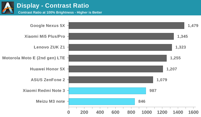
Because we measure the black level and contrast ratio at maximum brightness, it’s a little more difficult to make direct comparisons between devices in these charts; however, after taking into account that a display’s black level naturally increases with brightness, we see that the M3 note and Redmi Note 3 have relatively poor black levels. For example, the Nexus 5X, at a similar peak brightness, shows a much better black level, while the Xiaomi Mi5 achieves a similar black level but at a much higher brightness. Granted, both of these phones are more expensive, but even the Honor 5X and ZUK Z1 deliver better black levels at a similar price point. It’s safe to say that neither the M3 note nor Redmi Note 3 use a panel with photo-aligned crystals like the LG G5, which achieves a black level of 0.21 at 405 nits, a greater than 2x improvement.
The poor black level performance is evident when looking at contrast ratio: The phones fall to the bottom of the chart, failing to break the 1,000 barrier. Even the less-expensive Moto E (2nd gen) has a contrast ratio 27% better than the Redmi Note 3.
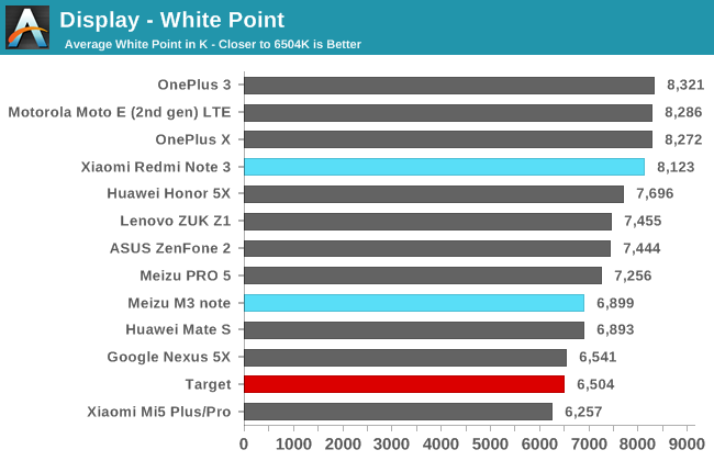
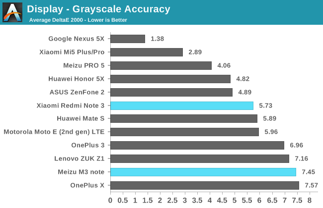
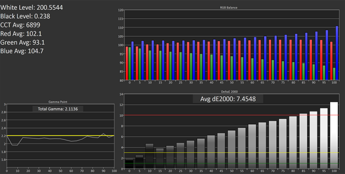
At its default setting Xiaomi’s Redmi Note 3 has a very cool white point above 8,100K, which gives whites and lighter shades of gray a very noticeable blue tint. Its poor grayscale accuracy, unfortunately, is typical for phones in its price range, especially among Chinese OEMs who specifically target cool white points for their home market. Gamma is also too high, measuring between 2.4 to 2.5 across a full luminance sweep, which reduces shadow detail and makes images look darker overall.
Meizu’s M3 note has its own set of issues with grayscale accuracy. It places too much emphasis on the red and blue primary colors, giving its screen a purplish tint and a peak ΔE2000 grayscale error of over 12 at 100% white compared to just under 8 for the Redmi Note 3. The M3 note’s gamma curve is a little better, however, sticking pretty close to the target value for most luminance settings.
While neither phone’s default grayscale performance impresses, at least they both include a color temperature slider control that allows you to tailor the screens’ white point based on personal preference. The M3 note’s continuous slider is very sensitive, making it difficult to dial-in a specific value. The endpoints are also far too extreme, with average white points of 3,707K at the warmest setting and a ridiculously blue 100,061K at the coolest setting, which basically turns all colors into a shade of blue. It’s great that Meizu allows for some customization, but it really needs to execute better and tune the control with more sensible settings that actually improve image quality; I find the default setting actually provides the best overall grayscale and color accuracy, and no matter the position of the slider, the green primary is always too low.
The Redmi Note 3’s color temperature control only has three settings: Warm, Cool, and Standard (the default middle position). Because these settings produce usable results, I’ve included their grayscale charts above for comparison. The Cool setting raises the average color temperature to 8,795K for anyone who may prefer a screen with a heavy blue tint. The Warm setting actually yields nice looking grays, with error levels at or below 3 (the point where error becomes readily noticeable) across the full luminance sweep. The gamma curve still fluctuates too much, however.
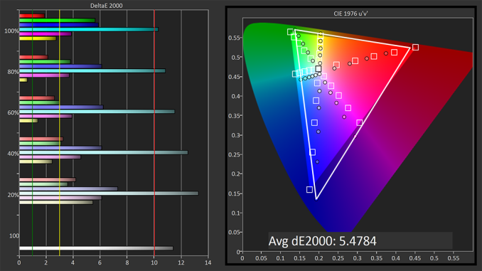
People who enjoy the vibrant, oversaturated colors that many AMOLED panels provide will be disappointed to know that neither of these phones have wide-gamut displays. People who prefer color accuracy will not be happy either, because neither phone properly covers even the sRGB color space.
It’s interesting that the M3 note and Redmi Note 3 exhibit the same fundamental issues. For starters, they both miss all three corner points that define the sRGB color space. The large deviations for the blue and green primary colors effectively limit the hues of blue, cyan, and green that the panels are capable of rendering. Color saturation is uneven overall, with blues appearing oversaturated, cyans and reds appearing undersaturated, and yellows the most accurately saturated. We can also see how each display’s cool white point pulls cyan and magenta hues towards blue.
The Redmi Note 3’s Cool color temperature setting only makes things worse by shifting all color hues closer to blue. Its Warm setting, however, does actually help improve color saturation and accuracy, at least a little bit. Red hues show much better saturation, and with the blue primary turned down, the secondary colors (cyan, magenta, and yellow) all shift closer to their target boxes. The overall gamut issue remains, though, because that’s set by the panel’s backlight.
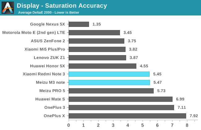
With the same list of issues, the M3 note and Redmi Note 3 end up with nearly the same average saturation error, values that are worse than the Honor 5X, Moto E (2nd gen), and ZUK Z1, which all do a better job covering the sRGB color space. They do fare better than the Meizu PRO 5, Huawei Mate S, OnePlus 3, and OnePlus X, though, whose wide-gamut AMOLED panels all produce oversaturated colors relative to sRGB.
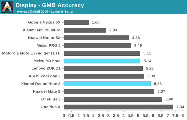
After seeing their issues with grayscale rendition and gamut coverage, it should not be surprising that the M3 note and Redmi Note 3 show noticeable color error. The M3 note actually does pretty well with shades of green and yellow, including skin tones, with ΔE2000 error remaining within the acceptable range. It’s blues, reds, and their mixtures where color error becomes most noticeable. The Redmi Note 3’s color accuracy is a bit worse because of its cooler white point and improperly configured gamma, with nearly all tested colors showing error levels above 3. Its Warm color temperature setting does help a little, but it cannot compensate for the gamut and gamma issues.
While neither phone exhibits great color accuracy, their average error is typical among phones with a similar price point. The more expensive Nexus 5X and Xiaomi Mi5 perform significantly better; the oversaturated, overly cool OnePlus phones score worse (the OnePlus 3 is shown at its default setting and not its sRGB mode); and the rest show little variation on average.
The LCD displays in the M3 note and Redmi Note 3 are optically bonded to the cover glass, and neither of our review units show any noticeable backlight bleed. Viewing angles are also typical for IPS displays with no obvious problems.
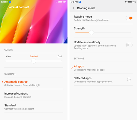
Xiaomi Redmi Note 3 Display Settings: Color temperature control (left), Reading mode (right)
The Redmi Note 3 includes one additional display feature the M3 note does not have: a reading mode. Similar to Apple’s Night Shift feature, it shifts the display’s white point, reducing the blue luminance and making the display appear warmer, in this case more yellowish than red. Some studies have shown that blue-shifted light can interfere with our sleep cycle or even cause eye strain, so Xiaomi’s inclusion of a reading mode is welcome. Unlike Apple’s version, Xiaomi’s reading mode cannot be activated automatically on a schedule, but there is a quick setting toggle in the notification shade to quickly turn it on or off.
It’s great to see 1080p panels trickle down to lower price points. The higher resolution helps text and images look crisp on both the M3 note and Redmi Note 3, and a decent peak brightness of around 450 nits makes both screens viewable in everything but direct sunlight. However, it’s clear some sacrifices were made to reduce panel cost. Their black levels cannot match those of other phones in their price range, let alone more expensive flagships. Both phones also struggle with gamut; neither panel is capable of rendering all of the colors in the sRGB color space.
In addition to the hardware limitations, software calibration is also an issue. Cool white points hurt both grayscale and color accuracy. The Redmi Note 3 compounds these issues with the wrong gamma setting, leading to a loss of shadow detail and a screen that just looks darker. Its Warm color temperature setting dramatically improves grayscale performance and even improves color accuracy a little, but it cannot overcome its hardware deficiencies and improper gamma.
In the end, display performance is not a strong point for either the M3 note or Redmi Note 3. Their performance is merely average when compared to similarly priced phones. If display performance is not a high priority, and your primary use case (for the screen) is reading, then you’ll likely find these phones good enough. If you require better performance, then you’ll need to spend a little more on something like Google’s Nexus 5X.





79 Comments
View All Comments
Pissedoffyouth - Tuesday, July 12, 2016 - link
I have a Redmi Note 3 and I generally get >8h SOT over 2 days. I LOVE LOVE LOVE this phone.It's just a pity they can't stick bigger batteries in phones that cost 3x as much
Le Geek - Tuesday, July 12, 2016 - link
I know right!!! I too have the same phone and never have I gotten a sot less than 9 hrs. This device is turning out to be the best Tech purchase I've ever made. Cheers!!ddriver - Tuesday, July 12, 2016 - link
They can, just don't want to.JeffFlanagan - Tuesday, July 12, 2016 - link
They don't want to because it would be a bad choice. This way people who want a bulkier phone with longer battery-life can get a battery-case, and people who want a thinner phone at the cost of battery-life can skip the case. The alternative is a bulky phone that's only appealing to people who need a larger battery, so have to put up with a larger device.TechnikalKP - Wednesday, July 13, 2016 - link
The iPhone 6+ is 7.3mm thick. The Redmi Note 3 is 8.6mm. That's less than the thickness of a US dime.close - Wednesday, July 13, 2016 - link
Bulky? Compared to what? Compared to the thinnest flagships maybe. But compare it to anything any normal person would consider acceptable and it's nowhere near bulky. I've never heard anyone saying "oh I wish this phone wasn't so bulky" when talking about normal phone thickness in the past years. Battery complaints though? All the time. What's the ideal thickness? The S6 Edge was 7mm while the S7 is 7.7mm. So adding 10% to the thickness didn't raise any eyebrows.Yes, putting a bigger battery would be a bad choice for all kinds of ignorant people thinking that a battery case is the same as adding an extra mm to the thickness of the phone and also for phone manufacturers who know that a battery that barely lasts a day when new will push you to get a new phone when the battery is 2 years old and you spend most of the day tethered to an outlet.
Spunjji - Thursday, July 14, 2016 - link
Agreed with this. My Nexus 5 was almost useless to me after 18 months; by 2 years I was charging it 2 or 3 times a day. I can't believe for a second that one or two additional millimeters for 10 to 25% additional battery capacity would have been a bad choice for that device, what with it being very thin already and having a stupid camera bump.Battery cases are a terrible solution - they are restricted to a single device, add unnecessary bulk and increase the complexity of charging.
Impulses - Thursday, July 14, 2016 - link
I was on the same boat, recently decided to open it up and swap the battery as I'm keeping it until the next round of Nexus at year'd end. I hope even the next 5" model goes for at least a 3000mAh (and/or wireless charging)... Otherwise I might be looking at larger phones which I've resisted all these years.Bulat Ziganshin - Wednesday, July 20, 2016 - link
The new battery for Nexus4 costs me $10 at aliexpressImpulses - Thursday, July 14, 2016 - link
A battery case isn't really comparable, or even a viable choice I'd argue. They're only made for a handful of flagship models, and they add a lot more bulk relative to the battery life you gain (and compared with phones that have larger batteries and are just a mm thicker)... You can't honestly be serious.