The Samsung Galaxy Note7 (S820) Review
by Joshua Ho on August 16, 2016 9:00 AM EST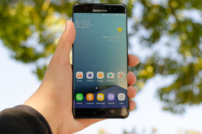
This year has been difficult for smartphones, which is a bit of a paradox when you consider just how much better things have gotten compared to last year. With Snapdragon 820, 650, 652, and 625 we’ve finally moved past the shadow of the Snapdragon 810, 808, and 617/615. While there were Android devices that shipped with the Exynos 7420, they were often paired with a modem that was not necessarily the most power efficient. Despite all of this, there seems to be a general disappointment with smartphones. People are increasingly finding it hard to justify phones like the HTC 10 or Galaxy S7 with competition from OnePlus, Xiaomi, and even Apple with their iPhone SE.
In this context the Galaxy Note7 brings much of the flavor of the Galaxy S7 edge, but blends it with the S-Pen of the Note line and a few new features like the iris scanner. If you were paying attention to the industry with the launch of the Galaxy S6 and Galaxy Note5, it’s very much more of the same rather than the major redesigns that we saw moving from the Galaxy S5 to the Galaxy Note 4. To better illustrate what I mean we can take a look at the spec sheet.
| Samsung Galaxy Note5 | Samsung Galaxy Note7 | |
| SoC | Exynos 7420 4x Cortex-A57 @ 2.1Ghz 4x Cortex-A53 @ 1.5GHz Mali T770MP8 (Samsung 14LPE) |
Snapdragon 820 (US) 2x Kryo @ 2.15GHz 2x Kryo @ 1.6GHz Adreno 530 Exynos 8890 (ROW) 4x Exynos M1 @ 2.3GHz 4x Cortex A53 @ 1.6GHz Mali T880MP12 (Samsung 14LPP) |
| RAM | 4GB LPDDR4 | 4GB LPDDR4 |
| NAND | 32/64/128GB NAND (UFS 2.0) | 64GB NAND (UFS 2.0) + microSD KLUCG4J1CB-B0B1 UFS 2.0 1 lane MLC |
| Display | 5.7” 1440p SAMOLED |
5.7” 1440p SAMOLED Dual Edge |
| Network | 2G / 3G / 4G LTE (Category 6/9 LTE) Region Dependent |
2G / 3G / 4G LTE (Category 12/10/9 LTE) Region Dependent |
| Dimensions | 153.2 x 76.1 x 7.6mm, 171g | 153.5 x 73.9 x 7.9mm, 169g |
| Camera | 16MP Rear Facing w/ OIS f/1.9, 1.12µm, 1/2.6" (Sony IMX240, Samsung S5K2P2) |
12MP Rear Facing w/ OIS, f/1.7, 1.4µm, 1/2.6" (Sony IMX260, Samsung S5K2L1) |
| 5MP Front Facing, f/1.9, 1.34µm (Samsung S5K4E6) |
5MP Front Facing, f/1.7, 1.34µm (Samsung S5K4E6) |
|
| Battery | 3000 mAh (11.55 Whr) | 3500 mAh (13.48 Whr) |
| OS | Android 5 w/ TouchWiz (At Launch) |
Android 6 w/ TouchWiz (At Launch) |
| Connectivity | 2x2 802.11a/b/g/n/ac, BT 4.2 microUSB, USB2, GPS/GLONASS/Beidou NFC, MST |
2x2 802.11a/b/g/n/ac, BT 4.2 USB-C, USB3.1, GPS/GLONASS/Beidou NFC, MST |
| Fingerprint Sensor | Capacitive by Synaptics | Capacitive by Synaptics |
| SIM | NanoSIM | NanoSIM |
When we look at the spec sheet, the Galaxy Note7 is almost identical to the Galaxy S7 edge, but sees a minor bump in size and the addition of an S-Pen. Of course, the Galaxy Note7 is a big step up from the Note5, but for perspective it's generally more interesting to look at recent smartphone launches to contextualize the device under test. For the first time we’re really starting to see the impact on internal volume that the S-Pen has, as the Galaxy S7 edge is slightly smaller than the Galaxy Note7 but actually has a larger battery, which wasn’t the case when comparing the Galaxy S6 edge+ and Galaxy Note5. Of course, the S-Pen does also provide functional value if regularly used, so it’s a trade-off that has to be considered by the end user. While we’re still on the subject of the S-Pen, it no longer breaks the phone if inserted backwards. It also has a thinner 0.7mm tip and an extra bit of precision for pressure sensing, but we'll have to take a closer look a bit later here.
Other than the addition of the S-Pen and a slightly larger display, the Galaxy Note7 also gains a USB-C port relative to the Galaxy S7 edge, which makes the connector reversible. It also supports USB 3.1 Gen 1 but the cable in the box is USB 2 only, which seems to be a popular trend with a number of recent flagships. There’s also the addition of the iris scanner, which supports iris scanning from one pair of eyes. Other than these changes, the Galaxy Note7 at a high level is rather difficult to tell apart from the Galaxy S7 edge.
Design
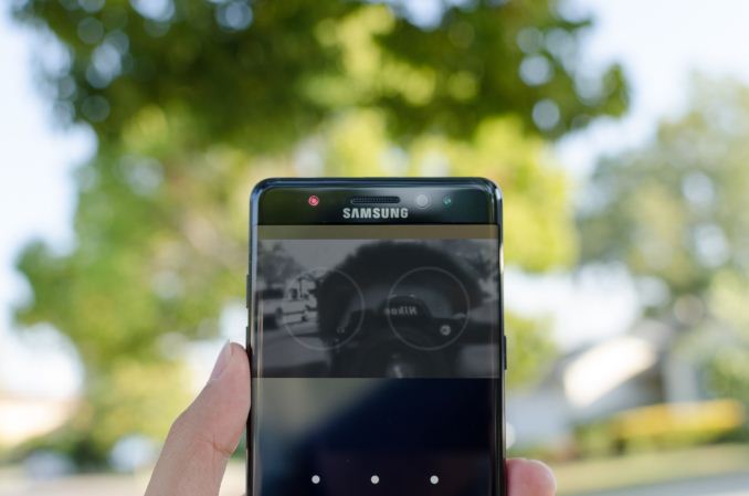
The similarities between the Galaxy Note7 and Galaxy S7 edge don’t really end at the spec sheet either. Both devices have the same curved pebble-like design on the front with a physical home button and pretty much the only noticeable difference here is that the curve of the edge display is changed. There are also some extra sensors to enable the iris scanning functionality at the top near the earpiece such as the IR LED and IR camera, but Samsung is sticking to what works for them here.
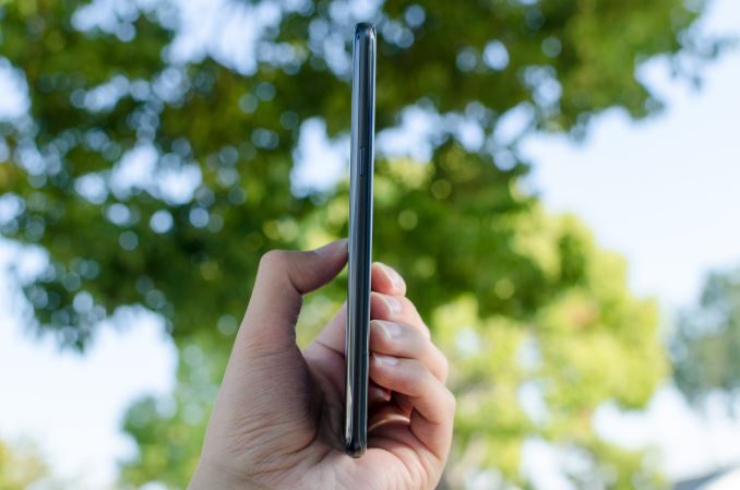
Along the sides of the phone we start to see some of the differences as the device has the same radius of curvature on the front and back of the phone so the front and rear glass feel identical when your finger approaches the edge of the device rather than a more severe edge on the display lens and a gentler one on the back as seen in the Galaxy S7 edge. This also causes some noticeable changes in viewing angles which we’ll address in later sections. What is worth talking about right now is how edge swipes seem inconsistent in the sense that the edge panel requires a swipe that basically starts right at the edge of the display, while apps seem to do best when an edge swipe starts at the junction where the display begins to curve. This kind of thing is fairly annoying for the first few days you use the phone but eventually you get used to it, but in some ways this is a missing step of usability.
The front and rear glass of the Note7 meet with an aluminum frame that functions as the backbone of the phone. As the glass back is epoxied to this aluminum frame, there is no removable battery, but this simplifies internal design and volumetric efficiency. The LG G5 continues to be the last notable flagship with a removable battery and has notable issues with volumetric efficiency as a result, so I’m not sure it necessarily makes sense with the kinds of designs that Samsung has been pursuing for the last year and a half, but it would be nice to see some method of removing the back cover without using a hair dryer if only as a concession to the likelihood of shattering a glass back in a drop.
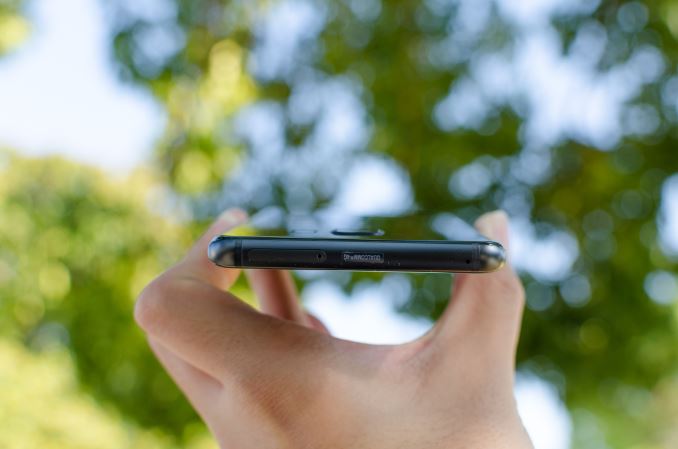
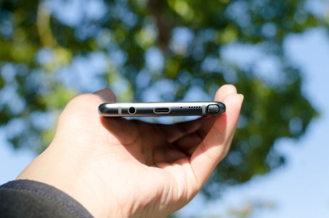
Discussions of repairability aside, the aluminum frame of this phone also holds things like the SIM/microSD tray, microphone holes, and other cutouts. It’s worth mentioning here that the phone has better alignment of all the various buttons and holes compared to the Galaxy S7 edge by a significant margin. Things like the power and volume buttons are centered and in the right place ergonomically and remain fairly clicky, although if you’re used to something like the HTC 10 they have a much softer break and feel. There have been various people that have complained about these things, and presumably in an effort to address these kinds of complaints Samsung saw fit to resolve this issue but things like the microphone holes are not necessarily aligned, so if Samsung really intends to sell this design story of symmetry I suspect future generations will need to resolve these kinds of small niggles. It’s worth mentioning that even the antenna insulation on the frame is symmetrical. The entire phone is basically edge-less and feels like holding a pebble. The one notable area of this phone that actually has a perceivable edge here is the S-Pen, which has a slight edge that helps with pulling it out if you have slightly longer fingernails. If you don’t have fingernails, the head can be depressed to make it protrude for easy access. The device also has a 3.5mm jack, which is nice to see when at least one recent device has shipped without one, but I’m still undecided on whether this really matters one way or another.
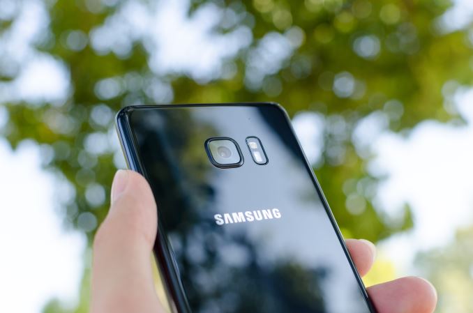
The back of the phone is pretty much identical to the Galaxy S7 and S7 edge. The curved glass helps with ergonomics, with a slightly rounded square camera lens which now contains a subtle pattern of concentric circles between the cover lens and the camera module. I don’t think this actually serves a functional purpose and actually calls attention to the rather strange mismatch of a squared-off cover lens with a circular camera. It’s worth mentioning here that the coating underneath the glass is no longer as elaborate as the one seen in the Galaxy S6 or Note5, which had an extremely fine texture to it and multiple layers to produce a neat effect in the sun, but there are still some interesting optical effects to this back cover as reflections diffuse vertically instead of a simple mirror reflection.
Overall, the design of the phone is acceptable, but honestly at this point it’s nothing really special. If you’re stepping up from a phone like the Galaxy Note 3 it’s going to feel nicer in the hand but really the design is just keeping up with competition like Xiaomi. I would argue that OnePlus and Google/Huawei have surpassed Samsung here as far as ID goes from a lower price point, and that both Apple and HTC have done better than Samsung for about the same price. We can argue about how Apple uses a plastic liner or whatever minute detail in the design is “better”, but something as simple as the camera lens is square even though a circular design would look less out of place due to the use of concentric circles. The IR LED, front facing camera, and iris scanner are visually unbalanced, and microphone holes are just not aligned in any sensible way. For all of the marketing bravado about symmetry and a focus on design, these kinds of things make it feel like Samsung is really just doing this to address press criticism rather than doing it out of some kind of internal push for improved design.
The Galaxy S6 was a massive leap forward for Samsung, and as we approach the end of year two for this design I think it’s time for Samsung to move forward once again. There are only so many ways to make a slightly rounded rectangle, but something other than the same curved glass and aluminum frame with physical home button would go a very long way towards refreshing the design. It’s easy to argue that Samsung’s strategy of mostly making the exact same design with a slight twist has worked for them for a very long time, but just looking at the past Samsung and other OEMs in the business usually only get about two generations out of a given ID before they need to refresh their designs. The edge display is pretty, but functionally it’s honestly at least mildly annoying because edge swipes don’t really work the way you’d expect them to due to the abbreviated edge on the Note7 relative to previous devices. This is obviously my opinion, but the Galaxy Note7 feels designed in a disjointed manner. The right pieces are generally in the right place, but if you look too closely the seams of not-quite symmetrical parts are still there. I found it hard to fault phones like the Galaxy S5 and Note 4 that were unabashedly functional, but this is a phone that tries to have some sense of style so it’s harder to be kind here. The Note7 isn’t going to make you sad when you take it out of the box and functionally there’s absolutely nothing wrong with this phone other than the strange ergonomics of the edge display, but if you look too closely you’ll notice the incongruities.




202 Comments
View All Comments
zbingonz - Tuesday, August 16, 2016 - link
So did you guys drop the HTC 10 review?Ian Cutress - Tuesday, August 16, 2016 - link
We had the opportunity to put significant time into meeting the official review launch date for the Note7, so decided to put resources into that as a priority. After Josh has finished up the final sections and had his nap, we'll crack the whip :Dzbingonz - Tuesday, August 16, 2016 - link
Ah good to hear :)Thanks for the prompt reply!
JoshHo - Tuesday, August 16, 2016 - link
Given the choice between being timely on the Note7 and finishing the HTC 10 review we have elected to focus on timeliness for the Note7 review.philehidiot - Tuesday, August 16, 2016 - link
Suppose it makes sense to get one review out promptly and delay the already crazily late one but please, please get on with it! It's getting silly now ;)philehidiot - Tuesday, August 16, 2016 - link
Buuutt... if you want to send me the HTC 10, I'll review it for you (badly).I'm not having a go, I do appreciate quality takes time and there is no other site I know of which can match this place for quality.
lagittaja - Wednesday, August 17, 2016 - link
Since you pushed the 10 review even further, I'm going to have to assume your review will be based on the latest firmware, which for the US version would be 1.91JoshHo - Wednesday, August 17, 2016 - link
The HTC 10 review unit is on EMEA software, it will be the EMEA 1.90.401 build.wessam_yamani - Tuesday, August 23, 2016 - link
i hope you consider the software update version 1.90.401.5 or the latest update you have . and please mention the software version in your article .thanks to all the reviewerXinn3r - Wednesday, August 17, 2016 - link
Please tell me you're reviewing the Xiaomi 5 as you seem to include them in all the benchmarks for newer phones.