Nokia 7.2 Launched: 6.3-Inch PureDisplay, 48MP Camera, Snapdragon 660
by Anton Shilov on September 9, 2019 3:00 PM EST
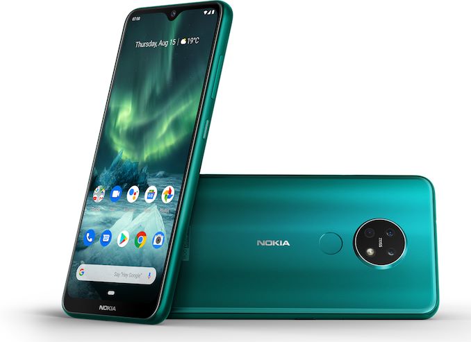
HMD Global has announced its new ‘performance mainstream’ smartphone, the Nokia 7.2. It is aimed at the mass market, yet features premium capabilities, like a large HDR10-capable display with PurePlay enhancements, and a triple-module camera with a 48 MP sensor. When compared to its predecessor in the same price segment, the Nokia 7.2 upgrades itself in every important aspect like the screen size, performance, and imaging capabilities.
The design language of the Nokia 7.2 is somewhat different when compared to its ancestor, the Nokia 7.1, as well as other advanced Nokia handsets available today. The chassis is symmetric with very smooth edges to ensure a pleasant grip. The handset no longer has sharp/diamond-cut edges that were meant to ensure firm grip and give a somewhat special feeling. There is a reason for that. The enclosure no longer uses an aluminum unibody frame, but features a frame made of a polymer composite along with Corning Gorilla Glass 3 on both sides. Nokia says that the polymer composite it uses is twice as strong as polycarbonate at half the weight of aluminum. Use of the polymer instead of metal enabled Nokia to install a 6.3-inch LCD and boost battery capacity while maintaining weight of the phone at around 160 grams (same as predecessor).
Speaking of the display, the Nokia 7.2 features a 6.3-inch IPS LCD with a 2244×1080 resolution as well as Nokia’s PureDisplay hardware and software technology enabled by a PixelWorks chip that can process HDR10 content, upscale SDR content to HDR, as well as adjust brightness and contrast dynamically to provide the best possible image quality both indoors and outdoors.
Inside the Nokia 7.2 is the Qualcomm Snapdragon 660 that integrates eight Kryo cores (so, four semi-custom Cortex-A73 and four semi-custom Cortex-A53 cores) as well as an Adreno 512 graphics core, and an X12 LTE modem. The application processor is paired with 4 or 6 GB of LPDDR4 memory as well as 64 GB or 128 GB of NAND flash storage. Meanwhile, the device is equipped with a 3,500 mAh battery that can be fast charged.
As noted above, the Nokia 7.2 got significant upgrades when it comes to imaging. The main camera module is a 48 MP equipped with Zeiss optics, an ultrawide 8 MP sensor, a 5 MP depth module, and a LED flash. Also, there is a 20 MP camera for selfies on the front of the phone. To take advantage of the new triple-module camera as well as the new front sensor, Nokia developed its new camera software that takes advantage of the new hardware and supports ‘AI-powered night mode’ (which is probably a way to call Google Android’s Night Mode). Besides, there is Pro Camera Mode that enables a precise control of white balance, ISO, aperture, and shutter speed. Obviously, there are various refinements when it comes to the selfie camera too.
Physical interfaces of the Nokia 7.2 include a fingerprint reader on the back, power, volume and Google Assistant buttons, as well as a USB Type-C for data and power. For those who care, there still is a 3.5-mm audio jack for headsets.
| General Specifications of the Nokia 7.2 | |||
| Nokia 7.2 Good |
Nokia 7.2 Better |
||
| Display | Size | 6.3" IPS | |
| Resolution | 2280×1080 (19:9) | ||
| PPI | 400 PPI | ||
| Cover | Gorilla Glass 3 | ||
| Processor | PixelWorks | ||
| SoC | Snapdragon 636 Kryo 260 4 × Kryo 260 Gold (semi-custom Cortex-A73 cores) @ 2.2 GHz 4 × Kryo 260 Silver (semi-custom Cortex-A53 cores) @ 1.84 GHz |
||
| GPU | Adreno 512 | ||
| RAM | 4 GB LPDDR4 | 6 GB LPDDR4 | |
| Storage | 64 GB + microSD | 128 GB + microSD | |
| Networks | GSM GPRS (2G), UMTS HSPA (3G), LTE (4G) | ||
| SIM Size | Nano SIM | ||
| SIM Options | Dual SIM, second SIM slot is used by microSD card | ||
| Local Connectivity | 802.11ac Wi-Fi, BT 5.0, NFC, 3.5mm jack, USB 2.0 Type-C |
||
| Front Camera | 20 MP | ||
| Rear Camera | Main: 48 MP, f/1.8, 0.88µm, Quad-Pixel, PDAF Ultrawide: 8 MP, f/2.2 Depth: 5 MP, (f/2.4, 1.12µm ?) Flash: LED |
||
| Battery | 3,500 mAh | ||
| Dimensions | Height | 159.9 mm | 6.3 inches | |
| Width | 71.8 mm | 2.8 inches | ||
| Thickness | 8 mm | 0.31 inches | ||
| Weight | 160 grams | 5.63 ounces | ||
| Launch OS | Android 9.0 | ||
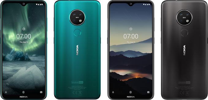
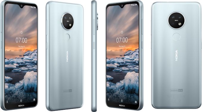
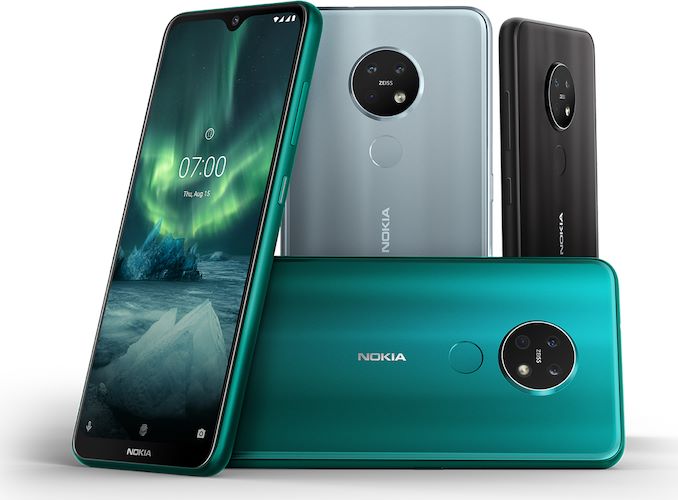
The Nokia 7.2 smartphone will be available in Cyan Green, Charcoal, and Ice finishes later this month. The 4 GB + 64 GB model will cost €299, whereas the more advanced 6 GB + 128 GB SKU will be priced at €349.
Related Reading:


49 Comments
View All Comments
eek2121 - Monday, September 9, 2019 - link
I personally would like to see a Nexus 7 follow-up. Even if it came from a competitor. High end specs, a great screen (the N7 was 1900x1200), and it ran stock android. The fact Google even killed it off baffles me. If they were losing money on it, just bump the price a bit or lower the specs a bit. I'd pay $400 for a high end 7" tablet with a high resolution screen.Luckily Lineage OS has an unofficial port and it looks beautiful and performs great.
A5 - Monday, September 9, 2019 - link
iPad Mini says hello.I've been a long-time Android guy on phones, but the iOS tablet app situation is miles better.
skavi - Monday, September 9, 2019 - link
Hardware situation is much better too. They've got an A12 in that thing.yetanotherhuman - Tuesday, September 10, 2019 - link
Oh shit, does it have wireless charging?... No. So it's not worthwhile
BurntMyBacon - Tuesday, September 10, 2019 - link
Not worthwhile to you perhaps, but your single criteria for dismissing it is not mentioned by the original poster so your conclusion based on this single criteria holds little weight in this discussion. Not unlike you, I would also personally avoid an iPad Mini (for a number of reasons), but the original poster only specified $400, high-end, 7", and high resolution. The iPad Mini meets all of these (well 7.9" is loosely 7"). You might be able to draw an implicit requirement on aspect ratio from the Nexus 7 (16x10), but as it isn't explicitly stated, I would not dismiss a product based on this.Like the original poster, I think a Nexus 7 update would be great. I don't hold out much hope of ever seeing one, but I'd buy several of them for my family if given the opportunity. They are unsatisfied with their current Apple dictated situation.
FreckledTrout - Tuesday, September 10, 2019 - link
I suspect that even if Apple did have wireless charging you would not buy an Apple product. People like to hate on Apple, I get it they overcharge and are slow to adopt a lot of features. However when they do adopt features they tend to do it better than anyone else. There phones and tablets simply just work with no tweaking or issues which for many millions of people this is much better than having the latest features.Speedfriend - Tuesday, September 10, 2019 - link
A5I am a long time Android phone and tablet user. I recently bought an iPad on a great deal. While the hardware is great, I am astonished how poor the software experience is in some ways. Things like changing your wifi connection take multiple more steps than on Android, the whole app orgaisation system of being confined to left to right, top to bottom i and not being able to resize app tiles. Some of the menu structure in settings is so unitutitive. Realy not impressed.
Xyler94 - Tuesday, September 10, 2019 - link
To be fair, how long do you stay on the home screen for that stuff to really be an issue? Most of that functionality you like is also Nova Launcher (Unless I'm mistaken, I haven't used stock launcher's on my android phone since I found Nova Launcher). Really, the simplicity of iOS is very intuitive, and the main reason I see your discontent is because you like styling your home screen to your exact liking.As for Wifi... I don't understand that comment. I have had used both, and neither are longer or take more steps...
nico_mach - Tuesday, September 10, 2019 - link
No, the UI is way behind, and in fact Apple agrees - they're finally updating it this year. Sometimes 'simplicity' is just stubbornness and laziness. They're abandoning 3d touch - not intuitive. Storage is still clunky, not intuitive. Holding down icons to uninstall is still good, but not exactly intuitive and grouping/ungrouping icons by touch is still an exercise in frustration. Why is it so hard to view the clock when I'm in an app on the ipad?I own both for years now, and Android has a better UI. Simplicity is always good but Android is simpler in some ways. And simplicity really was a cop-out after 3d touch and the multifinger gestures came along. I hardly know how multitasking works on my own year old ipad. And then let's talk about the settings screen and how app store accounts vs imessage works in a family - I'm not convinced even Apple knows how it works.
It's 12 years old. Eliminating skeumorphism is good, but not a real overhaul. It's time for IOS to have a real overhaul in functionality, even if only in the ipad version of it. I still don't see any real ambition from those guys, and on Mac they're arguably going backwards.
trivik12 - Monday, September 9, 2019 - link
I think Nokia gonna struggle in markets where they compete with Xiaomi/Realme who are using SD665 for sub $150 phone and SD710/SD675 for sub $200 phone. 660 was used in sub $150 phone early this year and so Nokia is like 6 months too late.