Apple MacBook Pro 13: Can a Mac Be a Decent Windows Laptop?
by Vivek Gowri on October 14, 2010 9:00 PM ESTApple MacBook Pro 13—Core 2 Duo Performance
It’s kind of embarrassing to be reviewing a $1200 computer with a two year old processor and application performance to match. It’s not that evident in day to day use, and in most games performance is more dependant on the graphics card, but application performance benchmarks are where the Core 2 Duo really makes itself felt (and not in a good way).
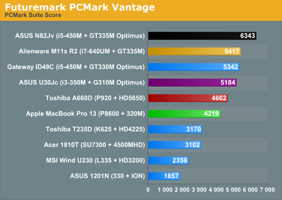
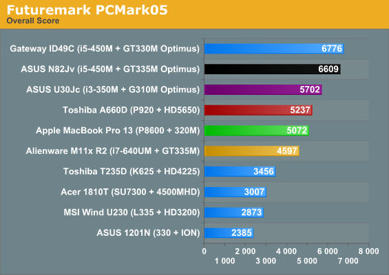
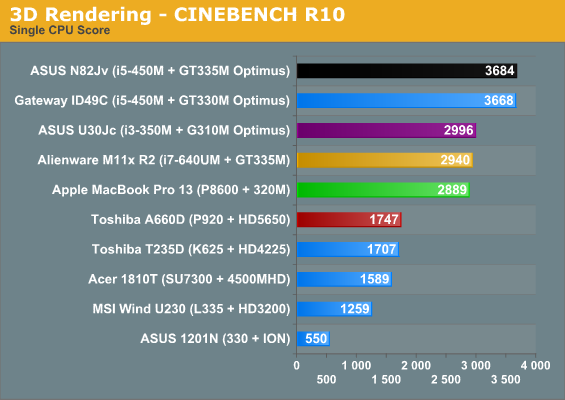
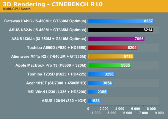
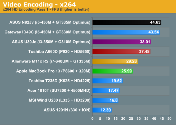
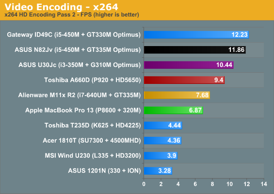
Here’s why it’s really sad: the MBP13 results would fit pretty well in our old Core 2 Duo notebook roundups, like this one from two years ago. The G50V and dv5t were $1200 notebooks back then, and they’re basically on par with the current MBP13. Quite frankly, it’s almost pathetic that Apple decided they could get away with a Core 2-based processor for another year at a price point that can get you a 14” aluminum unibody notebook with a quad core i7-720QM (HP, we’d still like to test an Envy 14, thanks). People expect Macs to cost more almost by default, but after a couple of years of the MBP13 being a decent value for a premium quality notebook (look at the old Envy 13 for comparison), it’s particularly jarring now to see it be so far behind the competition. I have none of these complaints for the Core i5/i7 sporting 15” and 17” models, however.
At this juncture, any notebook with a Core i3 can outrun the MBP. Same goes for the Core i7 ULV chip. We’ve never tested a Core i5 ULV, but we'll see the Core i3 ULV in a review shortly and it's in the same ballpark as Core 2—and the overclocked Core i3-330UM in the ASUS UL80Jt is basically on par with the MBP.
There are two ways you can look at this; you can say that at this point, anything with a Core 2 (even an old Merom) is more than powerful enough to run Windows and handle any reasonable task a thin and light notebook might be asked to. A lot of Apple fans say that. There’s another camp that says it’s completely unreasonable for Apple to sell a notebook with a Core 2 Duo processor at $1200, regardless of what it might be asked to do—there are smaller, thinner, lighter systems that perform better in basically every way. A lot of anti-Apple fans say that. They’re both right.
The Core 2 Duo is most certainly adequate to handle the normal, every day rigors of a portable notebook, but that’s not a reasonable justification for Apple selling a notebook that is more expensive than more powerful competitors. Apple is getting a bargain price on P8600 CPUs and the 320M chipset, which means the Core 2 + 320M is more about increasing profit margins than anything else. (And for those people who still cling to the theory that Apple couldn’t fit a third chip onto the board without reducing the battery size or making the notebook larger, that’s nonsense. If ASUS can manage to fit a Core 2010 processor, the chipset, and a dedicated graphics card into a system with similar dimensions to the MBP13 and a 33% larger battery, then Apple could have too. Simple as that.)
While we're here, we also ran all the 3DMark suites. This hints at the Core 2 + 320M combination being a lot more impressive than the above results, but then why couldn't Apple get GT 320M or faster with switching graphics into the system instead? Oh, right: that's only for 15" and 17" MBP. More on this when you hit the next page.
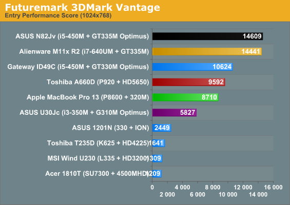
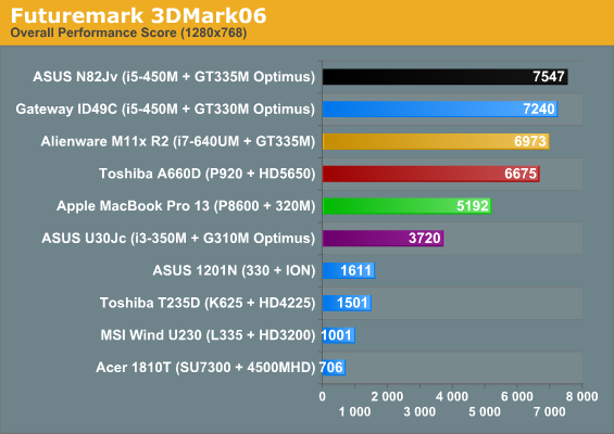
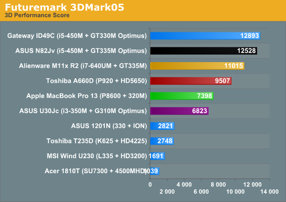
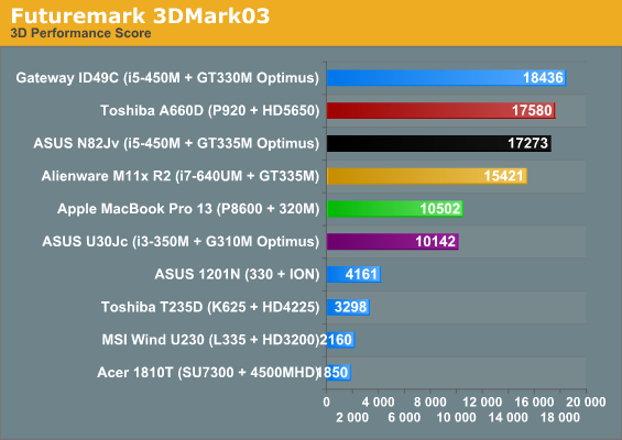
Okay, 320M looks decent, but the CPU is still old. We'll get into the graphics stuff on the next page, but while we're here looking at 3DMarks, we do have a quick question: how many of you want us to continue posting 3DMark results with our laptop reviews? We know they're a consistent point of reference for the long-term, but 03 and 05 in particular are getting very long in the tooth. So, if you want to sound off in the comments, would you like us to ditch 3DMark entirely, keep 06 and Vantage, keep all four like we've got above, or only skip 03/05?


117 Comments
View All Comments
chui101 - Thursday, October 14, 2010 - link
"I wanted to take the vaunted MBP and put it in an apples-to-apples comparison"Shouldn't that be an *Apple*-to apples comparison? :D
numberoneoppa - Thursday, October 14, 2010 - link
o ho - i see what you did there.seanleeforever - Tuesday, October 19, 2010 - link
the article is very well written. However, i would say that comparison section was not well justified.i mean.. look at the price.... if you want to do a "apple to apple" comparison, aren't you suppose to have product in the same ball park? at least for products that carries similar MSRP (i am not even talking about street price, which we all know you can easily get 30% off for all dell).
i know anand review are based on computers that send to you for reviewing at the manufacture's cost, and this chart is probably the best anand can gather. but reading this review is akin to read, say a MB S550 destroies Toyota corolla in term of comfort and features. OKAY.. what i really know is does MB S550 a better vehicle than Lexus LS600. (besdies, the Macbook seems to carry a better screen, but doesn't offer much else if you want to run windows)
i recently discovered you can easily buy a AFFS screen from ebay and swap it yourself. what this means is that instead of buying expensive tablet IPS/AFFS screen, one can just spend 75 dollars on ebay and get a 8 bit AFFS screen for computers such as Thinkpad X200/X201, which will be infinity better than TN of any kind. i am shocked that lenovo doesn't make it a option.
anyhow. good write up, but next time please do a "apple" to "apple" comparison.
newrigel - Saturday, November 27, 2010 - link
Yeah, everyone's a tech.Maxed Out - Thursday, October 14, 2010 - link
I have been running Windows 7 Ultimate from the beta stage and up on my MacBook Pro 17" (Early 2008) and have had no real problems. Before 7 I was running Vista Ultimate x64, so no real surprises. The only real gripe would be that the key (Windows=command & ALT=option) positions and the lack of a contextual menu key, but in the Mac world, right click has been frowned upon by Steve and the rest of the board, so i understand that.The only bad thing I have to say is that, yes the MacBook runs hot in Mac OS, but apple has not done anything to port the ASIC driver that controls the fans, it there for runs even hotter in Windows.
Stokestack - Friday, October 15, 2010 - link
A far bigger annoyance is the lack of a real Delete key. Alone among manufacturers, Apple has only a Backspace key (which they mislabel "delete"). Meanwhile, they have a dedicated Eject key, for seldom-used optical media. Oh, and they decided that they had to put a hardware delay on Eject, to prevent the bloody mayhem of accidentally ejecting a disc. That prevents you from remapping it as a Delete key.Apple could easily have solved both problems by replacing Eject with a real Delete key, and making Eject a secondary function on some other key (or even on the same one). Instead, they require you to use a secret two-handed key combination to delete a character. The vast majority of users spend their time arrowing to the right across the text they want to delete and then backspacing over it. Yes, that's "elegant."
The reviewer also should have hammered the asinine glossy screen, and lack of a matte option. It makes no sense: The computer most likely to actually leave the house is the one denied common-sense options like a matte screen. Glossy screens suck in all conditions; even in a pitch-black room, you see YOURSELF in the screen because you're illuminated by it. Those "deep blacks" and "rich colors" you were promised with a glossy screen are neither deep nor rich when washed out by the sheen of reflection that covers them 100% of the time.
JS - Friday, October 15, 2010 - link
I definitely prefer glossy screens on desktops. To me, seeing a vague reflection of yourself under certain lighting conditions is nothing compared to the "sparkling" surface finish of all matte screens that I have used so far.It's a matter of taste.
SoCalBoomer - Friday, October 15, 2010 - link
That would be fine - if he were reviewing a desktop. He's reviewing a laptop and on a laptop, a glossy screen is asinine! :DTros - Friday, October 15, 2010 - link
I'm using both a matte desktop screen (Samsung P2570HD) and a MBP side by side right now. Guess what. I can read things easier on the glossy high-contrast screen better than on the matte-monitor. The blacks are deeper, the whites are brighter. I can also read on the MBP outside (Texas).I would like to think that this isn't because of glossy vs matte, but because of contrast, period. I have another laptop around here with a glossy screen, and have a hard time reading it in a lit room.
B3an - Friday, October 15, 2010 - link
High contrast will make a screen easier to read and whatever, but if that MBP had a matte screen it would be yet more easy to see with no distractions. The whole point of a display is to see what's displayed on it, not to see what's reflected on it, which is also going to affect colour accuracy. Glossy screens are totally not usable as far as i'm concerned.Even in the pics posted here it looks ridiculous, imagine how much better and easier to see that screen would be outside without all them reflections over it.