The Apple Thunderbolt Display Review
by Anand Lal Shimpi on September 23, 2011 2:56 AM EST- Posted in
- Displays
- Mac
- Apple
- Thunderbolt
- Thunderbolt Display
Brightness and Contrast
For brightness, black level, and contrast points, we use the same colorimeter setup described earlier. Specifically, we use an Xrite i1D2 with ColorEyes Display Pro, and take measurements at maximum and minimum brightness of white and black targets. Dynamic contrast is turned off. We also let the panels settle in for a half hour at the respective settings before taking any measurements.
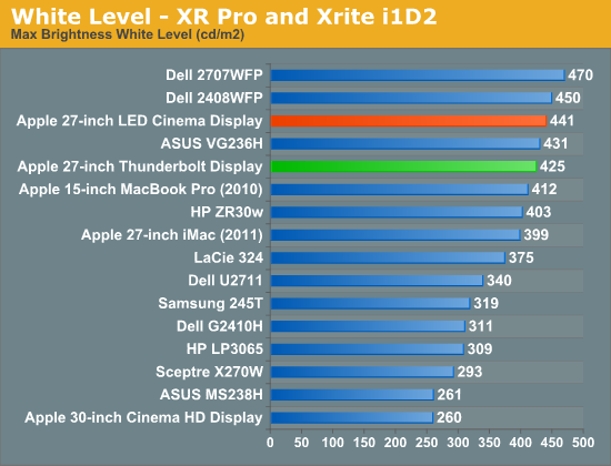
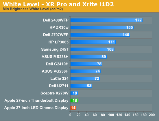
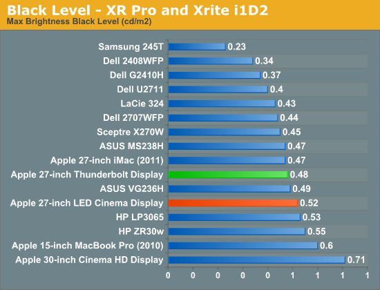
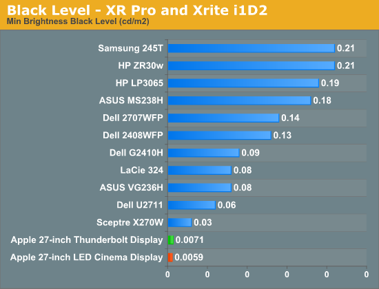
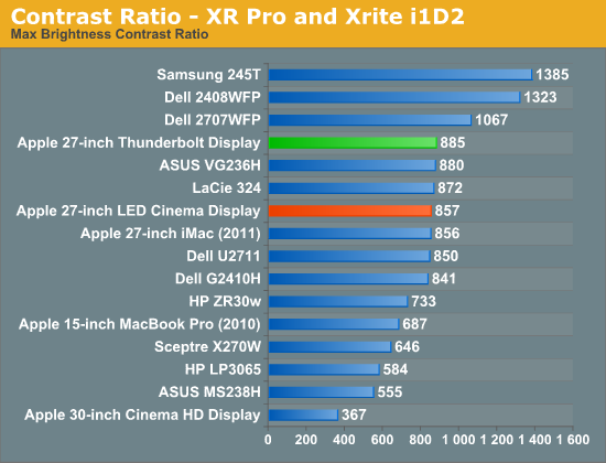
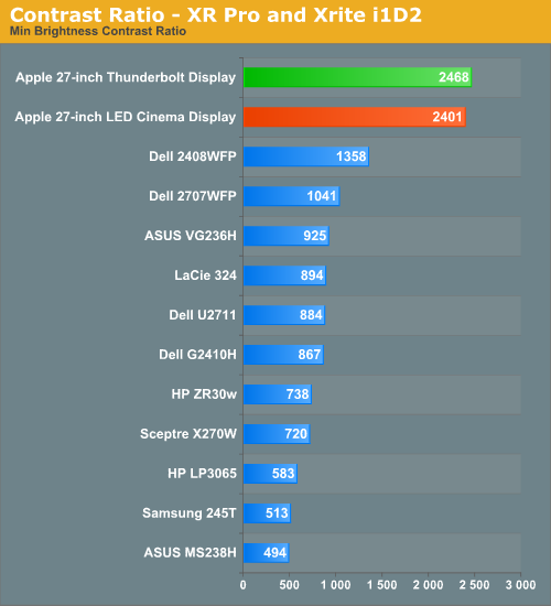
If you were expecting an change in panel quality you won't find it here. The Thunderbolt Display is almost exactly the same as last year's panel but with a bunch of new features.
Brightness Uniformity
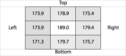
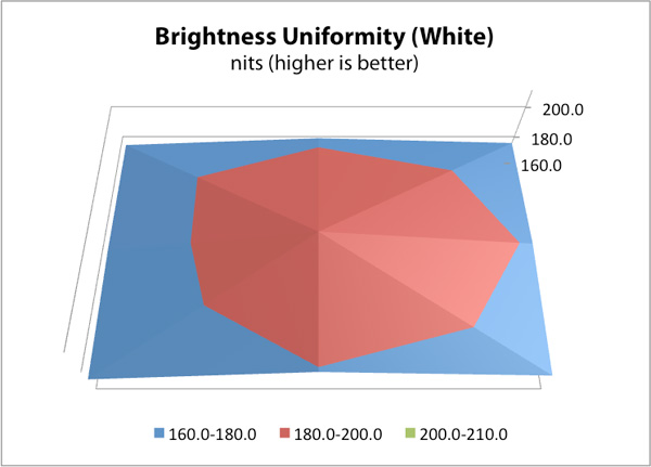
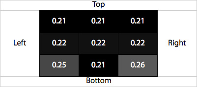
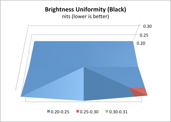
In addition to the performance at center, we’ve also added 9-point testing for brightness, both white and black. This is done the same way we measure color uniformity, except we only care about measured intensity. We set the monitor to near 200 nits, and then measure those 9 points.
The Thunderbolt Display performed very well in these tests. The display was very consistent everywhere. Although the center of the panel measured about 8% brighter than the surroundings, it wasn't noticeable in actual use. Brightness uniformity was remarkably consistent through the majority of our measurements, even better than the original 27 we reviewed last year.
White Level Uniformity
Black Level Uniformity
Viewing Angles
The Thunderbolt Display uses an IPS panel which guarantees good horizontal and vertical viewing angles. It doesn't matter how you tilt the display or from what angle you're looking at it (within reason), you'll get a fairly consistent image.


275 Comments
View All Comments
V4lkyri3 - Friday, September 23, 2011 - link
Maybe I'm slow to the party, but I'm loving this video review Anand.Valkyrie.
mfenn - Friday, September 23, 2011 - link
Agreed!GeorgeH - Friday, September 23, 2011 - link
It was a very well-done video, everything from lighting and sound to the presentation was very well done.Hopefully you use video reviews as more of a supplement where it's appropriate though (case reviews with videos would be great.) I can read much faster and than I can listen, and it's much easier to search and reference text.
dragonsqrrl - Friday, September 23, 2011 - link
+1! Love the way Anand and reviewers have been using these video's to supplement the written content, it's a great added bonus.And I agree, it would be great for things like case, monitor, and smart phone reviews, things of that nature, but not so much for a hard drive or SSD reviews, for instance. And it seems like that's precisely the way the video reviews have been used thus far.
Great stuff...
Operandi - Monday, September 26, 2011 - link
For one it is a very concise version of the full review, and it complements it very well. Just the quick and dirty info on what Apple has been up to, and as this will do nothing for me as a PC user I now know I can stop there; if I want more detailed info I have the full review at my disposal, pretty cool. The other obvious benefit is the video format itself has advantages over still images for products such as this.Also great work on the video and audio production, it looked and sounded great. The set is almost too minimalistic though, might want to experiment there.
tech6 - Friday, September 23, 2011 - link
+1 - Nice work - looks and sounds professional. More please.leodc - Friday, September 23, 2011 - link
You are are quite a fluent speaker, Anand! You spoke continuously for more than 5 minutes without meandering, drifting.... Impressive.ImSpartacus - Friday, September 23, 2011 - link
I agree. I love how he leaped into the anecdote without throwing an annoying intro on the screen. Anand's performance was engaging; I love listening to where he thinks the industry is going.B3an - Friday, September 23, 2011 - link
It's well made but it annoys me how he puts this much effort in to Apple products and only makes a video of this quality for something by Apple. Also in Anandtech articles theres very often better quality photos for Apple stuff, in comparison to other articles for anything else. More effort is put in to lighting, location, and camera shots. On a whole Apple articles just seem better presented and it just makes the site seem bias and like some fanboyism exists.Stas - Friday, September 23, 2011 - link
Or they just get paid to do it right. Other articles they do on their own initiative. I'm sure, if a company stepped in and paid for a review, they would do it just as well, as Apple's.