Cooler Master Cosmos II: Large and in Charge
by Dustin Sklavos on January 23, 2012 3:20 PM EST- Posted in
- Cases/Cooling/PSUs
- Cooler Master
- Full-Tower
Assembling the Cooler Master Cosmos II
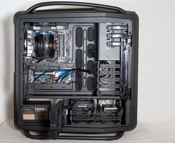
Part of the problem with assembling the Cooler Master Cosmos II is that it looks exponentially more complicated than it actually is, and the instruction manual on their website isn't as useful as I would like it to be. Assembly is really fairly simple; the Cosmos II is an oversized ATX case, but in terms of layout Cooler Master hasn't done anything radical here.
Owing to the copious internal real estate, getting the motherboard in is a breeze, but when you're paying $349 for an enclosure at least having the mounting studs preinstalled would've been appreciated. Some of Corsair's enclosures actually have the center stud already installed to use as a guide for getting the rest of the screws in place; why not have something like that here to make life a little easier? Installing the video card is painless as well; Cooler Master uses thumbscrews for the expansion slots but they're in pretty tight and you'll want to use a screwdriver regardless.

Installing the 3.5" and 2.5" drives is just as easy; Cooler Master uses the same trays for the top and bottom drive cages, and for 3.5" drives you just slide out the tray, snap it around the sides of the drive, and slide the tray back in. 2.5" drives need to be mounted with four screws to the bottom of the tray, but this is par for the course. Where things get dicey is the 5.25" drive bay. The bay shield pops out easily enough thanks to the lever on the left side (though it feels a bit fragile), but the "push-button" locking mechanism for the optical drive is dire and I wouldn't trust it. It's better to screw in the other side of the optical drive and call it a day, but this is not one of the better toolless systems I've seen for mounting 5.25" drives.
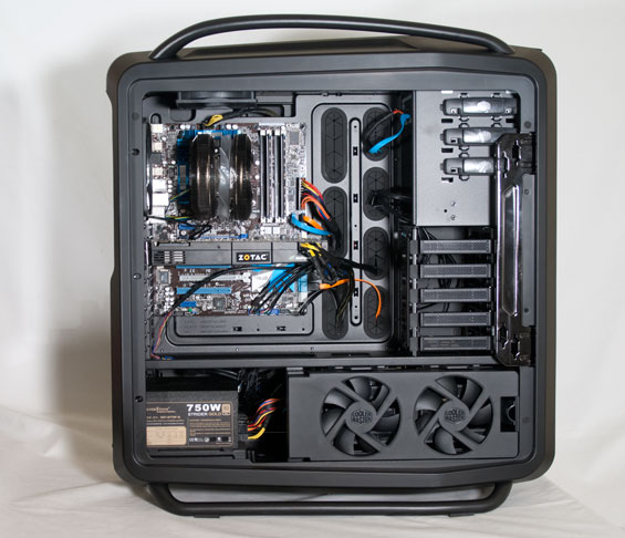
Finally, getting the power supply in and the cables all routed proved simple enough; there's just enough space between the PSU and the bottom drive cage to plug in modular cables without too much discomfort, but the mounting bracket for the PSU affords you a little more real estate if you need it. Cooler Master also smartly includes an extension cable for the AUX 12V line; our power supply didn't need it, but the cable was stretched about as far as it could go (and this is true for most of the power leads, actually). Finally, there's a healthy amount of headroom at the top for plugging in the AUX 12V, owing to the space needed to mount a full 360mm radiator.
I'm not ashamed to admit the most confusing part of the assembly was actually figuring out what the heck all the two-pin leads coming off of the top control panel were. There's a massive braid of them in the case, and these turned out to be the LED controls. You'll want to tuck these leads behind the motherboard tray (along with the extra fan headers) as only the front intake fan actually uses the LED lead. I did like that there's no dedicated power indicator lead for the motherboard front panel headers; given that the power button is powered by the same molex connection that powers the fan controller, what purpose is there for one? Yet you'd be surprised how many enclosures include one anyhow.

Ultimately, assembly and cable routing was really very easy, which is the major perk of a case of this magnitude. The worst part was trying to get the case to lay flat on the table, and then having to manipulate it to route cables, install parts, and so on. The case is very large and that makes it a bit awkward to manipulate, but in the end it's not hard to produce a nice, clean assembly in the Cosmos II.


53 Comments
View All Comments
zappb - Monday, January 23, 2012 - link
Oh yeaDeath666Angel - Monday, January 23, 2012 - link
it just doesn't look very pleasing to me. Too much "1337 gamz0r pwn4g3".But that's just me. :-)
ReachTheSky - Monday, January 23, 2012 - link
I'd be proud to own that. I'm honestly getting a bit tired of minimalism. There's not a whole lot of flashy "HEY LOOK HOW BADASS I AM!" cases that are also functional.Death666Angel - Monday, January 23, 2012 - link
Like I said, just my own opinion. Nothing more, nothing less. And "badassness" and "functionality" are also very subjective, I wouldn't give this case high marks in either category, much less so considering the price. :-)michaelheath - Monday, January 23, 2012 - link
Agreed. This case is aimed at the crowd of people who pay through the nose for features that accomodate the other components they paid through the nose for. As a person who lives within his means and requires no more case than what provides room for a modest gaming/entertainment machine, the Cosmos II is pretty overboard in most aspects, and I could put $350 to better use.Sabresiberian - Thursday, January 26, 2012 - link
Actually, I think this case is made so people like you can get swelled heads about how well you manage your money.I have a suggestion: give up your gaming/entertainment altogether. After all, it's really nothing you actually require. It's not only a waste of money because you spend it on things you don't need, it's even more a waste of money because it takes up your time, as well, time you could be using to make money instead of spend it.
;)
aguilpa1 - Wednesday, January 25, 2012 - link
At this price I honestly expected it to have an integrated liquid cooling radiator with dual fans not just holes for one. I like to buy high end stuff but I still expect to get my money's worth. This isn't it.ZeDestructor - Tuesday, January 24, 2012 - link
You'd like the Lian Li PC-A71F then. Its a big, black monser of a case that I'm planning to build my next rig in, complete with dual watercooling radiators...Tetracycloide - Wednesday, January 25, 2012 - link
The thing is, it's really not that flashy in many respects. They basically took an ostentatious design and painted it matte black. Why they wouldn't go with cleaner lines or a color scheme that better accents the lines it currently has I have no idea. I think it fails on the aesthetic front by trying to split the difference between minimalism and snazzy, never quite reaching either and attempting to appeal to two tastes that are fundamentally opposites.Tetracycloide - Wednesday, January 25, 2012 - link
Now that I've looked at it a little more and seen some additional close up shots from other review sites I've decided to change my mind. The case is flashy but in tasteful way although the tastefulness is largely left up to the builder. The mesh areas have a unique polygonal design layered into them that's almost fractal. With the matte black brush aluminum finish and the right color backlights (blue was the wrong choice IMO) the case could be very beautiful. Personally I'm thinking amber LEDs myself. Without backlighting many of the aesthetics of the case are lost IMO and it just looks like minimalism in areas that don't make sense because the other areas aren't very interesting without lights so the minimalist areas don't contrast with them enough. If you can imagine those areas backlit with LEDs it's a completely different case. The unlit pictures don't do it justice I think.