Capsule Review: Corsair's Vengeance M60 and M90 Mice
by Dustin Sklavos on February 22, 2012 2:45 PM EST- Posted in
- Mouse
- Peripherals
- Corsair
- Input Devices
The Corsair Vengeance M60 and M90 Gaming Mice
Here's a prickly subject if ever there were one: while with keyboards you could reasonably argue for the superiority of using mechanical switches over traditional rubber-dome membrane keys, mice are much, much more a matter of preference. A mouse could have all the features you're looking for, but if the grip isn't right or the texture makes you hand clammy the whole enterprise can be a bust. Understanding how delicate the balancing act of a good mouse can be, Corsair has come up with matching mice for their new gaming keyboards.
The new Vengeance M60 is geared for FPS players with an innovative "Sniper" button while the M90 targets MMO players who'll use as many configurable buttons as they can find. In terms of styling and intended use, the M60 theoretically should be paired with the K60 keyboard while the M90 goes with the K90, though you can obviously mix and match as you see fit. The real question is how well they actually work in practice.

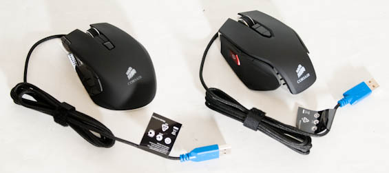
Corsair Vengeance M90 (Left) and M60 (Right)
While Corsair's Vengeance keyboards had a pretty obvious progression, with the K90 being almost directly superior to the K60, the mice are definitely different creatures, sporting very different features and different grips. The only commonality between the two lies in the sensors (both use lasers rated for up to 5700dpi) and the ability to adjust sensitivity between three settings on the fly using Corsair's Dashboard software.
They also come with different price tags, though the difference isn't as great as the keyboards: the FPS-oriented M60 runs $59, while the MMO-oriented M90 clocks up at $69. These are fairly high prices but still essentially comparable to similar products from other vendors (and actually substantially cheaper than a lot of Razer's offerings).

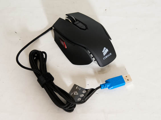
The Vengeance M60 sports the standard mouse button configuration (left and right, middle mouse on the mouse wheel) along with back and forward buttons on the left side. Corsair's innovation here is the "Sniper" button, the big red button on the left side that, while held, drastically reduces the mouse's sensitivity to allow for more precise aiming. Below the mouse wheel is the mouse sensitivity indicator along with the sensitivity adjustment buttons, but it bears mentioning that all of these buttons can be reconfigured in Corsair's software. The underside of the M60 also features something the M90 lacks: three removable weights.

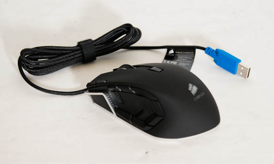
For the Vengeance M90, Corsair ditches the open-bodied grip and substantially changes the left side of the mouse. The sensitivity buttons are relocated to the top left next to the left mouse button, and then the thumb grip region includes a staggering nine configurable buttons. This is very different from the Razer Naga, which has twelve buttons arranged in a three-by-four grid; Corsair has essentially designed the M90 to have a button within range no matter where you click.
Like the M60, all of the M90's mouse buttons are configurable, and you can even configure a button with the M60's "Sniper" function. With the M90 you also gain a toggled backlit logo under the palm, but you lose the adjustable weight.
Finally, both mice come with braided cables, and neither comes with a software disc: you'll have to download Corsair's Dashboard from their website. It's probably just as well; I can't remember the last time I actually needed a driver disc and didn't just download the most recent drivers.


40 Comments
View All Comments
stimpack99 - Wednesday, February 22, 2012 - link
... are currently poorly designed by most manufacturers, even logitechs new ambidextrous mouse sucks. The button placement is all wrong.I swear the people designing these things aren't gamers. I'd really like a good dpad on the side of the mouse below the "web browser" forward/backward buttons. Either that or scrap the browser buttons entirely and put good quality gamepad like buttons on it oriented like you would have on a gamepad. It drives me insane that so-called gaming mice are just marketing labels for crappy mice.
cigar3tte - Wednesday, February 22, 2012 - link
I can't understand why all the mice have the thumb buttons laid out horizontally. Vertical buttons seems so much easier to hit both.moriz - Wednesday, February 22, 2012 - link
the idea with the horizontal placement is that you place your thumb over both, and rock back and forth on the second joint to press the buttons. this is way faster than repositioning your entire thumb up and down.Omega215D - Wednesday, February 22, 2012 - link
The MS Sidewinder line of mice had the vertical thumb button placement (save the X3 which has one on each side as it's ambi). They were pretty unique and the buttons functioned well. Their designs were ok but I would rather have the Logitech MX518/ G400 or CM Storm Spawn/ Xornet style bodies.MS should make a new Sidewinder mouse that's like the IME with 2 vertical thumb buttons or 3 horizontal thumb buttons (like Logitech's G500 as I'm always in need of a 3rd thumb button).
realjetavenger - Thursday, February 23, 2012 - link
I agree that verticle placement of the thumb buttons makes more sense. But on the sidewinder mice I found the bottom thumb button placed too low. I always had a problem hitting that button since my thumb would be hitting the desktop moreso than the button itself and it just wasn't comfortable, for me. But this is another great example of how personal the feel of any mouse is. Again, love the idea of verticle placement, but in this case it just didn't fit my hand very well.mclazer - Wednesday, February 22, 2012 - link
You are a perfect example to highlight the truth of the first paragraph of the article.Sounds like you are not satisfied with the feel/button placement of any gaming mice and are attributing it to cheapness/marketing labels.
I can empathize however. Since you never know if you will like a mouse until you have it in your hands it almost forces you to buy a whole crap ton of mice to get the one you want. I'm pretty picky also and went through almost 20 mice until I found the Roccat Kova+.. thats the one for me :D
sking.tech - Thursday, February 23, 2012 - link
Exactly! My God, have I gone through a crap-ton of mice!!! I still haven't found one that feels like the perfect fit. I wanted to love the cyborg mice as they look fantastic but, so far they leave a lot to be desired, same for razer, same for most logitech's - I'm using the m705 marathon currently - not a great gaming mouse but, not too bad - but, it's pretty comfortable as far as grip and long use time.The M60 here looks pretty good, hoping to get my hands on one soon!
Sabresiberian - Wednesday, February 22, 2012 - link
One of the "problems" with mice with a lot of buttons is that you have to be willing to figure out how to use them for your app(s) and then spend time adapting to the mouse. No matter how well the buttons are placed (and some of them aren't placed well at all on every one I've seen) you are just going to have to learn how to use it right - especially for gaming when you have to do things fast without thinking about it.It's pretty much like learning how to type again - well, simpler than that, but that kind of thing. Before you buy one you should consider whether or not you have the aptitude to go through all that. I think it's worth it in the end, but it isn't an instant-gratification thing.
;)
ckryan - Wednesday, February 22, 2012 - link
The Logitech MX1100 is more my speed, which is unfortunate, since they've not made that mouse for some time.Impulses - Wednesday, February 22, 2012 - link
Same here, I'm hoping mine holds up for a few more years since I haven't found a siecle wireless replacement. I was intrigued by the R.A.T. for a while but kept hearing about too many QC issues.