Google Nexus 4 Review - Google's new Flagship
by Brian Klug on November 13, 2012 8:45 AM EST- Posted in
- Smartphones
- LG
- Android
- Mobile
- APQ8064
- Nexus 4
- Android 4.2
- MDM9215
Camera - Stills and Video
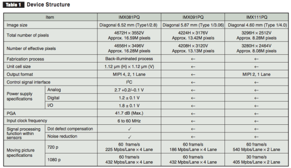
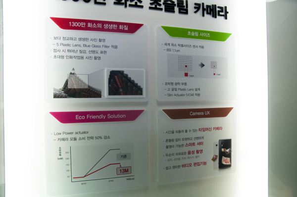
The Nexus 4 includes the same 8 MP optical system as the 8 MP configuration on the LG Optimus G. It’s interesting to me that Google went with the 8 MP system for its Nexus, as the 13 MP system is an option for the Optimus G and seems to have gained a lot of traction on some carriers and in some regions. The tradeoff is the 13 MP option incurs a z depth penalty and results in the module sticking out about one millimeter or two from the back of the device, the infamous “camera bump” that everyone is spending tons of money and time trying to eliminate. The 8 MP option however lies flush with the back of all Optimus G designs I’ve seen, and it’s this one Google chose for the Nexus 4. Both the 8 and 13 MP Optimus G configuration use 1.12 µm square pixels and a 5 P (5 plastic elements) optical system. The difference in optical format (the 13 MP CMOS is physically larger, 1/3.06“ for 13 MP vs 1/4.0” for 8 MP) is what necessitates a larger z depth for the optical system, hence the z-height penalty and infamous camera bump.
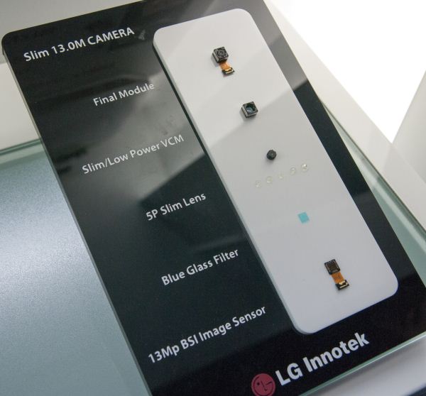
LG Optimus G - 13 MP Camera system, 8 MP system inside Nexus 4
I’ve done my digging on the Nexus 4 and found that it has a Sony IMX111 (PDF) CMOS for the rear facing camera, which again is 1/4.0“ optical format with 1.12 micron square back-illuminated pixels. The focal length on the Nexus 4 is 4.6mm according to EXIF, and curiuosly enough there’s no F/# given. I highly suspect that the 13 MP Optimus G uses the IMX091 from this same family.
The front facing camera is Sony IMX119 which has 1.4 micron pixels, 1/7.8” format, and 1.3 MP overall resolution. This matches up nicely with some comments from Googlers about the Nexus 4 having a Sony BSI CMOS sensor.
I wager for most people the Nexus 4 will be the first real exposure to the 1.1µm class of pixels. Over the course of my time paying attention to smartphone camera optics as a reviewer (outside of the optical engineering context) I’ve seen mobile CMOSes go from 1.75 micron pixels to 1.4 micron and now to 1.1 micron over the course of a few generations. If we consider an incoming photon in the red, thus with a wavelength of around 700 nm (0.7 microns) that’s a step from 2.5 waves, to 2 waves, to 1.5 waves — it’s now obvious where those pixel pitch numbers came from. Pixel geometry can’t really get much smaller than one wave in the red (the longest wavelength in the visible) without odd quantum nonsense happening, so I suspect 1.1 micron will stick around at least for a while. Of course the benefit of this smaller pixel geometry is smaller overall CMOS size, and the possibility to deliver thinner devices, the downside is less area to integrate over, higher noise from higher drive voltages, potentially less dynamic range, and an even more challenging Rayleigh criterion for already very constrained camera optics to meet.
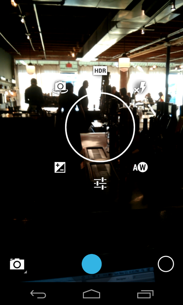
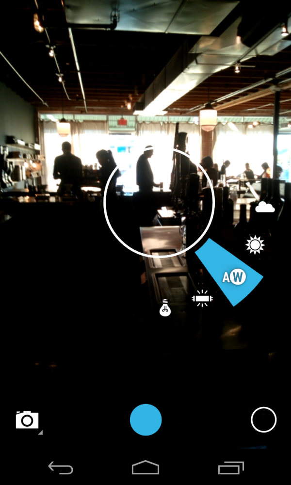
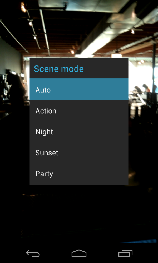
I mentioned that Google has made a number of changes to the camera UI in Android 4.2. That’s putting it lightly, as the UI is almost completely redesigned now. Settings are accessed either by pressing on the circle or tapping and holding on the preview. Settings can then be modified by either tapping or holding and dragging to the setting you’re interested in. This is a nice new take on settings for camera UIs, and includes access to manual exposure control, front facing camera, flash settings, white balance, HDR shooting which is new in Android 4.2, and additional settings (shooting scenes, location storage, and resolution). I think the UI design here is nicely done.
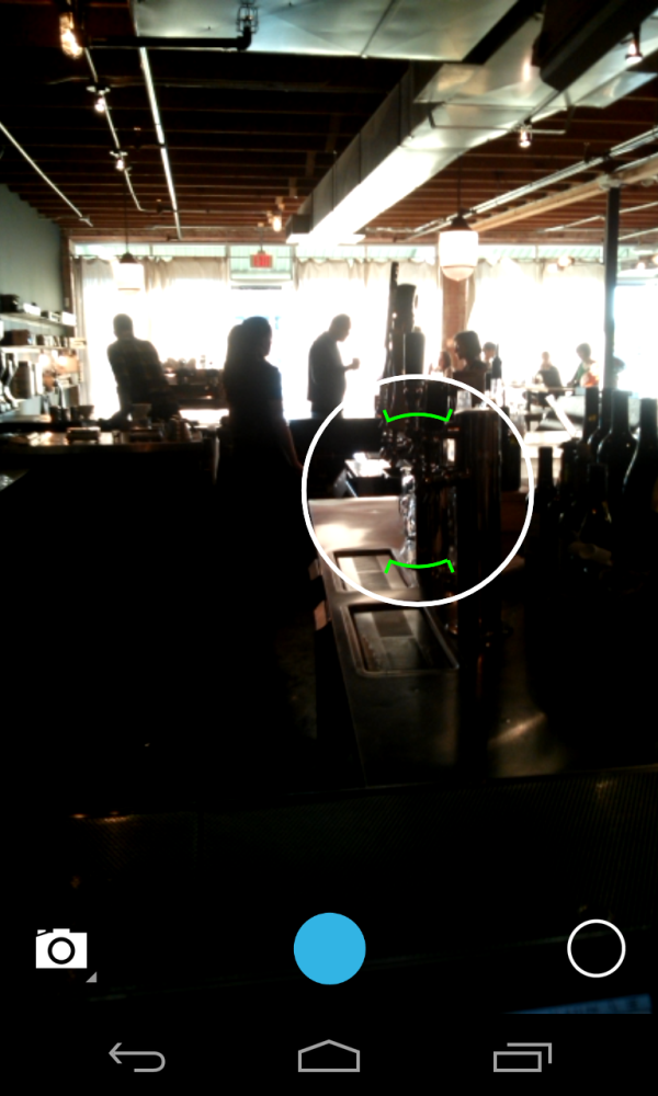
When it comes to the preview however, I still feel like Google’s execution is less than perfect. First, the preview resolution could be higher. I’m not sure what subsampling or resolution this preview is, but part of having users perceive your smartphone as having a good camera is presenting a high resolution, high framerate preview, and this seems to be something many Android phones still don’t nail. It doesn’t have to be native, just high enough resolution that users can tell whether the image is in focus or not. Going into HDR shooting mode results in an even lower resolution preview as well. And that is my problem with the Nexus 4 — the preview isn’t high enough resolution to tell whether you’ve nailed focus, and the AF routine running on the camera seems to often miss focus. Tapping to re-focus often also doesn’t always trigger another autofocus run if the reticule is showing green (when the camera thinks it’s in focus). With the Nexus 4 I often have to completely recompose in order to refocus, even when I know the camera isn’t focused. Google went through a number of iterations of this behavior with the Galaxy Nexus, so I have no doubt the same will play out here with the Nexus 4.
My other main gripe with the Nexus 4 camera UX is a big one, and it’s something I felt very passionately about in our iPhone 5 camera review. The Nexus 4 makes the same annoying UX decision as the iPhone 5 and shows an aspect-crop in its preview instead of the full field of view. Put simply, the top and bottom of the image are cropped off in the preview, but appear in the image. I realize that this eliminates letterboxing in the preview and makes it take up all of the usable display space, but what you see is not what you get at all when taking pictures on the Nexus 4. This is a huge problem, since taking compositionally good photos requires, surprise, being able to properly frame a photo based on your viewfinder or preview.
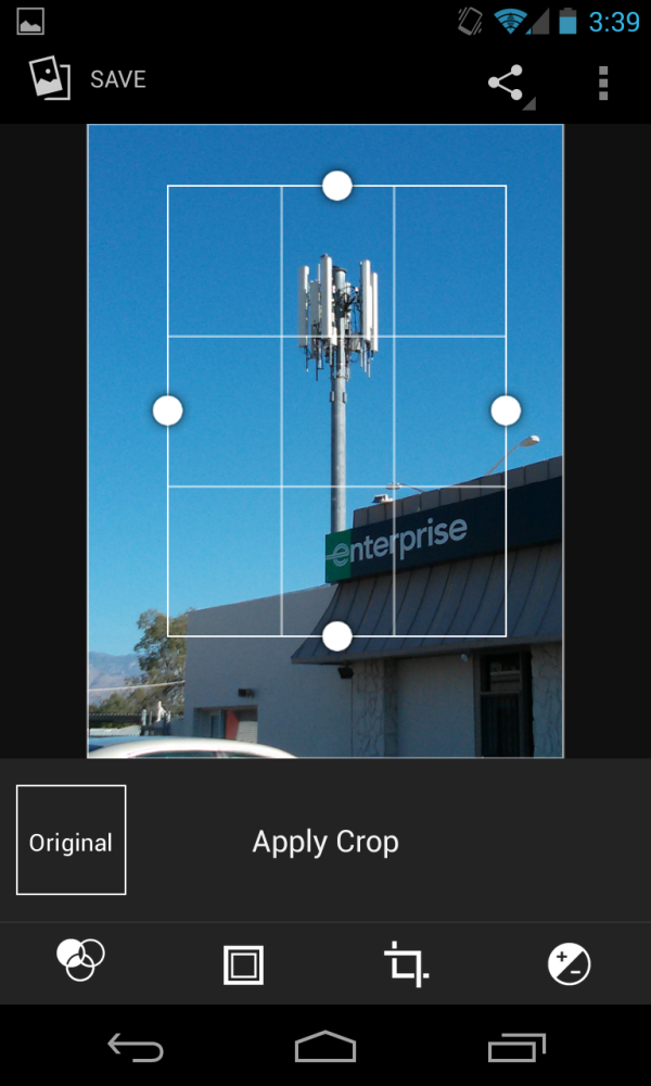
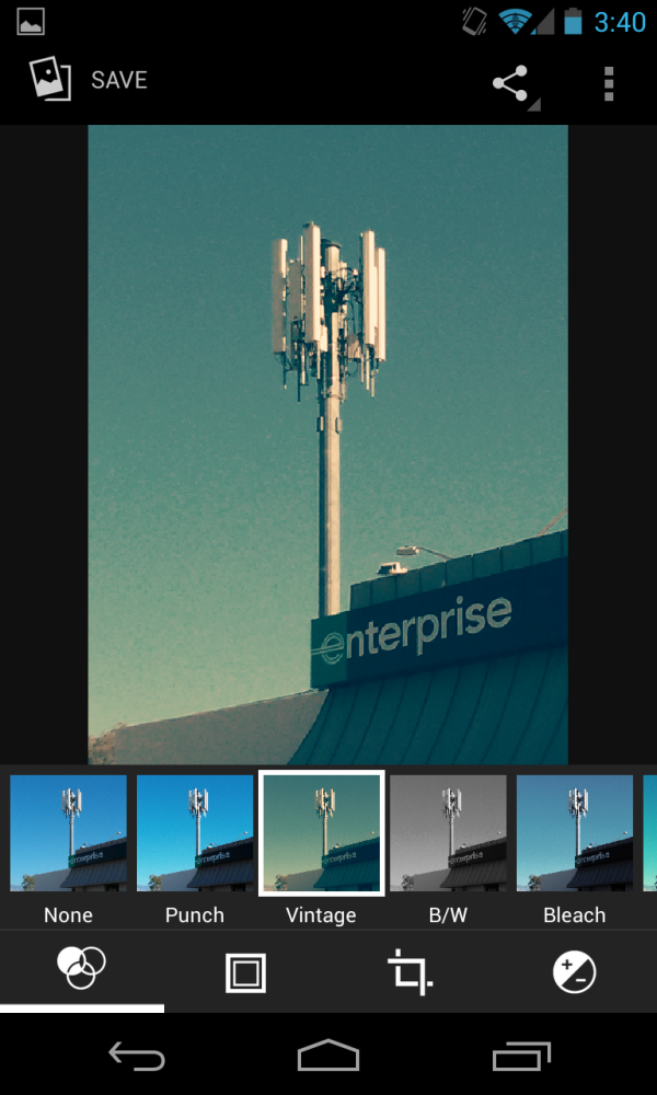
New filters in Gallery from Android 4.2
Viewfinder accuracy is a huge deal for DSLR shoppers, and having an LCD preview that represents 1:1 the CMOS imaging area is a huge advantage with digital cameras, so it absolutely blows my mind that trend with showing a crop because otherwise there would be bars is a thing for smartphone camera UX lately. The aspect ratio difference between camera photo and preview is pretty extreme because almost all camera CMOSes are 4:3 aspect ratio and 16:9 (720p) or 15:9 (1280 x 768) has won for most mobile displays, but this trend of showing some kind of crop needs to stop now for smartphones. An alternative is for UX designers to go with the default camera preview showing a crop, but give an aspect-correct option where the preview represents the framing you’re going to get out of the camera actually taking photos.
So how does the Nexus 4 fare at capturing still images? For this we turn to our usual smartphone camera test set, which consists of photographs taken of a test scene in a lightbox with the lights on and off, of three tests charts; ISO12233, distortion, and the GMB colorchecker card, photos at the usual smartphone bench testing locations, and finally miscellaneous photos taken during my time with the Nexus 4.
Starting with the misc. photos I’ve taken with the Nexus 4, I find myself thinking that camera performance is really quite bimodal. In broad daylight the Nexus 4 can take some surprisingly decent shots as long as you’re not looking at them at 1:1 resolution. Viewed like that, you can see just how aggressive the anti-noise smoothing is even in good lighting on the Nexus 4. The Android 4.2 HDR mode also makes a significant difference in end results too, for example with HDR turned off, and with HDR turned on. Indoors in lower light however the Nexus 4 definitely struggles to produce well exposed results or even hit focus. Again I have to note that I have many duplicates from where my Nexus 4 missed focus and I was forced to take a few more shots to get one totally in focus.
Distortion is well controlled on the Nexus 4, colors and white balance in my test lightbox are definitely off however and have a very yellow cast of both the lights on scene and the GMB colorchecker card. I took an ISO12233 chart sample, but again thanks to the fact that the preview isn’t the end result I wasted a lot of time trying to align and get a photo with it properly cropped for actual comparisons.
I don’t want to sound negative about the Nexus 4 camera experience, since this is a huge step forward for Google over the Galaxy Nexus both in terms of UI and imaging quality. At the same time there’s a lot of opportunity for iterative improvements even in just software that will dramatically help the Nexus 4 imaging experience.
Video
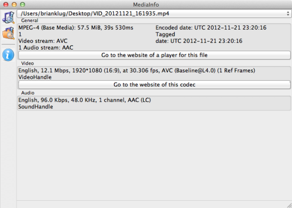
Video encode on the Nexus 4 uses Qualcomm’s encoder onboard APQ8064, which is capable of encoding up to 20 Mbps baseline, mainline, and high profile H.264. Like the Optimus G, Google has selected H.264 1080p30 at 12 Mbps baseline for encode on the rear facing camera.
I recorded my rear and front facing test videos at the usual location and when I got home was very shocked to see that the rear facing video had many dropped frames and had a resulting bitrate significantly below the encode target.
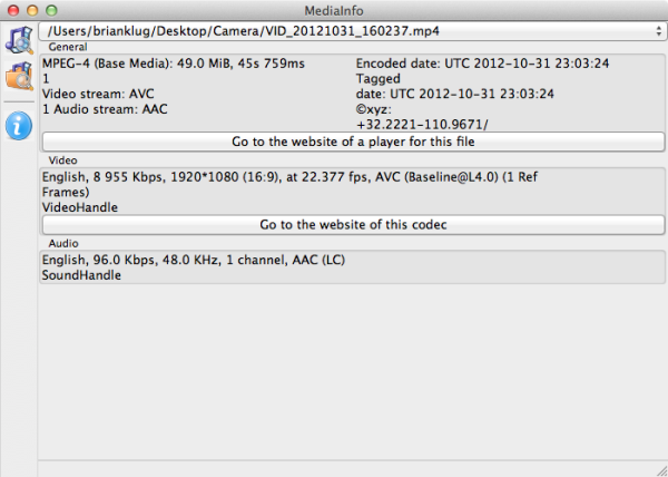
MediaInfo Pre-Nov 13 OTA Update
The video noticeably stutters and is not acceptable quality at all from a mobile device, clearly there was something wrong with either priority or parameters set for the encoder. You can grab the original videos from the Nexus 4 from our servers here. I pinged Google about this when I first saw it and as I write this the final 4.2 OTA has been pushed out to the Nexus 4 which appears to fix this encode quality issue. I’m going to hold off on saying much more until I get the chance to go re-shoot video at the test location, but this does appear fixed based on a video I recorded in my office quickly. I should note that there were some video electronic image stabilization issues with Galaxy Nexus that went much the same way back when I was working on that review.
Google has also improved the time lapse video record functionality on the Nexus 4 and lets you set even more arbitrary time lapse intervals in the video UI. I recorded a number of time lapse videos on the device, both of me driving down Campbell and doing a homebrew pumpkin beer bottling with friends. These don’t have any issues with encode (no dropped frames) and nail the 12.0 Mbps 30 FPS target, unsurprisingly.
Update: I promised I would re-shoot the Nexus 4 bench video now that the final release OTA image is out. This time, the video recorded on the Nexus 4 doesn't have dropped frames and shows the 12 Mbps H.264 1080p30 that I expect. I've uploaded the Nexus 4 video to our servers (60 MB) and also to YouTube.
The Nexus 4 video quality is now adequate by no longer dropping frames left and right, but isn't what I'd call best in class among smartphones that record 1080p30. I can see compression artifacts in the shadows and audio is still single channel AAC that still sounds like it was recorded under water.






188 Comments
View All Comments
dae_aosp_omg - Tuesday, November 13, 2012 - link
Good job seriously.Brian Klug - Tuesday, November 13, 2012 - link
Thanks :)Hopefully minimal errors in here, working on no sleep this time!
-Brian
WiWavelength - Tuesday, November 13, 2012 - link
Hi Brian...Since the Nexus 4 is a 3GPP only device, shouldn't the entry tag be the MDM9215, instead of the MDM9615?
AJ
Brian Klug - Tuesday, November 13, 2012 - link
Yeah you're right, I just tab-completed and it went with 9615 since we don't have a 9215 tag yet, fixing!-Brian
blanarahul - Sunday, July 7, 2013 - link
"I heard that a smartphone based on the Optimus G would be the next Nexus phone and was quite simply blown away. Nexus has rarely been first to the latest and greatest in terms of hardware platforms, and certainly there was no way that combination would be inexpensive. For Google to nail the next Nexus phone it would have to be a combination of both"The first time I read the article, I agreed with this sentence. But now I don't. HTC J Butterfly was released two months later. And it is the only phone (apart from Nexus 4) which is competitive in 2013. It would have been best if the next Nexus was based on HTC J Butterfly. Even if it ended up costing 50$ more.
chrone - Tuesday, November 13, 2012 - link
thanks for the storage benchmark! nice improvement there over galaxy nexus. :)at80eighty - Tuesday, November 13, 2012 - link
Brian, sorry to threadjack - any clue when you're expecting the Lumia 920 review to happen? just curious what AT's take on the weight is, more than anything elseJedi2155 - Thursday, November 15, 2012 - link
"The other common design element between the Optimus G and Nexus 4 is that nonconductive metallic plastic ring which extends around the perimeter of the device. This is something that comes off as tacky in the US market but (I’m told) is still a somewhat attractive motif in the Korean market."I love how you described a chrome band here...haha.
krumme - Tuesday, November 13, 2012 - link
Agree. The part about the camera is a new benchmark for reviews!I would like som other performance test, but know its difficult.
soccerballtux - Tuesday, November 13, 2012 - link
+1.Going forward, I expect (Freezer) tests added to Anandtech's benchmarks. Please also add this to the benchmark comparison tools.