OPPO Find 5 Review
by Vivek Gowri on May 29, 2013 6:55 AM EST- Posted in
- Smartphones
- Qualcomm
- Mobile
- APQ8064
- OPPO Find 5
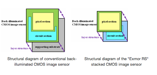
The Find 5 was noted to be using Sony’s Exmor RS branded 13MP camera sensor pretty early on, with OPPO releasing preview images taken on a preproduction device way back in December of last year. This sensor, the Sony IMX135, is the next generation version of the IMX091PQ sensor found in devices like the Optimus G and the Galaxy S4, and can also be seen in Sony’s own Xperia Z. The two sensors basically cover the who’s who of current flagship smartphones between them, other than the HTC One. IMX135 is a 1/3.06” stacked CMOS with 13.13 effective megapixels and on-sensor HDR. The stacked structure part means that the pixel and circuit sections of the sensor are layered, as seen in the Sony-provided diagram below.

This layering replaces the supporting substrates used in conventional backside-illuminated CMOS sensors, allowing for a much more compact overall image sensor size. It’s definitely an interesting piece of tech, though the use of this sensor definitely points to an emphasis on megapixel count. As Brian has covered many times in the past, sensors with more densely packed pixels have less light sensitivity and dynamic range than sensors with larger pixels, so the presence of on-sensor HDR capability for both stills and video is definitely an important one given the 1.12um pixels in IMX135. The front facing camera uses the Samsung S5K6A3 sensor, which can also be found in the Galaxy S3 and Galaxy Note 2.
Optically, the Find 5 also has an F/2.2 lens and a focal length of 3.85mm. It shares a lot of the imaging characteristics of the Galaxy S4, which makes sense given the hardware-level similarities. The image processing is different, but it’s still a sensor with a very high spatial resolution that does a great job in well lit situations and seems to suffer when light sensitivity or dynamic range is important.
I took the Find 5 with me on a spring break trip to Hawaii and used it as my primary camera. It was pretty solid, but low light is a problem, particularly when objects are far enough away to not be impacted by flash. It’s impressive, when you look casually at the pictures coming out of modern smartphones in the right situations, to consider how far we’ve come in the last few years.
Compared to the HTC One, the OPPO is pretty competitive in bright outdoor shots, and definitely better when looked at 1:1. The low light story is a bit different - the One is just a lot better, and the lack of a night mode on the OPPO hamstrings it even further. Even shooting with HDR, the OPPO isn’t close. The dual LED flash is okay indoors and particularly with nearby subjects (within 5 feet) it does quite well, but relying on it outdoors in the dark will result in a near-useless picture.
Taken at night with the OPPO Find 5, Normal shooting mode with flash.
The lack of advanced camera settings really doesn’t help here. The camera interface is pretty simple, with a brushed metal feel and clearly laid out controls, but you don’t get access to critical functions like shutter speed, white balance, ISO, etc. The exposed settings are resolution, self-timer, face detection, geotagging, and a grid overlay for the UI. Other than that, you get the three shooting modes (normal, HDR, and panorama), as well as a flash control and toggles for front/rear camera and photo/video recording. It’s pretty light on settings, though for the purposes of most smartphone camera users it’s adequate. From a camera control perspective, this is not much better than Apple in terms of how little of it you actually get. The other disappointing thing about the camera interface is that the preview image runs at roughly 20 fps, which is a noticeable but mild annoyance while taking stills.


39 Comments
View All Comments
Kristian Vättö - Wednesday, May 29, 2013 - link
I agree with you on the button layout. Power button on the side design might be okay if you're right-handed as your thumb can easily reach the button but I can say from experience that it's awful if you're left-handed (like me). Given the size of the current phones, it's very, very hard to securely reach the power button with your left index finger - but I'd have no problems if the button was placed on the top of the device.That said, I know left-handed people are the minority and most designs ignore us, but I'm pretty sure there are scenarios when right-handed people use their phone with their left hand. Or at least I use my Nexus 4 with my right hand by time to time (e.g. while driving).
kondamin - Wednesday, May 29, 2013 - link
Powerbutton on the top of the device or the bottom is the way to do it. I'm constanly chaning the volume when I turn my s3 off because of that moronic idea of putting them on oposing sides.And you are spot on that these devices aren't friendly for left handed people, the biggest sinner in my book is nokia their lumia buttons are all on the same (and wrong) side.
JPForums - Wednesday, May 29, 2013 - link
I'm mostly ambidextrous, but I'm always using my Lumia 920 with my left hand. I have no trouble using it with my right either (just switch to operating the buttons with my thumb), but I find more often than not, I pick it up and operate it with my left hand. On that note, I suspect I'd get used to the OPPO button placement fairly quickly as well (even if it isn't ideal). I'm guessing you don't much care for operating your phone buttons with your fingers. I do agree with you that putting the power and volume rocker on opposite sides is a generically bad idea, though.mr_tawan - Wednesday, May 29, 2013 - link
I'm kinda like the Galaxy Nexus's button layout. In the other hand, button layout on the Nexus 7 sucks. I constantly press volume button instead of power button.I think the power button on the top is good for smaller phone. For a larger phone (>4.6"), it's should be on either left or right side, and on the opposite side of volume buttons). It's too far to reach the top.
WhiteAdam - Wednesday, May 29, 2013 - link
Love my job, since I've been bringing in $82h… I sit at home, music playing while I work in front of my new iMac that I got now that I'm making it online. (Home more information)http://goo.gl/fDMVb
nancy919 - Wednesday, May 29, 2013 - link
it's realy the easiest work Ive had.mwarner1 - Wednesday, May 29, 2013 - link
I actually prefer having buttons on the side of modern, large screened phones. The idea of having the power button on top is fine for a device the size of an iPhone, but when you are taking about devices with 5+ inch displays, it is rather awkward to reach all the way to the top of the device to press the power button.Zandros - Wednesday, May 29, 2013 - link
As a right-handed person, I'm usually holding my phone with my left hand so my dominant hand is free to do other things (which occasionally consists of stabbing at the screen).Maybe I'm missing something, though, but isn't having the power button on the left site (as in this case) advantageous for thumb use if you're using it with your left hand?
Kristian Vättö - Wednesday, May 29, 2013 - link
Oh, you're right - the power button is on the left side in the OPPO. I just looked at the "Finger Friendly Design" picture and thought that it's on the right side like in my Nexus, haha. At least for me, it would advantageous to have the power button on the left instead.Basically, with the OPPO all the right-handed people go through the same pain as I go through with the Nexus 4.
VivekGowri - Wednesday, May 29, 2013 - link
Yeah the OPPO power button is a nightmare. I am not impressed by their so-called finger friendly design.