The Google Nexus 9 Review
by Joshua Ho & Ryan Smith on February 4, 2015 8:00 AM EST- Posted in
- Tablets
- HTC
- Project Denver
- Android
- Mobile
- NVIDIA
- Nexus 9
- Lollipop
- Android 5.0
Software
With the Nexus 9, Google has released the biggest upgrade to Android since 4.0. In some ways, Android 5.0 represents one of the biggest shifts in the design of the OS ever. While we’ve had JIT compiling on Dalvik since Android 2.2, this has remained largely static for the past few years during Android’s monumental growth. With Android 5.0, we see the introduction of Android Runtime, or ART. Instead of trying to compile the application right before execution, ART does most of the compilation well before the application is launched. This incurs higher storage requirements, longer app-install times, and longer first-boot times, but with great benefits to performance. Google has done a great deal of work in general to try and resolve performance issues, as we first detailed in our coverage on ART.
While performance is one major aspect of Android 5.0, Google has also fundamentally redesigned the interface. To replace Holo, Google has introduced Material Design, which emphasizes depth, physics, animation, and a new palette of colors. While it would be great to go over all of these aspects of the Nexus 9, it’s best to refer to Brandon's review of Android 5.0 Lollipop for these issues. Instead, for this review I will mostly focus on the Lollipop experience specific to the Nexus 9. This means that the focus will be on performance of the device in general usage, along with the app ecosystem for Android tablets.
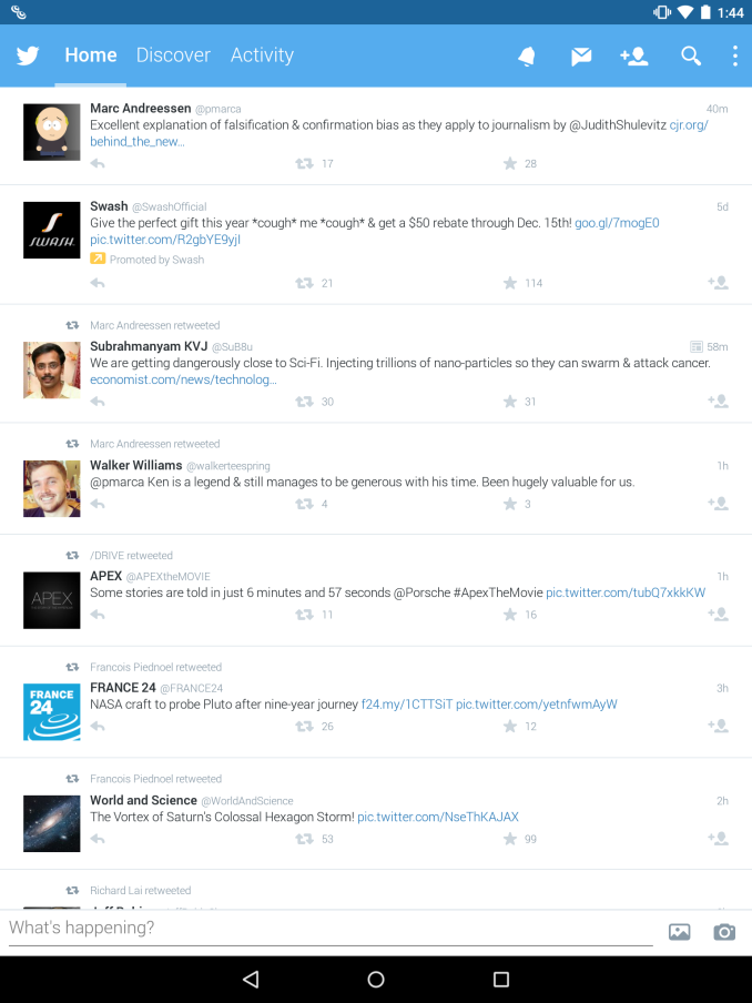
Unfortunately, these seem to be sore points of the Nexus 9 and the broader Android tablet ecosystem. Without question, if we’re talking about tablet applications they definitely do exist for the Nexus 9. The problem is that there is a pervasive lack of applications that are truly designed for a 9 inch, 4:3 aspect ratio display. Applications like Twitter, Facebook, and other first-party apps are simply blown up versions of the phone application. There is some level of extra content presented, but a lot of applications just don’t scale correctly which wastes a lot of real estate on the display. While we found issue with the Nexus 6’s lack of phablet-specific layouts, this is an even bigger issue on the Nexus 9.
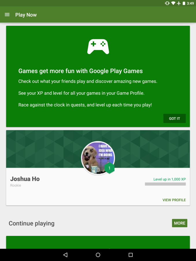
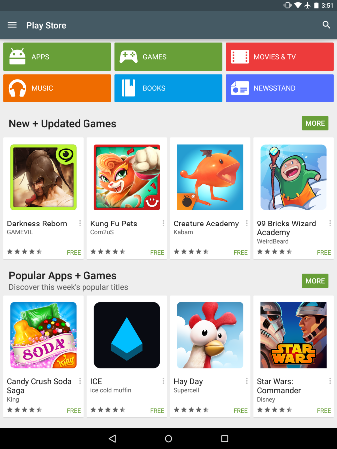
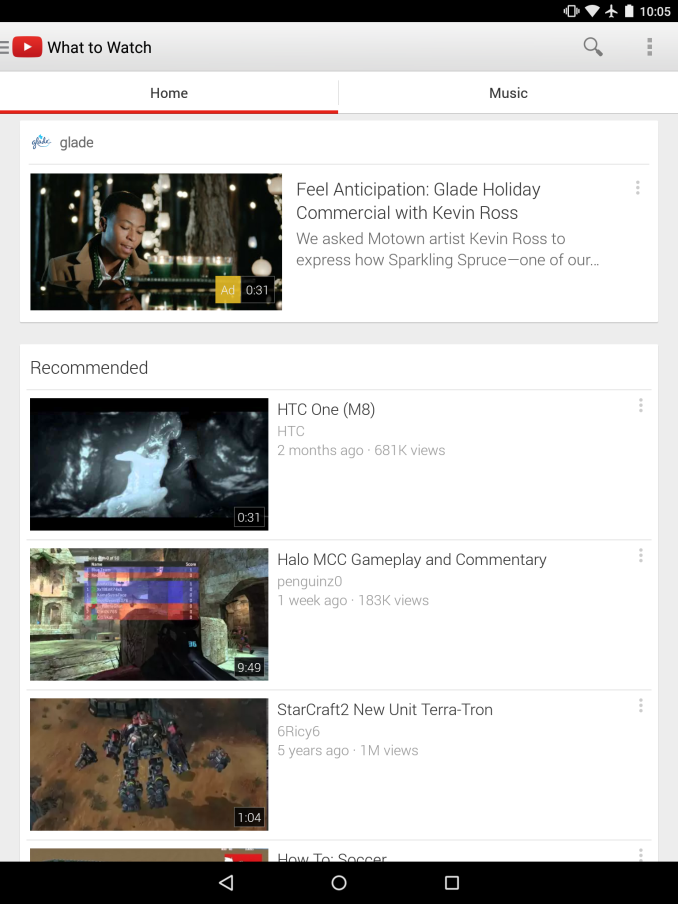
While it’s possible to point fingers at app developers for not supporting Android properly, Google seems to have these problems as well. The settings interface is a single large pane of options, instead of a dual-pane interface that allows for simultaneous navigation of the overall settings and individual settings. The Play Store application is mostly similar in this respect, and the YouTube app is possibly the worst example of these kinds of issues. For example, while there is a tablet-specific video view in landscape, most navigation, search, and video selection is identical to what we see on a smartphone.
Nothing really takes advantage of the screen size other than simply being bigger than before. There aren’t any multi-window modes that exploit the larger screen size, and in general the Nexus 9 doesn’t introduce any new functionality that clearly justifies the need for a bag/backpack to carry it. There are applications that take advantage of the larger display, but these are rare. For the most part though, this is effectively true for most tablets other than the Surface Pro 3 which is effectively in a different category altogether.
On the performance side, the story is better but it isn’t perfect either. Similar to Brandon’s experience with the Nexus 6, I often saw random stutters on animations such as the app drawer or while opening an application. It’s hard to say what the cause is at this point, as the Nexus 6 seems to have similar issues with lag even though the Nexus 5 has none of these issues. One might point to FDE causing worse performance, but even that isn’t quite accurate as a build of Lollipop with FDE disabled didn’t do all that much in the way of solving these problems. Overall though, the experience is somehow less performant than the SHIELD Tablet on Android 5.0, even if these issues mostly present themselves in the form of minor frame drops from time to time. I also noticed that there was a distinct lack of available memory over time, which suggests a memory leak as on reboot launcher redraws effectively disappeared.
While these are significant issues that need to be resolved, the experience isn’t actually as bad as it seems. For what it’s worth, Material Design is a great new design scheme to replace the somewhat dated Holo UI that has been in use since Honeycomb/Android 3.0. While there are issues with the tablet experience, if one is willing to look past these issues they will find that the Nexus 9 is a respectable software experience. There’s also the potential for the Nexus 9 to spur improved tablet experiences, although this would be a slow change that could take years to be meaningful.




169 Comments
View All Comments
Mondozai - Wednesday, February 4, 2015 - link
No offence but how relevant is this review so many months after release?You guys dropped the ball on this one. We're also still waiting for the GTX 960 review.
What has happened to Anandtech...
LocutusEstBorg - Wednesday, February 4, 2015 - link
There's no Anand.nathanddrews - Wednesday, February 4, 2015 - link
That's the only change I've noticed.Morawka - Wednesday, February 4, 2015 - link
and no Brian Klugnathanddrews - Wednesday, February 4, 2015 - link
Yeah, but that was earlier.Ryan Smith - Wednesday, February 4, 2015 - link
"What has happened to Anandtech..."Nothing has happened to AnandTech. We're still here and working away at new articles.=)
However this article fell victim to bad timing. The short story is that I was out sick for almost 2 weeks in December, which meant this got backed up into the mess that is the holidays and CES.
As for how relevant it is, it is still Google's premiere large format tablet and the only shipping Denver device, both of which make it a very interesting product.
Jon Tseng - Wednesday, February 4, 2015 - link
It's fine to be late (although maybe not as late as the Razer Blade 2014 review!). Better to have late, differentiated content than early, commoditised content. Whether the review like's the colour of a tablet's trim is of limited interest for me; the details of Denver code-morphing are.Actually my worry is that under new ownership Anandtech might be pushed to go down the publish early/get click views route vs. the publish late/actually deliver something useful. Hopefully it won't come to this, but this is what historically happens... :-(
Operandi - Thursday, February 5, 2015 - link
Being there on day one is not a huge deal but its certainly not ok be as late as this review is or the still MIA 960 review. If you are going to be late you better be brining something new to the table to justify not being there in the same time frame as your peers. This is so laughably late its almost embarrassing to release it at all at this point.Tech journalism like most other markets is competitive and there are lots of other very competent publications out there competing for the same readers. Personally I've already gotten all the Nexus 9 information elsewhere so this review is of no value to me whatsoever. The same goes for the 960 review when/if that review ever shows up.
akdj - Wednesday, February 11, 2015 - link
Not sure where you've seen such an extensive write up and dissection of Denver, but I certainky haven't. Nor were the N9/6 widely available until the holidays were over. Like a month agoFor every 10,000,000 iPads produced, HTC is probably knocking out 10,000
Excellent review, write up and information about the 'other 64bit' option.
Taneli - Wednesday, February 4, 2015 - link
Timing is secondary for a deeply technical article like this here. You guys did exactly the right thing, reporting when the device was announced and waited for the review to be done before publishing. Also, having people out sick in a small team is something you really can't do that much about. I hope you're well now.The article itself was superb. Thanks for the read and keep up the good work.