The Meizu MX4 Pro Review
by Andrei Frumusanu on February 16, 2015 2:00 AM EST- Posted in
- Smartphones
- Exynos
- Mobile
- Meizu
User Interface - FlymeOS
Almost every manufacturer currently offering Android on their smartphone devices looks to differentiate themselves on the software side by employing a customized user interface. Meizu is no different as they deliver their own artistic touch in the form of FlymeOS.
Right off the bat you're presented with the most daunting difference, and users will likely view this as the most controversial user interface choice: the launcher and its lack of an application drawer. Similar to iOS, the stock FlymeOS launcher carries all installed applications on the home screens. I feel that this choice in functionality has been discussed and debated a lot over the years and ultimately there will be people who hate it and there will be people who don't mind it that much.
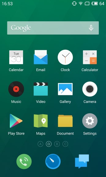
In terms of aesthetics there is little to criticize in the stock launcher: it offers a minimalist clean look that is actually quite refreshing, and has a certain unique look to it due to the icon designs that differ from what we see in stock Android and from other vendors. The OS actually replaces a load of Google application icons so that they better fit FlymeOS's look and feel, as one can see in the Play Store or Google Maps icons below.
Before diving more deeply into other aspects the user interface and applications, it's worth addressing the task-switching screen, or better said the lack of thereof, which will be seen as the most radical departure from traditional Android. FlymeOS has no multi-task button and also no task switcher screen in the traditional sense. Instead, switching tasks is done by swiping up from the bottom bezel of the phone. A little context view with up to four application icons in order of most recently used applications shows up. Clicking on an application icon switches you to it. Swiping right and left takes you to overflow rows of more applications in case you have had more than four open. Swiping up from an icon closes the program, and swiping up from the background will close all currently open applications.
How this works in practice is better explained in a video than any written explanation I could come up with. I've mentioned that the hardware home button serves a dual function in that it's also a capacitive button that you can tap on without pressing down on the button. FlymeOS allows users to re-bind this functionality to a slew of operations, but the one I recommend and that simply works the best is to use it as a back button.
As can be seen in the video example, once you get used to the navigation mechanics of the phone, task switching can be very fast and comfortable, especially in one-handed use. Although we lose the preview thumbnail for each application because of Meizu's task-switcher choice, I couldn't really see any negative impact in everyday usage and didn't really miss the preview as much as one would think.
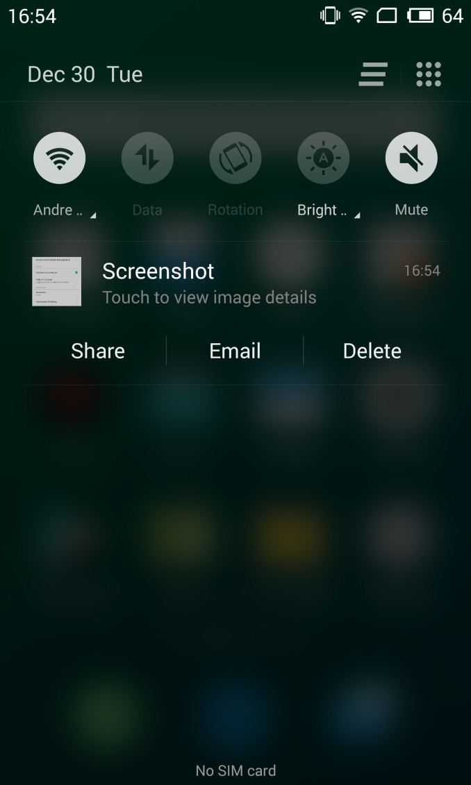
The notification shade employs an attractive black look with a frosted glass translucent effect that is rendered live via Gaussian blur on the GPU. This translucent background effect can be found most visibly here in the notification shade, but it is also present in backgrounds of some panels throughout the OS. It can be disabled in the display settings to improve battery life and performance. If disabled, the notification shade turns into full black or another solid color depending on the theme that you are currently running. The notification panel also has quick-settings buttons available that can be rearranged to one's needs. There is also a brightness slider that is accessible via a drop-down menu when clicking on the brightness switch's text label, offering both a full manual and auto-brightness luminosity level choice.
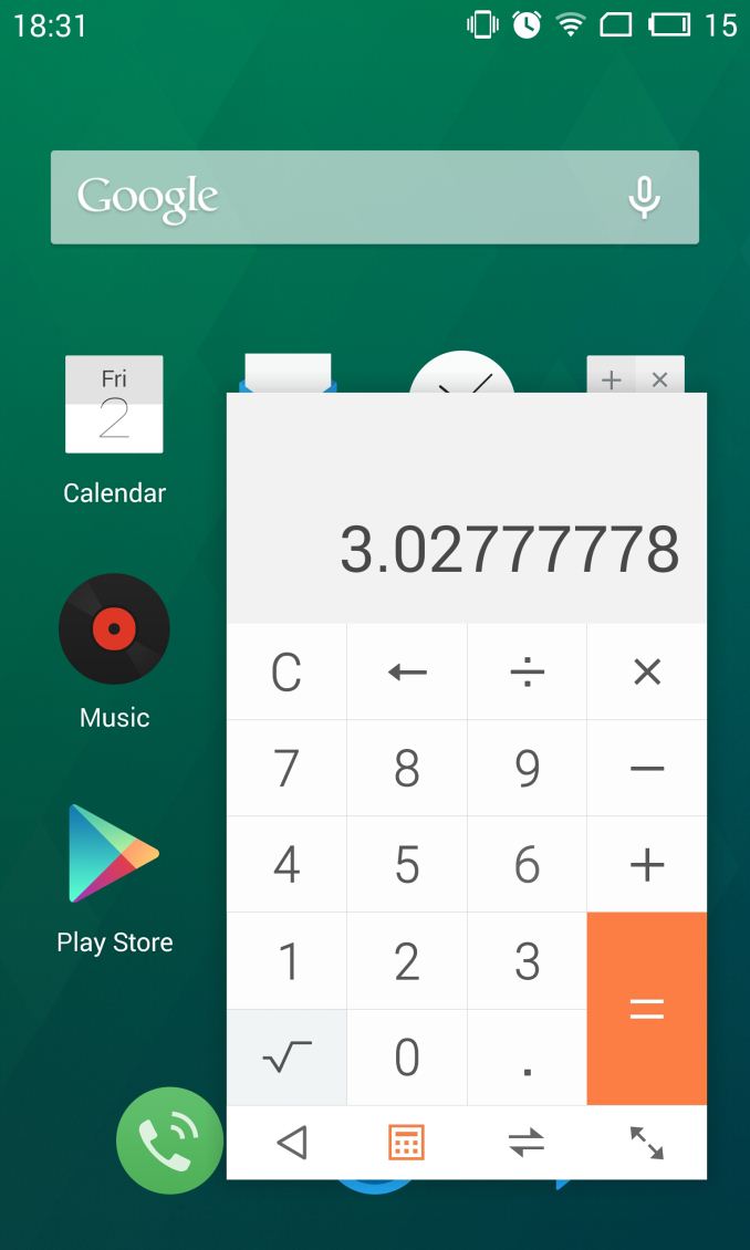
Meizu also has a Samsung-esque multi-window support but the number of applications available to use this is limited, and the most notable is probably the calculator app (which is useful as it contains extensive unit and up-to-date currency conversion functions). I hope Meizu continues to work on this feature to enable it for more applications and hopefully for any arbitrary application if possible.
The stock browser delivers a simplistic interface and the most commonly used basic functions. Unfortunately I found that the OS's libraries were not as optimized as for example Samsung's, and Chrome outperforms it in our synthetic benchmarks.
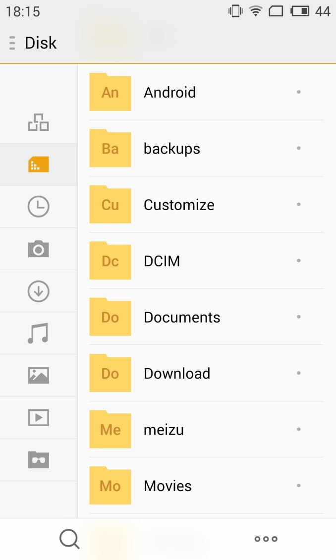
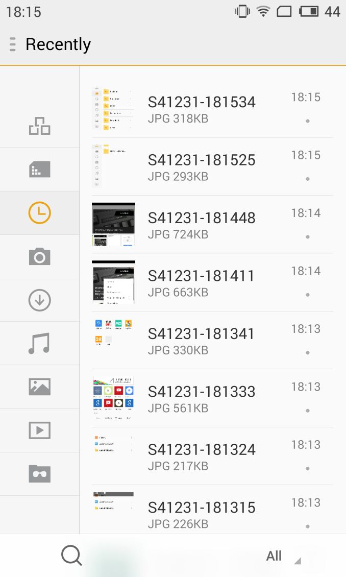
Meizu seems to like to employ a side-bar navigation oriented UI, something notably used in the settings, file manager and gallery apps. This doesn't pose too much of an issue but does eat up some of the usable screen-estate. There's a general feeling that the UI layouts are not optimized for western languages as there is more than one instance where text is clipped whereas the Chinese version looks fine.
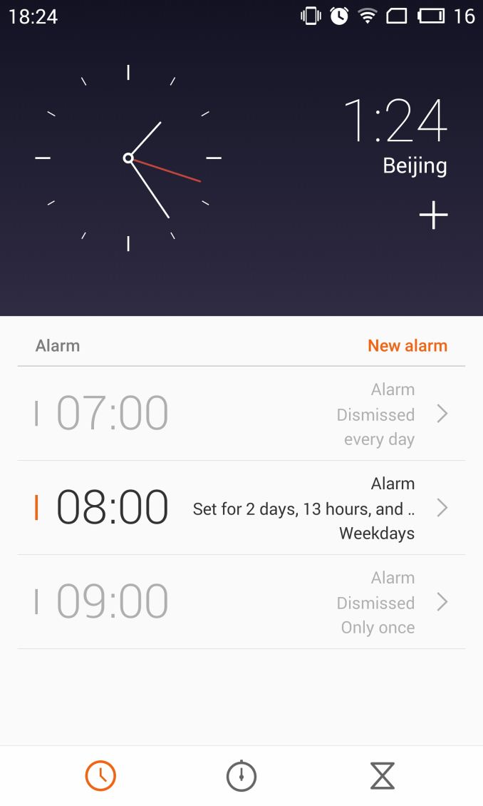
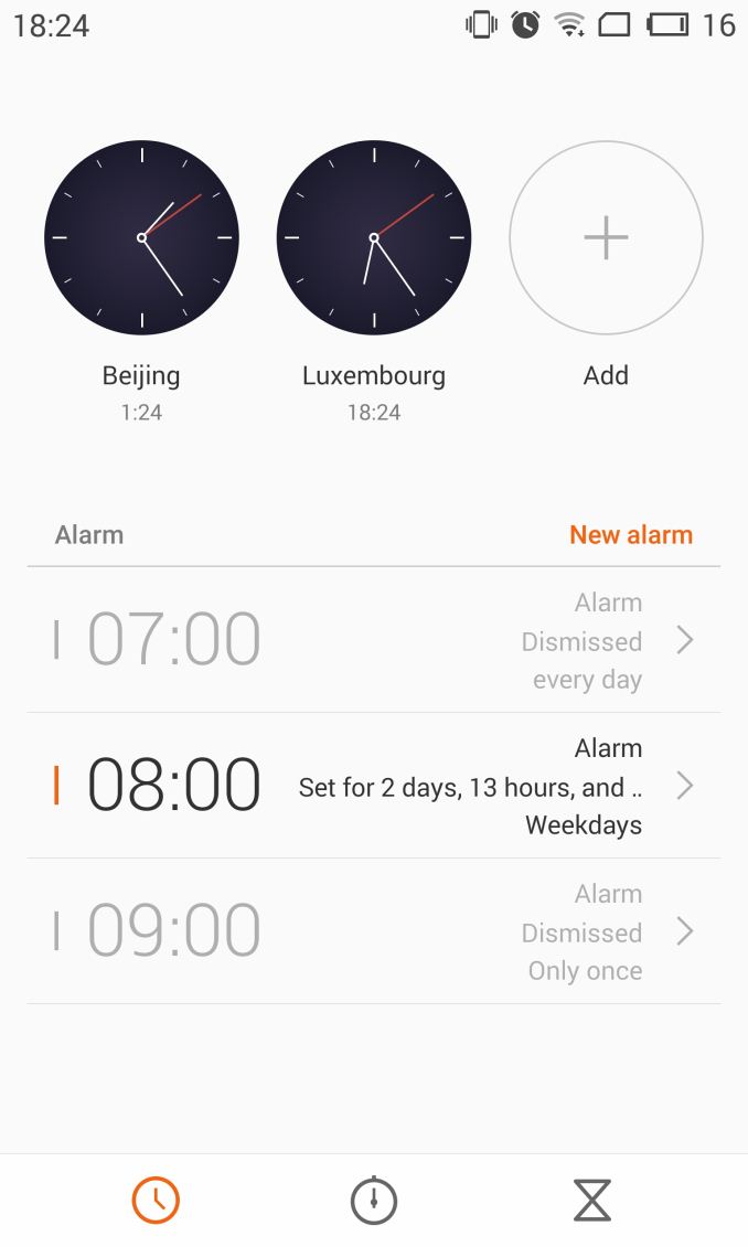
The impact of this Chinese-first focus continues to be seen in various places throughout the OS. For example the alarm app simply didn't let me delete the Beijing time-zone and forced me to have both the Beijing and the local time-zone clocks on display simultaneously.
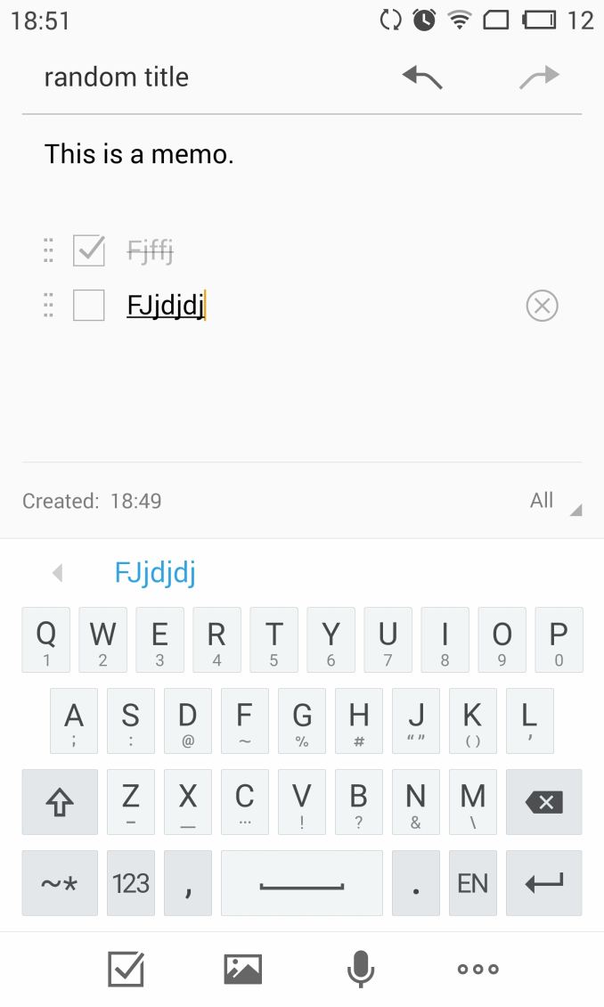
The keyboard was surprisingly good except that the hyphen symbol (-) was not the normal ASCII hypen-minus but some other Unicode character that caused me some issues when entering passwords, forcing you to switch to the numerical layout to be able to properly input it. I say that the keyboard is otherwise good because it allows for gesture-typing numericals and secondary characters by swiping down from the keys instead of long-pressing them. I've only ever seen other keyboards allow this on the numerical row and only by swiping up. Although I still prefer full-fledged word-swype keyboards, this still provided a better stock keyboard experience than most other OEM variants. The keyboard is clean and attractive, and is reminiscent of the iOS keyboard.
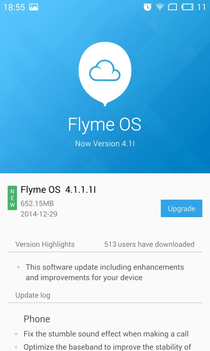
I also appreciated Meizu's proper version and system update interface. This review was done on the 4.1l firmware, but I updated later on to the newly available 4.1.1.1l version bringing lots of smaller bug fixes and improvements. Meizu here discloses a full change-log in great detail of what was updated and fixed in the new version, something even giants such as Samsung or HTC fail to do.
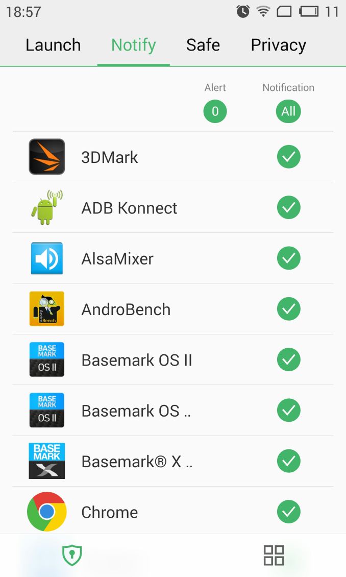
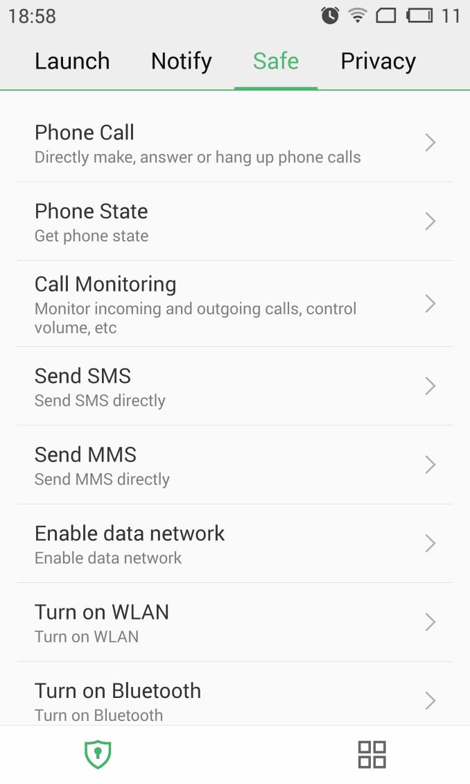
People who have read my Huawei Mate 7 review will remember that I praised EmotionUI's implementation of Android's application permission and notification controls. I was surprised to find the same amount of control on the Meizu MX4 Pro. The controls are not accessible via the traditional settings menu as one would expect, and are instead exposed through the "Security Center" application, an odd choice because it took me several days to actually notice it.
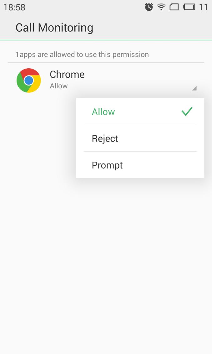
When installing an application you can choose to grant, revoke, or let it prompt for the various permissions that an app requests. The difference in implementation between EmotionUI is that FlymeOS's defaults are much less cumbersome to the user and will grant the permissions per default like vanilla Android.
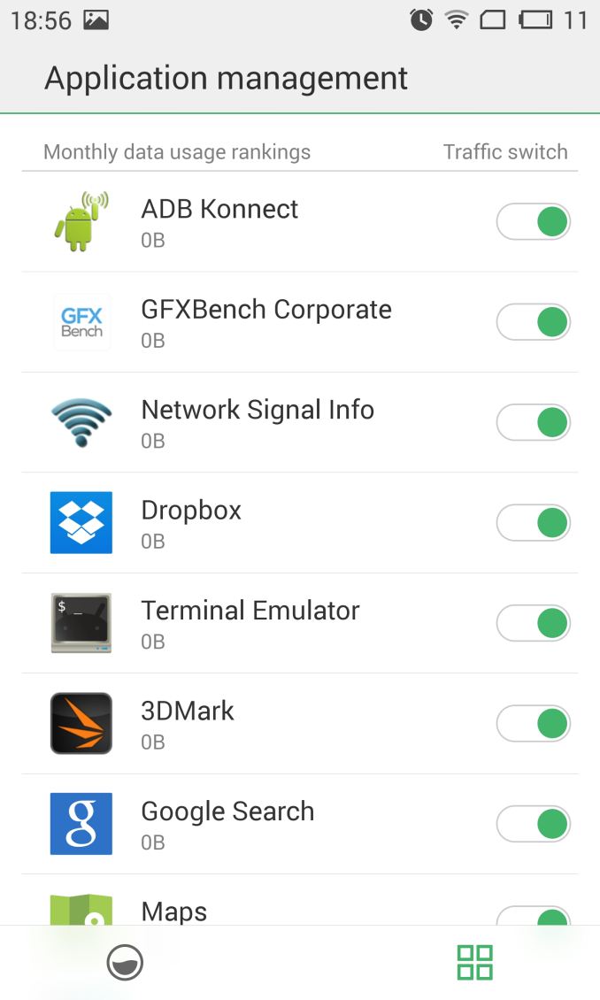
If you wish for fine-grained control of an application's actions, you can restrict it to your own desire. The "Security Center" allows for disabling of application launches at boot, network traffic revoking when on mobile data, and full notification management. Misbehaving apps and games with advertisement notifications can be silenced. An alternative view of the system permissions control panel allows you to list applications per permission category, allowing for example to see all applications who request SMS sending permissions.
As part of the security suite we see the use of the fingerprint sensor for not only the phone's lock-screen, but also as a general lock on a per-application basis. The gallery and file manager applications are also able to make use of a private "Vault" where you can move files that are then protected from access unless you scan your fingerprint or enter a backup password. The touch-based hardware fingerprint sensor itself works flawlessly and basically mimics TouchID; the only difference is that the initial scanning procedure is much more extensive as it demanded around 20 scans of my fingerprint. The only quirk I have noticed is that when you turn the phone on via the home button, there is a high failure rate on trying to scan the fingerprint in the same motion, requiring you to lift your finger and put it back down for a successful scan and screen unlock.
As further customization Meizu offers a theme engine with themes available from their own app store, although the China-hosted server seems to be painstakingly slow. At the time of the review the whole ecosystem revolving around Meizu's own service apps is still Chinese-only, with a prompt from Meizu promising that more English content will be added in the future.
If you register the device with Meizu's account services there is one option that power-users might find interesting: Meizu allows for rooting ("Opening system privileges" as they call it) under the personal settings of the phone. It comes with a custom root manager that seems sluggish at times but nevertheless does its job without having to fall back to flashing any community-developed root methods. Interestingly users who choose to register their device will be locked out of changing any sync or privilege settings if they forget their password unless they manage to navigate through Meizu's Chinese-only community site to request a new password.
Overall, FlymeOS is an interesting UX. Beyond the lack of an application drawer there isn't much where I can critique Meizu's OS in terms of functionality. Meizu has kept it simple on the application side as there is no bloat-ware or gimmicky features. The power-user features that are part of Android are present and functioning well. What is lacking is a general polish and quality to the interface. I felt that I was using a phone that only just came through the translation team's hands and had little quality assurance, as I could observe a lot of typos and layout issues. Performance wise the interface was good; I could see no major problems in loading the built-in apps or menus. However, I think Meizu still has a lot of room for improvement on the software side in trying to polish what they already have.





70 Comments
View All Comments
blackmagnum - Monday, February 16, 2015 - link
Have you checked that it was not programmed with a backdoor that could access your personal information? Right? Just checking.WorldWithoutMadness - Monday, February 16, 2015 - link
Well, you can't really know. What if they installed it from the hardware to software?If you don't trust these technologies then just buy your own country phone. Even if they do access your personal information, you can blame your country for it
Murloc - Monday, February 16, 2015 - link
most of the stuff in any phone is made in China so...StevoLincolnite - Monday, February 16, 2015 - link
They can spy on me.I only look at cat video's anyway.
bigstrudel - Friday, February 20, 2015 - link
You're a happy slave. Keep paying your taxes buddy. And invest in the stock market.theduckofdeath - Tuesday, February 17, 2015 - link
The SoC is made in Korea. Apart from that, I think Apple trolls on this site are just about as pathetic as trolls on the internet can get. Virtually all smartphones in the world are assembled in China, except for a few high end Samsung devices and maybe an LG or two. That includes brands like Microsoft and Apple.twoD - Monday, February 16, 2015 - link
Agree.While you at it, also check Apple and Google. They've known to be sharing personal info with the NSA.
Just saying.
melgross - Monday, February 16, 2015 - link
Don't make things up please.bigstrudel - Friday, February 20, 2015 - link
Its not made up. Do some homework. All the info you need to draw your own conclusion is on the internet.Or you could keep getting all of your info spoon fed to you by corporate media who basically just want you to buy stuff and watch commercials.
deadlockedworld - Monday, February 16, 2015 - link
Apple and Google have been pretty good about fighting for public transparency in their national security cooperation. Both are taking heat from the government for encrypting consumer devices and data. Its Verizon and ATT that are fully onboard with giving everything to the NSA.