Lenovo Yoga 3 Pro Review: Refreshed With Faster Core M
by Brett Howse on March 13, 2015 8:00 AM ESTFinal Words
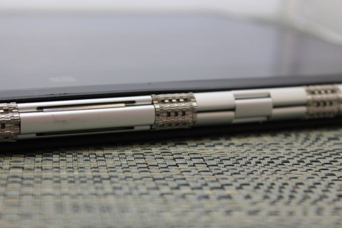
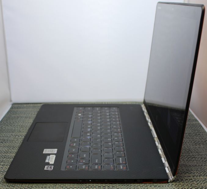
When looking at convertible laptops, Lenovo likely has the most prolific number of convertible devices and they fall under the Yoga line. When they came up with the Yoga hinge, it set the bar for convertible devices. It keeps the balance and usability of a traditional clamshell Ultrabook, but adds in the ability to use it in three additional touch modes. For the Yoga 3 Pro, Lenovo has refined this experience again, with a thinner, and lighter laptop. The watchband hinge is both stylish and functional. They have kept the high resolution display of the Yoga 2 Pro, but improved the overall efficiency of the device which allowed them to keep similar battery life with a smaller, and therefore lighter battery.
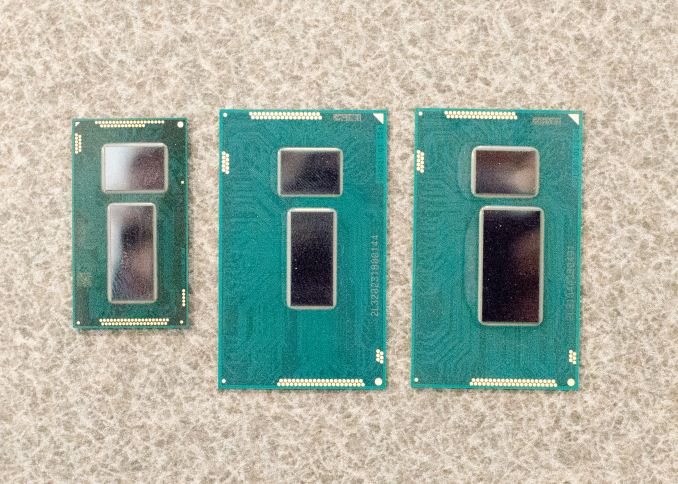
Moving to Core M may seem like a step backwards in performance. However when you compare most workloads to the outgoing Core i5 Yoga 2 Pro, the Yoga 3 Pro can hold its own against it, and even surpasses it in many benchmarks. Core M is more than just a lower power SoC. It is also about packaging. The size of Core M as compared to Broadwell-U is quite a bit smaller in all dimensions, including the Z axis, which allows for more space for other components around it, and a thinner overall device. When you look at the Yoga, and realise it is not just a notebook computer, the extra reduction in thickness is appreciated. It is still a bit big to use as a tablet, but it is better as a tablet than the outgoing model.
 From left to right: Broadwell-Y (Core M), Broadwell ULT/ULX and Haswell ULT/ULX
The GPU side is certainly a regression though. Core M’s very restrictive TDP of just 4.5 watts means that the GPU is limited a lot quicker than Haswell-U or Broadwell-U GPUs are. It has the same basic architecture as the Broadwell-U GPU, and therefore it should have similar performance if given the headroom for this. Intel still has some work to do on the GPU side to make it more efficient, and they lag some of their competitors there, although less so with HD 5300 than the woeful Atom N2840’s Intel HD Graphics. They have made some headway here, but still have some more room to improve.
As a tablet, the Core M powered Yoga 3 Pro will run circles around other tablets when performing CPU tasks. The GPU is a bit behind, but it is ahead of the iPad Air already, so it is not a slouch. The CPU is miles ahead though, even when compared to the Apple A8X which is consistently the best ARM based tablet CPU.
The display, which was a defining feature of the Yoga 2 Pro, is a slightly different model of the Samsung RGBW IPS LCD. It offers the same great viewing angles and crisp text as before, but it also suffers from being uncalibrated. It would be nice to see Lenovo include an ICC profile, or better yet to switch to the Sharp IGZO display which has proven to be the current LCD to beat right now. The one real drawback of the Samsung display is the terrible black levels, which give a mediocre contrast ratio and is very noticeable when watching movies on the Yoga 3 Pro. A switch to a true RGB model like the Sharp would fix that glaring issue. The steady march of progress means that Lenovo sitting still on their display means that they have been passed by their competitors.
Lenovo has fixed their biggest issue with the Yoga 2 Pro though, and that was the wireless performance. The move to a Broadcom 802.11ac solution has moved them from the bottom to the top of our test, and it was sorely needed. My wife still owns and uses the Yoga 2 Pro every day, and her one major complaint is the wireless performance. The new model solves that and then some.
For 2015 though, Lenovo has some serious competition. If you are after a pure Ultrabook, the Yoga 3 Pro is likely not the frontrunner right now. Lenovo does have other offerings, such as the non Pro version of the Yoga, and the ThinkPad Yoga, which do come with Broadwell-U and would have better performance for heavier workloads. However I have yet to see a better convertible laptop yet. Other OEMs have taken the Yoga style hinge and incorporated it into their designs, and we will see more of these as time goes on.
The Yoga 3 Pro is at least as good as the Yoga 2 Pro, which is a compliment. After owning the Yoga 2 Pro for over a year, it is still incredibly handy to be able to flip the display around and use it as a touch device. The new Yoga 3 Pro improves the overall design, and makes it even thinner and lighter than the outgoing model. The Yoga 3 Pro is even thinner than the just announced MacBook, and although it is also a bit heavier, it does include a touch digitizer and Gorilla Glass over the display, all the while coming in at $1150, around $150 cheaper than the MacBook.. Apple has also seen that Core M, especially the just released 5Y71 model, is enough performance to not have any regression over Haswell-U which powered all of the Ultrabooks last year. If battery life is not your biggest concern, then the Yoga 3 Pro is certainly worth checking out. It offers incredible versatility due to the design, and it has made some nice improvements for the new model.


113 Comments
View All Comments
KZ0 - Friday, March 13, 2015 - link
Why did they have to break the keyboard! So close to perfect, but the keyboard is important!fokka - Friday, March 13, 2015 - link
the yoga line is nice and the yoga 3 pro could be one killer machine, but when i have to press key combos for simple things as adjusting brightness, or to skip a track this would be just a big step back in usability for me.like the author, i'm also not a fan of the rgbw-display, especially when sharp makes a display of the same resolution which is just so much nicer.
and the third point would be the middling battery life. i would give up the 1800p screen in a heartbeat if it meant i could get the same battery life as the 1080p xps 13.
i'm still not the biggest fan of core m, even with a little fan helping out.
i guess for me that means the time isn't quite here yet for the super-slim 12mm for factor and in this generation and probably the next i'd still be more inclined to go with a 15-17mm thick device, simply to have something a bit more future proof in the cpu and especially gpu department.
if more manufacturers could now offer 16:10, or even 15:10 screens on their future devices, that would be much appreciated.
fokka - Friday, March 13, 2015 - link
oh sorry, now i posted the whole shebang, when i only wanted to share my sentiments about the keyboard... edit option, anyone?wintermute000 - Saturday, March 14, 2015 - link
someone in lenovo has obviously gotten hold of some kind of focus group testing or user survey that says most 'normals' don't use the F keys, and gone ahead and loaded the shotgun (pointed at their feet). Observe the X1 carbon (though maybe the latest variant went back to the F keys?), yep thinkpad users don't use F keys... not.....My company recently got a laptop refresh where we were given the choice of T440s or X1s. The first wave of people went X1s en masse and there was a seriously high return rate after people realised how much of a PITA the new, no-F-key layout was.
MrSpadge - Sunday, March 15, 2015 - link
I agree, this is ridiculous especially for a "Pro" version. And they still have so much space left at the top of the current keyboard.Wwhat - Sunday, March 15, 2015 - link
It seems the new paradigm to remove stuff and reduce user convenience, samsung did it with their new phones, apple did it with their new single-port laptop, and you see more and more devices being released with pointlessly reduced functionality.But as for 'pro', I'm not sure any 'pro' would get lenovo after the spy-ware fiasco.
I know lenovo is not an option for me after that.
Gigaplex - Monday, March 16, 2015 - link
"Pro" use in the Enterprise would just use a corporate image, rather than using whatever Lenovo installed.Wwhat - Saturday, March 21, 2015 - link
Fair point, but seeing we hear more and more about things embedded in firmware and BIOS I'm not sure I'd trust it either way. Especially the BIOS would only require a cooperation of lenovo to 'enhance' their system.It's the nature of the nastiness they were exposed as bundling, it was too complex and devious to brush off. In my opinion at least. And it ruined any trust I have.
miahshodan - Tuesday, March 17, 2015 - link
I don't mind the function keys as much as having keys in the wrong place. For instance the right shift key should be directly below the enter key and the forward slash / should be below the '. things like that kill typing speed.Wwhat - Tuesday, March 24, 2015 - link
Odd view, the shift key isn't too bad if you type with ten fingers since it is where it suppose to be except the right part missing, and people can probably adapt to that.As for the forward slash, that is always below the middle between ; and ' on standard keyboards, check wikipedia to see. And it's actually the ctrl key which isn't where you expect it.