The All-in-One Battle: Dell's XPS One 24 vs. Apple's iMac
by Anand Lal Shimpi on October 30, 2008 3:00 PM EST- Posted in
- Systems
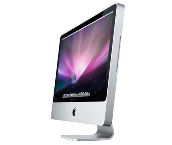
The New Apple iMac
It would be impossible, unjust and a disservice to avoid the inevitable: the iMac comparison. I hadn't owned an iMac since the last iMac G5 and the very first Intel based iMac so it was about time that I got a look at one of the updated glass/aluminum models.
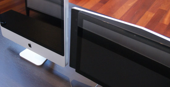
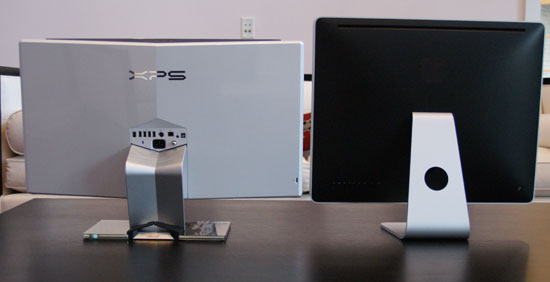
iMac on the left, XPS One 24 on the right
Oh so glossy
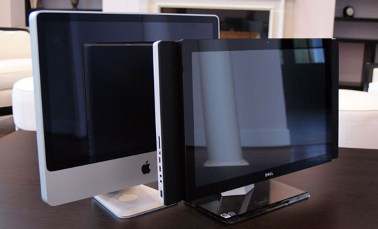
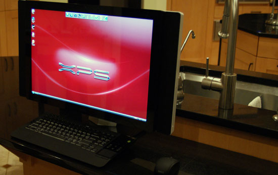
If this were an episode of Top Gear you'd see the XPS One and the cameraman would quickly pan to Apple's 24" iMac flying down the runway, and Clarkson would make some snide remark about how Dell had gotten it perfect, but almost.
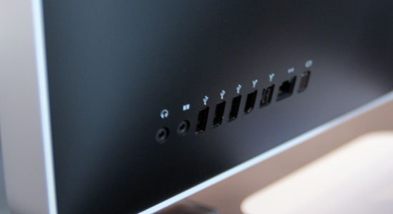
The iMac ports
Enter Apple's iMac, the king of the all-in-one market, not because it's perfect, but because it is the target everyone else seems to aim at. The resurgence in all-in-one PCs is due largely to the success of Apple's iMac, but many seem to forget that the iMac is so successful because there is no other way to get a decent Mac desktop without spending a lot more money on the Mac Pro.
While the XPS One is very wide, the iMac is very tall, despite both using a 16:10 24" panel. The difference is that Apple sticks much of the hardware in the bottom part of the machine, while Dell opted for cooler running mobile hardware to keep its platform both thin and narrow.
Apple does a better job of hiding its speakers, but the end result is a better sound out of the XPS One. The iMac sounds more muffled while the XPS One comes in a lot clearer, although the highs are overly harsh and you lose a lot of the clarity in the midrange - in both cases you make sacrifices for the form factor, something you should know by now when considering an all-in-one regardless of what logo is on the box.
Like the Dell, Apple's display is glossy and will show reflections but unlike a notebook, presumably you'll be in a more controlled lighting situation with either of these machines so the glare on the screen should be manageable. My kitchen has no curtains or blinds so I put both systems in there naturally and despite the glossy screens being distracting, they were both usable.
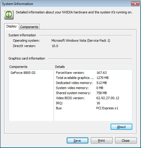
The iMac is pretty decent, the top of the line $2199 configuration gives you a very fast 3.06GHz Core 2 Duo CPU, only 2GB of RAM but a GeForce 8800 GS GPU:
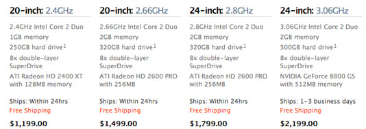
The $1799 configuration skimps on the video, but it's still better than the G45 graphics that are in the $1699 XPS One, but not better than the 9600M that's in the $1999 model. It seems as if Apple and Dell almost worked together to ensure that their pricepoints didn't overlap but rather complemented one another.
Apple continues to skimp on memory and drive size, although admittedly 2GB is enough for most that you'd want to do under OS X. The 500GB drive is acceptable but I'd say that the 320GB version in the $1799 model is a bit too small, especially if you're going to be running Boot Camp.
Apple's Boot Camp works incredibly well, simply tell Boot Camp how much of your hard drive you'd like to use for your Windows partition, stick in your Vista DVD and OS X will reboot into the Vista Installer. Once you're actually in Windows, pop in your Mac OS Disc 1 and Apple will install of the drivers for your iMac.
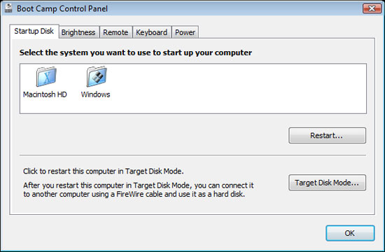
The unfortunate part of this approach is that Apple opts for stability rather than performance with its driver image, and thus the NVIDIA drivers Boot Camp installed were 167.63 compared to 175.29 on the Dell and 178.24 which are the latest publicly available from NVIDIA. Apple's Software Update also fails to update the Boot Camp drivers, unlike how it works under OS X, so you'll have to either rely on Windows Update for driver updates or go off to NVIDIA and grab your own.
Overall Apple's iMac is actually pretty solid; it's got a good enough display (24" 1920 x 1200 H-IPS panel) that you won't feel bad about being stuck with it, it's actually got impressively fast hardware if you opt for either of the 24" models, and with the top of the line system you can actually play most modern games on it with a Vista install. The design is quite stylish and if you're an OS X fan then there's little to complain about, it feels fast and looks great.


60 Comments
View All Comments
Eidorian - Thursday, October 30, 2008 - link
It's not that hard.8800M GTS > 9600M GT
HanSolo71 - Thursday, October 30, 2008 - link
thanks for the top gear reference i wish more people in america would actually get thatsxr7171 - Tuesday, November 4, 2008 - link
Well we have BBC America. But people don't watch it much.Jovec - Thursday, October 30, 2008 - link
Well, that is the behavior of the MS Intellitype software - it will only control iTunes if it is in the foreground. By contrast, Logitech's Setpoint will control iTunes in the background. I have no idea if Logitech does something extra to make this work, or if MS is purposely limiting their keyboards. Had this exact same issue that encouraged me to move back to a Logitech KB.mfed3 - Thursday, October 30, 2008 - link
this has to do with the keypresses binding to windows commands. they will all work in media player, media center, and all windows programs.it has to do with itunes controls not mapping directly to the same commands.
logitech's software must look at the media process running and send the correct command
epyon96 - Thursday, October 30, 2008 - link
Not sure why the author insists on having a Mac OSX bias. I see nothing wrong with the Start menu nor do I find it outdated. Usually, it's 3 clicks max to get to a program with minimal mouse movement. I am not saying Mac OSX has a bad interface but I see nothing wrong with the Start menu unless you are a devoted OSX fan.I am slightly annoyed why Apple still insists on a single button mouse. For some strange reason, Jobs still insists that computer users are too stupid to learn to effectively use a two button mouse. So what does he give us? A one button mouse that tries to emulate two-button mouse behaviour. Sure it looks cool and has that novelty effect but it wears off after the showroom. It begs the question why?
What does the article mean when it says that the 24" inch flat panel monitors have trouble with 24 FPS 1080 Non-interlaced Blu ray playback? Is it trying to say that 24 FPS refresh rate is not possible on the flat panel without ghosting?
CMcK - Friday, October 31, 2008 - link
Apple haven't shipped a single button mouse with desktops or laptops for a few years now. The Mighty Mouse has four buttons - left, right, side (squeeze) and centre (press the trackball). Very useful. I have mine set for left click, right click, Expose and show desktop.Even the single, or indeed no button, Apple laptops have a left and right click. Just place a second finger on the trackpad and press the button or pad and you have a right click.
I don't find that I actually need to right click often while using OS X.
mikeepu - Friday, October 31, 2008 - link
Frankly I don't really sense a bias in the article. If anything the author is critical of both systems and just states his (keyword alert) 'personal' preference at the end of the article.But I do agree with you that there is nothing wrong with the Start Menu, its just that the Apple Dock is simpler in that only one click is required to start a program located on the dock or just two clicks if you have the Applications folder (the equivalent of the Programs folder in the Windows Start menu) attached to the Dock. But then again, where’s the harm in a few extra clicks to get to a program?
But man Do i want that Dell all-in-one for a Desktop media center :)
MrDiSante - Thursday, October 30, 2008 - link
I am also surprised at the obvious pro-Mac OS X bias in the article. Usually Anand is far more impartial, but this is more than a bit on the Engadget side. Pretty as Mac OS X is, I find that Vista actually offers the more practical solutions to task management problems.The taskbar is far better at showing the user what is and isn't running than the dock (something that Microsoft is mistakenly changing with Windows 7 and will hopefully reconsider). As the fact that there is text with the icons allows me to efficiently differentiate between the numerous windows I have open (again, something Microsoft should not change; OS X looks prettier, but Vista takes the usability prize here).
The start menu still makes more sense than Apple's solution since there is in fact a central place to go for all of your programs (although I personally think Linux does a better job of that).
Alt+tab scales far better than expose does. They both work fine if you're running 5 or fewer programs, but expose just gets messy really fast if you exceed that. If you have 10 or more programs open, with stickies gadgets/widgets etc, then Expose gets downright unusable.
Finally, Windows tends to be far more shortcut friendly. Start + number, and start + 3-4 characters + enter usually launch just about any application I need. Alt+tab switches to just about any program I need. Expose and the dock both struggle with shortcut-friendliness.
DCstewieG - Sunday, November 2, 2008 - link
Actually Apple was first on the shortcuts you're talking about. Pressing Apple+Space brings up Spotlight which lets you type the first few characters of the app to find it and Enter to run it.As for Anand's Mac bias, it's a very interesting story. Here you have a devoted editor of a PC hardware site who decided to give a Mac a spin for a month to write an article about it. What happens? He becomes a huge fan in the process.
You see a lot of comments saying that people use Macs because Steve Jobs put them in a trance or because they look nice or something, but here's a guy who came in fresh and decided he liked it a lot by actually using it.
If you haven't read it: http://www.anandtech.com/mac/showdoc.aspx?i=2232">http://www.anandtech.com/mac/showdoc.aspx?i=2232 (though it is a bit outdated now)