The All-in-One Battle: Dell's XPS One 24 vs. Apple's iMac
by Anand Lal Shimpi on October 30, 2008 3:00 PM EST- Posted in
- Systems
Input Device Wars
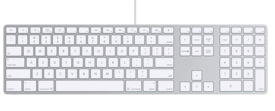
I talked a bit about the Dell's input devices so let's do the same for Apple's. The new iMacs ship with Apple's very compact aluminum keyboard, if you're a fan of the MacBook/Pro/Air keyboards, then you'll like this thing. The layout is obviously Mac optimized, so if you plan on using it under Windows you may find yourself frustrated that the Windows and Alt keys are switched. Personally I like the keyboard a lot, it's got a great feel to it, it's compact and it's easy to type on well. If you hate laptop keyboards however and need a more meaty feel to your keypresses, then you won't be a fan.
The keyboard is wired with a very short USB cable, designed to basically reach the USB port at the back of the iMac and go no further, it's the mouse however that has a very short cable. The Mighty Mouse, as Apple calls it, is designed to be plugged into the keyboard and thus you've got less than a foot of USB cord to work with. The Mighty Mouse is the same mouse I reviewed a couple of years back, it's got a single button but thanks to some fancy touch trickery it can behave as a two button mouse.
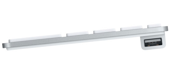
Mighty Mouse plugs in here
The entire surface of the mouse is a button (sound familiar?), press it down and you'll get a left click. Keep a finger on the right side of the mouse and press it down and it'll act as a right click, but note that for this to work you can't have your left finger resting on the left half of the mouse. My explanation may be a bit clumsy but using the mouse actually works pretty well, I don't really have any complaints there. The tracking precision is better than on the mouse that ships with the XPS One 24 and the tiny scroll ball is pretty sweet too.
For what it's worth, the scroll ball on the original Mighty Mouse I reviewed bit the dust within the first year of ownership; it just stopped working. I'm assuming that Apple's quality control has improved since the mouse was introduced but that may be a bit presumptuous on my part.
If you plan on gaming on this machine however, you'll need to replace the Mighty Mouse with something that has a real second button. While the Mighty Mouse is sufficient for all normal tasks, in a game where you're switching between left and right clicks a lot it's terribly annoying.
The Dell mouse needs to be replaced because of poor tracking precision and the Apple mouse would need replacement if you wanted to game on the iMac. The sad part is that neither of these tradeoffs are actually required by the all-in-one form factor, it's just a result of not thinking things through all the way. Dell has the greatest chance of fixing the problem though as Apple wouldn't bundle a Logitech mouse with its machine and there is no Apple branded mouse with two physical buttons for gamers.


60 Comments
View All Comments
nitrous9200 - Friday, October 31, 2008 - link
There will be an option to show the text next to the program icons in 7, but obviously it will be turned off by default. Of course it's really quite easy to differentiate between programs by the icon since they're usually so different.strikeback03 - Monday, November 3, 2008 - link
Yeah, but if you have several instances of the same program open (for example, I have 2 firefox right now, and multiple Explorer windows is common) then icons won't cut it. I couldn't care less how pretty the interface looks, so long as it is effective at conveying what is going on and allowing me to interact with it.sxr7171 - Tuesday, November 4, 2008 - link
No big deal. You will get a choice which is the downside of Macs. It's either "our way" or the "highway" in the Mac universe which is my big issue with Mac.Wolfpup - Friday, October 31, 2008 - link
I've long felt Windows' interface is considerably superior to OS X. Honestly I'd take 98's interface over 10.5, let alone XP or Vistas. It's really customizable, and...well I could go on and on about the things I prefer.(Two huge ones off the top of my head, you can edit files and folders from a save dialog box, and create new documents where you want them in the file system rather than having to open a program and navigate that way.)
Certainly I vastly prefer the quick launch bar and start menu to the dock.
Expose is the only interface element I wouldn't mind ripped off and put in Windows (though even there there's sort of a version of it in Vista).
slashbinslashbash - Friday, October 31, 2008 - link
Hmmm... how long have you been reading AnandTech? I've been here a good 7-8 years now, and I have grown to have an almost personal relationship with Anand's reviews. I know his thought processes, and he has kept a consistent POV over the years. Look back to 2004-2005 when he got his first Macs and somewhat reluctantly concluded (after all, he had built his site's reputation as a PC hardware review site) that he liked OS X better than Windows. Ever since then, the push has been on. Anand has grown to be more and more of a "Mac guy" and AFAIK largely uses Macs to conduct his day-to-day work. It's to the point now that I think of Anand as my go-to guy for Mac reviews and analysis (as he and his site have always been my go-to site for PC hardware reviews), if only because his voice has been so consistent and I know that he will tell me what he really thinks, and more importantly, that I know how he thinks and I know that he usually thinks like I do. Editorial consistency is so important and usually overlooked.In any case, being surprised at the "obvious pro-Mac OS X bias" shows you to be a pretty non-observant AnandTech reader, IMO. It is no surprise to me at all, and in fact I felt that Anand gave pretty fair shakes to the Dell, which copied the iMac and OS X to an embarrassing degree (the Dock is such a blatant ripoff! And the "Eject" graphic! Even the input/output ports are totally Mac-like.).
As for your criticisms of OS X, "knowing what is running" is far less important on OS X than on Windows anyway. To quote from Anand's 4/13/06 review of the original MacBook Pro: "When I started using OS X I initially hated the idea that closing all the windows of an application wouldn't actually close the application itself. However the more I used OS X, the more I realized that I didn't want to close the applications I used a lot; I wanted their windows out of the way but I wanted the ability to switch to them without waiting on the hard drive to load up that program again. Leaving just about every application I use open all the time and not having to worry about my system getting slow over time was a bit of a new experience for me, but it was a welcome one." I am the same way. I pretty much never quit programs completely on my Macs. It just doesn't make any difference in performance. When they are running in the background, the memory is managed well enough by OS X that they do not intrude on what I am doing.
"Differentiating between the numerous windows I have open" -- nothing does this better than Exposé.
"a central place to go for all your programs" -- OS X does a much better job of this with the Applications folder and the way that Applications themselves are folders in a sense. You click on them to open the application, but all the files and components that actually make up the application are enclosed in the folder that is the visible manifestation of the application in the Applications folder. To give a concrete example: I have an application called "Firefox" in my Applications folder. To open Firefox, I double-click on it. But if I right-click (I have a MS wireless mouse and keyboard -- I'm not a bigot) and select "View Package Contents", I see that this Firefox application is really just a container with a bunch of files and folders within it; chrome, extensions, dictionaries, etc. All of the confusing files and folders that seem to spread their way across multiple locations on Windows confine themselves nicely to that one pseudo-folder on OS X. No .dll files in strange places! No configuration settings hidden in the Registry! Just one place, and if you want to get rid of the program, there's no need for a complicated "Uninstall" process that scours your hard drive for odd remnants, you just drag the whole thing to the trash and be done with it! Wow, what a concept!
As for Linux's "central place to go for all your programs" -- don't get me started on the multitudinous locations of various ./bin folders (/usr/bin, /usr/local/bin, ~/bin, /bin, here a /bin, there a /bin, everywhere a /bin /bin.... I've got a $PATH that is several lines long, and different on every machine that I log into).
sxr7171 - Monday, November 3, 2008 - link
Huh. I used to ask Mac users why they did thought Mac was better in some ways and I many would mention the whole process of installing and uninstalling apps as a drag and drop thing. I never understood why they made such a big deal out of that because I thought dragging and dropping was analogous to clicking the install file.Not until you explained did I realize why they always bring that point up. Honestly now that I understand it, that is pretty darn amazing. It just makes sense. I hate hunting through local settings, application settings, the registry etc.
xeutonmojukai - Friday, October 31, 2008 - link
Um, I'm writing this on my MacBook right now, and trust me, this thing has a much more in-depth task manager than any Windows computer I've ever seen, and even allows you to restart the Finder program (or Main UI, basically) without restarting the computer.I find that my computer can go plowing into the great unknown reaches of the internet and come out clean, without using a firewall or any sort of protection program. It runs as fast as it did four years ago when I bought it.
I also use 10.4, and I've seen a lot of the new things from Leopard in my install of Ubuntu, and I don't need them, honestly. I'm fine with what Tiger has to offer.
Wolfpup - Friday, October 31, 2008 - link
How is Window's task manager less in depth...and you've been able to restart Explorer (ie Finder) separately from the computer in Windows since at LEAST Windows 98, if not earlier.
michael2k - Friday, October 31, 2008 - link
Windows taskbar doesn't give you a progress bar update per application?Windows taskbar doesn't tell you how many emails, IMs, or activity status in the taskbar?
All the Windows taskbar does is tell you which apps are open, which apps want your attention, and how many windows each app has open.
sxr7171 - Monday, November 3, 2008 - link
Not even liking Macs, I have to agree. Even Firefox tabs are easier to navigate and more informative with the right extensions. How many times have I wished for mouse gestures in Windows explorer? I really think Windows 7 will be fixing some of these issues. They seem to be standardizing the ways in which applications interact with the user. The fact that are are working to standardized where and how drivers are updated centrally and even use manufacturer input to build in sync and device management directly into the OS is going to make Windows 7 very easy to use and a much more consistent "mac-like" experience. Only with far more choices in hardware, software, and peripherals. The task they are undertaking is huge, but the results, if implemented correctly will be worth it.