Core i7 Giveaway Winner, AT on Kindle, Site Redesign Preview and More
by Anand Lal Shimpi on November 13, 2009 12:00 AM EST- Posted in
- CPUs
We have a winner to our Core i7 giveaway from last week: Gregory Peng from California (user name Possum). Congratulations Gregory! I've just sent you an email to confirm your details, drop me a response and I'll get this out to you.
Below are the specs of the iBuypower system that Gregory won:
| iBuypower Core i7 System | |
| Case | Chimera Inferno |
| CPU | Intel Core i7 870 |
| CPU Cooler | Asetek Liquid Cooler |
| Motherboard | ASUS P7P55D-LE |
| Memory | 4GB DDR3-1600 |
| Video Card | ATI Radeon HD 4890 1GB |
| HDD | Intel 80GB SSD, 1TB |
| Optical | LG Blu-ray Reader |
| PSU | NZXT 800W |
| Media | 12-in-1 Card Reader |
| OS | Windows Vista Home Premium 64-bit |
| KB & Mouse | iBuypower Keyboard & Mouse |
| Monitor | ASUS 23.6" Widescreen LCD Monitor |
We're already working on gathering hardware for the next giveaway, so this won't be your only opportunity to win. Thanks again to Intel and iBuypower for sending in the hardware for this giveaway and thanks to all of you for entering.
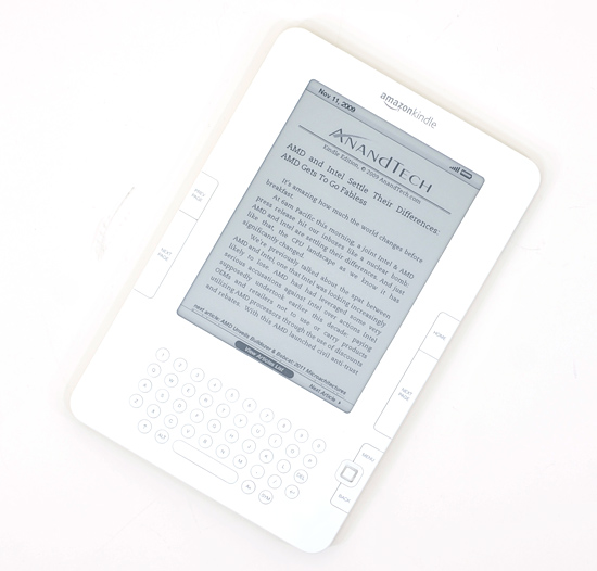
Next on the Agenda: AnandTech is now Available on Amazon Kindle Devices
I'm a Kindle 2 owner and I have to admit, it's sort of exciting seeing AnandTech on the device. Our 10 most recent articles are available for reading (subscription required) on the Kindle through Amazon's Kindle Store. If you've got a Kindle, check it out.
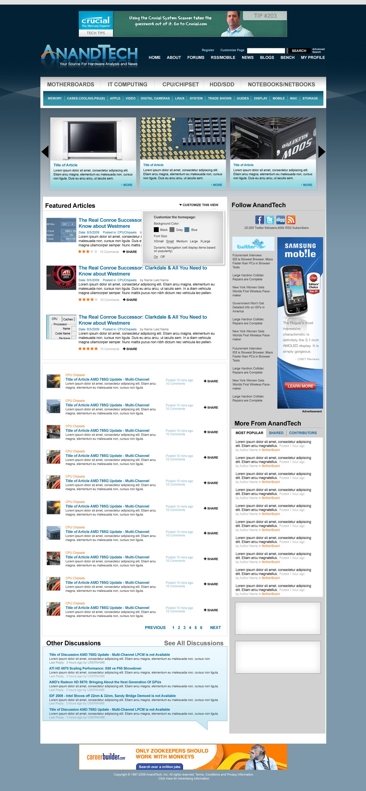
The AnandTech Redesign
I mentioned this a while ago, but we're finally at a point where we can give you guys an idea of what's coming. Have a look at the new AnandTech and be sure to leave your feedback in the comments section. We haven't implemented it in HTML so there's still room to tweak.
Not all of the ad placements are in (something I want to get your input on shortly) and there's going to be a ton of customization options offered as well. So keep those two in mind. The main carousel up top with three big article images will actually automatically rotate through a set number of articles so you'll be able to get a good idea of the past several articles on the main site without any scrolling.
Our main goal here was to make the site look and feel a lot more modern, as well as bring its functionality where it should be for 2010. There's a lot of cool stuff coming with more giveaways, more content and more categories of Bench next year. Here it is, constructive criticism is always appreciated :)
Coming Soon: A Call for Writers
It's a bit premature but I just wanted to give you all a heads up that we'll be looking for some new writers in the near future. If you've ever wanted the chance to get into the industry, it may be time to start polishing off your writing skills. Get those writing samples ready folks!
More details soon...
Anand Goes to India?
From 12/1 - 12/15 I will be traveling to India for the first time in 10 years. If you're an AnandTech reader in/around Mumbai, Delhi or Jaipur let me know. If we can get enough folks together we might do a reader meetup :)


97 Comments
View All Comments
falc0ne - Saturday, November 14, 2009 - link
looks nice, good and welcomed change!Smell This - Saturday, November 14, 2009 - link
http://i716.photobucket.com/albums/ww165/Back_at_t...">http://i716.photobucket.com/albums/ww16...s/Anandt...1) Your name and logo should take precedence over everything at the top masthead. I would lose the 'Leaderboard' banner - place a full banner-sized advertisement to the right of your logo.
2) Pick your top 5 site links and place them underneath the banner advertisement with your search bar. Fix the search, please! It's really, really frustrating. :)
3) Move the article scroll on the front page to the top under the masthead and drop the 'big' site menu below it. For the most part this becomes a scrolling ad banner for your articles and makes up for the loss in size of the top leaderboard banner.
I would hope if an article image clearly displayed 'branding' (in a very subtle way, of course) that a bit of click-thru revenue would be provided.
Even with moving the article scroll under the masthead the site navigation should still be available without any 'page scrolling' --- you could narrow the article scroll a bit if you feel that is a problem.
You could then move the nav menu back under the masthead once you have clicked past the home page.
4) Some consolidation/clarification of the big site menu would be nice. I prefer a 'friendly' mouse-over drop down but understand it may annoy some folks. It might have problems scaling if you are not careful.
It sure would help you clean things up, though, possibly eliminate a bit of redundancy and actually create more detail for navigation in the sub-menus.
5) I like the new Carolina-blue logo ;) You could probably squeeze a DailyTech headline crawler underneath it that would have minimal aesthetic impact on the looks of everything.
6) The top-tier nav menu could stand out a bit more from the second tier nav menu --- I just narrowed it down a bit.
7) You could probably squeeze a tasteful half banner in above the 'Follow Anandtech' column --- maybe drop the skyscraper a bit. I would hope no one would complain if you placed a full banner at the page break underneath the 'Featured Articles' cell and/or a half banner underneath 'More from Anandtech'.
Time to blow some leaves -- LOL
morsel - Saturday, November 14, 2009 - link
I concur with the previous poster, twitter is a waste of time and space. Don't let the twits drag you down, keep the DailyTech headlines in the right column.Keeping the category titles in lower case makes them easier to read and takes less space. Don't use PSU(S) instead of PSUs, you have plenty of mixed plurality already, no need for the parentheses. A Netbook is a type of Notebook, no need for Notebooks/Netbooks, just say Notebooks, or Laptops, if you prefer.
I like the old logo, but if you determined to go with the new one, fix the kerning around the letter T. if the A and T are made slightly taller, the space between the letters, including DTE, can be made the same, and the crossbar of the T can hang over the D and E by the same distance as the space between the letters.
The old swash with its more artsy graceful curve looks better, the new swash looks like a plucked eyebrow. The orange swash clashes with the baby blue letters. Stick with white letters, or change the swash color.
diehlr - Saturday, November 14, 2009 - link
It seems most site designs these days employ oversized fonts and excessive white space. Please try not to follow this pattern when finalizing the new design of Anandtech.Martimus - Saturday, November 14, 2009 - link
Anand,The proposed layout looks nice. Can't really see anything I don't like about it.
-Marty
PercocetPenguin - Saturday, November 14, 2009 - link
I love the improvements that I'm seeing Anand.I just hope with you looking for more writers, maybe that could mean there will be more Linux articles coming out in the future. :)
mapesdhs - Saturday, November 14, 2009 - link
By 'modern' I hope you don't mean slow. One of the things I really
like about Anandtech is the pages are fast to load, whereas sites
like toms are painfully, death-inducingly slow, full of script bloat,
ads, etc.
Please, don't go over the top with Java, etc.
Ian.
jakesbuddy - Saturday, November 14, 2009 - link
It seems you have a huge amount of real-estate devoted to twitter. Personally. I do not care for twitter; I come here for the news. Maybe you could shrink that or take it out and put back the Daily Tech links. Otherwise good job...jakesbuddy - Saturday, November 14, 2009 - link
Also, for the comment section, there needs to be a way to highlight new comments based on time elapsed since posting. After I have read through five pages of comments, and I return an hour later to seven pages, I have to scroll through all pages trying to find the new replies, since they are linked to the original comment. If I could just highlight all comments and replies posted in the last hour, it would eliminate much redundant reading and make for an all around better experience...Murloc - Saturday, November 14, 2009 - link
but don't put an ad at the top, otherwise you read that before the header.