Anand's Google Nexus One Review
by Anand Lal Shimpi on April 3, 2010 3:40 AM EST- Posted in
- Smartphones
- Mobile
It’s Mac vs. PC All Over Again
Until Windows Phone 7 arrives, Palm fixes its issues or MeeGo starts shipping in earnest, the inevitable comparison is between Android and the iPhone OS. And in my weeks of using Google’s Nexus One, I can honestly say that the differences really boil down to much of the same things that separate PC and Mac users.
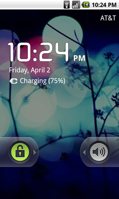
The Mac vs. PC analogy starts as soon as you look at the unlock screen for the phone. Here’s what you see on Apple’s iPhone vs. Google’s Android:
|
Google Nexus One
|
Apple iPhone 3GS
|
 |
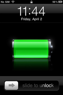 |
The iPhone allows for a single interaction: unlock the phone. The Nexus One gives you two: unlock or toggle sound on/off. The divergence continues once you unlock the phones:
|
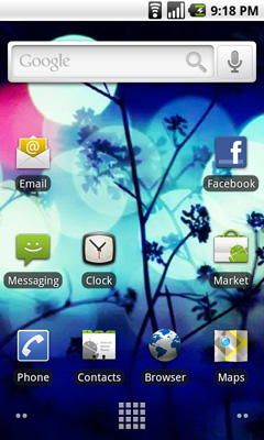
Google Nexus One
|
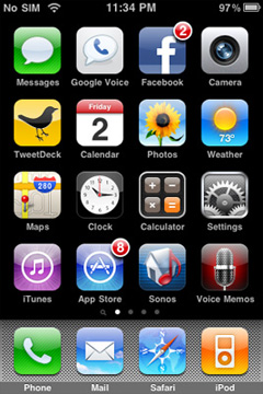
Apple iPhone 3GS
|
 |
|
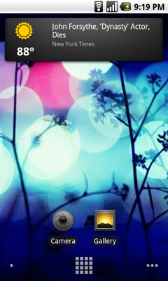
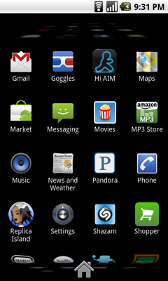
Apple’s home screen is a structured list of icons. Each swipe reveals another page that looks the same. You can customize placement of the app icons, and control what appears in the bottom row of four, but ultimately you’re flipping through a virtual index of your applications.
The Nexus One’s home screen is much more configurable/versatile. You start out with a u-shaped arrangement of icons. At the top, a Google search widget. Your home screen starts in the middle, you can swipe two screens to the right or left. On the iPhone you’re basically reading a book, on the Nexus One you’re navigating a field.
Swipe right to left and you’ll see a Gmail and Gtalk icon. Swipe left to right instead and you’ll see a weather widget and some more icons. The weather widget tells you the weather wherever you’re currently located (GPS/cellular network triangulation ftw) as well as gives you the latest news headlines all updated in real time.
 |
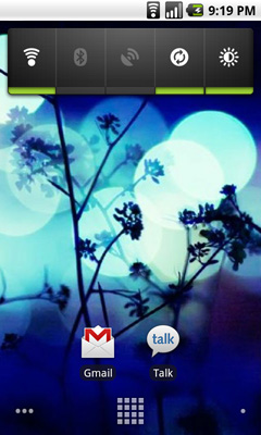 |
Apple’s predictable UI allows no room for quick ways to disable things like Bluetooth or 3G. The Nexus One ships with a Power widget that lets you quickly toggle WiFi, Bluetooth, GPS, auto syncing and auto brightness control. The only thing that’s missing is a quick way to disable 3G.
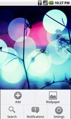
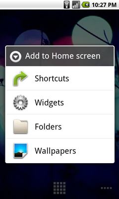
The remaining pages ship barren. It’s up to you to add items to them. You can do so by hitting the Nexus One’s contextual menu button and then clicking Add. You can add shortcuts to applications or interactive widgets. On the iPhone the only way you get something onto one of the home screens is by downloading/installing the app. There are no widgets, no concept of shortcuts, Apple abstracts all of this from the underlying software. As far as the user is concerned you install apps to the home screen and that’s how you access them. That’s your file system. Point, touch, access.
 |
 |
In Android it’s all a little less abstracted. Your home screens are like virtual desktops. True, you don’t run applications on them, but the widgets are similar enough. You create shortcuts to applications for easy access. If you want a list of all of the apps on your phone, just click the virtual button at the bottom of your home screen:
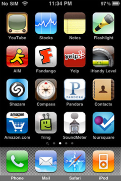
This is more of the traditional iPhone presentation, except instead of swiping to see more pages of apps you scroll down. As you scroll the vanishing list wraps around an imaginary cube to give the UI more depth.
|
Google Nexus One
|
Apple iPhone 3GS
|
 |
 |
The fundamental difference in approach to UI really shows how Google and Apple view the smartphone. Apple views it as a passive extension to the desktop/notebook. You use it when you want to make a call or quickly access a program or application. Your primary sources of information consumption are in other forms (e.g. desktop, notebook, tablet).
Google’s view is a bit more ambitious. Not having a desktop/notebook platform (yet) to rely on, Android’s role is understandably more pronounced. You get more customization and personalization options. The focus isn’t on simplicity, but rather customizable functionality. The sort of flexibility you’d expect out of a larger computing device, but on your smartphone. Again, it makes sense because Google doesn’t currently offer a larger computing device.
Those who cried foul when Apple tied everyone’s hands with the iPhone OS, those who listed everything that Windows Mobile could do that Apple couldn’t, if you are one of these people then Android is a far more natural fit. Those who wanted the focused simplicity the iPhone offered on the other hand, will probably feel a bit uncomfortable with Android.


95 Comments
View All Comments
Johnmcl7 - Sunday, April 4, 2010 - link
Very much agreed, I thought far too much time was wasted on Iphone references which given the Iphone generally does everything worse I really couldn't care less about it. Most noticeably multitasking was only given a brief mention despite being being detailed extensively for the Palm Pre reviews.I didn't understand the complaint about the notifications either, to me as a non-Android user the system makes perfect sense - it seems entirely logical to have icons for each notification which when tapped show a list with text on each one.
John
jamawass - Saturday, April 3, 2010 - link
Great review Anand. do you think the speech recognition worked well enough to be a complete subsitute for typed entry? I've been averse to touchscreen only devices (gave iphone to my wife) because I hate typing on them. Also did you try gesture search which has a highly publicized feature not too long ago?I'm currently using a treo pro windows mobile and even with all it's lack of polish it does feel like I am carrying a portable computer with me. I was hoping Windows7 series would enhance this but it appears as if MS is going to take the Apple approach in this regard. Looks like Android has picked up the windows mobile torch and literally flown to the stars with it.
Sidharthmodi - Saturday, April 3, 2010 - link
I liked the Depth in this Product Review. Thanks Anand.has407 - Saturday, April 3, 2010 - link
Appreciate the depth and that it's based on extended use. Using the 3GS for comparison is spot-on (everything is relative). Thanks again.Chloiber - Saturday, April 3, 2010 - link
Can we expect a review on the HTC Desire or Evo 4G?I know the specs are really quite the same (especially on the Desire) but HTC Sense UI gives the whole thing really a different touch and, according to first reviews, a much better usability.
Anand Lal Shimpi - Saturday, April 3, 2010 - link
We've been trying to get in touch with HTC to get review samples of both of those products. So far we haven't received any response but we won't stop trying :) Worst case, we'll just buy an EVO 4G when it comes out.Feel free to write HTC to provide some encouragement if you'd like :)
Take care,
Anand
Chloiber - Sunday, April 4, 2010 - link
Well, I'm waiting for my desire too :PEvo 4G will probably take even longer....to test Sense UI one can use the HTC Legend, Desire or Evo 4G - shouldn't make any real difference.
Anyway, I'm looking forward to it :)
relativityboy - Saturday, April 3, 2010 - link
If you already have an Android powered phone you can find the Sense UI online, and run it with the appropriate Rom and tools. I just saw it running on a G1 today. It was pretty fast. :)relativityboy - Saturday, April 3, 2010 - link
A very lengthy and thorough review of the bits, but I didn't come away with a solid understanding of how the device fits together as a user experience...the review feels, disjointed.The keyboard is narrow, how does that fit with the voice transcription?
Sometimes scrolling in the 'app drawer' is slow, but what else was going on in the background? Were you pulling data, listening to music, what else was going on in the phone? The device/os is a true multi-threaded environment for applications. I didn't notice any emphasis there (a major win over iPhone).
Did you try doing any benchmarking? Use 'Task Killer' or 'Setcpu'?
Android is OPEN, unlike apple's mobile products.
You can install apps that aren't in the app store.
Memory is super-upgradeable (when was the last time a 4Gb or 8Gb iPhone could be upgraded to 32Gb for the price of a micro-sd chip?)
The comment "It's Mac vs PC all over again" I think is totally missing representing what's going on here. Yet you hit the nail on the head later when you said Apple sees it as a device that's peripheral to laptops/pcs while Google is aiming for what it could be. Apple had a great idea, the iPhone. Google had a great idea a mobile environment/platform to allow lots of people to have great ideas. Google wants to let the world do the creating. The Nexus One as a device is a punctuation mark in a much larger story that includes the G1, Devour, HTC Evo, Droid, and others. Software development kits are available for-free for just about every platform you can shake a stick ate. Google is harnessing the creative powers of everyone who wants to get in on the game... The iPhone is just, well, Apple's 'one thing'.
A very respected developer friend of mine once said, "In a contest between your software/idea and the real world, the real world always wins." Google knows this. Apple doesn't.
I'm definitely an Android person, both by UI preference and ideology, but I don't feel like you've really tried, or given yourself enough time to 'get' what this platform is about.
jasperjones - Saturday, April 3, 2010 - link
Agree that Android's openness is of huge importance. On an iPhone, you can't even install an app that features a woman in bikini, Apple won't allow it. In this context, I always have to think of Tim Bray's statement that"The iPhone vision of the mobile internet’s future omits controversy, sex, and freedom, but includes strict limits on who can know what and who can say what. It’s a sterile Disneyfied walled garden surrounded by sharp-toothed lawyers."