The next-gen MacBook Pro with Retina Display Review
by Anand Lal Shimpi on June 23, 2012 4:14 AM EST- Posted in
- Mac
- Apple
- MacBook Pro
- Laptops
- Notebooks
The Software Side of Retina: Making it All Work
OS X, similar to iOS, uses points to represent display coordinates. Traditional OS/display combinations had a 1:1 mapping between points and pixels. Points in OS X are now floating point values, as a single point can be represented by multiple pixels on a high density display.
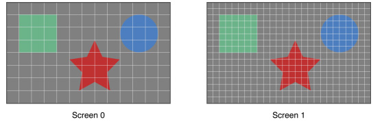
Images are the same size, but made of 4x the number of pixels on Screen 1 compared to Screen 0
How pixels map to points is determined by the backing scale factor. The backing scale factor can either be set to 1.0 or 2.0. In the case of the former you get 1:1 point to pixel mapping, while in the latter each point is backed by four pixels. The backing scale factor isn’t a global value, it can be set on a per element basis, allowing controls to to be legible while you get the benefits of a higher resolution for additional screen real estate. This aspect of OS X is key to enabling good behavior in applications as you’ll soon see.
Apple does a lot of the display handling for you so you don’t have to think about any of this. All vector based graphics and text using Apple’s APIs are automatically scaled up. Unmodified dialog boxes, toolbars, menus, etc.. should all look “normal” sized and just be ridiculously sharp on the Retina Display. Bitmapped images are scaled up using linear interpolation, but if higher resolution assets are provided OS X can simply swap and use those on a Retina Display.
Applications that render vector graphics, text and other elements to their own backing store will need hand tuning to look good on the Retina Display. These elements will receive the same linearly interpolated upscale I mentioned above.
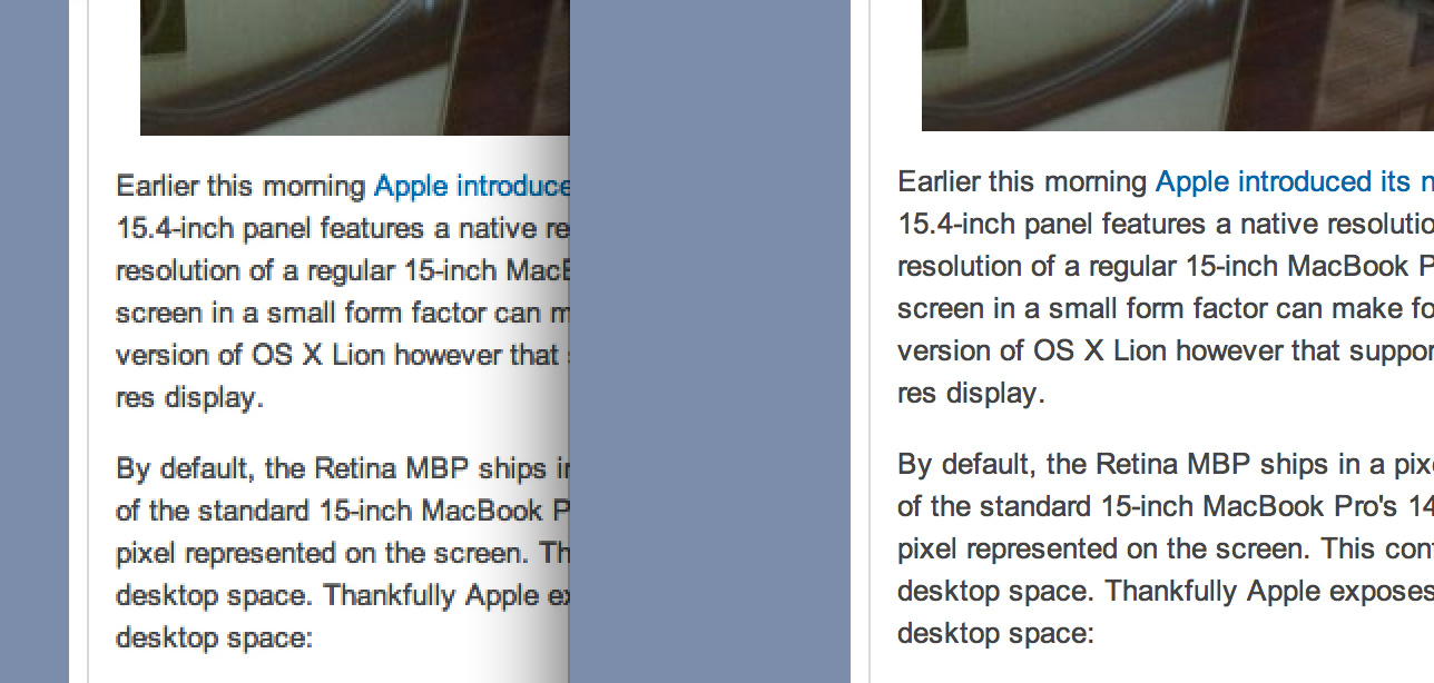
It’s a bit complicated and confusing so let me try my best to explain what’s going on here in a practical sense. The 15.4-inch Retina Display has a native resolution of 2880 x 1800, that’s 2880 pixels across and 1800 pixels down for a total area of 5,184,000 pixels.
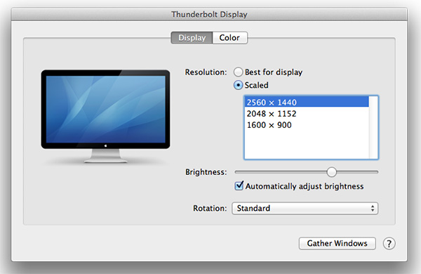
On the Retina MacBook Pro, Apple has done away with conventional resolution settings. Instead you get a horizontal list of scaling options (this applies to external displays as well):
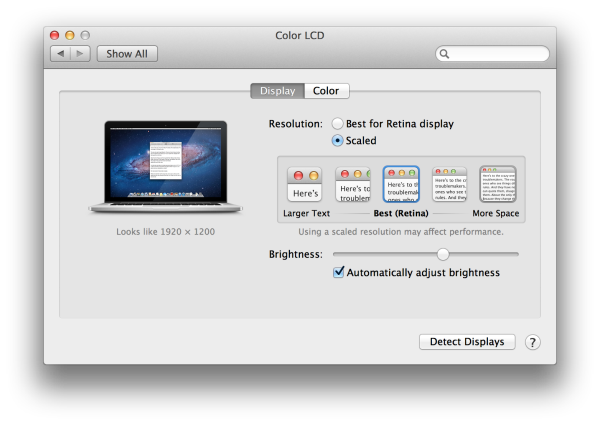


In the default “best for Retina Display” setting, the desktop, menu bar, icons and Finder windows are drawn at 2880 x 1800, but they are drawn larger than they would normally be at 2880. Apple draws everything at 4x the size to make the desktop behave exactly as it would on a 15.4-inch 1440 x 900 display - this is the backing scale factor (2.0) at work. This approach provides the best image quality as there’s integer mapping from pixels on the panel to pixels on the desktop. No interpolation or filtering is necessary.
The default "Best for Retina Display" setting, 2880 x 1800 but everything is scaled by 2.0 (4x resolution)
Third party applications without specific Retina Display support also operate in this same “looks like 1440 x 900” mode. If you fire up Chrome, Photoshop or Word you’ll see that everything looks identical to how it would look on a standard resolution 15-inch MacBook Pro. Again, the screen is drawn at 2880 x 1800 but everything is scaled up to be the same size it would be at 1440 x 900.
If third party applications use Apple’s standard methods of drawing text and windows, all of these windows will look super sharp. If they don’t however, whatever routines they use to display windows and text will need to be Retina aware otherwise they run the risk of not scaling text properly. The famous example at this point is Google’s Chrome which has its own offscreen text rendering buffer, even though it uses Apple’s text rendering APIs:
Google Chrome (left) vs. Safari (right) on the rMBP
Chrome Canary fixes the text rendering issue but it has a similar problem displaying images, they simply look better in Safari:

Google Chrome Canary (left) vs. Safari (right) on the rMBP
Even though Adobe had a Retina-aware version of Photoshop running at Apple’s WWDC keynote, the publicly available version of CS6 doesn’t feature the same support. Here even open dialog boxes look bad:
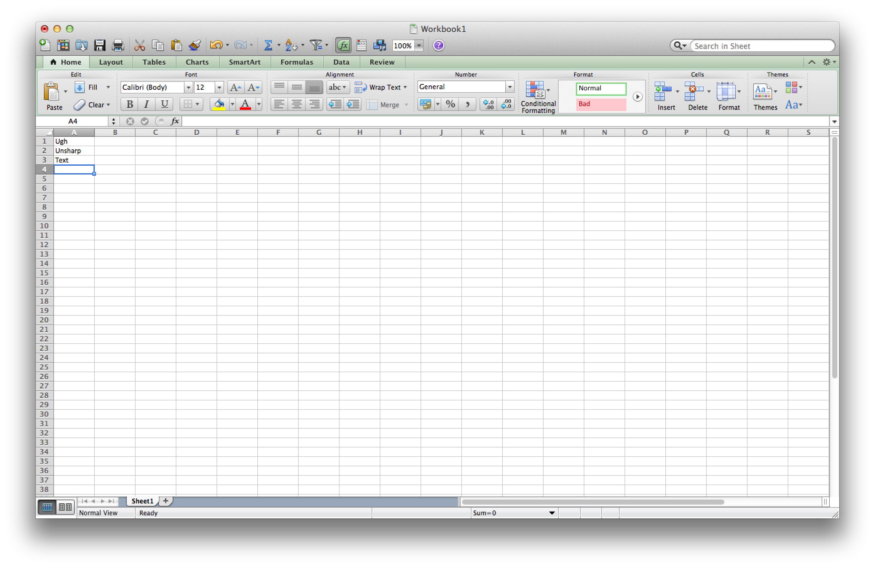
Many of you asked about Office 2011. These apps just work like they would at at 1440 x 900, just with blurrier text unfortunately:
MS Excel 2011 |
MS Word 2011 |
 |
 |
It’s not just third party applications that need updating however, even Apple’s own iWork suite has yet to be updated to take advantage of the Retina Display. As a result text in Pages is incredibly blurry. It has been roughly three years since Apple last updated the iWork suite, so the applications are definitely due for an overhaul. I am a bit surprised Apple didn’t update them at the launch of the rMBP to be honest. It’s quite possible that a major iWork update is imminent and Apple didn’t see the need to update 3 year old software in lieu of that.
Cocoa applications can be forced to open in magnified low resolution or high resolution modes by looking at the app's info window (cmd + i on a selected app in Finder):
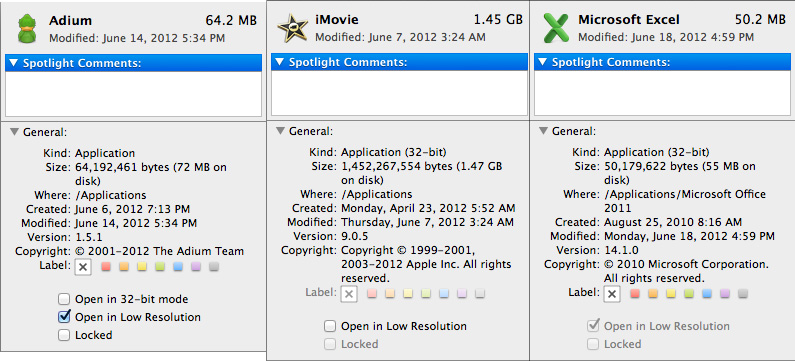
Eventually most apps will by default open in high resolution, such as those that have been optimized for Retina Display operation (e.g. iMovie above). Those applications that are not yet Retina aware may default to opening in low resolution mode (e.g. Adium, Pages), in which case they'll look and behave like they would at 1440 x 900 but with all UI elements upscaled to fit the 2880 x 1800 panel. Non-Cocoa applications will have the resolution scaling option greyed out (e.g. MS Office apps).
Where things get really exciting is when you have an application that not only handles scaling properly, but also takes advantage of the added resolution. Take Aperture 3.3 for example. With OS X set to its “best for Retina display” mode, this is what Aperture looks like with a 2880 x 1800 image open and displayed at full size:
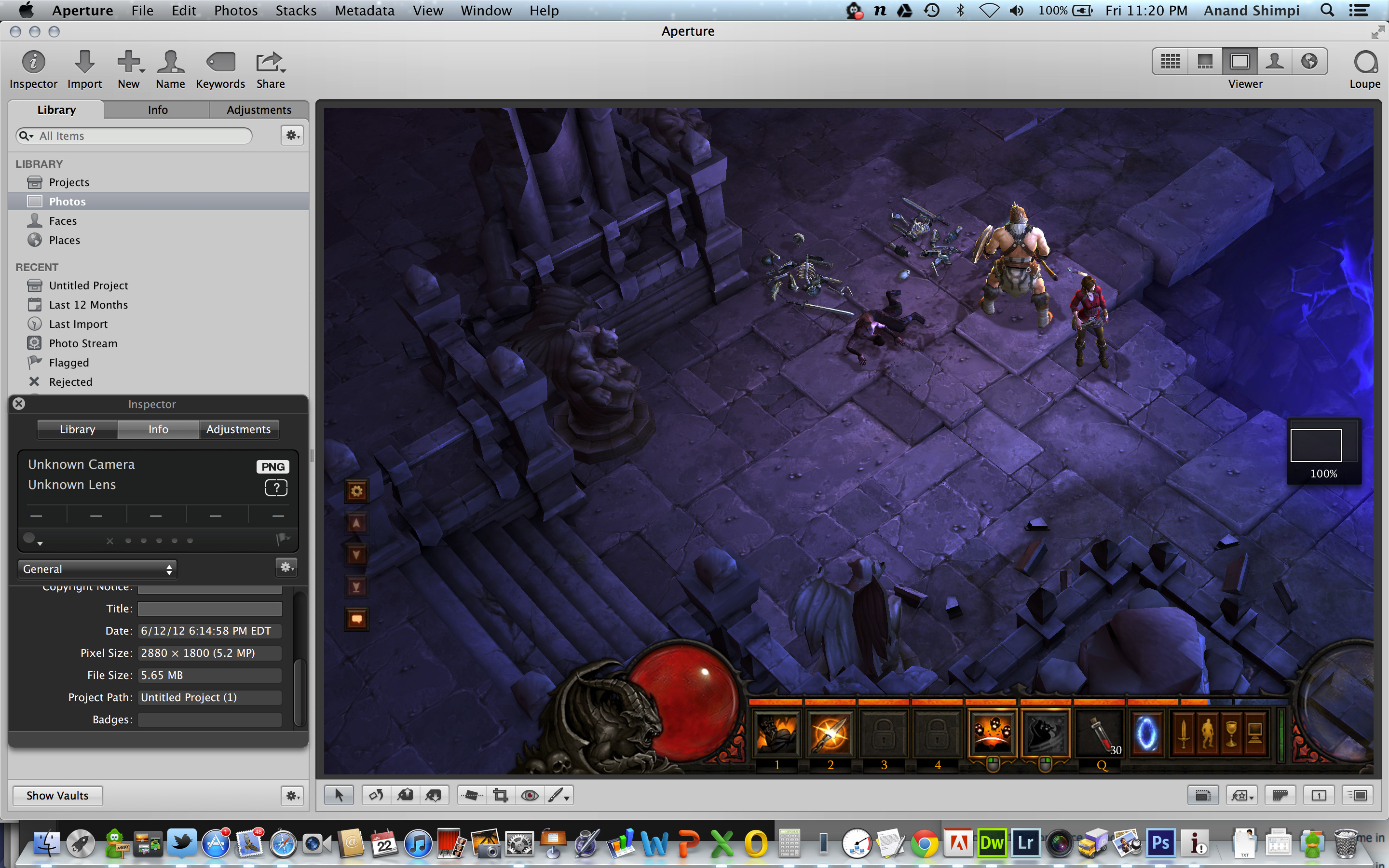
Here Apple is scaling the UI elements like the menus and widgets on the screen (backing scale factor = 2.0), but displaying the open image unscaled (backing scale factor = 1.0). As a result we can fit almost an entire 2880 x 1800 image on the screen without zooming out. Remember the backing scale factor isn’t global, individual elements on the screen can be scaled independently depending on their purpose.
The same thing happens when you look at applications like iMovie or Final Cut HD. The UI elements are scaled up but the video window is displayed unscaled, thus allowing us to display a full 1080p video alongside text and tools that are still legible.
It’s all handled amazingly well. It just works.
Oh but there’s more.
If you select the 1680 x 1050 or 1920 x 1200 scaling modes, Apple actually renders the desktop at 2x the selected resolution (3360 x 2100 or 3840 x 2400, respectively), scales up the text and UI elements accordingly so they aren’t super tiny (backing scale factor = 2.0), and downscales the final image to fit on the 2880 x 1800 panel. The end result is you get a 3360 x 2100 desktop, with text and UI elements the size they would be on a 1680 x 1050 desktop, all without sacrificing much sharpness/crispness thanks to the massive supersampling. The resulting image isn’t as perfect as it would be at the default setting because you have to perform a floating point filter down to 2880 x 1800, but it’s still incredibly good.
The same rules as above apply to Retina-aware applications. Take the Aperture example again, this time at “1680 x 1050”:
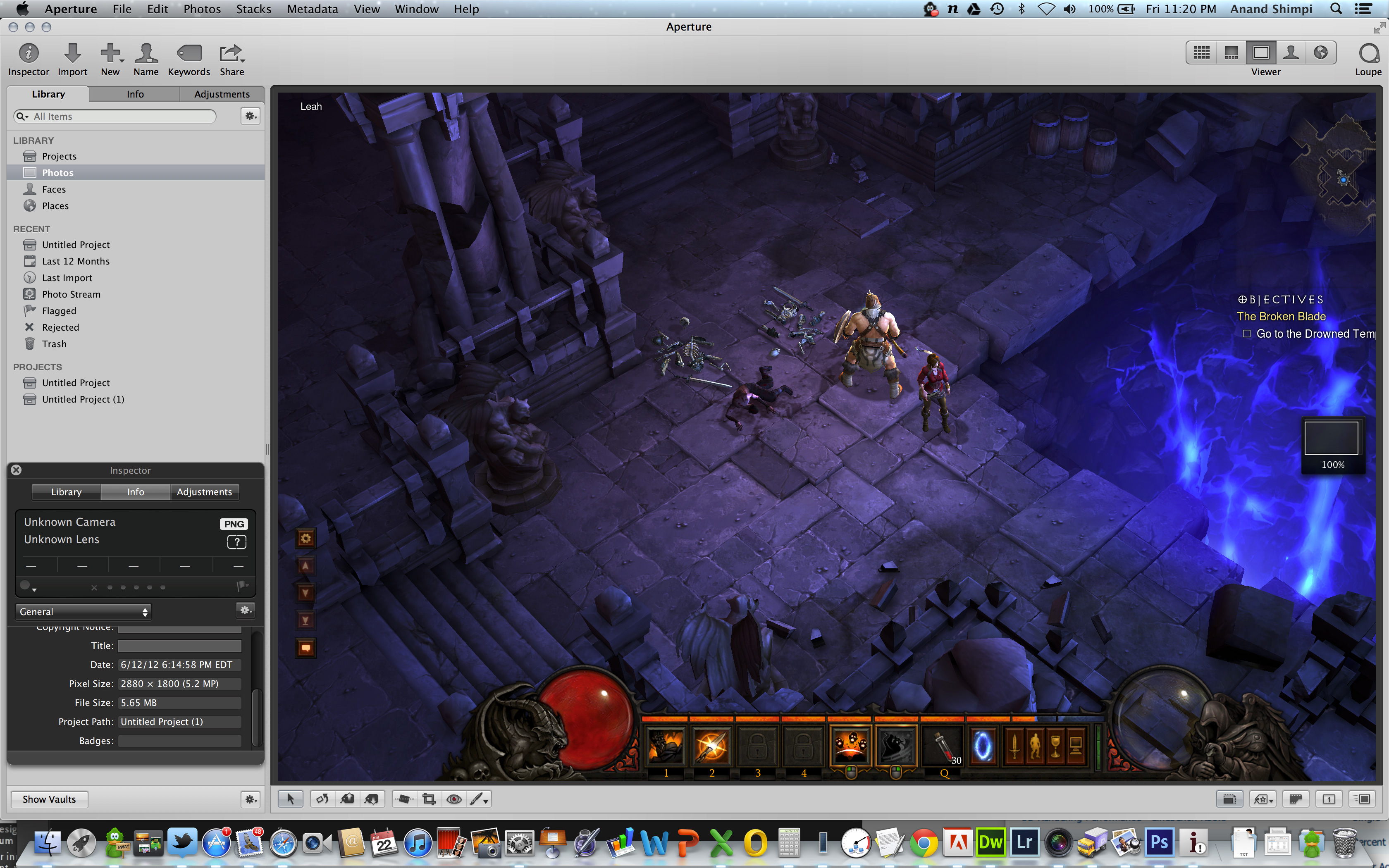
Note that we can fit the entire 2880 x 1800 image at 100% almost without having to scroll. This is possible because our screen is actually rendered at 3360 x 2100, with the text and UI elements scaled up so they aren’t super tiny, yet the image is left unscaled.
Here’s the same Aperture setup but at “1920 x 1200”:

The 2880 x 1800 image looks downright small since our desktop is rendered at 3840 x 2400. Despite the fact that we’re able to fit everything into a single screen, the text and other UI elements are totally usable at this setting. You get the benefits of additional application real estate without any of the downsides.
What happens if you decide to take Aperture full screen? The image is displayed almost completely at 2880 x 1800. You do lose a little vertical real estate but not much at all.
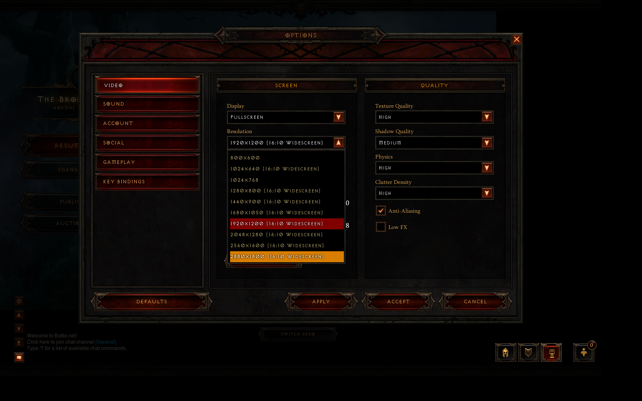
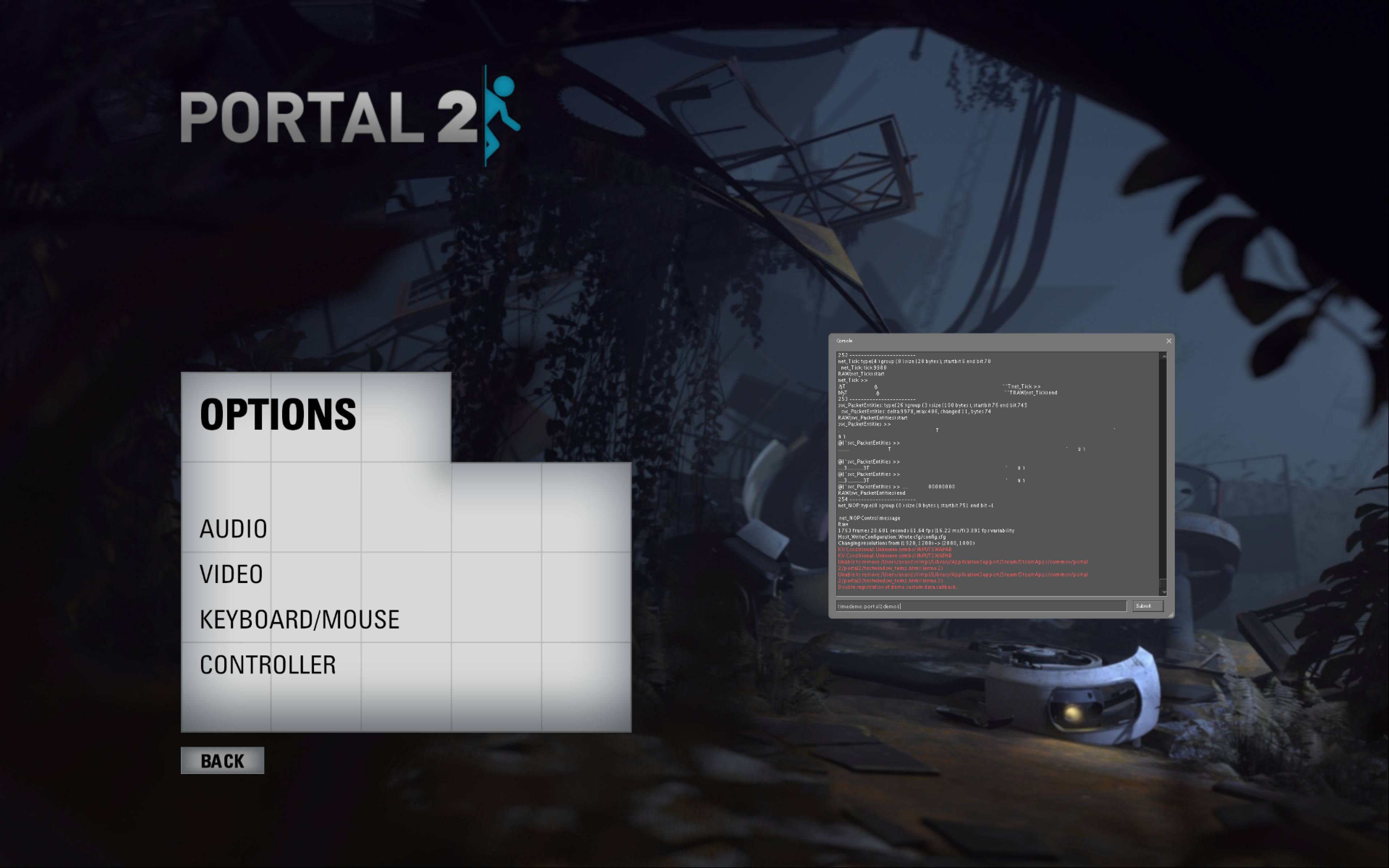
The 3D gaming experience is even simpler. Here you just choose the appropriate resolution and you get the same scaling you normally would in the game. I’ve already demonstrated support for 2880 x 1800 in titles like Diablo 3, although there is still a need for developer support as we see with the console window in Portal 2:
The flexibility offered by Apple’s handling of the Retina Display in OS X is unparalleled. What applications like Aperture, iPhoto, iMovie and Final Cut HD offer, is unbridled resolution independence. What Apple has done here is so much more difficult than what it pulled off in iOS with the Retina Display. It will take time for third party application developers to get on board, but with the power of the Mac app store and Apple’s growing install base of Mac users I suspect we will see incredibly quick adoption of support for the MacBook Pro’s Retina Display.


471 Comments
View All Comments
vincbxart - Saturday, June 23, 2012 - link
u wrong. Because of :16x9 is good to show my video work.
Discrete GPU is for gaming, ivy bridge is powerfull enough to threat with 4k video
VGA is especially for professionnal, a lot of video projector till get that.
The weight doesn't determine consumer or creative laptop...
Why the Z is not a consumer laptop
The price - pricier than the mb
The gamut full adobe rvb when apple is bader than the mb 2008... (98% VS 68%...) - you pay a lot for it
btw both are good. But The Z was greater than the macbook retina 2008 vs 2012
dannyboy153 - Sunday, June 24, 2012 - link
1) Showing of your video work is consuming media not creating. Feel free the use whatever you want to create content but I find it easier to do it on a 16x10. Menu bars, navigation panels, etc takes up room.2) I'm comparing the Sony Z to the MBP, not some technical fact that Ivy Bridge can do this or that. Does the Z output 2560x1600? No.
3) I didn't say the weight determine what was consumer or creative.
4) You can use the Z for creating content. You can use a $400 laptop to create content. But clearly the former is better than the later. Same with the MBP with retina vs the Z...clearly the former is better than the later. But use whichever one you want.
danrhiggins - Saturday, June 30, 2012 - link
BTW, I have a 2010 Z with 2 docking stations and the extra battery (the big one) that has been sitting on my desk unused for nearly a year when I switched to a 2011 MacBook Air. I really liked the Z. It was smaller and lighter than the Air. Actually I found the screen a bit too short for me.Bottom line is that I fell in love with the Mac OS and gestures. But that is just me.
So if anyone lives in Colorado and is interested I am going to put the Z on Craigslist. ;-)
KoolAidMan1 - Saturday, June 23, 2012 - link
Nailed it, the small 16:9 display, thicker chassis, and no dedicated GPU are huge corners that were cut. One can barely compare it with other 13" notebooks, let alone the 15" rMBP.Lots of grasping for straws going on here....
OCedHrt - Sunday, June 24, 2012 - link
Thicker chassis? The z is thinner than the MBP.The 13" is a design choice, not a manufacturing limitation. The goal is a 2.5 laptop. Japanese people don't weigh 180 lbs and don't like slugging around 4.5 lb laptops.
Barely compare it with other 13" notebooks? Care to list one that can even compete? It was 80% of the MBP retina in an MBA form factor in 2008, and then even lighter in 2011.
Spunjji - Monday, June 25, 2012 - link
Don't bother, you're arguing with an ignoramus.Chava - Friday, June 29, 2012 - link
+1KoolAidMan1 - Friday, July 6, 2012 - link
The only ignoramus I see are people grasping at straws trying to say that the rMBP has already been done in other laptops before.Sad and desperate
Spunjji - Thursday, November 8, 2012 - link
Thanks for proving my point.Guspaz - Saturday, June 23, 2012 - link
I tried out a Vaio Z in a Sony store when I was in the market for an ultraportable laptop (I decided on the first-gen Toshiba Portégé ultraportable, something I somewhat regret). The Vaoi Z was impressively thin, but suffered from three fatal flaws:1) Ludicrously expensive. The base model was $2000, and you needed to upgrade it a bunch from there to get the specs respectable
2) Only shipped with a bilingual keyboard; Sony refused to ship an American keyboard in Canada, even online, forcing consumers to get a strange non-standard keyboard with a funny shaped enter key
2) Indrecibly delicate. If you poke the screen in the corner with one finger, the whole screen flexes and bends away from your finger. It felt like this thing would shatter if I breathed on it.
In the end, it was no lighter than the Toshiba, and cost almost a thousand dollars more, but the Toshiba had its own issues.