The iOS 6 Review: Maps Thoroughly Investigated and More
by Brian Klug & Saumitra Bhagwat on September 19, 2012 2:21 PM ESTTurn By Turn
3D buildings look pretty, but without a doubt the most useful new maps feature in iOS 6 is first party support for turn by turn navigation. This has been notably lacking from iOS for some time now, partly due to rules Google imposes on what can be done with their map tiles.
I’ve spent a lot of time driving around with iOS 6 turn by turn, and in a word (well, three) it just works.
The previous maps app used to have two panes for search and directions. In iOS 6 maps theres a unified search bar, directions button, and address book button. As you’d expect, navigation can be initiated from either individual search listings by tapping on the quick route icon, or explicitly from the directions menu. Siri can also launch navigation if you ask it to navigate you somewhere. If you tap the directions icon you can select from either driving guidance, walking guidance, or routes using third party apps.
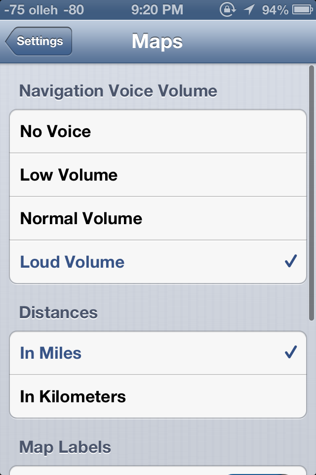
iOS initially prompts you to select from a few recommended routes, and then guidance begins. Further options are hidden away inside Settings.app, though these are relatively sparse. Voice guidance volume, label size, and units are really the only options here — there seen any options for preferring highways or surface streets, avoiding tolls (though you are warned when given routes to select from) or other common standalone GPS options. In iOS, voice guidance uses the same text to speech engine as Siri, so there’s no changing that either.
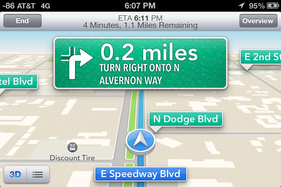
A third button appears alongside 3D as well which gives the route turn list and some detailed information. During normal turn by turn guidance, the status bar and all other UI is hidden, tapping brings these menus back into focus.
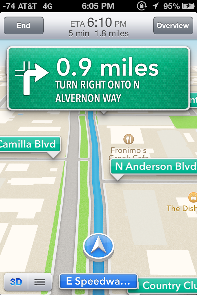
Driving interfaces - Navigation in progress (Left), tapping reveals more UI elements (Right)
I guess that brings us to the driving interface itself, which is extremely clean and minimalist. Previously I thought Google Navigation had an almost overly-minimalist set of OSD elements. After seeing iOS 6’s navigation interface it became clear that Apple has gone to some lengths to have even fewer things on their driving window. Up top is the next turn or event, and sometimes below it is the quick follow up guidance detail. At bottom is your current road, a vector position indicator, and really that’s it. The indicator is blue when you have a GNSS fix, grey when you otherwise don’t. By default the whole thing goes fullscreen including the status bar.
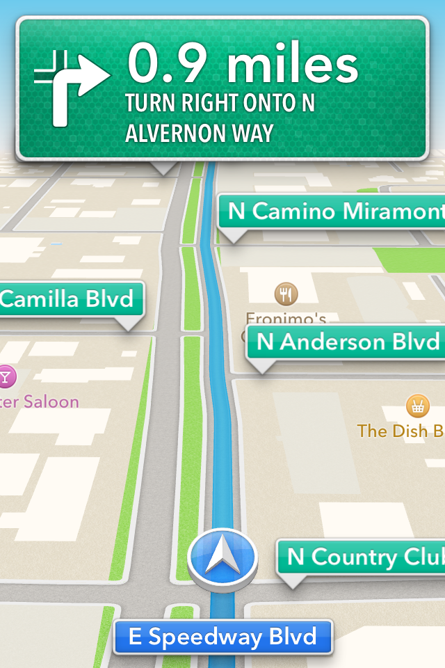
Apple’s design language for signage and alerts in the turn by turn app almost directly mirrors the USA’s Department of Transportation signage design style. Specifically, this is white text atop a green background for informational signage in the USA. In some navigation bubbles, Apple even emulates signage retroreflector texture (more skeuomorphism). Roads are called out with a green background as you drive along, route-specific roads are highlighted in blue. Points of interest and the same Apple maps base layer are both obviously carried over as well. In addition the interface zooms and pans very smoothly (breathes, really) as you change velocity and course. In addition, the view also changes perspective when approaching an intersection or turn. These animations are very smoothed and aren’t abrupt or otherwise distracting. I feel as though Apple’s main consideration for this interface was minimizing unnecessary clutter which would need parsing by your head and be potentially distracting.
On the whole the main view for turn by turn driving is strikingly minimalist. I was initially alarmed just how little information there is on the primary view when I first drove around with it, but it gets the job done. I generally want all the information I can get, so this isn’t really designed to what I like, but it makes guidance very easy to follow for drivers. What’s absent from the full screen view are any time to destination or estimated time of arrival clocks, present speed, or speed limit indicators. You can however see an estimated time of arrival and trip time by tapping which brings up the normal controls.
Closing navigation by pressing the home button doesn’t stop guidance, instead you get an ongoing process status bar indicator and textured badges when guidance alerts happen. This is very well executed, if you do need to do something else on the phone but still need guidance it is totally possible to survive, assuming your multitasking skills are up to snuff.
I’ve driven around with iOS 6 turn by turn since the first beta trying to break it or uncover some weird edge case where it gives horribly wrong guidance, but so far haven’t found a single thing. This is more than I can say for Google Navigation during its first few months, when it would periodically break on the I–10 and recommend driving literally up and down the interstate just past Casa Grande on the way to Phoenix (I jest not) and give endless voice prompts until being quit. That’s not to say Apple’s navigation product is perfect, I just haven’t uncovered anything insane yet.
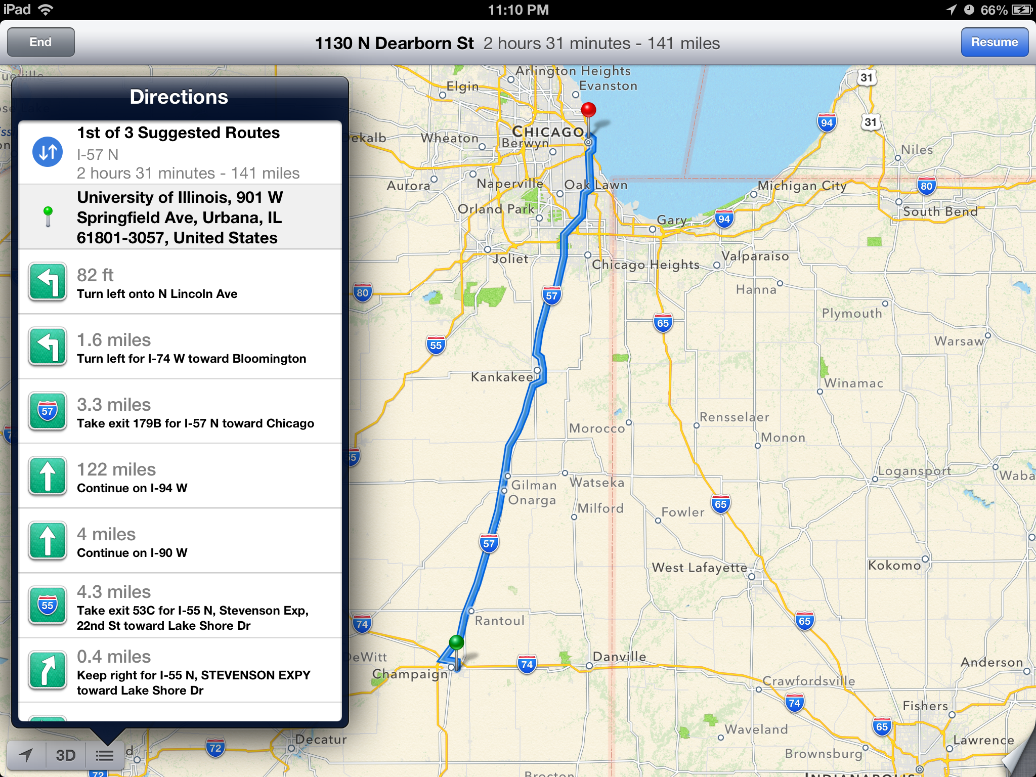 The new UI takes full advantage of the iPad's larger screen.
Time will tell both whether Apple’s GIS product is free of errors which cause weird routing instability, and whether its traffic avoidance component is competent. It is ready to go now, however, and I guess that is why it isn’t wearing a beta badge like some other iOS features I’m thinking of that don’t work nearly as well. At the same time however, Apple is hedging its bets with a “report a problem” button under the settings fold where you can select from a variety of issues or enter your own.
I drove around for a couple of journeys with both an iPhone 4S and an HTC One X giving voice guidance to compare the two. I still don’t believe there’s much cross platform shopping going on, but Google being the other dominant smartphone OS maker (well, and Nokia, but my Lumia review units are long gone) giving away free navigation does merit a comparison. I recorded an 18 minute video showing the difference since there’s just so much that can’t be conveyed with screenshots. Of course getting 20 minutes of good footage required a few hours of driving, so I’ve noticed a lot gradually.
First, iOS 6 is a bit less chatty with navigation information callouts, but does the usual alerts before reaching a turn and speaking roads. Second, Google and Apple do differ in their pathfinding a surprising amount as well. If you watch the video there are a number of times both disagree on which route is best to a surprising extent. Both reroute after deviating from the route very fast as well. My other thought is that the English (USA) female voice sounds more natural using the stock Google text to speech engine in Android 4.x than Siri does. In addition even at the maximum volume selected in settings and with system volume cranked all the way up in iOS, voice guidance is still way, way too quiet.
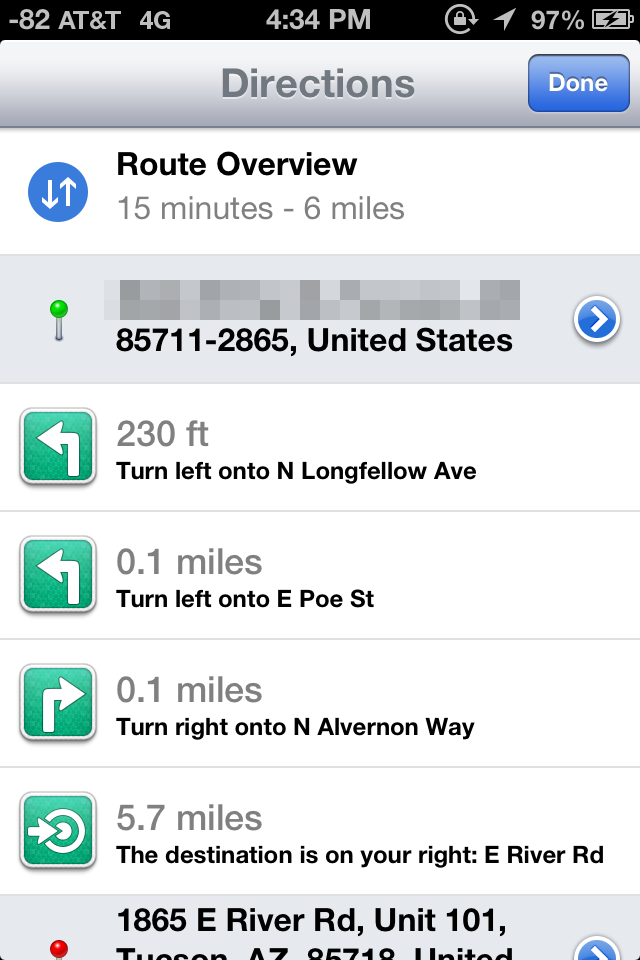
For devices which don’t include turn by turn (ones that aren’t A5 or A5X based or above), you can still get directions, however there’s just a paginated list which works basically like directions worked in iOS 5 and prior. That is to say you have to manually advance through each step of the journey.
On the whole though turn by turn in iOS 6 is a pretty solid experience with minimal stuff to complain about.
Listings
Maps also completely revamps the individual listing pages for dropped pins and places of interest. The app now uses Yelp for reviews and photos and presents these in a three pane layout for restaurants as businesses. Yelp data is heavily featured in the new maps application. Tapping on reviews launches the appropriate listing in the standalone Yelp app if it is installed, otherwise you immediately get brought to the App Store. This level of integration will no doubt be a huge boon for Yelp, though I wish there was a single sign on pane in Settings.app which would work the same way as Facebook and Twitter.


I’m a little confused by some of the duplication of functionality between the listings themselves and how seemingly every road leads to the Yelp app, however. Want to read a full review? Tap it, and you’re taken to the Yelp app. View more photos? To the Yelp app we go! It would’ve made a lot more sense to just integrate all of Yelp into Maps and have the standalone app exist as an extra of some kind.
As an aside, it’s interesting to see how the places and listing battle has shaken up, with Google buying Zagat after a falling out with Yelp, and Apple now being a key Yelp partner.


105 Comments
View All Comments
crankerchick - Thursday, September 20, 2012 - link
I was going to comment and quote the same statement. I'm an avid tech junkie. i've owned a variety of mobile electronics devices. I recently purchased first an iPad and then a MacBook Pro to replace my Xoom and Dell laptop and now I find myself feeling almost "forced" (I know no one forces me to spend my money) to buy an iPhone 5 because trying to find cross platform applications to sync with my Galaxy Nexus (which I really like) is just tough. Add in that iOS doesn't permit data sharing in the background, it makes being completely on iOS (for iCloud) or completely on Android for things to work together. Obviously, the Galaxy Nexus can't access iCloud, so to have things just seemlessly work together, I have to give up the iPad or migrate to the iPhone.It's obviously not the worse problem to have, but it sure is nice for things to work together. Right now, you really have to sign up for one or the other completely, for the best experience. Not to mention being on 2 different platforms means paying for the "same" app twice.
Fx1 - Wednesday, September 19, 2012 - link
When AT says on the internet that iOS STILL FEELS FRESH. You need to take a long hard look at your reporting because it stinks of Apple all over it.anactoraaron - Wednesday, September 19, 2012 - link
I know what you mean. I only had to read what was on the first page to see it. This is what first made me scratch my head..."Today, iPhone, iPad and iPod Touch make up a significant portion of Apple’s revenue, and as a result moving the platform along is more of a question of minimizing friction points rather than completely reinventing the OS. "
Why the hell not reinvent the wheel again? Oh right. Apple didn't reinvent it the first time around either. They 'stole' a bunch of ideas and put them together.
steven75 - Tuesday, September 25, 2012 - link
Yep, barely any phones these days look like that original 2007 iPhone.Oh no wait--THEY ALL DO!
Sufo - Thursday, September 20, 2012 - link
I have to agree. iOS does many things well, however "feeling fresh" is firmly at the bottom of that list. Visually, the experience has barely changed since the first iteration - yet the handsets cost, in essence, £1000 now...robinthakur - Thursday, September 20, 2012 - link
Well if you come from iOS5 to iOS6 it feels pretty fresh. I would imagine that this is what they meant. The changes are nice improvements in my cursory glance round them so far on iPad3 and IP4S, with Siri having massively improved in the UK. Having demo-ed it this morning in the office, a few people pre-ordered the IP5...I did buy a Samsung Galaxy 3 and kept it for a month, but didn't like the Android OS so went back to iPhone. Android does look nice (though obviously not as smooth) with some good ideas but I just felt that iOS is more integrated and some things just work more reliably. App choice was a big decider as well with a few of my favourite ones missing on Android, but the worst thing was the reception on the phone and the narrow ear-speaker which made me realise the 4S was actually quite good as a phone! If you feel restricted by the capabilities of the iPhone, then Android is probably a good bet, but I just bought it due to screen envy and wanting a new toy which then got bored after I finished playing.
Having gone from a WiMo phone back in 2007 to the first iPhone, and used Blackberrys, Sony P Series and others, I can say with certainty that anactoraaron's statement about "Apple didn't reinvent it the first time around either. They 'stole' a bunch of ideas and put them together. " is utter nonsense and the iPhone OS *was* completely revolutionary. People used to stop in the street and watch me using it, which seems unbelievable now, but true.
The best proof of this is that all phones now (barring perhaps Windows phone) operate and look like an iPhone. I concede though that if you never owned an iPhone/3G and went straight to Androids, perhaps they might even seem derrivative, but they were completely ground breaking when they were introduced.
maximumGPU - Thursday, September 20, 2012 - link
I went from ios 5 to 6, and it certainly doesn't feel novel.We've been having incremental improvements over the past 5 years, and while it was incredible in 2007, ios feels dated now.
It's gonna be windows phone for me now, that's a mobile os that feels "fresh".
Sufo - Friday, September 21, 2012 - link
Yes, windows phones are lovely - I adored my Lumia 800 (as a windows phone and as a physical handset) however lack of apps is a real and legitimate concern. If they can just drag more devs over I can really see windows being _the_ platform for "casual" phone users.Sufo - Friday, September 21, 2012 - link
Gonna have to disagree with you here. Not only does the jump from 5 to 6 not feel significant, it doesn't feel that different from the very first iteration (superficially).Stas - Sunday, September 23, 2012 - link
Loading the front page of AT doesn't give it away? O.o