The iOS 6 Review: Maps Thoroughly Investigated and More
by Brian Klug & Saumitra Bhagwat on September 19, 2012 2:21 PM ESTTurn By Turn
3D buildings look pretty, but without a doubt the most useful new maps feature in iOS 6 is first party support for turn by turn navigation. This has been notably lacking from iOS for some time now, partly due to rules Google imposes on what can be done with their map tiles.
I’ve spent a lot of time driving around with iOS 6 turn by turn, and in a word (well, three) it just works.
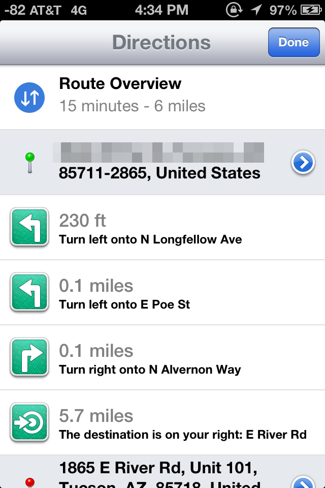
The previous maps app used to have two panes for search and directions. In iOS 6 maps theres a unified search bar, directions button, and address book button. As you’d expect, navigation can be initiated from either individual search listings by tapping on the quick route icon, or explicitly from the directions menu. Siri can also launch navigation if you ask it to navigate you somewhere. If you tap the directions icon you can select from either driving guidance, walking guidance, or routes using third party apps.
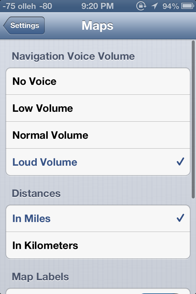
iOS initially prompts you to select from a few recommended routes, and then guidance begins. Further options are hidden away inside Settings.app, though these are relatively sparse. Voice guidance volume, label size, and units are really the only options here — there seen any options for preferring highways or surface streets, avoiding tolls (though you are warned when given routes to select from) or other common standalone GPS options. In iOS, voice guidance uses the same text to speech engine as Siri, so there’s no changing that either.
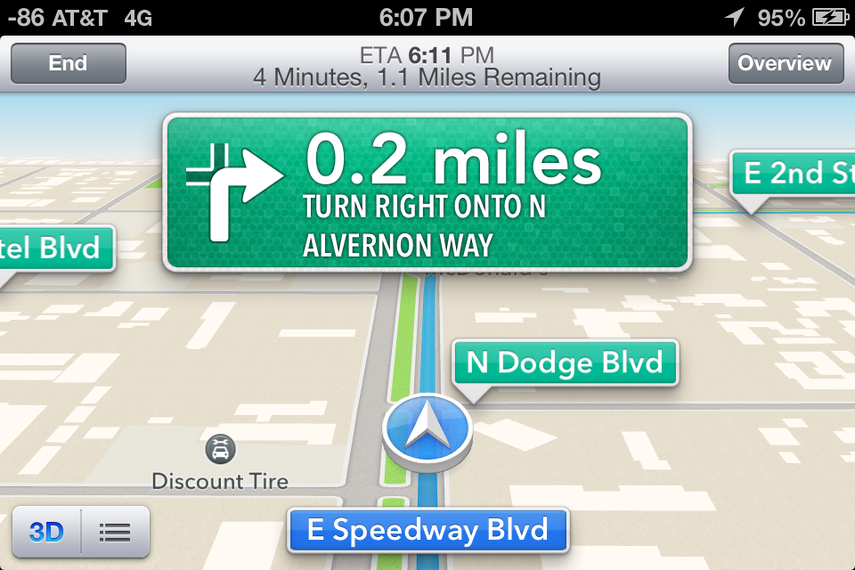
A third button appears alongside 3D as well which gives the route turn list and some detailed information. During normal turn by turn guidance, the status bar and all other UI is hidden, tapping brings these menus back into focus.
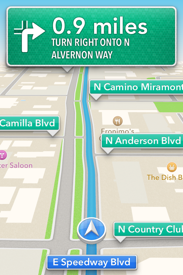
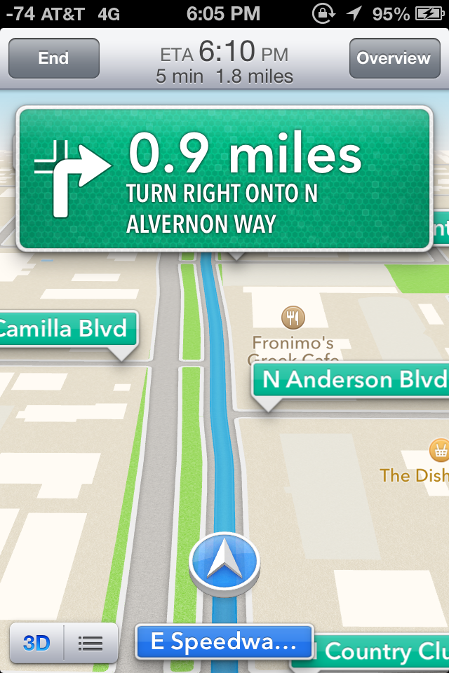
Driving interfaces - Navigation in progress (Left), tapping reveals more UI elements (Right)
I guess that brings us to the driving interface itself, which is extremely clean and minimalist. Previously I thought Google Navigation had an almost overly-minimalist set of OSD elements. After seeing iOS 6’s navigation interface it became clear that Apple has gone to some lengths to have even fewer things on their driving window. Up top is the next turn or event, and sometimes below it is the quick follow up guidance detail. At bottom is your current road, a vector position indicator, and really that’s it. The indicator is blue when you have a GNSS fix, grey when you otherwise don’t. By default the whole thing goes fullscreen including the status bar.
Apple’s design language for signage and alerts in the turn by turn app almost directly mirrors the USA’s Department of Transportation signage design style. Specifically, this is white text atop a green background for informational signage in the USA. In some navigation bubbles, Apple even emulates signage retroreflector texture (more skeuomorphism). Roads are called out with a green background as you drive along, route-specific roads are highlighted in blue. Points of interest and the same Apple maps base layer are both obviously carried over as well. In addition the interface zooms and pans very smoothly (breathes, really) as you change velocity and course. In addition, the view also changes perspective when approaching an intersection or turn. These animations are very smoothed and aren’t abrupt or otherwise distracting. I feel as though Apple’s main consideration for this interface was minimizing unnecessary clutter which would need parsing by your head and be potentially distracting.
On the whole the main view for turn by turn driving is strikingly minimalist. I was initially alarmed just how little information there is on the primary view when I first drove around with it, but it gets the job done. I generally want all the information I can get, so this isn’t really designed to what I like, but it makes guidance very easy to follow for drivers. What’s absent from the full screen view are any time to destination or estimated time of arrival clocks, present speed, or speed limit indicators. You can however see an estimated time of arrival and trip time by tapping which brings up the normal controls.
Closing navigation by pressing the home button doesn’t stop guidance, instead you get an ongoing process status bar indicator and textured badges when guidance alerts happen. This is very well executed, if you do need to do something else on the phone but still need guidance it is totally possible to survive, assuming your multitasking skills are up to snuff.
I’ve driven around with iOS 6 turn by turn since the first beta trying to break it or uncover some weird edge case where it gives horribly wrong guidance, but so far haven’t found a single thing. This is more than I can say for Google Navigation during its first few months, when it would periodically break on the I–10 and recommend driving literally up and down the interstate just past Casa Grande on the way to Phoenix (I jest not) and give endless voice prompts until being quit. That’s not to say Apple’s navigation product is perfect, I just haven’t uncovered anything insane yet.
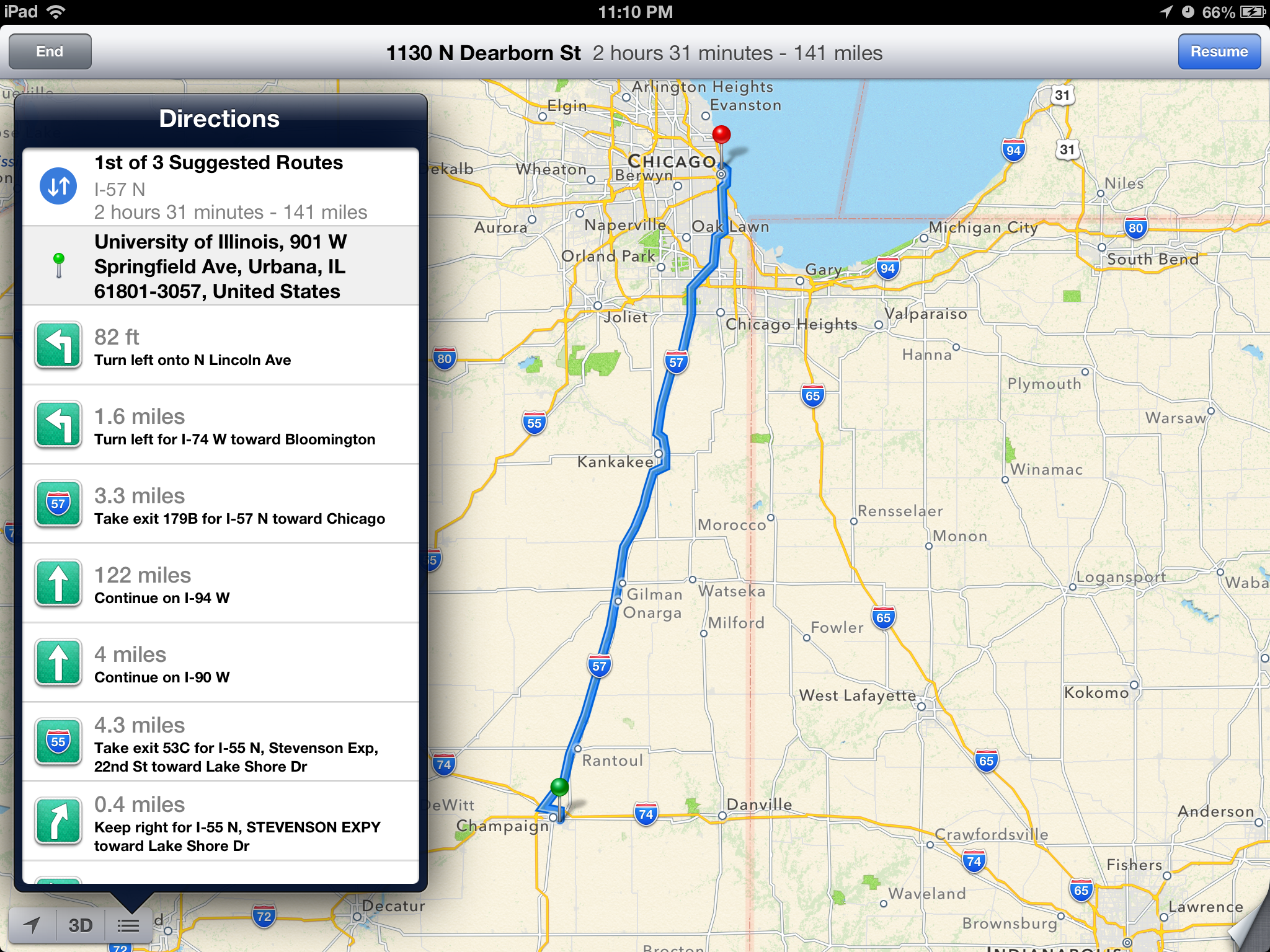 The new UI takes full advantage of the iPad's larger screen.
Time will tell both whether Apple’s GIS product is free of errors which cause weird routing instability, and whether its traffic avoidance component is competent. It is ready to go now, however, and I guess that is why it isn’t wearing a beta badge like some other iOS features I’m thinking of that don’t work nearly as well. At the same time however, Apple is hedging its bets with a “report a problem” button under the settings fold where you can select from a variety of issues or enter your own.
I drove around for a couple of journeys with both an iPhone 4S and an HTC One X giving voice guidance to compare the two. I still don’t believe there’s much cross platform shopping going on, but Google being the other dominant smartphone OS maker (well, and Nokia, but my Lumia review units are long gone) giving away free navigation does merit a comparison. I recorded an 18 minute video showing the difference since there’s just so much that can’t be conveyed with screenshots. Of course getting 20 minutes of good footage required a few hours of driving, so I’ve noticed a lot gradually.
First, iOS 6 is a bit less chatty with navigation information callouts, but does the usual alerts before reaching a turn and speaking roads. Second, Google and Apple do differ in their pathfinding a surprising amount as well. If you watch the video there are a number of times both disagree on which route is best to a surprising extent. Both reroute after deviating from the route very fast as well. My other thought is that the English (USA) female voice sounds more natural using the stock Google text to speech engine in Android 4.x than Siri does. In addition even at the maximum volume selected in settings and with system volume cranked all the way up in iOS, voice guidance is still way, way too quiet.
For devices which don’t include turn by turn (ones that aren’t A5 or A5X based or above), you can still get directions, however there’s just a paginated list which works basically like directions worked in iOS 5 and prior. That is to say you have to manually advance through each step of the journey.
On the whole though turn by turn in iOS 6 is a pretty solid experience with minimal stuff to complain about.
Listings
Maps also completely revamps the individual listing pages for dropped pins and places of interest. The app now uses Yelp for reviews and photos and presents these in a three pane layout for restaurants as businesses. Yelp data is heavily featured in the new maps application. Tapping on reviews launches the appropriate listing in the standalone Yelp app if it is installed, otherwise you immediately get brought to the App Store. This level of integration will no doubt be a huge boon for Yelp, though I wish there was a single sign on pane in Settings.app which would work the same way as Facebook and Twitter.


I’m a little confused by some of the duplication of functionality between the listings themselves and how seemingly every road leads to the Yelp app, however. Want to read a full review? Tap it, and you’re taken to the Yelp app. View more photos? To the Yelp app we go! It would’ve made a lot more sense to just integrate all of Yelp into Maps and have the standalone app exist as an extra of some kind.
As an aside, it’s interesting to see how the places and listing battle has shaken up, with Google buying Zagat after a falling out with Yelp, and Apple now being a key Yelp partner.


105 Comments
View All Comments
Hyper72 - Wednesday, September 19, 2012 - link
Mobile Safari reports as:Mozilla/5.0 (iPad; CPU OS 6_0 like Mac OS X) AppleWebKit/536.26 (KHTML, like Gecko) Version/6.0 Mobile/10A403 Safari/8536.25
iCab Mobile reports:
Mozilla/5.0 (iPad; U; CPU OS 5_0 like Mac OS X) AppleWebKit/534.46 (KHTML, like Gecko) Version/5.1 Mobile/9A334 Safari/7534.48.3
anandtech02148 - Wednesday, September 19, 2012 - link
gotta disagree with the author on the tablet web browsing.The convenience of web browsing on a tablet is one factor, instant access, easy finger gestures, it should be enhanced in the future so that we do away with the uneccessarry luggage like a keyboard and mouse. Even cutting and pasting have improved, i'm not sure what the author is talking about copying multiple links, mass email etc, the point of Ipad internet browsing is purely entertainment and should be improved upon. IOS does an amazing job on memory management, especially these websites that invades your browser with crazy advertising pop ups. Sinces Android foundation is from Java it might as well be the devil's advocate in crashing and freezing your device.
mikato - Thursday, September 27, 2012 - link
What if you are away from your tablet and are browsing the web, but then you have to stop or you want to save something for later. Then later you want to browse on your tablet instead, and you'd like to pick up where you left off or go back to what you'd saved. It seems like that's the point of the new Reading List syncing feature. How else would you do it besides emailing the links?Some typing is still required when using the web, right? Typing on a touchscreen has improved a lot but is still like a bit like using a keyboard with gloves on. I don't know what my WPM is on a tablet but it must be must be at least cut by 70% or something. I have still occasionally switched to using my desktop when I need to figure something out on the web since it is just much faster. Also, depending on what I'm doing, I may need to look at several web pages, my own notes, or something else why writing an email or a writing something. This is more than just web browsing and although a tablet screen is bigger than a phone and closer to a desktop/laptop, the functionality just isn't there for doing something like that with a tablet. If you're really just "browsing" then a tablet is comfortable for that.
JeremysBrain - Wednesday, September 19, 2012 - link
Only been using nav for 1 day, but the one annoyance that could likely drive me (no pun intended) back to Waze or Navigon is that when the voice guidance comes on, it talks on top of music and podcasts. Other navigation applications will stop playback from other applications, then resume when voice guidance is done.it's frustrating when I'm listening to Brian and Anand, then having to rewind every time new voice guidance comes on in then middle of one of Brian's tangents!
I would like this feature when I'm listening to music, but not when I'm listening to talking heads.
faizoff - Wednesday, September 19, 2012 - link
Just upgraded my iphone 4 to iOS6. The maps app is nowhere close to what google offers so far. I knew there would be issues during the initial release due sheer volume I suppose.Even without turn by turn directions or 3D flyover, the larger direction signs that show up are pretty good for navigation.
The standard maps are very ill configured and barely show any info. I'd have thought that with Tom Tom being a GPS company would have a rather comprehensive database already. My scaling is wrong and many areas are missing. No streetview means by default means I have to wait for google to release their app.
I think I was very impressed with the updates going from iOS4 to iOS5. Going from 5 to 6 however hasn't impressed overall that much yet.
The autobrightness is weird and isn't the same as before for some reason. I had issues with home sharing when it worked flawlessly before, infact was a huge improvement between updates up till now.
I do love the options now present when getting a call.
PPalmgren - Wednesday, September 19, 2012 - link
I'm dissapointed that this article completely glosses over the fact that the maps themselves look like absolute garbage. The way the roads are rendered and the colors used is god-awful compared to google maps, UI being Apple's main selling point. Its hard to tell road types apart close up and hard to read the map in general because of the way its rendered, with thin roads and all. I find it to be a piss-poor implementation and am dissapointed at the soft-white tinted glasses that appeared to be the filter this article went through.MykeM - Thursday, September 20, 2012 - link
I'm comparing what I'm seeing on iOS Map and Google Map- limiting to my milieu since I'm familiar with it- but what I'm seeing is quite comparable.There are a few things on the iOS6 map that seems incomplete. For example, rail track- yes it's much, much narrower than the street but missing the required lines that cut across the track.
But the street itself- the iOS6 version seems better at replicating and differentiating the various width of the main thoroughfares and side-streets. When toggling between the layers of Standard and the Satellite maps, I can clearly see that Google map does a poorer job- it seems to replicate the traffic flow rather than the road itself (resulting in curvier turns when it's actually right-angled). Expectedly, it does a better job at marking various businesses around the neighbourhood. One area where the iOS version will improve over time.
Colour choice and preference are completely subjective but again except for a few choices of colours, both maps seems to me more similar than they're different (Skeuomorphism aside).
robinthakur - Thursday, September 20, 2012 - link
I disagree completely I'm afraid. I was quite worried updating to iOS 6 that the maps would be awful as many early previews of the dev version said, but on my device it runs really fast, we have brilliant 3D flyovers and the maps are accurate and scale nicely. I especially like the rotation and elevation two finger controls like on Android Google maps. Since using G Maps on Android I always though the iOS implementation was a poor cousin, so I think it is good that Apple have finally come up with something comparable and slick which will hopefully grow swiftly. Navigation is much less confusing and busy than the Android version from what I have seen so far. The Siri integration is the icing on the cake.I do miss street view, buit rarely used the public transport navigation bit as Transport for London has a superior service available. At least now when Google release a mapping app it can be as Google want it to be and it will be up to the user whether they want Google tracking their every move and making money off of their browsing/map use.
bunga28 - Wednesday, September 19, 2012 - link
I really enjoy reading the article. It is very informative. Thank you.1. There are 2 authors listed for this piece. I just wanted to know who is the "I," "me," "mine," ... in this. That is very confusing.
2. "at present [Google] literally is the 9000 pound gorilla for maps." Literally? Literally? That is like a friend of mine said to me "I literally haven't seen you for a million years."
ciparis - Sunday, September 23, 2012 - link
Well, considering:1) they do weigh 9000 pounds (or more)
2) at least a few of them strongly resemble a gorilla, so who can say that they aren't?
I don't see the problem. Plus, your friend might just be a time traveller.