NEC PA242W Monitor Review
by Chris Heinonen on September 27, 2013 9:00 AM ESTWith the switch to CalMAN we have been able to use much better methods for measuring display uniformity. Instead of getting unique dE2000 values for each point on the screen, they are compared to the center of the screen to give us a true uniformity value. We also measure 24 patches so we have a much more accurate idea of overall color and brightness uniformity than just measuring white level. Now with the test data from the NEC PA242W, I can finally use it to show why a professional monitor costs so much more.
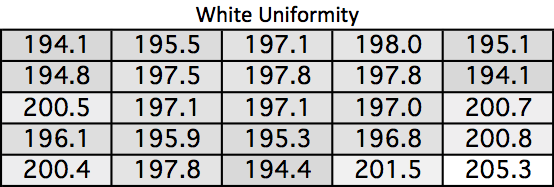
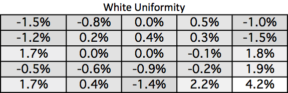
Look at the white uniformity data. I usually am very happy if nothing varies from the center by more than 10%. On the NEC PA242W the maximum variation is 4.2%. A white field on the screen is white, and it is the same level everywhere. No monitor before has come close to this performance, which is a testament to the design of the NEC backlight setup.
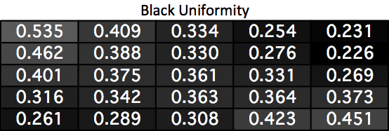
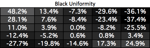
Black uniformity is not nearly as good as white. Two corners are much darker and two are much lighter than the center. I’m surprised by this as good uniformity usually works both ways, but it seems that white uniformity is being judged to be more important overall than black uniformity here.
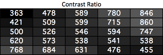
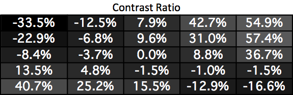
Since the white uniformity was almost perfect, this is just a mirror of the black uniformity chart. Two corners have much higher contrast ratios and two are much worse. It’s a bit disappointing just like the black uniformity is.
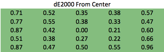
The color error uniformity is not disappointing at all. Instead, it is practically perfect. No area of the screen has an average dE2000 error >1 compared to the center. Since an error less than 1 is invisible to the eye, even on still images, this really is perfect. Even if the numbers were lower you wouldn’t see a difference, so I will just say this is perfect.
Uniformity like this has not been seen in my testing before. This performance is what professional designers and photo editors’ need, and it is what NEC delivers. It is expensive, but for many people it is worth paying for as it has untouched uniformity performance.


74 Comments
View All Comments
sweenish - Friday, September 27, 2013 - link
By your own admission, the monitor reviewed is fine as it does have the 1000:1 that you quote for a display being good. I know you say "at least," but that still makes all your complaining useless as this monitor meets your criteria.khanov - Sunday, September 29, 2013 - link
Hulk fail. :-(Hulk mad!
foxalopex - Friday, September 27, 2013 - link
Senti - I own this monitor so I can attest that you are right. What's striking about this monitor visually is that at first it doesn't look like it has a lot of contrast. That is the absolute white and absolute black colours are not as extreme as most monitors. At least until you put up a picture or run a movie that has very light and dark scenes. What you end up seeing is a lot of gradients of grey that are not pushed into absolute black or white. The results are amazing compared to what you would see in a normal monitor.Gothmoth - Friday, September 27, 2013 - link
we have pro eizo and quato monitors here, they are the best for photographers and designers and they have a contrast ratio of .. guess what.... 1000:1some noobs think higher contrast ratio numbers and maybe even dynamic contrast makes a monitor better... well they are wrong.
rabidwombatsquirrel - Saturday, October 26, 2013 - link
Well higher contrast ratios DO make a monitor better and I can't wait until we get OLED tech and 4k+ in these NEC displays since I do miss the extra deep blacks and contrast even for photos.That said screen uniformity, colors not going wonky looked at even a hint off angle, perfect primary location, perfect saturation and primary luminance tracking, wide gamut, etc. also matter a ton and these PA series do all that amazingly well (Eizo too, although they cost twice as much).
The internal 14bit 3D LUT in these PA monitors works wonders. And unlike with most wide gamut monitors you can pop it into a PERFECT sRGB emulation with not only just gamma 2.2 option but even sRGB TRC options as well, in fact, it does sRGB a lot better than virtually any sRGB monitor, almost all of which actually fall a bit short of sRGB primaries.
These are superb monitors!!!! That also said I can't wait until they get OLED into them for amazing blacks and contrast ratios and also 4k+ since the current res is bothersomely low (not that it's worse than 99.9999% of others, I just want the tablet/HDTV retina type stuff to appear in desktop monitors already).
rabidwombatsquirrel - Saturday, October 26, 2013 - link
Yeah being able to get low black levels is important and I surely wish IPS was better.That said, much of what you are saying is totally wrong! Dynamic range is not the ability to distinguish between various dark tones and various bright tones. And a low contrast ratio absolutely does not mean that dark tones appear crushed!!!! (unless you are using absolute calibration to pure black instead of relative, which doesn't work out all that well on anything other than OLED screens, although the top PVA and plasma could almost start to get away with it without crushing too much but even then you'll lose the ability to tell apart the very darkest tones) or that bright tones appear clipped!
A monitor with a poor contrast ratio tends to have blacks that are not all that dark and it's often easier to see into deep shadow details on them.
A monitor with superb calibration will leave the lowest steps all distinguishable if you use relative black level calibration while many cheap ones, even with intensely deep black levels and high contrast ratio, may crush all those tones together with no way to separate them and they might also clip the top end so the top few shades all look the same, that definitely isn't the case here.
Not measure here are things like saturation tracking curves and primary luminance tracking curves, many monitors appear to be perfectly calibrated but if you toss in these tests many will fail, some quite badly, here the lines are near perfect thanks to the 14bit 3D LUT.
rabidwombatsquirrel - Saturday, October 26, 2013 - link
My post above was supposed to be to Hulk not you Senti, sorry it got placed wrong.Death666Angel - Friday, September 27, 2013 - link
Well, NEC has been doing it like this for most of their high-ish end monitors for years and clearly they are much sought after. The way they make their displays so homogeneous is resulting in this "low" contrast ratio. I haven't ever seen anyone complain about contrast ratios above 500:1 in the professional space this is aimed at. I have also never seen anyone want an OLED display for their work, as you seem to desire. Also, last I checked, print contrast ratios are below 500:1 as are nearly all film/tv contrast ratios.chrnochime - Friday, September 27, 2013 - link
If you are as much an expert as you claim to be you wouldn't need to cast doubt into how good this monitor is when it comes to contrast, since you'd KNOW already. And if it's anywhere as bad as you think it is, NEC would not have people still buying them to warrant making this most recent iteration.ZeDestructor - Friday, September 27, 2013 - link
A 16:10 display! rare things these days..Nice results, but how does it compare to the similarly-targeted/specced Dell U2413, or even the older U2410?
Kinda dissapointed at the lack of 4K at 24" 16:10 (3840x2400), but I guess we still have to wait for the current stock of 1920x1200 panels to get pushed out and 4K stocks to build... Then again, with some good production, marketing, we could be having 8K at 20" already (my phone has 1920x1080 at 5", just scale up the panel)