NEC PA242W Monitor Review
by Chris Heinonen on September 27, 2013 9:00 AM ESTWith the switch to CalMAN we have been able to use much better methods for measuring display uniformity. Instead of getting unique dE2000 values for each point on the screen, they are compared to the center of the screen to give us a true uniformity value. We also measure 24 patches so we have a much more accurate idea of overall color and brightness uniformity than just measuring white level. Now with the test data from the NEC PA242W, I can finally use it to show why a professional monitor costs so much more.
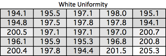
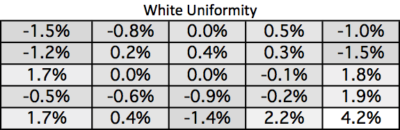
Look at the white uniformity data. I usually am very happy if nothing varies from the center by more than 10%. On the NEC PA242W the maximum variation is 4.2%. A white field on the screen is white, and it is the same level everywhere. No monitor before has come close to this performance, which is a testament to the design of the NEC backlight setup.
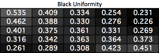
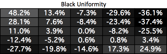
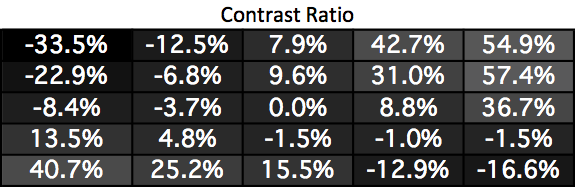
Black uniformity is not nearly as good as white. Two corners are much darker and two are much lighter than the center. I’m surprised by this as good uniformity usually works both ways, but it seems that white uniformity is being judged to be more important overall than black uniformity here.
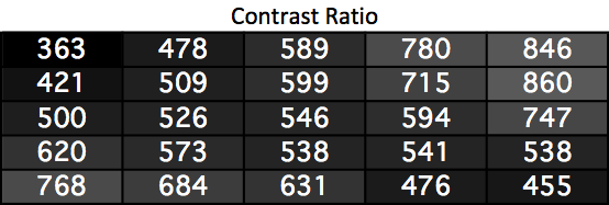
Since the white uniformity was almost perfect, this is just a mirror of the black uniformity chart. Two corners have much higher contrast ratios and two are much worse. It’s a bit disappointing just like the black uniformity is.
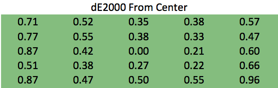
The color error uniformity is not disappointing at all. Instead, it is practically perfect. No area of the screen has an average dE2000 error >1 compared to the center. Since an error less than 1 is invisible to the eye, even on still images, this really is perfect. Even if the numbers were lower you wouldn’t see a difference, so I will just say this is perfect.
Uniformity like this has not been seen in my testing before. This performance is what professional designers and photo editors’ need, and it is what NEC delivers. It is expensive, but for many people it is worth paying for as it has untouched uniformity performance.


74 Comments
View All Comments
1Angelreloaded - Saturday, October 5, 2013 - link
Actually the whole 1080p labeling is for the HDTV industry and makes no complete sense to use in the PC space and 1080p(1920x1200) is 16 megapixels with 16:10 wide(Camera dependant).bobbozzo - Friday, September 27, 2013 - link
I have the Dell u2412M... I like that it's 16:10 (versus my 16:9 Samsung (below)); on 16:9 I don't feel like there's room for the taskbar...Anandtech reviewed the 2412:
http://www.anandtech.com/show/5550/dell-u2412m-16-...
At home I have a 23" Samsung 2343bwx which is 2048x1180, but its TN panel has serious problems for me when doing design or photo work; the viewing angle affects colors so much that a solid color looks significantly different at top or bottom of the screen versus the middle. If I move my head, it changes, so it's not a uniformity problem; just viewing angle. I sit over arm's length away, so it'd be even worse closer up.
ZeDestructor - Saturday, September 28, 2013 - link
2412 is only sRGB, not wide gamut like the 2408, U2410 and U2413.I agree on anything wider than 16:10 being too wide. 16:10 IMO is the perfect size this side of dynamically-sized holograms.
tarzan1234 - Monday, December 9, 2013 - link
This monitor is designed for graphic designers and digital photographers and they don't need and don't want high contrast. The goal is what you see on screen is what you get in prints. That means what's on the display must be as close to what's on a print as possible. In a standard viewing condition (standard light, natural daylight white), matte paper prints have contrast ratio of about 1:200, luster paper has contrast ratio of about 1:250 to 1:300 and glossy paper has a contrast ratio of about 1:350 to 1:400. For that reason, if you have a high contrast monitor, what you see on screen will be different from what you get in print. You can't change contrast ratio of paper, the only thing you can do is to have a monitor that can be adjusted close to that. That's what professional grade monitors are for. Some of the very best (and most expensive) graphic monitors are made by Eizo, and their contrast ratios are in 1:250 to 1:400 range. One additional note, photographers often set their monitor light output to around 80cd/m2 to 120cd/m2 for the same reason, getting close to how prints look. If the display is brighter, you often end up with dark prints because if it looks OK on a to bright monitor, the prints will be too dark.WhitneyLand - Friday, September 27, 2013 - link
>>do you need this? If you’re asking that question then you probably don’t.Instead of this answer how about telling us things like:
1) Is it possible to see benefits without calibration tools?
2) Is it possible to see benefits in applications that don't manage color profiles?
3) If you grab a couple non color-pro friends and ask them if it looks better, what do they say?
cheinonen - Friday, September 27, 2013 - link
OK, I'll answer those quickly then:1) Yes, because the out-of-box experience is also very good and it is still more uniform than any other display tested to date. The calibration does not affect the uniformity.
2) Yes, and especially with calibration. The SpectraView software does all of its work inside the monitor LUT, leaving the video LUT alone. So color profiles or not, the image should be basically perfect.
3) I'd have to grab them and see, though I'll admit to mostly having friends who I've converted to really caring about color.
DanNeely - Friday, September 27, 2013 - link
As a multi-monitor user #3 matters to me because it makes all my screens look the same. At work I've got 3 mismatched Dell screens (1901, 2208, 2210); and the fact that despite fiddling I can't get the colors on them to match is noticeable and a bit annoying. At home I have 3 NEC monitors (all bought refurbed to avoid breaking the bank) 2x 2090 and 1x 3090; out of the box colors between the three are close enough to each other that I've never felt the need to buy a colorimeter to calibrate them.inighthawki - Friday, September 27, 2013 - link
My experience has taught me to always go with the same monitors in multimon setups. 2x or 3x of the same brand, same model.DanNeely - Friday, September 27, 2013 - link
Even if I could've afforded multiple 30's at home I don't have the deskspace for them; and in any event I bought the 20's a year or two before the 30. (The 3way setup was however a major factor in why I bought what I did.)At work I got the screens one at a time; and had a pair of 2208's at one point; they matched each other about as poorly as the 2208 and 2210 do.
powruser - Saturday, September 28, 2013 - link
We have very similar setups. I have one 2490WUXi as my primary display and two 2090UXi as secondary display. All are first generation models which have the A-TW polarizer which greatly reduces the purple IPS glow on dark images when viewing at off angles. I also bought mine refurbished. NEC has excellent refurbs, and their warranty service is excellent as well. You'd have to pry my A-TW NEC displays from my cold dead hands! :)