
Original Link: https://www.anandtech.com/show/1456
New ATI Driver UI: The Catalyst Control Center
by Derek Wilson on September 2, 2004 6:00 AM EST- Posted in
- GPUs
Introduction
For quite a while, NVIDIA has led ATI in driver user interface capabilities. The ForceWare driver series has supplied users with all kinds of options. NVIDIA owners have been able to have more control over the functionality of their cards than ATI owners through the ability to disable or enable advanced optimizations. ForceWare even allows users to associate certain settings with a particular game, allowing users to pick optimal settings once for each game.Today, ATI fights back against NVIDIA on the software front and provides an extensive, clean, and powerful user interface in their Catalyst Control Center. We will take a look at the features of the new interface and just what ATI has done differently this time around.
The fist thing that we will look at is the technology behind the new user interface from ATI. This time around, they decided to go with Microsoft's .NET as a backbone. The features that they include offer more control for the power user and greater accessibility for those who want to play computer games, but don't understand the difference between anisotropic filtering and a trout. Let's dive in and see what's under the hood of the Catalyst Control Center.
In The Belly Of The .NET Beast
ATI decided to take a different approach this time around. The Catalyst Control Center (CCC) is written as a client/server pair, and allows for much extensibility and customization. All the underlying work of communicating with the driver has been taken care of in the server, which also exposes hooks to adjust any of the settings that ATI allows to be changed.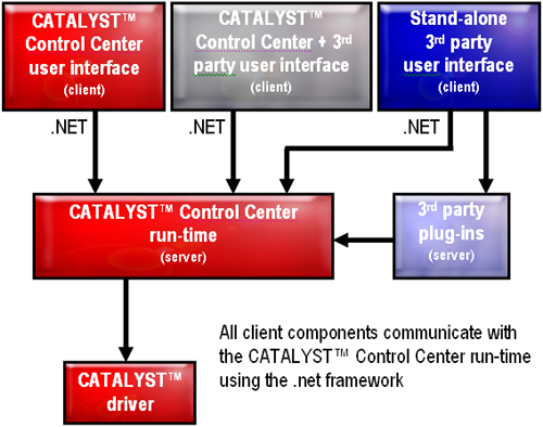
In talking about the usefulness of this, ATI has stated that vendors will now be able to customize effectively and quickly the control center for their product. We will also probably see UI mods from industrious users who want to add or subtract functionality, as the programming interface is not being kept private.
There are a couple of downsides to going with .NET for a graphics driver user interface. First, the client and server are constantly running. Second, the .NET framework from Microsoft is required (available via Windows Update). These aren't major kinks, but they definitely are not desirable. Probably the most annoying issue that we ran into is that installing the .NET framework made it such that our main user account didn't auto-login anymore. This was easily fixed and not that big of a deal (and it's also Microsoft's problem).
The 60 or 70 extra megs of memory used and multiple extra processes running are not what resource snobs are going to want to see, but ATI provided us a FAQ that addresses multiple questions about resources. They state that the CCC will release any memory that it occupies if another process requests it. We don't have a good way of testing this right now, but we can say that we haven't observed any performance drop in games due to the new UI. Maybe we should run Winstone to see if it impacts normal usage models.
So now that we know a little bit about how the CCC was built, let's take a look at what it does.
Simplifying Settings
The first thing that we noticed (aside from the skin) about the CCC is just how clean and simple it is. We do prefer a consistent UI look and feel, but the layout of and obviousness of where everything is helps immensely in getting around.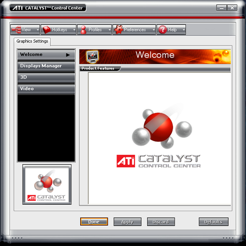
The tabs at the side clearly talk about what they are, and have only the most straight forward, basic, and necessary options inside. For instance, the Display manager offers resolution and multi-monitor setup options with a wizard button at the top, if you need help.
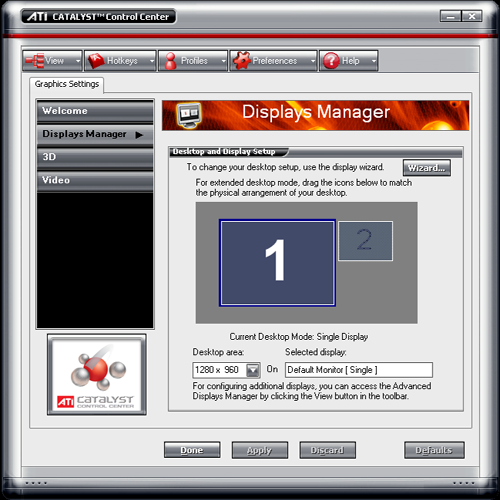
The wizard asks really basic questions about what type of monitor and setup that it's working with and comes up with settings based on the answers.
The simple 3D view is where things get really innovative. ATI has embedded a small OpenGL app into the CCC, which updates in real time as settings are changed. This allows the user to move the slider (siders in the advanced view) to determine exactly what will happen to their games. The inclusion of this feature will help in educating ATI users about what a setting does, and will also get more people hooked on the almost crack-like properties that high levels of anisotropic filtering and antialiasing have (when you see what they do visually, it's easier to tell when they aren't cranked up).
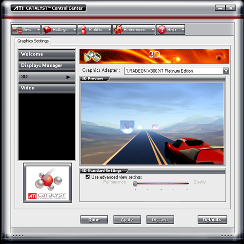
This is the must-have feature that ATI has included in the CCC. We want NVIDIA, Intel, and S3 to pick this up and run with it. It's just that helpful to new users and could help people adjust their settings in a useful way. And if the windowed mode isn't enough to help get the idea of what's going on, just double-click the scene and it'll go full screen.
The only downside that we've seen so far is that this new feature makes moving a slider a bit of a chore. The performance hit incurred by moving a slider on our x800XTPE in an FX53 system with 2GB of RAM qualifies as annoying if we are being kind. ATI has said that they are addressing performance related issues; hopefully, future releases will see faster response time.
But that's enough of the simple stuff. Let's take a look at the advanced view and find out what else this baby can do.
Click The View Button
The advanced view opens a tree on the left side of the CCC, containing many more options than the default view. Here, we can get our hands dirty with the settings that we are used to adjusting.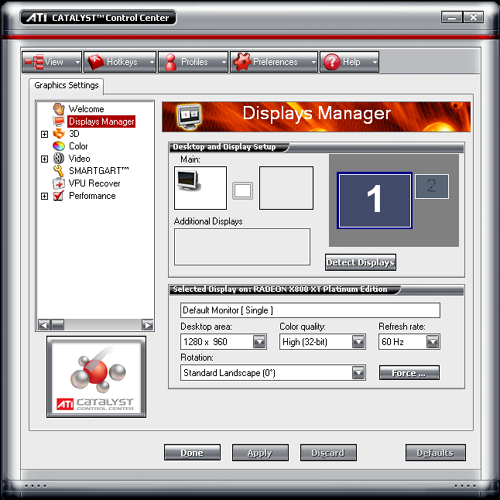
It feels much better having the ability to set color depth and refresh rate again. The 3D settings don't disappoint either.
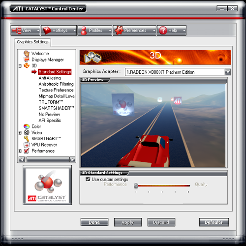
Each setting down the line offers one slider and the preview window. This allows you to check the effect of that setting individually. The "no preview" option takes it a step further for those who already know what they want. Also, VSYNC adjustments are only available in the "no preview" settings.
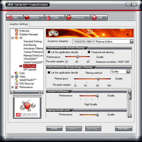
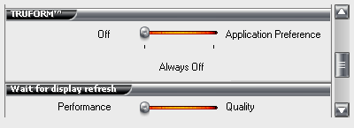
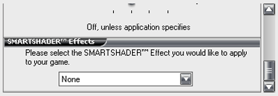
Apparently, ATI sees VSYNC being on as quality. This will help avoid tearing, but VSYNC is really more of a preference thing in the community. The quality options here are really more of what we've already had access to in the previous incarnation of the control center. We would really love to see the option to enable and disable trilinear and anisotropic filtering optimizations à la ForceWare. Of course, this is more of a low level driver issue that we hope ATI will address.
The last thing that we are going to tackle is also one of the coolest: the profile manager.
Would You Like Aniso With That?
We were very excited to see that ATI would be offering a profile manager. We've been happy with the ForceWare profile manager, and had previously asked ATI if they would allow certain settings to be associated with specific applications. This was, of course, the wrong question to ask (the answer was, and still is, "no"). ATI is very adamant about staying away from associating anything with a specific executable (anyone who remembers "quake/quack" will know why). Their solution to the problem is simple and elegant. Don't associate a profile with a specific executable; allow executables to be launched when a profile is enabled.Shortcuts to profiles can be created and placed anywhere (like the desktop or start menu), and can be used just like shortcuts to a game that have the added bonus of changing display settings before the game is launched. This is a very clean and elegant way of solving the linked profile problem. Here's a look at the profile manager screens:
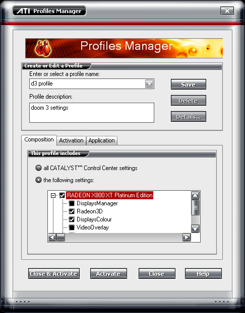
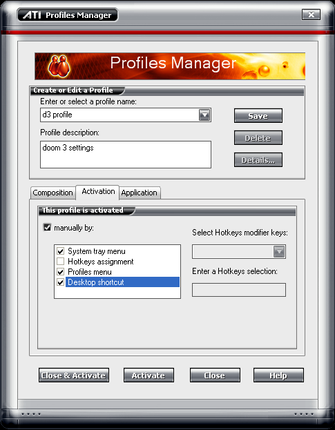
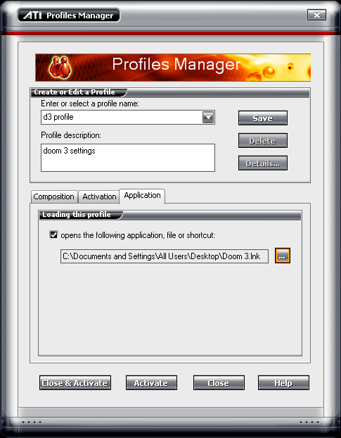
There are also a couple of other windows in the driver such as the hotkey manager, preferences window (which is basically a skin chooser), and an information window, but these are very straight forward and don't really require any explanation.
Final Words
ATI got on the right track when they started the Catalyst series of drivers, and we are seeing the first big steps beyond the Catalyst driver with the Catalyst Control Center. The 3D preview alongside each setting is nothing short of revolutionary in terms of making very complex functionality intuitive. Whenever we have to go back and explain Anisotropic filtering and Antialiasing, we have difficulty getting across exactly what the settings mean visually, even if we can communicate exactly what's going on in the hardware. Perhaps we should write a little java script to have the AA or AF setting change on an image when a slider is moved the next time we need to go there.The profile manager is very functional, and very powerful. Making the actual profile the focus (rather than the executable for which it is intended) allows for more freedom and a cleaner feel. Overall, the interface is very clean and intuitive.
We are not a fan of skinned windows, rather preferring consistent look and feel to unique window shapes and decoration, but this is admittedly a preference issue. There is a kind of "windows-ish" skin included in the CCC, but it doesn't do as good a job as we would like (it's just off enough to fit in worse than the default skin). But on the upside, users can create their own skins as ATI uses Stardock for skinning.
We only have a few real complaints with the Catalyst driver and Control Center combo right now. We really want to see the option to adjust how much trilinear filtering that it does. It would also be nice to have the option of setting anisotropic filtering to always use trilinear. As far as the Control Center goes, we would like to see the option to run a lower profile, non- .NET version, for those out there who know exactly what they want and don't care for all the bells and whistles. Perhaps ATI could continue to offer their current control center with future drivers and offer users a choice (with the default being the new CCC). We would also like the default skin to be a standard Windows XP skin that actually looks like WinXP. Currently, the Catalyst Control Center only works with R3xx and R4xx based cards, but upcoming versions will support older hardware as well.
Our final thought is that the Catalyst Control Center fits in very well with what consumers need from a graphics driver UI in order to get the most from their card. The features offered are well suited to both new users and seasoned GPU aficionados. Now, all we need is for ATI and NVIDIA to take some cues from each other and come out with something like a "ForceALYST" that combines the low level and extensive control of ForceWare with the intuitive, easy-to-use UI of the Catalyst Control Center.


