Original Link: https://www.anandtech.com/show/1500
A Month with a Mac: A Die-Hard PC User's Perspective
by Anand Lal Shimpi on October 8, 2004 12:05 AM EST- Posted in
- Mac
This is, quite possibly, one of the most difficult articles to write; for starters, it's not a review of hardware, and it's not actually a review of anything concrete - it is a review of an experience. We all go about using our computers knowing that if we don't like something about them, if they are too slow or too unreliable or don't do something we need them to do, then we can upgrade them, or we can swap out the faulty part and put in a new one. Now, it costs us money (sometimes lots of it), but it is possible. But much like the U.S. election system, although there may be the illusion of multiple options for your OS, in reality, there is really only one. If you want any sort of software compatibility, driver support and don't want to be made fun of, Windows is the way to go. There have been righteous attempts by smaller OSes to gain traction, and some of them have (e.g. Linux), but for the most part, we're dealing with a one-party OS system. Now that's not necessarily a bad thing; quite contrary, in fact. I believe that Windows XP is the best thing to ever come out of Redmond and I have very few issues with the OS. I actually liked the XP theme when it first came out and I've been happier with Windows XP than any previous Microsoft OS (except maybe the good ol' DOS days). When installed on the right hardware with the right drivers (and with an eye to be wary of poorly written apps), I found that Windows XP was just as stable as any other OS that I'd ever encountered. My personal machine would go months between reboots without a single problem. It's not that there is anything wrong with Windows; it's that if you want the option, if there's any particular thing that you don't like about the way Windows works, you're straight out of luck.
I think that a bit of me was feeling, after being a strictly Windows user ever since version 2.0 (with the requisite mix of DOS back then), that there were a couple of things that had started to annoy me about Windows, which I would rather do without.
For starters, heavy multi-tasking management under Windows had caused me a lot of grief. Maybe it's just because of the nature of my work, but I tend to have a lot of windows open at any given time. I like quick access to the information that I need when I'm working and much like a messy desk, there is a method to my window-madness that only I know. When writing an article (especially big NDA launches), I'd have around 20 IE windows open, Outlook with another 5 - 15 emails, Power Point with NDA presentations, Word with my article, maybe Dreamweaver if I was starting to put it into HTML, not to mention Acrobat, some sort of MP3 player, Trillian and a bunch of explorer windows as well. After a certain point, the cramped taskbar became difficult to use as a locator tool, and while I could ALT+TAB forever, I just felt like I was idle for too long. I knew what it was that I needed to get to, and I knew I had it open, but the process of getting to it was a pain.
The other issue was with the way Windows handled having so many windows opened; after a certain number of windows were opened, stability and performance both went down the drain. Sometimes applications could no longer spawn additional windows or dialog boxes, requiring me to close a handful before I could continue doing anything, and other times, applications would simply crash.
It's not that I was dissatisfied with Windows and the PC experience in general, but I thought it might be time for something new - to see what else was out there.
I've always been a fan of trying alternate Oses - I was even an OS/2 user (both 2.0 and Warp) for a little while in my early years. So, a while back, I conjured up this idea to try using a Mac for a month. At first, it started as just a personal experiment, but it later developed into the foundation for the article that you're reading now. After doing the necessary research to make sure that I could actually get work done on a Mac, I whipped out the trusty credit card and decided to give the experiment a try.
What you are about to read are my impressions, as a devout PC user, of the Apple way of life.
The Basics
I had used Macs in the past, mostly at schools, and boy, did I ever hate the experience. I would always feel completely lost when using them and I would grow increasingly more frustrated as the machines were always slow, would crash often and for the life of me, I could never right click on anything. Going into this experiment, I knew that if I was going to give the platform a good chance, I needed to get the fastest system that Apple had to offer. At the time, this was a dual 2GHz G5 system configured as follows:Dual 2GHz 0.13-micron G5 CPUs
512MB CAS3 DDR400 SDRAM
160GB SATA HDD
ATI Radeon 9600 (64MB)
The MSRP on the system when I bought it was $2999 ($2699 with a student discount). Since then, it has dropped to $2499 ($2299 with a student discount) with the dual 2.5GHz system taking its place at the $2999 pricepoint. Needless to say, at almost $3000, the G5 was one expensive system considering its specs. Many will attempt to justify the price of the G5 by comparing it to a workstation class PC, such as a dual Opteron or Xeon and then saying that the price differential isn't all that much - after all, it's not abnormal to spend $3000 on a workstation right? While that is true, generally speaking, a $3000 workstation will buy you much more than what Apple's top of the line G5 gives you from a hardware perspective.
The first thing I quickly realized was that justifying Apple's pricing wasn't something to do - just bite the bullet and try the experiment. It's all about supply and demand, Apple has around 2% of the computing market. Compare that to the rest of the pie that x86 makers get to share and you can quickly see why the economies of scale don't play in Apple's favor. If you look at the brief spec list above, however, you'll see that the memory, hard drive and video card are fairly mass produced components, but then you have to take into account that the chassis, processors, motherboard, power supplies and basically every other component in the system are not. Then, keep in mind that the video card has to be specially made for Apple and the memory is also the slowest DDR400 that you can find on the market today, so even the mass produced components aren't all that mass produced. The system is expensive; you can get much more PC for the same price, but the point of this experiment wasn't to discover what we already knew.
Ordering such an expensive system is a dangerously easy process through Apple's website (it's also dangerously easy to get a student discount. I was still in school when the order was placed, but it seems like Apple doesn't really require any proof one way or another). I ordered the system pretty much stock from Apple; I was going to do any and all upgrades on my own. Once your order is shipped, there's a 10% restocking fee if the box is opened should you decide to return it; it's not an unusual policy, but definitely not the most customer-friendly one.
Setup was a breeze, but so is any computer setup these days. There is a bit less cable clutter with a Mac, but it's nothing too significant, especially if you are using anything other than an iMac. Of course, all of the cables that come with the machine are white, which made using the millions of black power cables that I had laying around somehow "wrong". I had a setup of two Cinema Displays that I was going to be using with the G5, and since they were older displays, they both featured ADC connectors instead of the normal DVI connectors that I was used to. ADC is an interesting standard developed by Apple that basically allows power, USB and the video signal to be carried off of a single cable. The ADC interface cuts down significantly on cable clutter, since three cables are now merged into one; unfortunately, there is only a single ADC port on the video card, meaning that I had to use an ADC to DVI adaptor for the second display. The ADC to DVI adaptor is pretty expensive (around $150) as it has to provide an external power supply to power the monitor and USB ports. Apple has fixed this issue with the latest revision of their Cinema Displays, which are now all DVI. Unfortunately, you lose the cable clutter benefits with the new displays, since they abandon ADC.
The rest of the hardware is pretty simple, a stylish USB keyboard and the dreaded one-button mouse. Apple's mentality behind the one-button mouse is that it is less confusing to their users than two-button mice; rumor has it that John Carmack once asked Steve Jobs what would happen if they put more than one key on a keyboard in response to Apple's reasons for sticking with a single button mouse. Regardless of why they do it, for a power user, and especially for a Windows user, there was no way I was going to survive with a one-button mouse. Luckily, the mouse is USB and just about any PC compatible USB mouse will work on the platform. The same applies to the one-button Apple mouse, if you were wondering; it works just fine under Windows. I didn't bother hooking up Apple's mouse - I went straight for my optical Intellimouse. I had already met and hated the Apple mouse, so there was no reason to re-open old wounds if I was to remain as objective as possible.
The USB cables on the mouse and keyboard are purposefully short; they are meant to be plugged into your monitor - not the actual computer itself - in order to reduce cable clutter.
The system came with a recovery CD and some other manuals and booklets that I quickly cast aside; just because I'm using a Mac doesn't mean that I have to change my habits on reading manuals!
Unlike the older Macs that I remembered, you couldn't turn on the G5 using the keyboard - there was no keyboard power-on switch (which isn't a bad thing, as I remember turning friends' computers off all the time in the Mac labs). Touching the power button on either the Cinema Display or on the actual computer itself would turn on the system.
The classic Mac sound made its entrance as the system booted up. After filling out a couple of screens of information, I was dropped into Mac OS X - my new home away from home.
Finding my way around Finder
The OS X desktop is clearly different from what I was used to under XP. For starters, all of the icons have been moved to the right side of the screen; and where I was used to seeing a taskbar, there was this little translucent "dock" with a bunch of icons in it.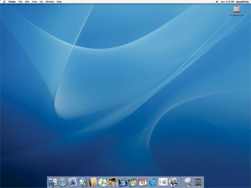
The OS X desktop and features, such as icon size, dock size and animations, are easily customizable.
Click to enlarge.
Under Windows, there is Explorer. It is the application that not only exists as a way of browsing your file system, but also as the "desktop" itself; the OS X equivalent? Finder. I don't think that I have to point out the similarity in the names. Yes, one company copied (or poked fun at) another.
My first reaction was that the icons on the desktop were far too large; indeed, they are, if you put them on a Windows desktop - but for some reason, they end up looking strange if you make them smaller. One of the biggest features of OS X is the ability to customize just about every aspect of the OS; I didn't like the size of the icons at first, so I simply changed the icon size through the "view options" menu. Although it's easy to talk about now, I had to ask how to do it online before I ever discovered the option - also the case with the majority of OS X, most of the power and customization of the OS remains hidden. I quickly realized that although Apple had targeted the entry level computer user with the interface of OS X, the OS was far more tailored to the power user in my opinion.
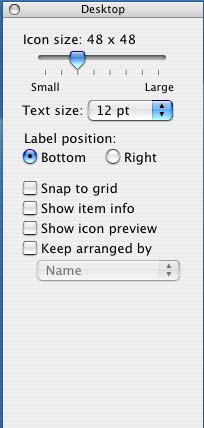
Where to start? Customization is much more possible (and easy to do) under OS X than any variant of Windows that I have ever encountered. Icon sizes are just the beginning; through the view options menu alone, you can change the positioning of the labels on the icons, the text size as well as the normal array of Windows options. And any changes you make here occur in real time - no clicking "OK" or "Apply". Just check a box and it happens instantaneously; and uncheck it, and everything goes back to normal. It's a small thing, but as I soon found out, much of OS X's appeal to me came in tiny gems like this.
The other thing to point out, which is quite possibly the biggest draw to OS X for me, is the fact that just about everything under OS X has a keyboard shortcut associated with it. I've found that if you got your start with PCs in the DOS days, then you end up being much more of a keyboard junkie than someone who is reliant on the mouse. I use the mouse when I have to, but when it's quicker to use the keyboard, I feel much more comfortable firing off a few keystroke combinations to get my point across. If you are anything like me in that respect, then OS X will be your playground.
I can't possibly list all of the keystroke combinations that I use on a daily basis, but there are quite a few. For example, I am a big "ALT-TAB"-er in Windows, but ALT-TAB is only really useful for switching applications, not closing them. The ALT-TAB equivalent under OS X, Command-TAB (the Command key is positioned where you'd expect ALT to be, so it works out fine), works similarly, but here's the catch - hit "Q" while you've selected an application and it will quit automatically. Nice, but nothing major right?
Want to minimize a window? Command-M will take care of that. Want to hide an application without minimizing it? Command-H. Hidden windows will automatically move to the end of the Command-TAB list, so you don't switch to them after you've hidden them.
Want to open a new Finder window? Command-N. Want to create a new folder on your drive? Shift-Command-N. I've always wanted to be able to create new folders in Explorer without using the mouse. OS X was a dream come true in that respect.
OS X will even let you define your own keyboard shortcuts for any application through the keyboard preferences panel:
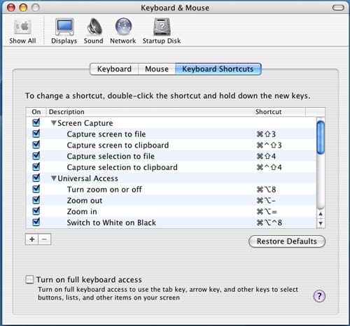
Not impressed? Not a keyboard junkie? Then Finder is just as capable and as usable as Explorer. No big win for Apple there, but maybe a draw. For me, the little things are what intrigued me, but I'll admit - not everyone is as easily amused!
There is one aspect of the keyboard shortcut support that OS X does fall behind on, and that is support for keyboard shortcuts in dialog boxes. In some dialog boxes, hitting Command and the letter of the option you want to select will work, but in others, it will not. Furthermore, finding out the correct key to hit to select the option that you want is most definitely a guessing game, as there are no underlined characters or anything indicating what key to hit. Given OS X's strong support for keyboard shortcuts, this shortcoming (no pun intended) is puzzling.
Finding my way around Finder (continued)
The folder structure under OS X is probably the one thing that has taken me the longest to get used to - mostly because I've been such a heavy DOS/Windows user that I still feel too foreign with anything other than C:\Windows or Program Files. It's a shame, and even after years of using *nix boxes at school, it's still something with which I'm not totally comfortable. Because of that, I continue to feel that the folder structure under OS X is quite disorganized, but there is also another reason why I don't feel as in touch with the location of all the files under OS X as I'd like to be - and it comes down to how applications are installed.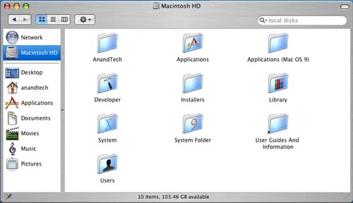
Installing (and conversely, uninstalling) applications under OS X is quite possibly the most disconnected feeling that the OS gave me, while at the same time, it was pleasantly easy. How could installing an application possibly be made any easier than it already is? Well, to install an application, you simply drag the application's installer to any folder on your hard drive and it's "installed". Doing so actually triggers a number of files to be copied to various places on your drive, but the fact that you are separated from that process, it really made me feel like I wasn't in control of my system. On the flip side, installing and uninstalling applications couldn't be easier. There are no full screen installers to deal with; just drag and drop, and get back to work while the application installs. The fact that I don't know where everything is being copied contributes to my feelings of file system disconnect. Then again, maybe I'm being a bit too philosophical about my OSes. Update: A number of people have written to provide some clarity to this statement. It is not the actual installation that copies files everywhere, in fact the installation is quite contained with all files remaining in a single folder. It's the process of running an application that will copy preferences over to your Preferences folder. The paragraph above as it stands does apply to Microsoft Office 2004 but not the vast majority of OS X applications, this isn't the only way in which Office 2004 differs from the rest of the applications for OS X. I apologize for the confusion.
The information about files and folders is also a bit more customizable under OS X. Highlight the file or folder on which you want details and hit Command-I, or you can just right click and go to "Get Info". From here, you can change everything from file permissions to what program opens the file or files of that type. You can add comments to any file or folder as well. As is the case with most other OS X dialog boxes, everything occurs in real time. Just hit Command-W or click the red button to close the window.
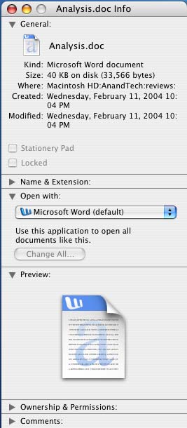
 One thing that may take some getting used to is the positioning of the close button on all windows in OS X - it's at the top left corner instead of the top right. The minimize button is next to it, followed by something other than the maximize button. In fact, there's no way to maximize a window quickly in OS X (I'll get to why in a bit); instead, the green button to the right of the minimize button is sort of a fit-to-content button. Clicking the green button will resize the window both horizontally and vertically to fit the contents of the window the best, which is especially useful when browsing web pages or really viewing any content where you're trying to maximize screen real estate.
 The fundamental difference between OS X and Windows is how applications and windows are handled. What OS X has going for it is uniformity between applications and windows; for example, the keyboard shortcut for the preferences dialog in any OS X application is Command and the "," key. So, regardless of what application you're in, the same keystroke combination will have the same expected effect - pretty useful.
The uniformity really extends far beyond keyboard shortcuts as I was alluding to before - a menubar always exists at the top of your screen in OS X, regardless of what application you're in. Thus, you always have a File, Edit, View, Window and Help menu regardless of what you're doing. It looks like Apple's reasoning behind this is to avoid confusing users, but to a Windows native, it can be very foreign.
The biggest complaint that I both had and levied against was that it always seemed like you had more applications opened than what you wanted. In Windows, once all of the windows of an application were closed, the application itself was usually exited. Under OS X, until you actually quit the application, regardless of how many or how few windows of it that are still open, the application remains running. Thanks to an extremely aggressive caching engine and an extremely robust/stable OS core, I ended up actually preferring it when I had the majority of my frequently used applications open. This approach ends up using quite a bit of memory, but I found that there's no slowdown if you have the memory to handle the open applications. If not, you can always close the applications that you don't want running - Command-Q is the keyboard shortcut; it's the same in any OS X application (Command-W just closes the foreground window).
The benefit of leaving applications running even when you're not using them is that when you do need to use them or open a file with one of them, the response time is instantaneous - as opposed to waiting for an application to load. Of course, you can do the same thing in Windows, but for some reason stability and performance seemed to remain unchanged under OS X, whereas I almost always ran into an issue with Windows - whether it was having too many windows open or too many programs running.
Multi-tasking
It is somewhat ironic that I would praise Apple for the multi-tasking capabilities built into OS X, given that the Mac OS trailed Windows in its support for preemptive multi-tasking. Needless to say, the mistakes of yesterday are not true of OS X today, and its multi-tasking prowess was my biggest draw to it.Multi-tasking under OS X works just like it would under Windows; you have multiple applications open, some of them doing things concurrently, while others are waiting for your input. I will address the two types of applications in a multi-tasking scenario separately.
In the case of applications running at the same time while performing tasks concurrently, OS X does one thing very well that Windows does not - the foreground application is never intruded upon by any other application that's running. Say you're encoding a video and typing a document in Word, should a dialog box popup in the encoding application, it will do it without shifting the window focus to that application. Instead, the dialog box will pop up in the background and you're free to dismiss it when you're ready and willing. It is all too often that Windows left me annoyed by a dialog box taking focus while I was typing a message to someone online or writing a document.
OS X has been designed to be as unintrusive to the user as possible. For that reason, one of the basics of the Windows interface is not echoed in OS X. While double-clicking a file or folder will open the item, hitting "enter" when one is highlighted will not cause the same effect. Instead, if you hit "enter" on a highlighted item, you'll be able to rename the item. In order to launch the file or open the folder via keyboard, you have to hit Command-Down Arrow (Command-Up Arrow will traverse up a folder tree). This takes a bit of getting used to and if approached with an open mind, you can get used to it in a couple of days, but it can be frustrating at first - especially if you are a keyboard addict used to Windows.
Another way in which OS X allows for less intrusive multi-tasking is in its ability to let you close a background window of an application other than the one you're currently working in without shifting focus to that application. Say that I have a browser window open behind a Word document that I'm typing. I can hover over the red close button on the browser window and click it without actually shifting focus away from the Word document - I can continue typing away right after clicking the browser's close button without any additional mouse use.
Next, there is the more frequently used type of multi-tasking, where multiple applications are open and the user switches between them. I've already mentioned that OS X has the equivalent of the Windows ALT-TAB functionality; the task switcher is activated by holding down the Command key and hitting "tab" to sequence through all of the open applications. Releasing Command activates the selected application and everything continues as it would under Windows.
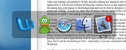
Command-Tab in action. The more applications that you have open, the smaller each icon becomes as the Command-Tab list grows in size.
There is also the equivalent of the taskbar, which in OS X is best likened to the "dock". The dock is a fully customizable bar at the bottom of the OS X desktop (you can position the dock along any side of the screen that you'd like) and it contains application launch icons for applications to which you want quick and easy access, as well as icons of any running applications. If a running application already has its icon in the dock, a little arrow appears under the icon to denote that it's running; if not, the application's launch icon will appear to the right of the dock. The dock does have a divider to which you can also drag folders and links; to the right of this divider is where minimized windows go (with a very nice accompanying animation). Clicking on any application's icon in the dock will either launch the application if it's not already running or it will switch to that application; but, of course, that requires using that pesky mouse.

Perfect Multi-tasking
So far, I've described OS X's multi-tasking as very similar to what is currently available under Windows, but where OS X sets itself apart is in a little feature called Exposé (note that typing an accented "e" is extremely easy under OS X - ALT-e followed by the "e" key or any vowel will do just that).By default, Exposé is activated by one of three function keys - F9, F10 or F11. Each function key serves a different purpose, each of which is a feature of Exposé. The theory behind Exposé is simple: it is a way of getting to a specific window on your desktop as fast as possible.
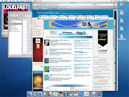
We start with our cluttered desktop...
Click to enlarge.
Hitting F9, for example, will cause Exposé to zoom out all of your active visible (unhidden) windows and essentially, tile them across your desktop. Then, using either the keyboard or the mouse, you can select the window that you want and everything goes back to normal, with the window that you have selected appearing in the foreground. The rest of the windows are untouched and are all in their original positions. The window that you selected is also in its original position; it is simply moved to the front so that you can see it.
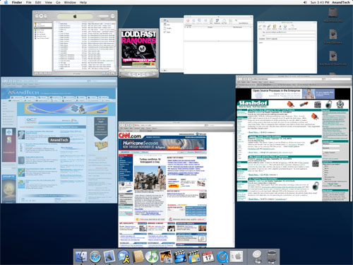
Hitting F9 activates Exposé across all applications.
Click to enlarge.
If you don't want to Exposé all windows, you can just Exposé the windows within a particular application (F10 by default), which is extremely handy for dealing with tons of images in Photoshop for example.
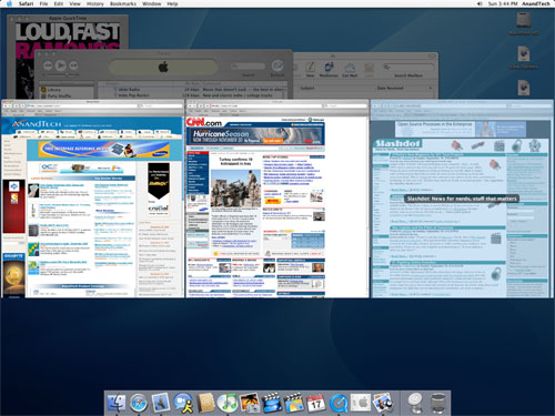
Hitting F10 activates Exposé across only a single application's windows.
Click to enlarge.
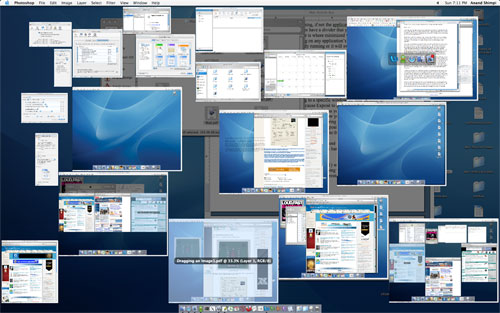
Another example of Exposé's usefulness in editing all of the images for this article in Photoshop.
Click to enlarge.
The final Exposé function lets you view your desktop (F11), which, to me, was like a more polished version of Windows-D, since after I was done doing whatever it is I needed to do on the desktop, Exposé deactivated and my screen was restored to its original state.
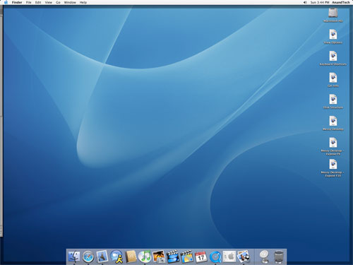
Hitting F11 reveals the desktop.
Click to enlarge.
The beauty of Exposé is difficult to convey in text alone. Honestly, the best way to evaluate it and understand its potential is to use it - luckily, there are Apple stores for this very purpose. Keep in mind that Exposé is very customizable as well and the three function keys that I mentioned above, although the defaults, are not the only ways that you can configure OS X to activate Exposé.
The benefits of Exposé are numerous. If you ever feel overwhelmed by having too many windows open, Exposé definitely alleviates that feeling as you don't have to tab through multiple applications to finally get to the window that you want. While Exposé does make having only a single display better, heavy multi-taskers will still enjoy the benefits of a dual display setup.
Since the OS X desktop environment is completely OpenGL accelerated, the performance of features like Exposé are not CPU limited - instead, they are GPU limited. Luckily, using Exposé with many windows open is not very stressful on even a Radeon 9600, but you do run out of video memory very quickly - in which case, your system ends up swapping to main memory over the AGP bus, making the Exposé animation considerably choppy. It seems that the sweet spot for more than a handful of windows open is around 128MB of video memory, with 256MB being perfect - needless to say, I found the mere 64MB that came on the Radeon 9600 which shipped with the system to be too little. There is no detriment to functionality if you don't have enough video memory; the Exposé animation simply becomes more choppy (which can be annoying on a $3000 system).
What you want is what you get
It's tough to find a section to write about in this next set of OS X features because in what section do you talk about the cool things that I've always wanted to do in Windows, but couldn't because they weren't supported? What sort of cool things, you ask?Under OS X, the term drag-and-drop is really taken to a new level - you can drag and drop just about anything. Let's say, you really like one of the pictures in this review. Under OS X, you could simply click and drag the image to your desktop or any folder and a copy of it would be saved. The dragged image appears as a smaller, slightly translucent version of the original, which obviously remains untouched. For whatever reason, this process is quite CPU intensive, making the G5's fans spin up if you drag an image for too long. With two CPUs, however, it's not really invasive, but it's just interesting to hear fans spin up while you're dragging an image around. The benefit of this stretches far beyond just saving an image. You can drag it into an IM window to send someone a URL of the image, or you can drag it into an email to send someone a copy of it. I'm a huge fan of car discussion boards online and I'm always sending pictures of up and coming cars that I may come across online to friends. The drag-and-drop of an image into an IM window makes the process a lot easier than right-clicking on an image, going to its properties and copying the URL, and then pasting it into an IM window.
If you're writing an email and don't want the window to shift focus to your web browser with the image in it, just hold down the Command key; you can still drag the image without shifting the window focus. The same thing can be done with text, whether it is a single word or an entire paragraph of text - just highlight and drag it to wherever you want it.
Going along with the "everything is draggable" motif, there is also an easy way of dragging a file other than an image without resorting to dragging its actual icon. In the titlebar of most windows where you're creating or editing content, there's a little icon that can be dragged from the titlebar to just about anywhere; in the case of an Office document, dragging that icon will copy the file to any location or attach it to an email. The feature is also pretty smart; you can't drag the icon unless the document that you're trying to copy/attach has been saved since your last changes.
![]()
Want to open a lot of files using a particular program (not necessarily the one that they open with by default)? Just drag them to the program's icon on the dock. There are tons of little features like these that I ended up appreciating quite a bit. I know that it's not hard to open up a few folders to copy a file, but this way is just quicker and just so much more intuitive. If you're looking at something, why shouldn't you be able to drag/copy/attach the file without having to find it in another form somewhere else? It seems to me that Apple asked that very same question.
The final cool feature that I'd like to mention briefly here is OS X's system-wide spell check. Any window, whether it is a text document, IM, email, form in a browser or anything else where you're inputting text, OS X checks spelling for you. It can be disabled in specific applications if you'd rather not be bothered, but it is very useful.
OS X Bottlenecks and Caching
Although the performance of OS X on the dual 2GHz G5 system that I'd been running was definitely acceptable, there is definitely room for improvement. The overall responsiveness of the system was decent, but go back to using a top-of-the-line PC in Windows for a few minutes, and you definitely feel a bit sluggish on the G5. I would say honestly that a 3GHz G5 would be a good speed to have; although, I have yet to try out the new 2.5GHz G5s to see how much things have improved with a 25% increase in clock speed.I've already mentioned video memory as being a bottleneck under OS X, thanks to the OpenGL accelerated UI. But luckily, with a more expensive video card (note: it's a shame that even a $3000 G5 comes with a measly ATI Radeon 9600 - shame on you Apple), that problem can be resolved; although, only through the expenditure of more money. There are, however, other performance related issues to which I have not been able to find solutions, even through faster hardware, which is definitely disappointing. The biggest issue seems to be scroll speed under OS X. Scrolling through any sort of window is much faster under Windows than it is under OS X. Take a browser window for example. If there's any flash running on the page and you try to scroll, you'll be greeted with a decently fast, but stuttering, scroll. It's almost as if saran wrap is behind each and every Finder window just to make things interesting. Regardless of what causes it, it's annoying - but thanks to how nice and polished the rest of OS X is, it's something that can be ignored. It does get frustrating at times, but it's one of those things that I'm able to live with, surprisingly. I think that I'm beginning to understand much of Apple's user base.
Performance isn't always a negative thing under OS X. In fact, there is one aspect of OS X's performance that I do believe significantly outshines that of even Windows XP: caching. The biggest pet peeve of mine as a PC user is hearing that hard drive crunch and having it be the reason for an interruption in my work, play or whatever else that I may be using my PC for at the time. I always get the upgrade-bug just as soon as I hear that drive crunch away, and immediately, I want to upgrade any and everything in my system to make those few seconds that feel like an eternity cease once and for all. Of course, regardless of how much I throw at the problem, it's always there and although I can lessen it, I cannot rid myself of it.
What I found in my time with the G5 and OS X was that it does a marvelous job of caching, to the point where after the first time I start the machine, I rarely hear the hard drive being accessed. Furthermore, I definitely don't feel as slowed down by it as I do under Windows. Again, I feel a bit lost writing this without a complete understanding of how Apple architected the caching system of OS X, but the results are positive and noticeable.
The obvious requirement for any OS that caches heavily is a lot of memory; while my system shipped with 512MB of memory, I quickly found the need to upgrade to more. At first, it was 2GB, then 4GB and I even contemplated going up to the 8GB limit; although, with 4GB, I definitely have memory to spare. What I found, however, was that unlike under Windows, the extra memory actually did something under OS X. The more room it had to cache, the more it spread its wings and the better it did. Obviously, there are limitations. For me, beyond 2GB wasn't really necessary (I was mostly testing out a set of 1GB modules that OCZ had sent) and even up to 2GB, I could've probably been fine with somewhere between 1 - 1.5GB without a change in the feel of the system. With enough memory, the I/O bottleneck that I had been used to dealing with for so long isn't gone, but significantly lessened on the Mac. This doesn't apply if you're doing anything I/O intensive, such as running a file server, database (to an extent) or video editing, but for a user like me, the difference is significant - and appreciated. In fact, I'd say that this is one of the things that kept me happy with the system for so long.
Stability
Now, it's time for the hot button issue, the one issue that Mac users use against PC users (and vice versa) all the time: stability. To put a few misconceptions to rest, I will resort to the timely bulleted list. I hope by this point, I've shown that I can definitely appreciate both a Mac and a PC platform, and thus, readers will view the following statements as pretty darn impartial:- OS X crashes
- Windows XP crashes
- My G5 machine crashes a bit less than any of my Windows XP machines
OS X is built on a very solid core and it does handle individual applications crashing much better than Windows does. I've never had to reboot the entire system because one application crashed. It's also much better about restarting Finder (the equivalent of Explorer) if it crashes. It is things like these that make OS X a bit more "stable" of a platform than Windows, but also, remember that the tight quality control that Apple has over the components that go into their systems does also play a very large part in assuring stability.
The end result is that my Mac is a bit more stable than my PCs. It's not night and day, and the Mac does crash, just like my PCs do - it just crashes a little less frequently.
As far as hardware stability and failures go, I've heard horror stories about dead/dying G5s on Apple's support boards. I was honestly worried when I started reading through the threads; thankfully, I have yet to encounter any hardware issues with the G5, but I do recognize that there are users out there that have had serious issues with their systems. Unfortunately (or fortunately?) without much experience in this regard, there's not much I can say to Apple's hardware quality control, but I view Apple just like any other hardware vendor - there's no way that everything to come out of a company is going to be perfect. It's how they minimize the imperfections and deal with them when they occur that matter the most.
Applications under OS X
What made my little OS X experiment feasible was the fact that, with the exception of games, just about every application, which I used daily on my work computer, was available as a direct port or in a substitute form for OS X. Below is a list of some of my commonly used applications on my PC and the equivalents or substitutes that I used under OS X:| Windows Application | Mac OS X Equivalent |
| Microsoft Office 2003 | Microsoft Office 2004 |
| Microsoft Outlook | Apple Mail |
| Trillian (IM/ICQ) | Adium X |
| Macromedia Dreamweaver | Macromedia Dreamweaver |
| Forte Agent Newsreader | Unison |
| Microsoft Outlook Addressbook | Apple Address Book |
| Microsoft Internet Explorer | Apple Safari |
| CuteFTP | Transmit |
| Microsoft Outlook Calendar | Apple iCalendar |
| Adobe Photoshop | Adobe Photoshop |
| Adobe Acrobat Reader | Apple Preview |
I won't touch on every single application and how it works under OS X, but I will tackle a few.
Mail.app
While email is usually discounted as a light use for a computer, anyone who has a considerable amount of email to deal with would hardly agree. For me, an email client must be robust as well as stable. I've had experiences with losing an entire mailbox in the past and it's never fun.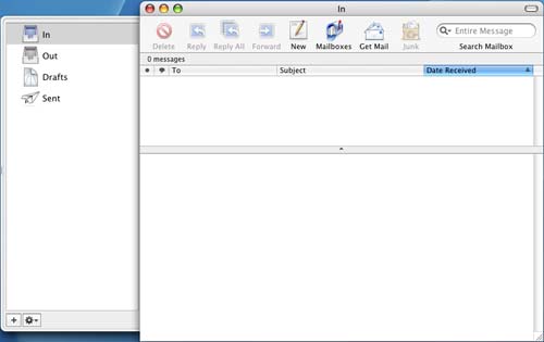
Mail comes with OS X, but instead of being a lightweight solution like Outlook Express, Mail is best compared to the likes of Outlook under Windows.
From a functionality standpoint, Mail has all of the features of Outlook as an email tool (Address book and Calendar support are provided through separate applications). The biggest changes that I had to get used to were, you guessed it, keyboard shortcuts to perform the tasks that I was used to under Outlook. The shortcuts did take a bit of getting used to for me, but in the end, it wasn't too difficult; to send a message after you've composed it, the shortcut is Command-Shift-D; replying is Command-R; forwarding is Command-Shift-F (Command-F opens up the Find dialog box); and Command-Shift-N gets new mail.
The application itself is lightning-fast; start up time is much faster than Outlook 2003 and a bit faster than Outlook 2004. The one aspect of Mail that is absolutely an improvement over Outlook is in its searching abilities. If you have any appreciable number of messages under Outlook, you know that searching for a particular message: 1) takes forever, and 2) leaves you with a noticeably slower machine with your hard drive crunching constantly. The search function in Mail is significantly quicker than Outlook and you get noticeably fewer disk accesses to find the email that you're searching for than under Outlook. Obviously, without knowing the architecture behind how Outlook searches vs. how Mail searches, I can't say exactly why Mail is faster, but I'd venture to say that it's either OS X doing some incredible caching, or it's just a much better indexed database with a faster search algorithm. Regardless of why, the reality is that it is significantly faster on a single 160GB SATA drive than I've ever had an Outlook search be on anything from a regular IDE drive to a 10K Raptor.
The overall interface and interaction with Mail is significantly faster than Outlook, regardless of how fast of a Windows PC I compare it to. The application has no problem handling tens of thousands of emails (the most that I've had in it at one time was a little over 23,000) and after a little experimenting, I finally found out that Option-Command-Delete would permanently delete an email instead of first sending it to the Trash folder. What's also nice to know is that copying or deleting a lot of emails doesn't slow down the program significantly; it's very easy to multi-task in Mail. While it could be attributed to the fact that all desktop G5s are now dual processor systems, the application is far less prone to slowdowns than any of the dual Opteron boxes on which I'd ever used Outlook. Now, it may be possible that Mail is more multi-threaded than Outlook or it may just be a case of better caching at work in the application. Needless to say, whatever it is - it works.
Mail has a built-in spam filter and the same filtering/rules capabilities of Outlook 2004. I've found that the spam filter in Mail is at least on par with that of Outlook 2004, if not a bit better. So far, I've been pretty pleased with it; although, there have been a few false positives that I've encountered when the filter is set to the most aggressive settings.
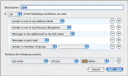
It's very easy to get a good set of rules set up and running in Mail - the process is even simpler than Outlook and it's quite easy to prioritize rules as well as have certain rules stop processing other rules after they've completed. Overall, I'd say the application is just as powerful as Outlook as an email client, but noticeably faster.
Most importantly, all of the little things that I appreciated about Outlook were also present in Mail. Start typing someone's name/email address to which you've sent email in the past or whose name already appears in your address book and autocomplete will bring up a list of addresses that match what you've already typed. While this feature has been in Outlook for a while, what's important here is that I didn't find any of the little gems of Outlook to be absent in Mail, which means a lot for a die-hard Windows user in order to feel comfortable under OS X.
The one issue that I had with Mail when I first started using it was that there was no way to directly import an Outlook pst file into the application. There are ways around this, such as exporting your Outlook mail to another format, then importing them into another client supported by Mail, and then exporting again before finally importing into Mail. But, I decided to not deal with that and just started my mailbox over from scratch. It took me a while to get enough emails accumulated in the application before I could truly pass judgment on it, but now that I have, it gets my stamp of approval.
Stability is another aspect of Mail that I have been pleased with, but the application isn't totally rock solid. Out of all of the apps on OS X, I've probably had Mail crash on me more times than the rest, but considering that I haven't had too many crashes under OS X in general, that's not too bad. None of the crashes have ever been detrimental to any of my mailboxes; all of my data always remained intact, but just as is the case with any crash, they've always been annoying. I would say the number of times that Mail has crashed on me would be similar to the number of times that Outlook 2004 crashed on me, maybe a little less.
In the end, I'd say the best way to summarize Mail is that it's nice to see a good, fast, robust email client finally included with the OS for free.
iCalendar
The one thing that I missed from Outlook was the integration between the email, calendar and address book applications. While light levels of integration are present in Mail (such as being tied in to the Address Book), you have to launch iCalendar separately in order to get calendar functionality. For some reason, I've never been able to really get much use out of iCalendar because it's not tied into Mail, whereas I used Outlook's calendar quite a bit. There's something about having a separate window to deal with just for the calendar that doesn't mix well with me.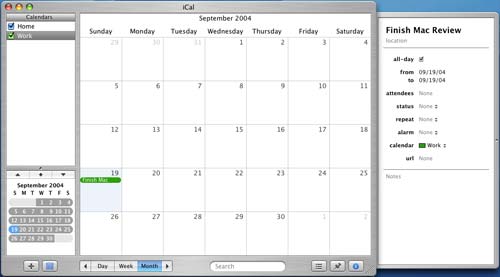
All uncomfortable feelings aside, iCal is a pretty well-rounded calendar program. It covers all of the bases including a to-do list, the ability to create multiple calendars, reminders for scheduled events, recurring events and once again, just about everything else that you can do in Outlook.
Maybe it's because of my lack of use of the application, but I haven't been able to find anything that stands out about iCal by which I was truly impressed. Mail had its speed and I guess iCal has its stylistic beauty, but other than that, I wasn't too floored by the application. That's not to say that it isn't good; it's a fine application, just nothing to write home about in my opinion. It does the job that Outlook did, which is all that matters in the end.
For those of you who are like me and want more integration between the applications, there is always Microsoft Entourage (basically Outlook for OS X). I honestly haven't played around with Entourage much, mostly because of the issues that I've had with Office for the Mac (which I'll cover later) and because I'm so happy with Mail.
Web Browsing
Safari is a tabbed browser much like Firefox and its usage is pretty straightforward. I've been a die-hard IE user ever since IE4 and have always appreciated its rendering speed and enjoyed its compatibility with the majority of websites out there. For an IE user, or any user for that matter, Safari is real easy to get used to.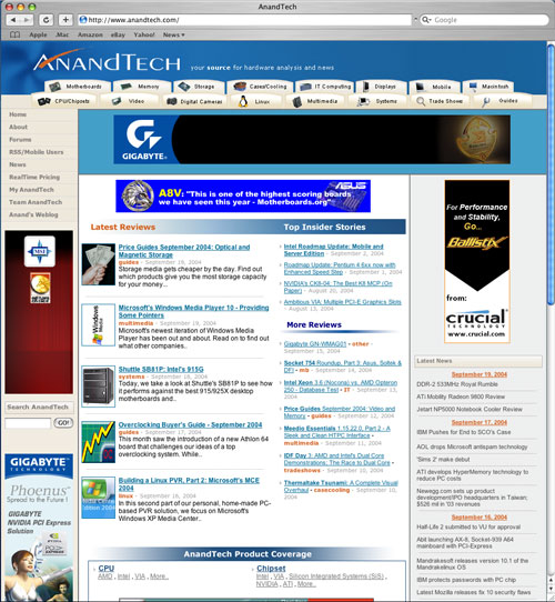
But before I get into the little features that make Safari a good browser, let me address its biggest shortcoming: rendering speed.
Back before Firefox's release on the PC, the one argument that I'd always hear against IE was that it was too slow compared to lesser used browsers such as Opera. Having used Opera, I could hardly tell any performance difference in rendering speed in comparison to IE. It was the lack of any appreciable difference coupled with no real application level benefits over IE that kept me from using it on the PC.
But when comparing Safari rendering speed to IE, the difference is much more noticeable. Webpages render instantaneously under IE compared to the multiple second delay that exists under Safari. In order to show the difference, I ran a couple of informal tests:
| IE (PC) | Safari (Mac) | ||
| www.anandtech.com | 2.825 | 4.073333333 | 0.306464812 |
| www.cnn.com | 2.75 | 4.123333333 | 0.333063864 |
| www.slashdot.org | 2.33 | 2.373333333 | 0.018258427 |
| www.apple.com | 2.625 | 4.073333333 | 0.355564648 |
| www.microsoft.com | 2.365 | 2.44 | 0.030737705 |
What we see here is that IE on the PC is consistently a lot faster in rendering webpages than Safari, and although the numbers may seem small themselves, they make the Mac (and actually your internet connection) feel a lot slower when browsing normal web pages. Considering the amount of web browsing that we all do on a regular basis, Safari's rendering performance is nothing short of unacceptable.
One solution would be to use Firefox, which is available for OS X, and in doing so, performance is improved tremendously - although Firefox under OS X continues to be slower than IE on a PC.
The performance problem, although alleviated by Firefox, is still a serious issue since I found that I personally preferred using Safari under OS X over Firefox. Safari feels much more polished and looks much more like the rest of the OS. The other problem with Firefox is that scrolling in Firefox is much less smooth than under Safari, and can get annoying when reading large web pages that require lots of scrolling. The other issue I had was that I couldn't seem to find a keyboard shortcut to switch between tabs in Firefox and for whatever reason, the autocomplete URL keyboard shortcut for a .com URL would never work for me in Firefox. Some can get used to these quirks of Firefox and won't have a problem, but I wasn't one of them.
So, now that we know what Apple needs to improve about Safari, what is so great about this browser?
Built-in pop-up blocking and tabbed browsing support are both must-haves with any current generation browser.
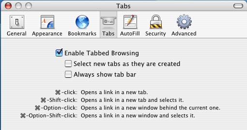
Safari also includes a built-in Google search bar and a download manager; again, nothing revolutionary, but a nice must-have for a web browser.
As with the rest of OS X, keyboard shortcuts are plentiful in Safari. As you would expect, Command-T will open a new tab while Command-N will open a new browser window. There is no auto-complete URL function, unfortunately (e.g. no equivalent to IE's CTRL-Enter). Although, just typing in the URL sans www. and .com will eventually find the site that you are looking for after a short lookup delay.
While Safari lacks an autocomplete URL keystroke combination, it does make navigating to a particular directory on a website easier without unnecessary typing. For example, if you want to visit www.anandtech.com/mac/, you can simply type in anandtech/mac and Safari will fill in the www. and .com for you in the appropriate places. It's not a huge time saver, but it's a nice feature to have.
The IE equivalent for shifting focus to the address bar is Command-L in Safari, which quickly became one of my most frequently used keyboard shortcuts under Safari (much like F2 or CTRL-Tab were for me in IE).
Unlike IE, regardless of how many Safari windows or tabs I have open, there is never any slowdown and definitely no slowdown in spawning new windows - both very important things to me as I tend to have a good number of web browser windows open at any given time.
Website compatibility, for the most part, wasn't an issue with Safari, but there were some definite compatibility issues that required me to have Firefox installed whenever a website wasn't working properly. The issues usually revolved around things like car configurators on car manufacturers' websites, or certain forms not working properly. Everything that didn't work under Safari had worked without a problem under Firefox, but the choppy scrolling under Firefox and lack of an integrated feel resulted in me being a Safari user - one who just had to put up with its shortcomings in terms of speed and compatibility.
When we were redesigning the AnandTech website, I had the pleasure of being the only Safari user on the team and thus, the only one with random weird problems that would crop up during the design phase. It quickly became evident how many Safari incompatibilities can crop up - most developers don't have an OS X box with Safari on which to test their websites. Needless to say, if I hadn't been running Safari at the time, AnandTech wouldn't have been the most Safari-friendly website.
I'd say that Safari is probably the weakest link in Apple's OS X package, and it's one that they absolutely need to fix. After all, you can argue that not everyone games, but when a $300 eMachines computer browses the web faster than a $3000 Powermac, it's time for an updated web browser.
Internet Explorer for the Mac is basically a piece of garbage. It looks like an old version of Netscape, it is horribly slow and it is nothing like the Windows version of IE. For me, Safari was the web browser of choice under OS X, with the occasional launch of Firefox whenever there was a compatibility issue. With the latest preview release of Firefox, the situation has been much improved for OS X browsing, but the OS still lacks a truly solid browser, which is very important in my book.
Microsoft Office
And now we get to my least favorite part of my Mac experience; that is, with Microsoft Office 2004. While I read that many Mac users heralded Office 2004 as an improvement to the previous version of Office for the Mac platform, it doesn't even begin to hold a candle to Office 2003 on the PC or just about any previous version of Office.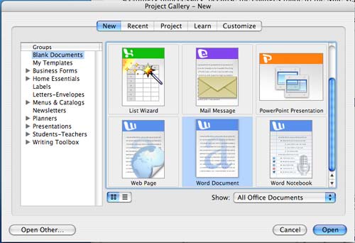
A number of my initial complaints about Office for the Mac have been resolved with Office 2004, but the most significant one remains: Office 2004 is an unacceptably slow application. On the PC side, we often talk about why anyone would need a Hyper Threaded 3.6GHz Pentium 4 for typing in Word, but on the Mac, I would do anything for something to make Word more responsive. While I'm assuming that the problem isn't hardware related (I find it hard to believe that the G5 processor has inherent problems with Microsoft Word), it may be a combination of hardware and software, as I have already mentioned that simple things like scrolling do not happen as fast as they should under OS X.
Simple things like bolding a word are ever so slightly slower under Office for the Mac than under Windows; you wouldn't notice it if your first experience with Office was on the Mac, but coming from a Windows user's perspective, it can drive you crazy.
Office is also the only application, which I've used on the Mac, that does not have a plethora of keyboard shortcuts associated with anything but the most common commands. Even Office 2003 for Windows has more keyboard shortcuts than the Mac version; maybe Microsoft's Office Mac team view OS X as little more than a beginner's OS?
Thankfully, compatibility with its Windows counterpart remains top notch; although, I occasionally forget to append an extension to files that I save, making for an interesting time when emailing them to Windows computers (I usually get an email back to the tune of "all I got was a .dat file").
There are clear differences between the Mac and Windows Office interface that are seemingly unnecessary because the changes made to the Mac version don't exactly make the suite fit in any better with OS X as the application still feels very un-Mac-like. Instead, it seems that the changes to Office were made for the sake of making the suite different than its Windows counterpart, which doesn't make much sense at all to me.
Games
I knew very well going into this that I would not be able to truly game on the Mac, but even the few games that were released on both Mac and PC platforms, which I wanted to play, did leave me with a sour taste of Mac gaming. It wasn't the games themselves - no, those were just fine - textured and filtered polygons look the same regardless of what side of the fence you're on; instead, it was actually getting the games.For example, the first Unreal Tournament 2003 demo was released while I was doing this little experiment and while all PC users were able to download the demo as soon as it was live, there was hardly any mention of it anywhere for Macs. I couldn't even find a download link off of Epic's website once the Mac version was available. Instead, I had to Google it and found a link off of a discussion board. This was well before an official link or even a mention of a Mac version ever appeared anywhere outside of a small circle of websites.
Then there's Doom 3. The game was released for the PC, and as everyone (me included) went out to buy a copy of the game, all Mac users were left with was a promise for a Mac demo and no solid release date for the Mac version. I surely wasn't going to wait and play it on the Mac when it came out. Nope - instead, I found myself playing even the games that were developed for the Mac on my PC as well.
The Mac is far from a gaming platform, and regardless of how positive a spin you put on it, the Mac gaming environment today is not much better than it was several years ago. I remember when Wolfenstein finally made it to the Mac. I would always make fun of my Mac friend because he was playing Wolfenstein while I was playing Doom - it doesn't seem like that much has changed.
The Hardware
Despite the fact that I started this lengthy article talking about how difficult it is to write because I'm not evaluating a piece of hardware, I have saved discussion about the Apple hardware until the end. Now that we're almost there, it is time to talk about the G5 hardware itself.The machine itself is quite heavy thanks to massive processor heatsinks and a generally heavy case. As with most Apples in recent history, the G5 tower is easily accessible - flip a lever at the back and pull off one of the side panels. The motherboard is obviously a low production custom design, but the board and the internals of the box seem much more like what you'd find inside an x86 server rather than a desktop PC.
There are a total of 8 DIMM sockets on the motherboard, requiring 1GB modules to meet the 8GB memory limit the system supports. The memory, as I've mentioned before, is the same DDR400 that you use in PCs, but the motherboard is quite picky about the SPD programming on the modules. The modules that the board supports are also quite slow, with very conservative memory timings (3-3-3-8). I don't believe that I've ever tested anything that slow on a PC before. Luckily, you can get G5-compatible DDR400 from more sources than just Apple; OCZ was the first to send me some compatible sticks, both 512MB and 1GB versions that worked perfectly. Other manufacturers also have Mac-lines of their memory.
The system is incredibly quiet. I'd say that it's definitely on par with the quietest PCs I've ever used. You do notice it when the fans spin up and yes, upgrading to a Radeon 9800 Pro did make the system noticeably louder - courtesy of the 9800 Pro's fan. The 9600 that ships with the system is passively cooled, so it managed to spoil me.
As I mentioned before, the 2GHz G5 processors that were in the system didn't "feel" slow, but they definitely didn't feel like the fastest things out there. The system itself could use a little kick in the pants. I'm hoping that the new 2.5GHz system will alleviate some of that feeling, but at another $3000, it's difficult to justify the upgrade. That being said, it's not a system with which I find myself complaining about speed - mostly due to the performance of a couple of key applications as well as OS X's excellent job of caching.
The keyboard and mouse both look great but fall flat on their face when it comes to functionality. For a company that has seemingly done a good job of allowing form and function to go hand in hand, and for a company that has developed some of the best human interfaces to digital technology, the input devices are a strange enigma.
The Apple displays are impressive, I started using them with a PC well before I ever thought about buying and using a Mac. The problem again comes down to cost. At $3000 for a top of the line system, adding a pair of Apple displays onto the bottom line is a tough pill to swallow. Luckily, you can use any DVI monitor with the machine, which cuts down the barrier to entry by a little bit.
Final Words
Writing for AnandTech is difficult. Just imagine talking to any group of almost 5 million people - are they all going to have the same interests? Should I have tailored this article totally to PC users who've never touched a Mac showing them the good and the bad through my eyes? I tried to do a bit of that. Or was I to show the Mac users a PC guy's objective take on their platform? I dabbled in some of that as well. Was I trying to get PC users to add a Mac to their "stable" of rigs? Maybe not so much "persuade", but more of "put another option out there for consideration". It has been a very difficult article to write, and I hope that all of the people to whom I'm writing at least gained something useful out of this - I know that I did.More than anything, I'm glad to be aware and somewhat proficient in dealing with yet another hardware/OS platform, even though it's a very small percentage of the total computing population out there. It's nice to know that I'm not to totally lost if I find myself stuck with nothing else to use but a Mac. But this experiment has clearly gone far beyond just a "trying it out" stage. The G5 is a computer that I use on a daily basis and it's something that I do enjoy using. I find the multi-tasking capabilities, some of the little gems that I talked about throughout this article, and the overall stability of the platform to be great for most of the computer usage that I do on a day-to-day basis. Despite my appeasement with Apple's platform, this is far from a "switch" story.
I've outlined what I do and don't like about the platform, and honestly, if you gave me the task of doing the same thing for the x86/Windows platform, I could come up with a set of different, but similar, sounding arguments for that platform as well. In the end, they are both very strong platforms, but without the compatibility and affordability of the PC platform, I can't see myself being strictly a Mac user. The OS is excellent, far from perfect, but more so than Windows in my opinion - and all the major applications do run on the platform. But, it's not having the major ones that you miss; rather, it's the few little ones that really make it difficult. Games aside, until very recently, I couldn't use my Blackberry with my Mac, it took a 3rd party developer to bring support for the Blackberry to OS X. Before that, I could only sync my Blackberry to my Windows PC - completely unacceptable if the G5 were my only computer. It's rare these days that new hardware, software and gadgets are released with out-of-the-box OS X support, which is unfortunately what makes completely switching to the platform difficult. Then there's the obvious issue of price - $3000 for a top of the line G5 isn't a bargain regardless of what you compare it to.
In the end, Apple has developed a very strong platform. OS X is quite possibly one of the best operating systems of its time and in many ways, is the best for what it does, and Apple's hardware leaves very little to be desired. But as always, the Apple platform is a tough sell to the mainstream for the reasons that I've already outlined. I took a chance and ended up pleasantly surprised. Maybe more PC users would be pleasantly surprised too - the problem is that even as a second machine, a Mac is an expensive proposition. Maybe instead of switch commercials, Apple should have poured that money into arranging 30-day trials of G5s for PC users. They would've probably gotten more converts that way.

