The Apple Thunderbolt Display Review
by Anand Lal Shimpi on September 23, 2011 2:56 AM EST- Posted in
- Displays
- Mac
- Apple
- Thunderbolt
- Thunderbolt Display
Final Words
As a display, the Thunderbolt Display is no different than the 27-inch LED Cinema Display. You lose some of the resolution of the older 30-inch panels but you get a much more compact form factor that feels far less overwhelming on a desk. Having the 27-inch display exclusively for the past year I can honestly say that I don't miss the 30. I've mentioned before that I'm more productive on a single high resolution display vs. two lower resolution panels, the 27 continues to suit my needs very well in that regard.
Quality hasn't changed at all since the previous generation. Color temperatures are finally more reasonable out of the box thanks to Apple's pre-calibration on all panels. Brightness and contrast are both good and calibrated color quality is professional grade. Color gamut is about the only blemish, a side effect of Apple's LED backlight. If you're coming from a notebook panel however, you won't notice the difference.
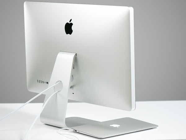
The real improvements here are obviously those enabled by Thunderbolt. Apple is turning its line of displays into docks for its mobile computers rather than just external displays. It started with integrating MagSafe and has culminated in GigE and FireWire controllers now a part of the display. For MacBook Air owners who don't have options for these high speed interfaces to begin with, the Thunderbolt Display is a must-have. If your MBA is a secondary or tertiary computer that only gets taken on trips perhaps the Thunderbolt Display isn't so life changing. For those users who have moved from older MacBook Pros to the 13-inch MBA however, the Thunderbolt Display is a wonderful companion.
For MacBook Pro owners the Thunderbolt Display is more of a convenience than anything else. If you ferry your notebook between locations frequently, having to hook up only two cables vs. several is nice. I don't know how else to word this without sounding incredibly lazy (I promise I'm not), but I'm more likely to move my notebook around if I don't have to unplug/reconnect 7 cables everytime I get back to my desk.
For me the Thunderbolt Display is good but not perfect. I wish it had a 1/8" stereo output, an SD card reader and USB 3.0 support. Give me those things and I'd be ecstatic. There's always next year's model.
Promise Pegasus owners beware. If you're writing to the Pegasus while listing to music via the Thunderbolt Display you'll eventually encounter dropped/corrupted audio frames. The problem seems confined to the Pegasus, so we'll have to wait on Promise for a fix. The Thunderbolt Display itself doesn't seem to be the cause of any issues.
Even with its limitations, the Thunderbolt Display is one of a kind. I do hope it's the start of a much larger trend. Short of a CPU and memory there's a bonafide motherboard inside the Thunderbolt Display, featuring many of the components we're used to seeing inside systems but now encased in a display. Thanks to SSDs, Turbo Boost and Thunderbolt the only thing holding notebooks back from being true desktop replacements is GPU performance. Sony has already toyed with the idea of sticking a GPU in an external box connected to their notebooks, perhaps that's something we may see more of in the future.

There are still significant concerns over the adoption of Thunderbolt in the future. While it may be free of royalties, there's only one company that makes Thunderbolt controllers: Intel. Not to mention the licensing fees for using the Thunderbolt logo. What made USB and PCIe successful was the ability for many companies to produce and integrate the necessary controllers. I believe we'll need to see the same from Thunderbolt for it to truly become ubiquitous.


275 Comments
View All Comments
V4lkyri3 - Friday, September 23, 2011 - link
Maybe I'm slow to the party, but I'm loving this video review Anand.Valkyrie.
mfenn - Friday, September 23, 2011 - link
Agreed!GeorgeH - Friday, September 23, 2011 - link
It was a very well-done video, everything from lighting and sound to the presentation was very well done.Hopefully you use video reviews as more of a supplement where it's appropriate though (case reviews with videos would be great.) I can read much faster and than I can listen, and it's much easier to search and reference text.
dragonsqrrl - Friday, September 23, 2011 - link
+1! Love the way Anand and reviewers have been using these video's to supplement the written content, it's a great added bonus.And I agree, it would be great for things like case, monitor, and smart phone reviews, things of that nature, but not so much for a hard drive or SSD reviews, for instance. And it seems like that's precisely the way the video reviews have been used thus far.
Great stuff...
Operandi - Monday, September 26, 2011 - link
For one it is a very concise version of the full review, and it complements it very well. Just the quick and dirty info on what Apple has been up to, and as this will do nothing for me as a PC user I now know I can stop there; if I want more detailed info I have the full review at my disposal, pretty cool. The other obvious benefit is the video format itself has advantages over still images for products such as this.Also great work on the video and audio production, it looked and sounded great. The set is almost too minimalistic though, might want to experiment there.
tech6 - Friday, September 23, 2011 - link
+1 - Nice work - looks and sounds professional. More please.leodc - Friday, September 23, 2011 - link
You are are quite a fluent speaker, Anand! You spoke continuously for more than 5 minutes without meandering, drifting.... Impressive.ImSpartacus - Friday, September 23, 2011 - link
I agree. I love how he leaped into the anecdote without throwing an annoying intro on the screen. Anand's performance was engaging; I love listening to where he thinks the industry is going.B3an - Friday, September 23, 2011 - link
It's well made but it annoys me how he puts this much effort in to Apple products and only makes a video of this quality for something by Apple. Also in Anandtech articles theres very often better quality photos for Apple stuff, in comparison to other articles for anything else. More effort is put in to lighting, location, and camera shots. On a whole Apple articles just seem better presented and it just makes the site seem bias and like some fanboyism exists.Stas - Friday, September 23, 2011 - link
Or they just get paid to do it right. Other articles they do on their own initiative. I'm sure, if a company stepped in and paid for a review, they would do it just as well, as Apple's.