NEC PA242W Monitor Review
by Chris Heinonen on September 27, 2013 9:00 AM ESTWith the switch to CalMAN we have been able to use much better methods for measuring display uniformity. Instead of getting unique dE2000 values for each point on the screen, they are compared to the center of the screen to give us a true uniformity value. We also measure 24 patches so we have a much more accurate idea of overall color and brightness uniformity than just measuring white level. Now with the test data from the NEC PA242W, I can finally use it to show why a professional monitor costs so much more.
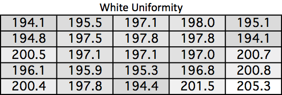
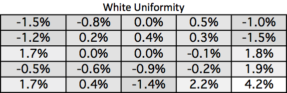
Look at the white uniformity data. I usually am very happy if nothing varies from the center by more than 10%. On the NEC PA242W the maximum variation is 4.2%. A white field on the screen is white, and it is the same level everywhere. No monitor before has come close to this performance, which is a testament to the design of the NEC backlight setup.
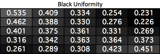
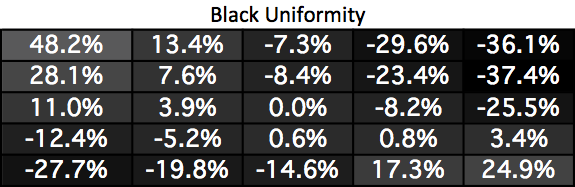
Black uniformity is not nearly as good as white. Two corners are much darker and two are much lighter than the center. I’m surprised by this as good uniformity usually works both ways, but it seems that white uniformity is being judged to be more important overall than black uniformity here.
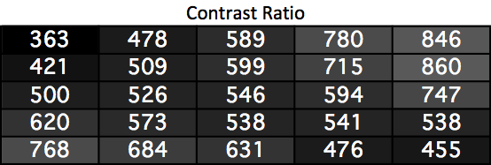
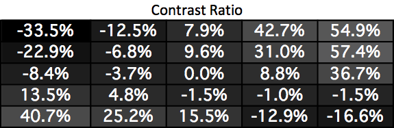
Since the white uniformity was almost perfect, this is just a mirror of the black uniformity chart. Two corners have much higher contrast ratios and two are much worse. It’s a bit disappointing just like the black uniformity is.
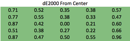
The color error uniformity is not disappointing at all. Instead, it is practically perfect. No area of the screen has an average dE2000 error >1 compared to the center. Since an error less than 1 is invisible to the eye, even on still images, this really is perfect. Even if the numbers were lower you wouldn’t see a difference, so I will just say this is perfect.
Uniformity like this has not been seen in my testing before. This performance is what professional designers and photo editors’ need, and it is what NEC delivers. It is expensive, but for many people it is worth paying for as it has untouched uniformity performance.


74 Comments
View All Comments
Hulk - Friday, September 27, 2013 - link
I trust Anandtech reviews but that contrast ratio would be a huge concern of mine if I were dropping $1000 on a monitor.noeldillabough - Friday, September 27, 2013 - link
I'm using an older 26" version of this at work and its great...so much so that when I work on a different machine I'm grumbling about the difference!coolhardware - Friday, September 27, 2013 - link
I could not find a 26" (older) version of this monitor, anybody have a model #???asakharov - Sunday, October 6, 2013 - link
NEC 2690WUXIDeath666Angel - Friday, September 27, 2013 - link
If you drop 1k on this you need it for the uniformity and color/calibration results, not for high contrast for your movies and games. :)Hulk - Friday, September 27, 2013 - link
Actually when I do post work for video/photo, lattitude (dynamic range), which is ability to see detail in the darkest and brightest areas is a big deal, as important if not more so than color space and uniformity. A low contrast ratio means that highlights turn into bright blotches and dark areas simply appear crushed.I look for contrast ratio first, then color space, and finally uniformity in a monitor for doing work in post. Uniformity and color space are useless if I can't see any detail in the bright and dark areas.
Senti - Friday, September 27, 2013 - link
You are absolutely wrong about contrast. Contrast is the ratio of pure white to pure black and nothing else. This has nothing to do with ability to display dark and bright shades. Actually, the reverse is true: VA panels have great contrast and awful dark tones reproduction. I can see the difference between all the shades with my NEC PA241W even though its contrast is quite modest.In general, I have to say that displays are definitely not Anandtech's specialization. Not just mine opinion, as I heard several times how disappointed people I know were at the usefulness of such reviews here. Some important points that AT completely missed: 10-bit mode of operation, overdrive errors, refresh rates, impact of different Uniformity setting values.
Hulk - Friday, September 27, 2013 - link
No. You are wrong.Contrast ratio should be high for a good display.
http://en.wikipedia.org/wiki/Contrast_ratio
Furthermore, dynamic range and contrast are closely related and a good display should have a contrast ratio of at least 1000:1.
http://en.wikipedia.org/wiki/Dynamic_range
Finally, you might want to read up on this subjest.
http://www.cambridgeincolour.com/tutorials/dynamic...
Gothmoth - Friday, September 27, 2013 - link
sorry hulk. but you are clueless.look at eizo coloredge or quato monitors.
and don´t argue about something you obviously know not much about.
enjoy the faked contrast ratio numbers of your gaming monitors and google a few more articles that say nothing about actual display quality .
Samus - Saturday, September 28, 2013 - link
Ohh Hulk, throwing wiki links to general topics with no direct data about this monitor (or any other comparison) is fail.No where in Contrast Ratio does it say anything along the lines of quality monitors have high contrast ratio or low-end monitors have weak contrast ratio, etc.