The iOS 7 Review
by Brian Klug & Saumitra Bhagwat on September 19, 2013 1:25 AM ESTCamera
I touched on the new camera interface in my iPhone 5S camera improvement thoughts piece already, but it’s worth talking about again. Camera UI seems to be something that every OEM is changing quickly, and while there are common elements shared between the various camera UIs out there, there’s really no common design like there is say for threaded messaging or a dialer.
The camera UI gets probably one of the more dramatic overhauls in iOS 7, and fixes a lot of things that were slowly becoming a problem as Apple added camera features to its platforms.

iOS 6

iOS 7
The camera UI has completely different iconography and styling from the old one. Gone is the video toggle, and in its place is a mode ring which switches between slow-mo, videos, photo, square, and panorama. This eliminates some of the feature cruft that was piling up in the “options” button from the old UI. There’s also the filters option which shows a live preview grid of some filters on the image – think photo booth for iOS. My only complaint is that whereas the previous iOS camera UI had more visual cues that made it easy to confirm the camera detected proper portrait or landscape orientation, the iOS 7 camera really doesn’t. Only the thumbnail and flash/HDR/front camera icons rotate. Further, the text ring switcher doesn’t rotate, which adds some mental processing when you’re shooting in landscape (which you should, especially for video).
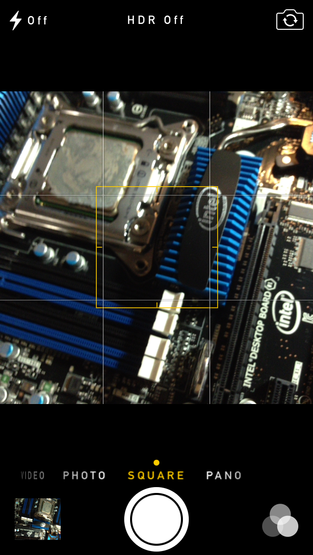

A major problem with the iPhone 5 and iOS 6 camera UI was the aspect ratio mismatch between the camera sensor and display, and the way Apple chose to deal with it. This has become a problem for other OEMs as well since then. The live preview previously was fit to the long axis of the display, chopping the top and bottom of the actual image area off. This hilariously results in a preview that doesn’t actually show what the output image is going to look like, and composition matters when taking photos.
The good news is that in iOS 7 Apple has changed it so the image preview is now aspect-correct without cropping of the image preview. The bad news is that it took a whole iOS release cycle to fix that problem, which is curious considering that problem existed for video already (video is 16:9) on previous iPhones without 16:9 displays and Apple just implemented a double tap to show the full field of view.
On the iPad the camera UI changes slightly, there’s no ring switcher but just a strip with text for the ring switcher and all the controls.

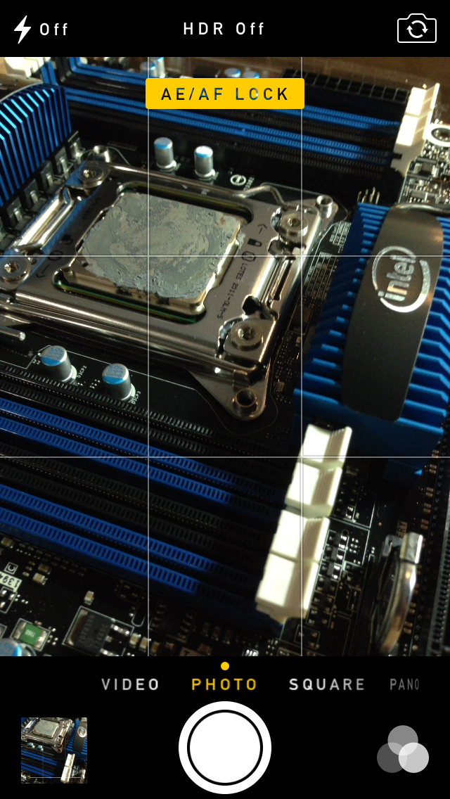
The camera UI still retains AF/AE lock (long press in the preview) and the rule of thirds grid (although this is under settings, outside of camera.app), what’s different is holding the capture button now bust captures on every platform. Previously you could hold the camera button down indefinitely and capture on release, which was great if you wanted to take a selfie with the rear facing camera (just hold it, then release).
Apple has taken the extreme automatic route with its camera UI, you won’t ever see a Nokia 1020-esque UI with optional manual controls for ISO, focus, or exposure time, so getting everything right is very important. I’m really happy that the new UI fixes the aspect ratio cropping issue which was alarming to see shipped on the iPhone 5.
Photos
The Photos application gets an entirely new icon and a number of overhauls inside. In addition to the Albums view there’s a new Photos view which has a few different visualizations and groupings – collections, years, and moments. These group photos together based on time or place in a logical fashion.
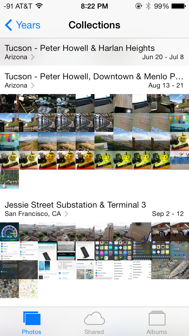

The visualizations show small thumbnails with all the photos automatically grouped together. This is a big step forward from the oldest at top, newest at bottom organization that the albums view provided with fixed size thumbnails that quickly became impossible to navigate after getting a few thousand images in. There are some new multitouch effects in this view too, you can pinch and zoom into images from the moments views and flick them around. The maps view is also still around, which uses the location tags from EXIF.
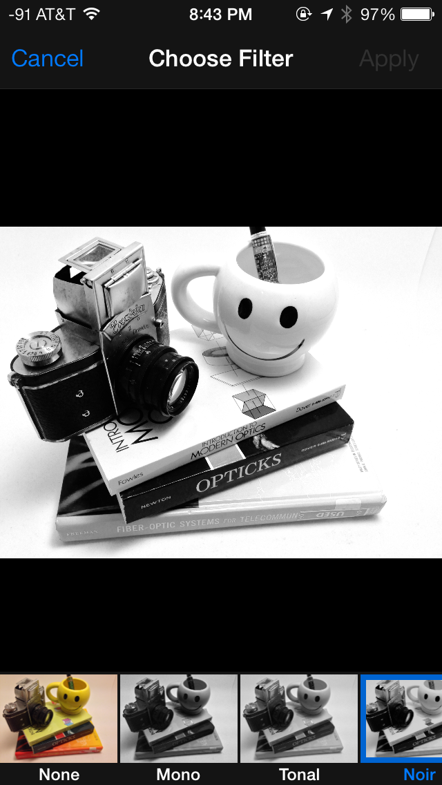
Inside the edit menu there’s also new support added for photo filter effects after the fact. In addition photos taken with the filter toggled don’t actually destructively change the original image, so you can remove these or change them after the fact. I’m not a big filters person but this kind of nondestructive editing is awesome.


144 Comments
View All Comments
KPOM - Thursday, September 19, 2013 - link
Regarding battery life, I'd say I've noticed a slight drop, but it's hard to tell from one day. I recall that happened last year, too, but was fixed in one of the first bug fixes. I expect it will be the same this year.ltcommanderdata - Thursday, September 19, 2013 - link
What about graphics benchmarks? Are the newer GPU drivers faster?blacks329 - Thursday, September 19, 2013 - link
"Swipe to delete has also been reversed in iOS 7. Rather than a left to right swipe to bring up a delete button, it’s now a right to left swipe."Actually swiping both ways worked pre-iOS 7, swipe left to right or right to left, would present you with the delete button. The delete button would animate in from right to left anyways, so I don't know why they even let you swipe left to right to delete.
Surrept - Thursday, September 19, 2013 - link
Good review Brian. Been beta testing for awhile now and I really do like the changes.Icehawk - Thursday, September 19, 2013 - link
Did I miss it - where was AirDrop discussed?apertotes - Thursday, September 19, 2013 - link
"The other reality is that smartphone users no longer need a UI that emulates real-world analogues to real objects for them to be able to discover and learn the interface. Things like controls (switches, sliders, and buttons) that emulated actual buttons no longer have to appear that way to be immediately obvious. Textures and other surfaces no longer need to mimic the real world either. Instead these can now give way to something that’s minimalist and new."Welcome to 2005. But as always, nothing is cool until Apple does it.
solipsism - Thursday, September 19, 2013 - link
What changed in 2005? Where did these sweeping changes take place that somehow left Apple out in the cold despite being 2 years before the original iPhone launched?Impulses - Thursday, September 19, 2013 - link
Revisionism 101uhuznaa - Thursday, September 19, 2013 - link
I think this is totally wrong. Emulating real-world analogues (including things like inertia and friction) leverages things you not only have learned by dealing with the world but even things that are hard-wired in every animal. Even cats have an easier time to tap on things that appear like things and not an abstract symbol.Doing away with that is just another fad, that's all. Things like clear borders, shadows and raised buttons are not only a fad, they carry a meaning that goes much deeper than things you learn by using an interface.
Skeuomorphism got a bad reputation for all the wrong reasons. UNNECESSARY decoration is bad (maybe, it may still look nice) but not everything from the real world is skeuomorphism. You just need to look at the physics model of inertia and friction when scrolling that is still pretty much nailed down in iOS and a bad emulation in Android (and this is not meant as a jab, you'll find no combination of mass and friction that will work like the model in Android tries to do, it's just wrong from a physics POV). These are things that are rooted in physics. It's not only a good idea, it's the law...
Because of that I still like things I can press to look as if they're standing out. There's something in my animal layers that understands these hints even before I do. Apple throwing this away for no good reason is a sign of them being helpless and without a real clue. They're just fumbling around.
By the way, using large areas in clear colors for that may be fine too, and this is what MS is doing. Apple just using strings of colored text is by far a third-rate choice, but it was the only choice left for them. This is important to understand: iOS 7 is all about what was left and nobody did before for very good reasons. Apple was complacent for far too long, they did nothing for 6 years and thus they gave up the freedom of leading.
One day all of this will be written down in IT history books and it will be clear as day.
LordConrad - Thursday, September 19, 2013 - link
I don't like the new look, seems like it was designed for teenage girls. I will not be upgrading my iPad 4.