The iOS 7 Review
by Brian Klug & Saumitra Bhagwat on September 19, 2013 1:25 AM ESTCamera
I touched on the new camera interface in my iPhone 5S camera improvement thoughts piece already, but it’s worth talking about again. Camera UI seems to be something that every OEM is changing quickly, and while there are common elements shared between the various camera UIs out there, there’s really no common design like there is say for threaded messaging or a dialer.
The camera UI gets probably one of the more dramatic overhauls in iOS 7, and fixes a lot of things that were slowly becoming a problem as Apple added camera features to its platforms.

iOS 6

iOS 7
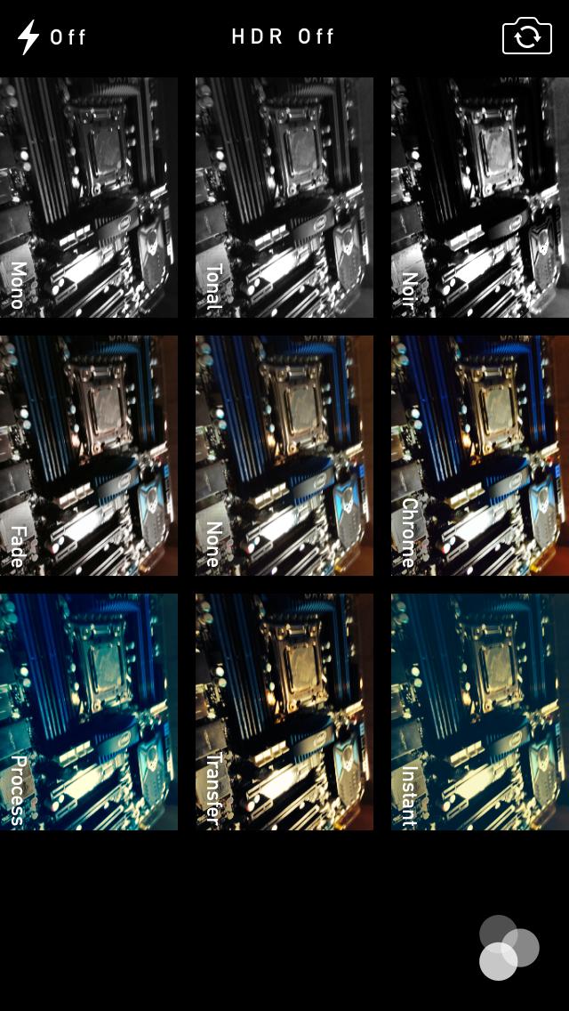
The camera UI has completely different iconography and styling from the old one. Gone is the video toggle, and in its place is a mode ring which switches between slow-mo, videos, photo, square, and panorama. This eliminates some of the feature cruft that was piling up in the “options” button from the old UI. There’s also the filters option which shows a live preview grid of some filters on the image – think photo booth for iOS. My only complaint is that whereas the previous iOS camera UI had more visual cues that made it easy to confirm the camera detected proper portrait or landscape orientation, the iOS 7 camera really doesn’t. Only the thumbnail and flash/HDR/front camera icons rotate. Further, the text ring switcher doesn’t rotate, which adds some mental processing when you’re shooting in landscape (which you should, especially for video).
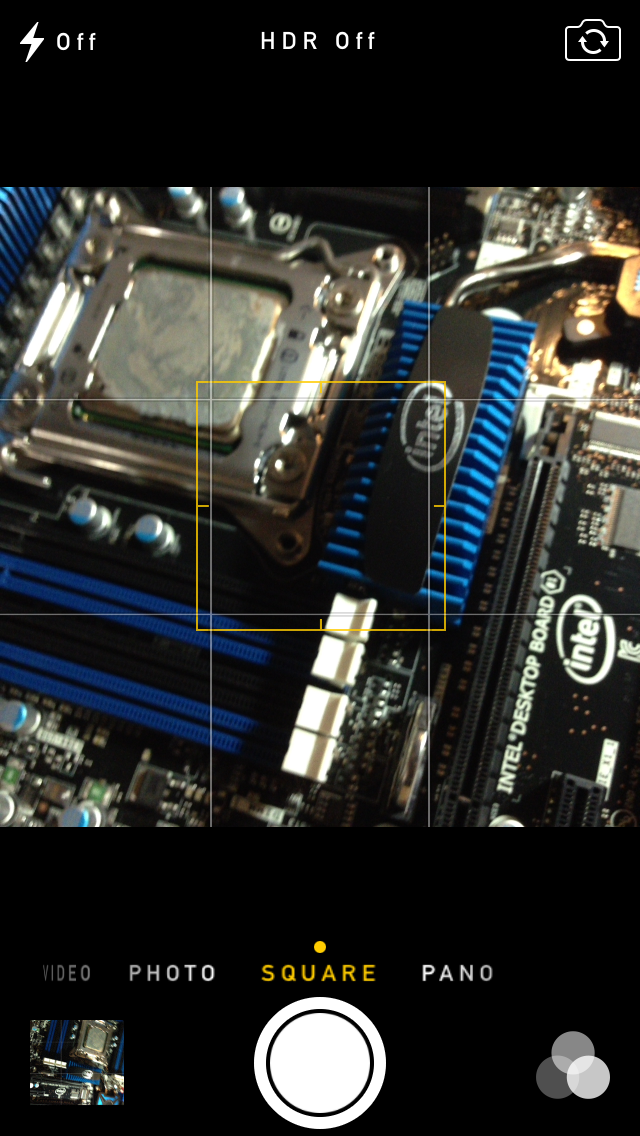
A major problem with the iPhone 5 and iOS 6 camera UI was the aspect ratio mismatch between the camera sensor and display, and the way Apple chose to deal with it. This has become a problem for other OEMs as well since then. The live preview previously was fit to the long axis of the display, chopping the top and bottom of the actual image area off. This hilariously results in a preview that doesn’t actually show what the output image is going to look like, and composition matters when taking photos.
The good news is that in iOS 7 Apple has changed it so the image preview is now aspect-correct without cropping of the image preview. The bad news is that it took a whole iOS release cycle to fix that problem, which is curious considering that problem existed for video already (video is 16:9) on previous iPhones without 16:9 displays and Apple just implemented a double tap to show the full field of view.
On the iPad the camera UI changes slightly, there’s no ring switcher but just a strip with text for the ring switcher and all the controls.

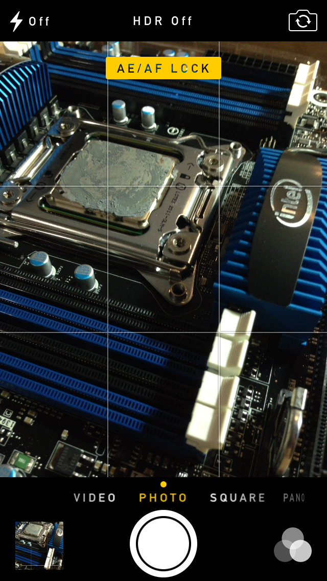
The camera UI still retains AF/AE lock (long press in the preview) and the rule of thirds grid (although this is under settings, outside of camera.app), what’s different is holding the capture button now bust captures on every platform. Previously you could hold the camera button down indefinitely and capture on release, which was great if you wanted to take a selfie with the rear facing camera (just hold it, then release).
Apple has taken the extreme automatic route with its camera UI, you won’t ever see a Nokia 1020-esque UI with optional manual controls for ISO, focus, or exposure time, so getting everything right is very important. I’m really happy that the new UI fixes the aspect ratio cropping issue which was alarming to see shipped on the iPhone 5.
Photos
The Photos application gets an entirely new icon and a number of overhauls inside. In addition to the Albums view there’s a new Photos view which has a few different visualizations and groupings – collections, years, and moments. These group photos together based on time or place in a logical fashion.
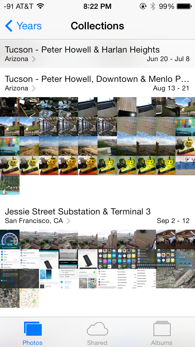
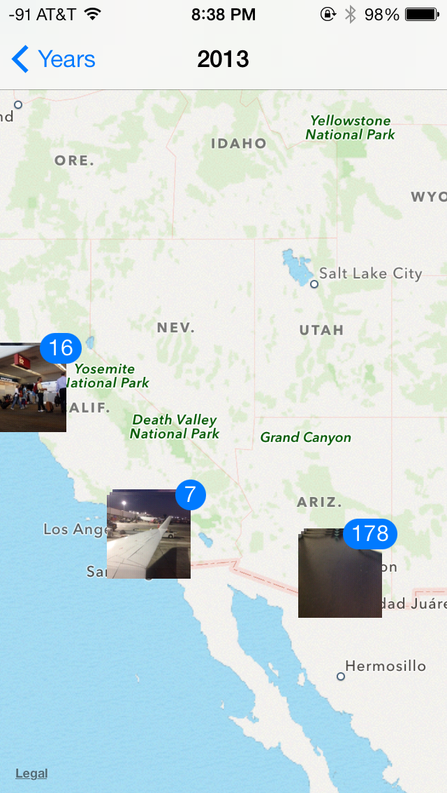
The visualizations show small thumbnails with all the photos automatically grouped together. This is a big step forward from the oldest at top, newest at bottom organization that the albums view provided with fixed size thumbnails that quickly became impossible to navigate after getting a few thousand images in. There are some new multitouch effects in this view too, you can pinch and zoom into images from the moments views and flick them around. The maps view is also still around, which uses the location tags from EXIF.
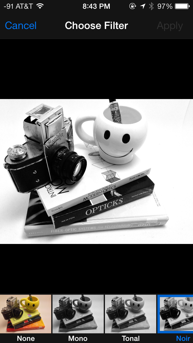
Inside the edit menu there’s also new support added for photo filter effects after the fact. In addition photos taken with the filter toggled don’t actually destructively change the original image, so you can remove these or change them after the fact. I’m not a big filters person but this kind of nondestructive editing is awesome.


144 Comments
View All Comments
akdj - Tuesday, October 1, 2013 - link
@rrecine...glad you're digging your Note. My contract can't mature fast enough. Of all the smartphones we've purchased for development (Android, iOS and Windows)---it's hands down my least favorite. I just bought the 5s and can honestly tell you the new iPhone bests the GNote 2. The SD card. What an absolute joke. And no wonder Google is trying to get the OEMs to get rid of it. Can't put apps on it. Can't store any app info on it. Media essentially only. I bought in hook line and sinker. I'll never buy another Samsung or TouchWiz device as long as I live. Like I said though...glad you're digging yours. The iPhone 5s is definitely a big step up so don't go playing with one. You may just end up coming to the dark side. Removable battery isn't necessary on a phone capable of excellent and often all day use. That's one of the biggest downfalls of the Note 1 & bit less so on the 2. Battery life (stock) absolutely sucks!Crono - Thursday, September 19, 2013 - link
iOS 7 needs less transparency/translucency elements, a slightly darker color or solid color palette, and less animations. Otherwise the UI changes are a step in the right direction as far as lessening skeumorphic icons and moving toward a flatter look.tim851 - Thursday, September 19, 2013 - link
The color palette was probably chosen to hide the extend to which WP7/8 was copied.As a WP7/8 hater, I don't like this iOS 7 look. On the iPad, there's too much (literal) white space. It starts with the greeting screens, which are just big black text on white. Looks like a no-nonsense powerpoint presentation. And at times, iOS 7 appears unpolished.
I disliked some of the skeumorphism in iOS 6, but generally preferred the look-and-feel. But as Brian said, there were lots of people who called for change - for change's sake. And that's what they got.
Also, on the iPad 2, performance is borderline. Every once in a while an animation stutters. Temple Run 2 now stutters all the time. Might be an app issue, might not be. But it's 2013 people, the operating system should NOT do things that slow down the interface. Another thing I have to grudgingly give to Windows Phone.
nathanddrews - Thursday, September 19, 2013 - link
Maybe it's just a hold over from the old days, but the first thing I do with any OS is disable every animation possible. Much like disabling startup videos on games. When I click something, I just want it to work immediately.Ain't nobody got time fo dat. /mandatory
Impulses - Thursday, September 19, 2013 - link
OTOH, aren't WP app load times still behind everyone else? I don't know that they necessarily emulated WP too much, seems like they took interesting bits from both it and stock Android (roboto font was a big deal on ICS, etc).OzedStarfish - Friday, September 20, 2013 - link
Yeah they are still quite long. It's especially frustrating for me, a developer for WP8 because it seems it's a deeper problem than what can be addressed with smart application design.It's most evident when looking at the settings app, launching is effectively instant (animations withstanding) while any third party app takes noticeably longer. To Microsoft's credit, it is far better than it used to be with WP7, switching from JIT to MDIL as well as other back end changes have definitely helped.
NeXTguy2 - Friday, September 20, 2013 - link
It's interesting. Load times can be slow to the point of being seriously annoying. I'm looking at you, WhatsApp. At the same time, though, there are enough apps that launch in 0.5 seconds or so, even on my old Lumia 800 with WP7.5, which indicates to me that there is no fundamental "penalty" in the OS itself.Maybe it has to do with the number of resources an app depends on? The apps with fast launch times include 1Password, the Blizzard and RSA authenticator apps, while stuff the needs an internet status, Twitter and TripIt for example, are slowish. Worst seem to be apps that have a lot of local data. This is all suspicion, I have not tested any of this. Maybe I should...
OzedStarfish - Friday, September 20, 2013 - link
There is a huge correlation between loading data and launch time, especially when developers are lazy and run their routines on the UI thread. But I think the difference between first party and third party apps is most clear comparing 'music+video' or 'photos' or any other complex native panorama app to even the SDK sample, the sample drops frames on opening whilst the native ones are smooth and seamless.Just comparing the settings apps from my Lumia 920 and Nexus 7 (2013) I swore that the phone opened quicker from general usage, but comparing side by side the nexus is noticeably quicker, the animations on the phone really did well at masking the loading while I felt that looking at the grey screen on the nexus made it feel slow. I can see how it takes an adjustment period when switching platforms.
Wolfpup - Wednesday, September 25, 2013 - link
Windows Phone feels fast to me. Both iOS and Windows Phone generally feel really fast, while Android (even on better hardware) feels sluuuuuggish (still, as of 4.3).Daniel Egger - Friday, September 20, 2013 - link
Really not sure where all the WP7/8 references are coming from; one Windows-affine techsite suddenly confesses liking iOS 7 because they copied so many good parts from WP and others start hating iOS 7 because they only copied the worst parts. As a WP7 and 8 user I cannot see at all where this is coming from because the few things they have in common now (like the task switcher which is still quite rudimentary in 8, to be improved in 'Blue' to an iOS 7ish level) or a sans serif font (which is still quite a different choice between the two) are not coming from WP originally at all.