The iOS 7 Review
by Brian Klug & Saumitra Bhagwat on September 19, 2013 1:25 AM ESTCamera
I touched on the new camera interface in my iPhone 5S camera improvement thoughts piece already, but it’s worth talking about again. Camera UI seems to be something that every OEM is changing quickly, and while there are common elements shared between the various camera UIs out there, there’s really no common design like there is say for threaded messaging or a dialer.
The camera UI gets probably one of the more dramatic overhauls in iOS 7, and fixes a lot of things that were slowly becoming a problem as Apple added camera features to its platforms.
iOS 6
iOS 7
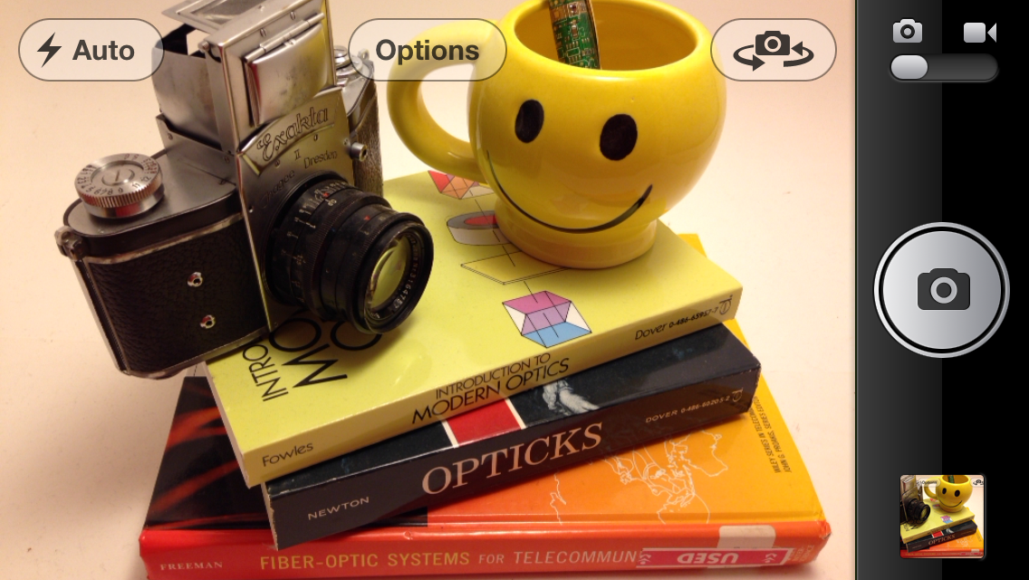
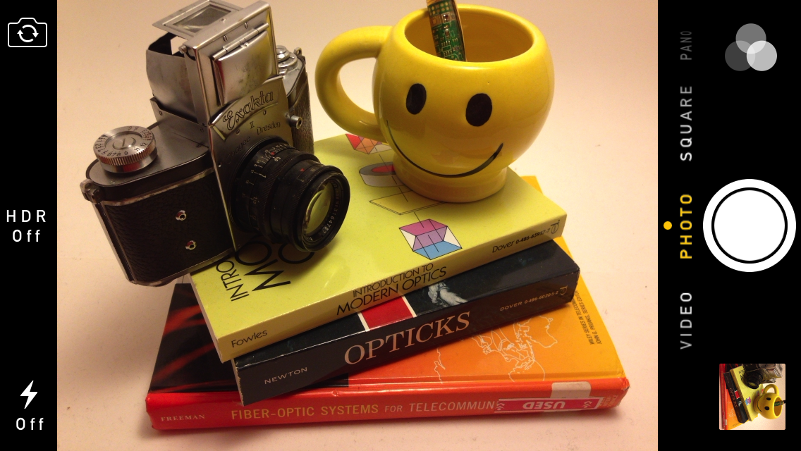
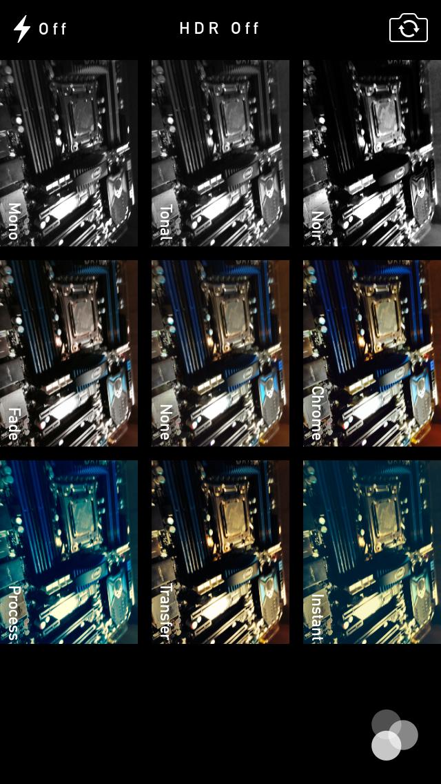
The camera UI has completely different iconography and styling from the old one. Gone is the video toggle, and in its place is a mode ring which switches between slow-mo, videos, photo, square, and panorama. This eliminates some of the feature cruft that was piling up in the “options” button from the old UI. There’s also the filters option which shows a live preview grid of some filters on the image – think photo booth for iOS. My only complaint is that whereas the previous iOS camera UI had more visual cues that made it easy to confirm the camera detected proper portrait or landscape orientation, the iOS 7 camera really doesn’t. Only the thumbnail and flash/HDR/front camera icons rotate. Further, the text ring switcher doesn’t rotate, which adds some mental processing when you’re shooting in landscape (which you should, especially for video).
A major problem with the iPhone 5 and iOS 6 camera UI was the aspect ratio mismatch between the camera sensor and display, and the way Apple chose to deal with it. This has become a problem for other OEMs as well since then. The live preview previously was fit to the long axis of the display, chopping the top and bottom of the actual image area off. This hilariously results in a preview that doesn’t actually show what the output image is going to look like, and composition matters when taking photos.
The good news is that in iOS 7 Apple has changed it so the image preview is now aspect-correct without cropping of the image preview. The bad news is that it took a whole iOS release cycle to fix that problem, which is curious considering that problem existed for video already (video is 16:9) on previous iPhones without 16:9 displays and Apple just implemented a double tap to show the full field of view.
On the iPad the camera UI changes slightly, there’s no ring switcher but just a strip with text for the ring switcher and all the controls.

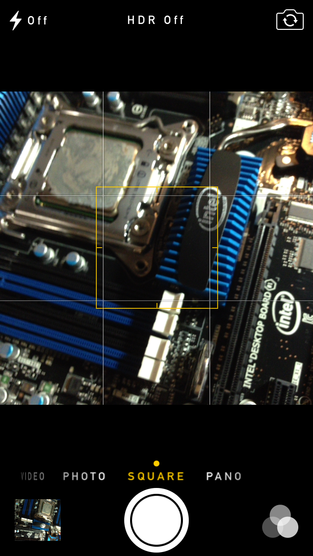
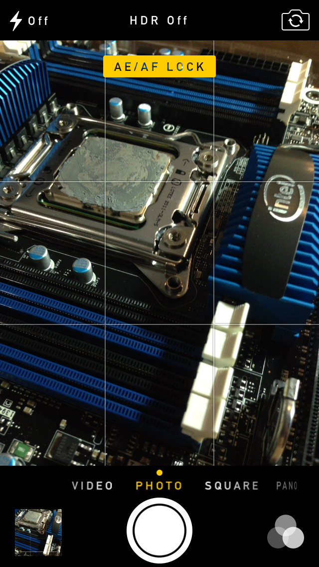
The camera UI still retains AF/AE lock (long press in the preview) and the rule of thirds grid (although this is under settings, outside of camera.app), what’s different is holding the capture button now bust captures on every platform. Previously you could hold the camera button down indefinitely and capture on release, which was great if you wanted to take a selfie with the rear facing camera (just hold it, then release).
Apple has taken the extreme automatic route with its camera UI, you won’t ever see a Nokia 1020-esque UI with optional manual controls for ISO, focus, or exposure time, so getting everything right is very important. I’m really happy that the new UI fixes the aspect ratio cropping issue which was alarming to see shipped on the iPhone 5.
Photos
The Photos application gets an entirely new icon and a number of overhauls inside. In addition to the Albums view there’s a new Photos view which has a few different visualizations and groupings – collections, years, and moments. These group photos together based on time or place in a logical fashion.
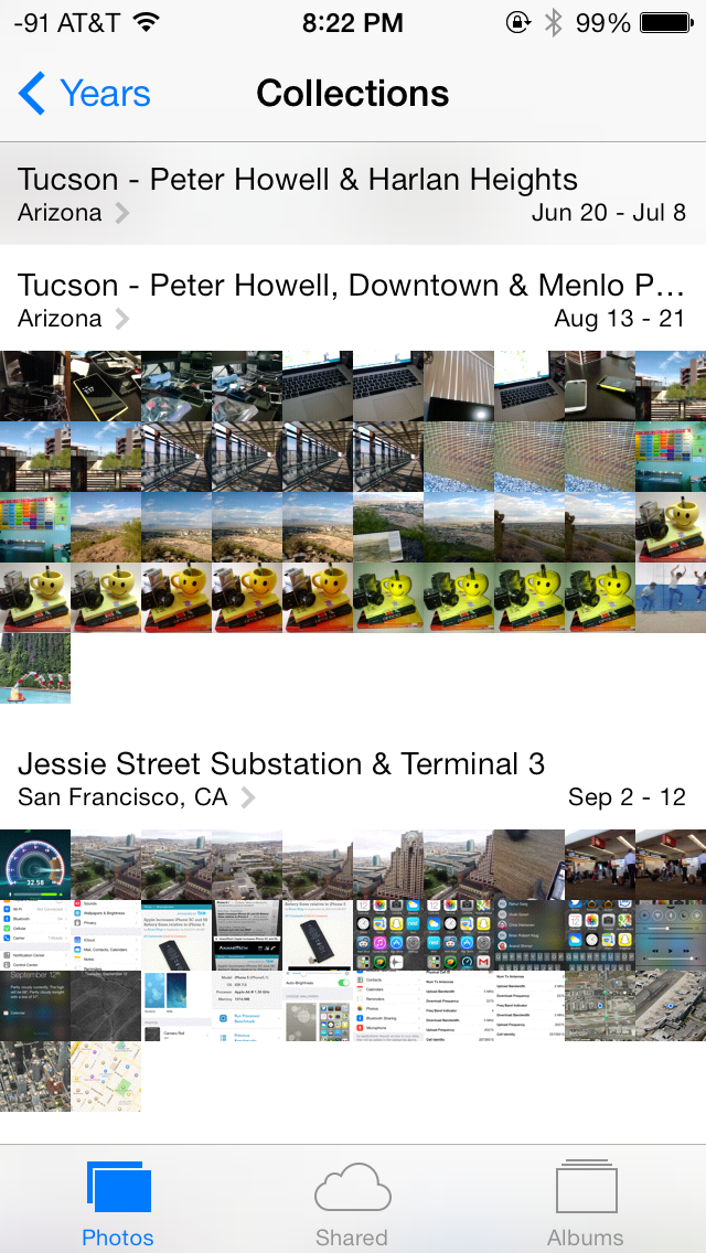

The visualizations show small thumbnails with all the photos automatically grouped together. This is a big step forward from the oldest at top, newest at bottom organization that the albums view provided with fixed size thumbnails that quickly became impossible to navigate after getting a few thousand images in. There are some new multitouch effects in this view too, you can pinch and zoom into images from the moments views and flick them around. The maps view is also still around, which uses the location tags from EXIF.
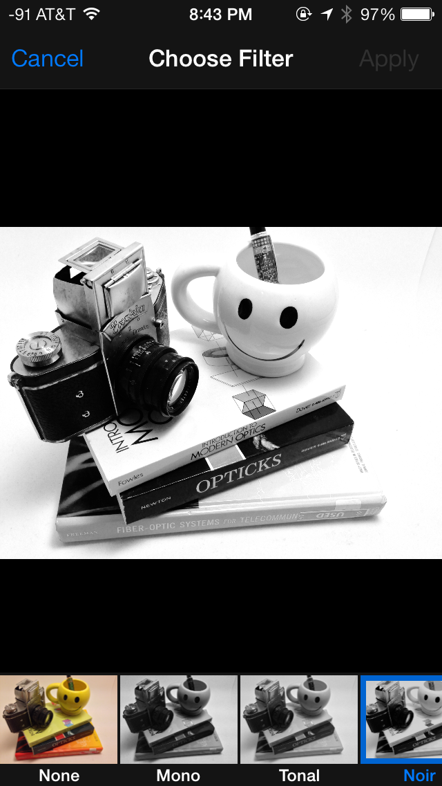
Inside the edit menu there’s also new support added for photo filter effects after the fact. In addition photos taken with the filter toggled don’t actually destructively change the original image, so you can remove these or change them after the fact. I’m not a big filters person but this kind of nondestructive editing is awesome.


144 Comments
View All Comments
Impulses - Sunday, September 22, 2013 - link
I just read the Verge's review and while they don't go anywhere as in depth as Anandtech (really, who does?) it did seem more cohesive at a high level. It drew far less direct comparisons between OS yet you always knew when David seemed to think iOS was ahead or behind the competition in any aspect. I won't say it seemed more objective cause I think this kinda review is inherently subjective, but less enthusiastic about minor cosmetic changes for sure.akdj - Tuesday, October 1, 2013 - link
It's 2013 and you're running a new OS from late 2013 on a almost three year old device. It's bound to run a bit slower and show its 'age'. We've got an iPad 2 and we won't be updating from iOS 6.Krysto - Thursday, September 19, 2013 - link
How can translucency be a "step in the right direction"? I think it belongs more in the past, right there with gradients. Same for the parallax effect, which is just cheese, and has always been cheesy.B3an - Thursday, September 19, 2013 - link
I agree. iOS 7 looks very cheesy. But pretty much everything Apple design looks cheesy as they've always had tons of gradients and tacky effects (atleast they've got rid of drop shadows now), all that stuff came from the early to mid 2000's. As a designer i used to design stuff like it myself, but this was around 7 - 12 years ago and things have moved on. Funny how Microsoft now lead in modern design, who would have thought.star-affinity - Tuesday, September 24, 2013 - link
”But pretty much everything Apple design looks cheesy as they've always had tons of gradients and tacky effects”Don't agree at all. Especially in OS X I don't think there's much ”tackiness”. And the only really thing I found really tacky in iOS 6 was Game Center.
What in Microsoft's designs are better you mean? A few examples?
CBone - Friday, October 4, 2013 - link
OSX looks pretty slick. iOS 7 still looks tacky to me. I still don't like the "every app ever barfed up on the screen so it looks like my mother-in-law's XP desktop ultra busy this-is-just-an-app-drawer" look.Wolfpup - Wednesday, September 25, 2013 - link
That's nonsense. Those ideas were developed for a reason, not arbitrarily. Removing them is fad, fashion, and has nothing to do with functionality, which is diminished.akdj - Thursday, October 3, 2013 - link
'Functionality....diminished?' How so?I'm incredibly blown away by the incessant negativity to iOS 7. It's unreal. It's amazing how just a month ago....thru the past three years Apple's taken constant flack on skeumorphism and 'cheese'. iOS 7, while completely different than 6 is one HELL of a makeover. Perhaps it's because we are using an iPhone 5 and 5s...iPad 4s and minis...but I've lost absolutely NO functionality. The minimalist design UI is a HUGE breath of fresh air and it's apparent to me why so many design 'experts' on this board and many others are crying foul. 'So yesterday'. 'Dated'. Blah blah blah blah blah
What an absolute joke. To decry the new UI, it's incredible fluidity....even on two year old hardware, the simplicity...added functionality (control center, camera, notifications, background updates...there are literally DOZENS of examples of extended functionality....it truly makes me question and wonder who these anonymous design experts are behind the anonymity do their keyboard. Ridiculous.
I guarantee Apple will win not one, two or even six awards for this UI overhaul/design. They'll win a dozen or more. A TRUE design expert would realize this. Is there areas of improvement to be made? Sure! Absolutely....but that's been the same since iOS 1.0 (was that a version? I can't remember even after owning each iPhone). The complaints of 'boring' and analog symbols and UI with the skeumorphic design through iOS 6 was tiring. And ubiquitous. And everywhere...all the time. Now, they change it and it's not what you want. Hilarious. There are plenty of choices on the market if you don't like it. android isn't android. It's TouchWiz, Sense, and dozens of other launchers to set it up the way you like it. If Windows crappy UI is so intriguing, why are you slamming iOS 7? Why aren't you buying a Lumia?
It's tiring. And boring. Especially reading all the bullshit from the so called and most likely unemployed 'design experts'. I don't suppose anyone has explored so many of the other excellent updates, ala error and spelling correction, fast swipe to rid a reminder, excellent new options for sounds, font size and 'thickening' if you find it bothersome....and to call parallax effects cheesy just exemplifies the thin knowledge some posters have when it comes to UI design, simplicity and fluidity. It's easy to put out a crappy, glitchy and slow UI. Look at Samsung and the new S4 (I have one. We develop for both Android and iOS and have just started to learn the ins and outs with Windows mobile). That is a phone with some of the fastest hardware on the market and in comparison with either the '5' or the '5s' it's obliterated when it comes to speed, fluency and doing what it's designed to do...a springboard, launching platform for your apps and software.
Rant over...sorry, just tired of all the bullshit. Pardon my Cantonese
akdj - Thursday, October 3, 2013 - link
I meant to also mention, Apple designing this new UI and as trouble free and fluent as it is...is almost miraculous. It's hard as HELL to create a simple user experience. One that's easy to understand and operate. As mentioned before...TouchWiz is a perfect example of how tough it is even with current hardware to achieve this level of performance.CBone - Friday, October 4, 2013 - link
If all you want to do is ultraslurp Apple UI and react poorly to people giving opinions contrary to yours on it, you probably shouldn't read many opinions. Why is it so hard to accept that people might love the phone but hate the UI?