The iOS 7 Review
by Brian Klug & Saumitra Bhagwat on September 19, 2013 1:25 AM ESTCamera
I touched on the new camera interface in my iPhone 5S camera improvement thoughts piece already, but it’s worth talking about again. Camera UI seems to be something that every OEM is changing quickly, and while there are common elements shared between the various camera UIs out there, there’s really no common design like there is say for threaded messaging or a dialer.
The camera UI gets probably one of the more dramatic overhauls in iOS 7, and fixes a lot of things that were slowly becoming a problem as Apple added camera features to its platforms.
iOS 6
iOS 7
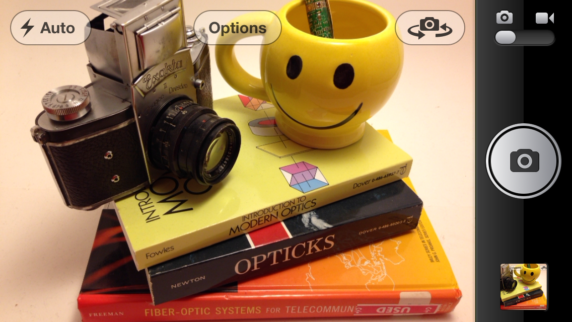
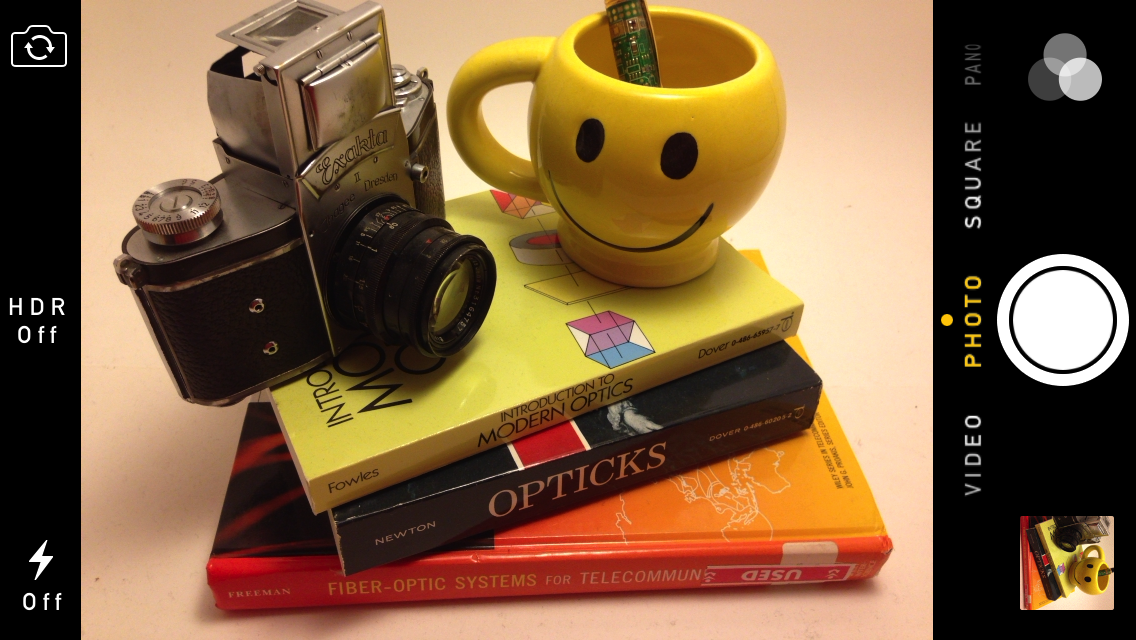
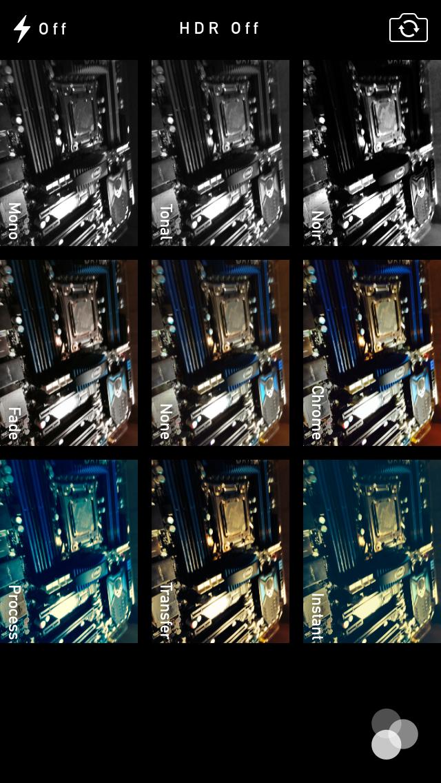
The camera UI has completely different iconography and styling from the old one. Gone is the video toggle, and in its place is a mode ring which switches between slow-mo, videos, photo, square, and panorama. This eliminates some of the feature cruft that was piling up in the “options” button from the old UI. There’s also the filters option which shows a live preview grid of some filters on the image – think photo booth for iOS. My only complaint is that whereas the previous iOS camera UI had more visual cues that made it easy to confirm the camera detected proper portrait or landscape orientation, the iOS 7 camera really doesn’t. Only the thumbnail and flash/HDR/front camera icons rotate. Further, the text ring switcher doesn’t rotate, which adds some mental processing when you’re shooting in landscape (which you should, especially for video).
A major problem with the iPhone 5 and iOS 6 camera UI was the aspect ratio mismatch between the camera sensor and display, and the way Apple chose to deal with it. This has become a problem for other OEMs as well since then. The live preview previously was fit to the long axis of the display, chopping the top and bottom of the actual image area off. This hilariously results in a preview that doesn’t actually show what the output image is going to look like, and composition matters when taking photos.
The good news is that in iOS 7 Apple has changed it so the image preview is now aspect-correct without cropping of the image preview. The bad news is that it took a whole iOS release cycle to fix that problem, which is curious considering that problem existed for video already (video is 16:9) on previous iPhones without 16:9 displays and Apple just implemented a double tap to show the full field of view.
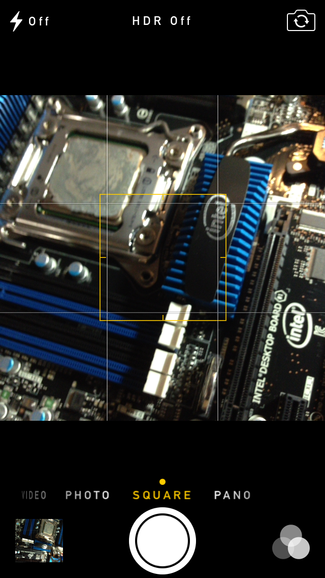
On the iPad the camera UI changes slightly, there’s no ring switcher but just a strip with text for the ring switcher and all the controls.

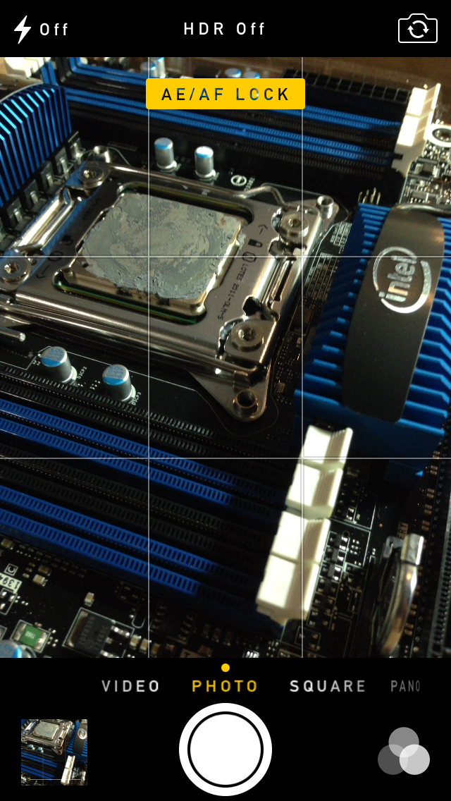
The camera UI still retains AF/AE lock (long press in the preview) and the rule of thirds grid (although this is under settings, outside of camera.app), what’s different is holding the capture button now bust captures on every platform. Previously you could hold the camera button down indefinitely and capture on release, which was great if you wanted to take a selfie with the rear facing camera (just hold it, then release).
Apple has taken the extreme automatic route with its camera UI, you won’t ever see a Nokia 1020-esque UI with optional manual controls for ISO, focus, or exposure time, so getting everything right is very important. I’m really happy that the new UI fixes the aspect ratio cropping issue which was alarming to see shipped on the iPhone 5.
Photos
The Photos application gets an entirely new icon and a number of overhauls inside. In addition to the Albums view there’s a new Photos view which has a few different visualizations and groupings – collections, years, and moments. These group photos together based on time or place in a logical fashion.
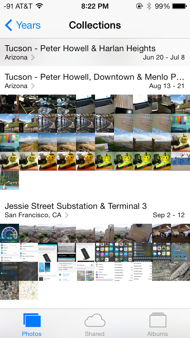

The visualizations show small thumbnails with all the photos automatically grouped together. This is a big step forward from the oldest at top, newest at bottom organization that the albums view provided with fixed size thumbnails that quickly became impossible to navigate after getting a few thousand images in. There are some new multitouch effects in this view too, you can pinch and zoom into images from the moments views and flick them around. The maps view is also still around, which uses the location tags from EXIF.
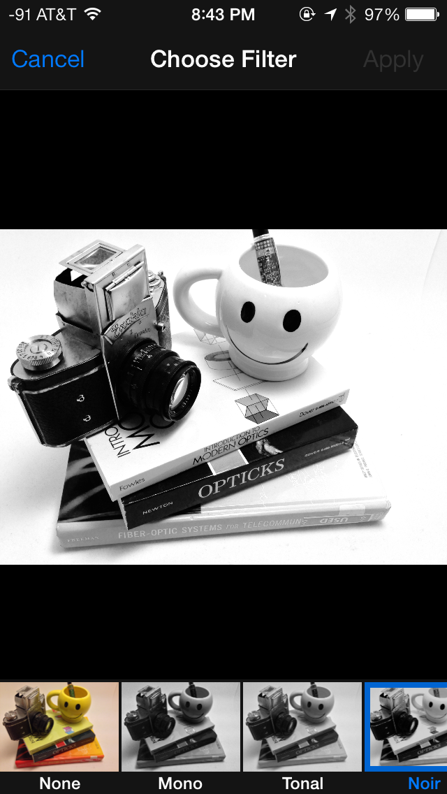
Inside the edit menu there’s also new support added for photo filter effects after the fact. In addition photos taken with the filter toggled don’t actually destructively change the original image, so you can remove these or change them after the fact. I’m not a big filters person but this kind of nondestructive editing is awesome.


144 Comments
View All Comments
Guspaz - Thursday, September 19, 2013 - link
Agreed. Some of the animations are fine, others are way too slow. It generally needs tweaking.You can get away with some animation, because there's a certain human reaction time involved, but you've got to fit your animations inside of that time, so that you're not delaying the human. iOS7 fails in that regard in a bunch of places, but it's not hard to fix. I bet iOS 7.1 will make a bunch of tweaks in that regard.
mchart - Thursday, September 19, 2013 - link
Still no live tiles or gadgets to feed you information.So you still need to go into an app for everything. Photo gallery, running tasks, flashlight, weather, alarm, reminders/calendar, shortcuts like shazam, navigate home, quick dials, and so on...
And the multitasking hasn't improved at all. They could at least do what Blackberry did and copy WebOS' card-style tasks interface...
This is the same damn OS all over again with a new font. It's getting ridiculous. No wonder their stock got downgraded by four agencies. Apple makes this ridiculously awesome hardware running an OS from 2007.
Flashlight, weather, alarm, reminders/calendar and quick dials to missed notifications are available from the notification or quick settings pop up.
Navigate home? That's what the 'Home' button (One of two buttons on the phone) is for.
Running tasks? This is iOS. Needing to see a full blown task manager isn't needed. Suspended/running in the background tasks show up by double clicking the home button though.
Yes, to view photos you must go into the photo app, or access it from the Camera app. I'm not sure how an additional widget would help here. It would still be the same number of clicks/user gestures away.
A lot of your critique makes it appear as though you have limited time with iOS, if any. Most of what you want is already there or irrelevant to how workflow occurs in the GUI.
KoolAidMan1 - Thursday, September 19, 2013 - link
You were obviously trying to respond to Samus' post, but your response is still mostly correct. Aside from things like giving weather data via the weather icon (it is asinine that Clock is the only "live" icon), Samus' criticisms don't stand. Its a lot of nitpicking over nothing of any importance.jamawass - Friday, September 20, 2013 - link
Regards multitasking can you play streaming audio from Safari and switch to another task without it stopping? Or play a video stream in the background now?Tyler_Durden_83 - Thursday, September 19, 2013 - link
Not a single mention of this kills your credibility: https://dl.dropboxusercontent.com/u/66751019/12355...beysl - Thursday, September 19, 2013 - link
Yawn, boring!Android "copies" stuff from iOS, iOS "copies" stuff from Android. And windoes Phone was "flat" before iOS. And Nokia and others had "not so stupid" phones before the iPhone. Old story, noone cares.
I know, Jobs once said good artist copy, great artist steal and later wanted to start a NUCULAR war against Android. Get over it. Good troll anyway.
This is how it works and will work in the future. And the best thing is, that it is good for the consumer!
Tyler_Durden_83 - Thursday, September 19, 2013 - link
Except that Apple cares, and had the guts to sue Samsung for a "rectangular shaped phone with a big glass touch screen in most of the front part" instead of trying to regain the market share that Samsung was gaining by actually releasing better products than the competition.rgmonkey - Thursday, September 19, 2013 - link
Quit trolling. The screenshot you posted is a horrible comparison. It's like comparing a Volkswagen to a Porsche. They both have wheels and a motor. Oh look, they both have headlights and a windshield wiper. Design is subjective. Everything has been done before. It's whoever delivers the best user experience. The consumer wins as they get to select which platform works best for them. If you are going to critique, then don't oversimplify the issue like most so-called news sites. Talk about actual proof points and have a meaningful debate.Tyler_Durden_83 - Thursday, September 19, 2013 - link
Except that comparing two cars and saying that they are similar cause they both have wheels is retarded, as it would be saying that two phones are similar cause they both are rectangularly shaped (something on which Apple based a lawsuit, nevertheless).This is kinda different than saying they both have windshields or a battery: http://cdn.cultofandroid.com/wp-content/uploads/20...
rgmonkey - Thursday, September 19, 2013 - link
Wow. That is your response? So what specifically about this article that bothers you so much?