The iOS 7 Review
by Brian Klug & Saumitra Bhagwat on September 19, 2013 1:25 AM ESTCamera
I touched on the new camera interface in my iPhone 5S camera improvement thoughts piece already, but it’s worth talking about again. Camera UI seems to be something that every OEM is changing quickly, and while there are common elements shared between the various camera UIs out there, there’s really no common design like there is say for threaded messaging or a dialer.
The camera UI gets probably one of the more dramatic overhauls in iOS 7, and fixes a lot of things that were slowly becoming a problem as Apple added camera features to its platforms.
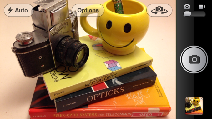
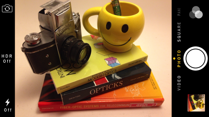
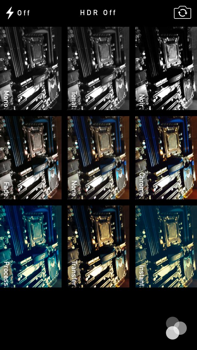
The camera UI has completely different iconography and styling from the old one. Gone is the video toggle, and in its place is a mode ring which switches between slow-mo, videos, photo, square, and panorama. This eliminates some of the feature cruft that was piling up in the “options” button from the old UI. There’s also the filters option which shows a live preview grid of some filters on the image – think photo booth for iOS. My only complaint is that whereas the previous iOS camera UI had more visual cues that made it easy to confirm the camera detected proper portrait or landscape orientation, the iOS 7 camera really doesn’t. Only the thumbnail and flash/HDR/front camera icons rotate. Further, the text ring switcher doesn’t rotate, which adds some mental processing when you’re shooting in landscape (which you should, especially for video).
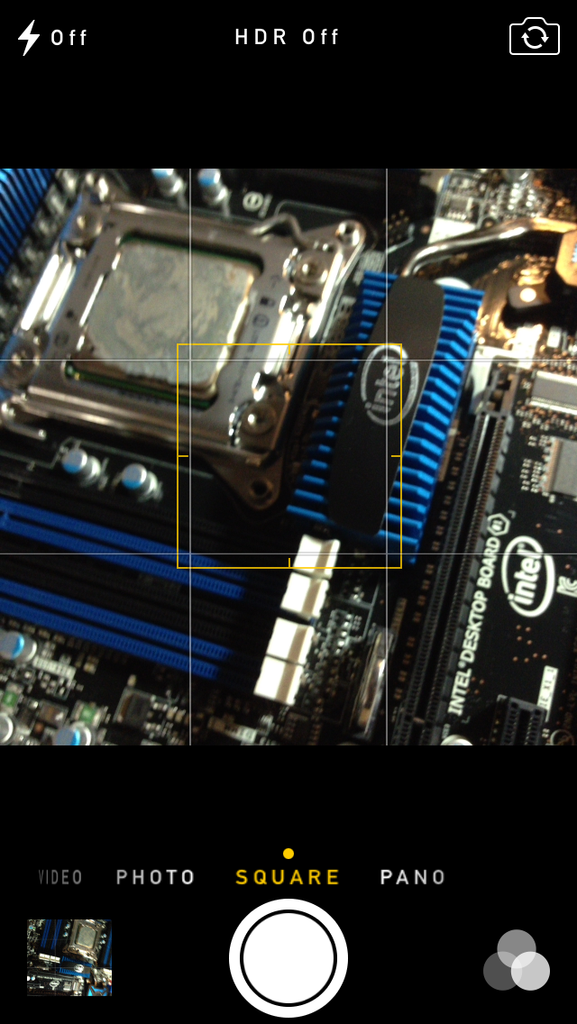
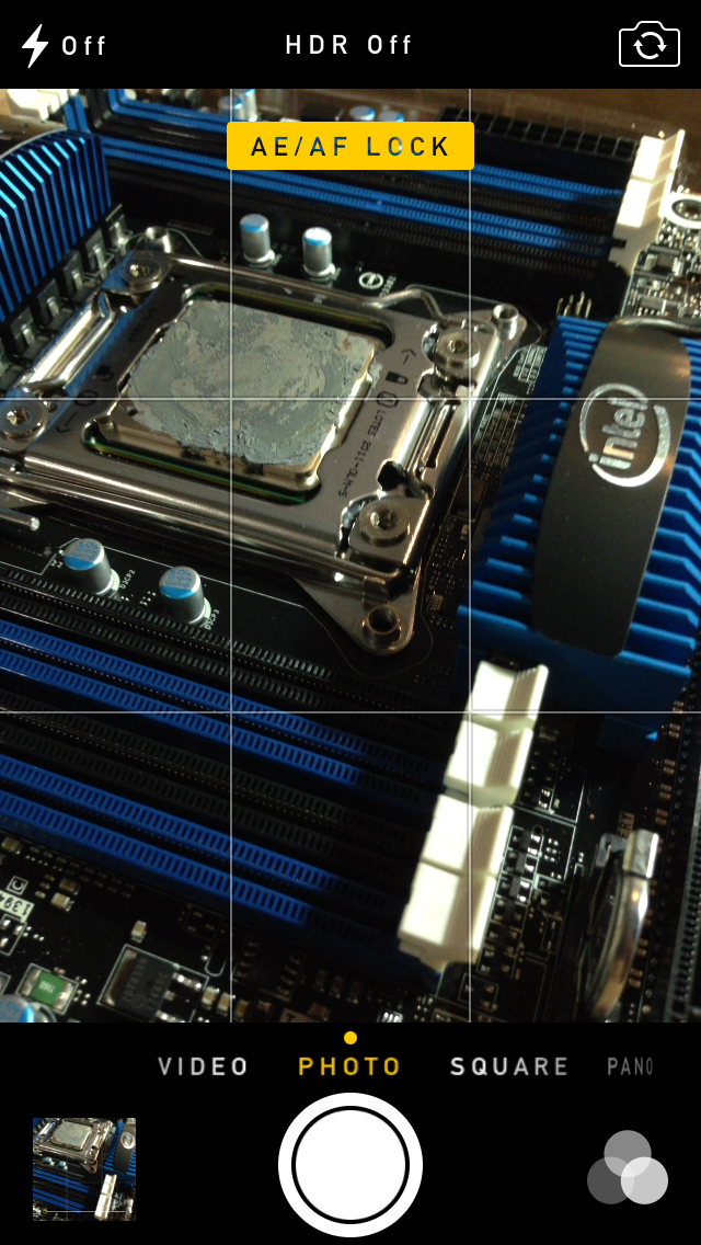
A major problem with the iPhone 5 and iOS 6 camera UI was the aspect ratio mismatch between the camera sensor and display, and the way Apple chose to deal with it. This has become a problem for other OEMs as well since then. The live preview previously was fit to the long axis of the display, chopping the top and bottom of the actual image area off. This hilariously results in a preview that doesn’t actually show what the output image is going to look like, and composition matters when taking photos.
The good news is that in iOS 7 Apple has changed it so the image preview is now aspect-correct without cropping of the image preview. The bad news is that it took a whole iOS release cycle to fix that problem, which is curious considering that problem existed for video already (video is 16:9) on previous iPhones without 16:9 displays and Apple just implemented a double tap to show the full field of view.
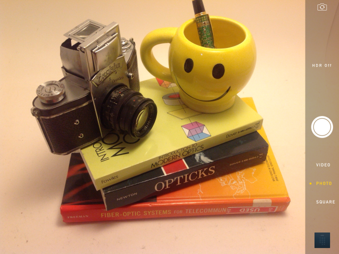
On the iPad the camera UI changes slightly, there’s no ring switcher but just a strip with text for the ring switcher and all the controls.
The camera UI still retains AF/AE lock (long press in the preview) and the rule of thirds grid (although this is under settings, outside of camera.app), what’s different is holding the capture button now bust captures on every platform. Previously you could hold the camera button down indefinitely and capture on release, which was great if you wanted to take a selfie with the rear facing camera (just hold it, then release).
Apple has taken the extreme automatic route with its camera UI, you won’t ever see a Nokia 1020-esque UI with optional manual controls for ISO, focus, or exposure time, so getting everything right is very important. I’m really happy that the new UI fixes the aspect ratio cropping issue which was alarming to see shipped on the iPhone 5.
Photos
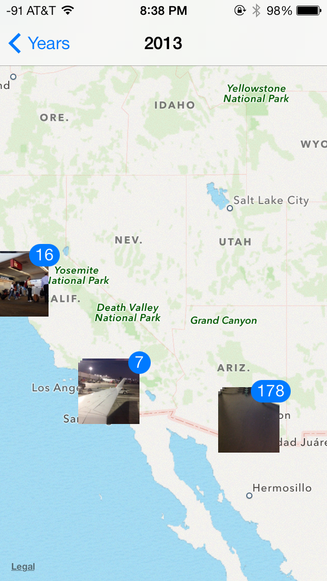
The Photos application gets an entirely new icon and a number of overhauls inside. In addition to the Albums view there’s a new Photos view which has a few different visualizations and groupings – collections, years, and moments. These group photos together based on time or place in a logical fashion.
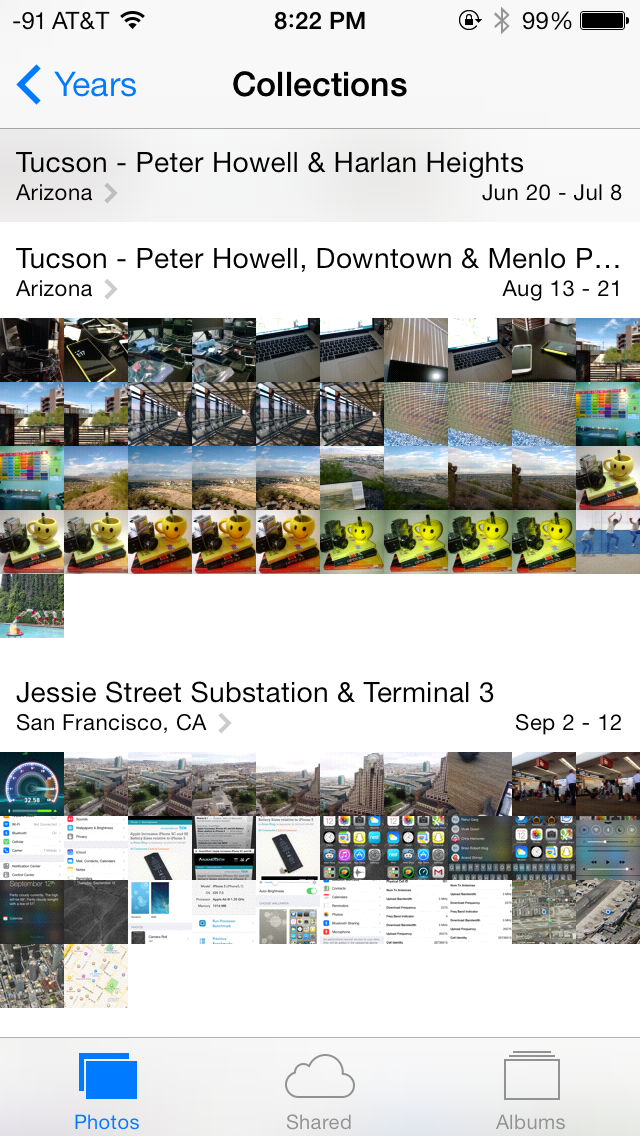
The visualizations show small thumbnails with all the photos automatically grouped together. This is a big step forward from the oldest at top, newest at bottom organization that the albums view provided with fixed size thumbnails that quickly became impossible to navigate after getting a few thousand images in. There are some new multitouch effects in this view too, you can pinch and zoom into images from the moments views and flick them around. The maps view is also still around, which uses the location tags from EXIF.
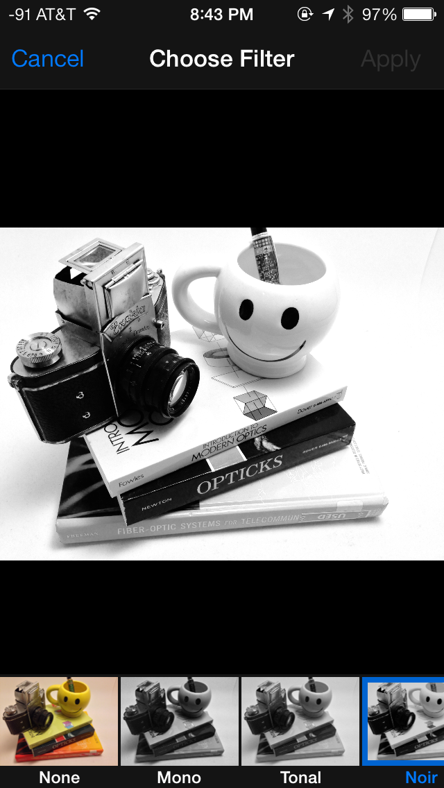
Inside the edit menu there’s also new support added for photo filter effects after the fact. In addition photos taken with the filter toggled don’t actually destructively change the original image, so you can remove these or change them after the fact. I’m not a big filters person but this kind of nondestructive editing is awesome.




144 Comments
View All Comments
Hinotori - Thursday, September 19, 2013 - link
How does iOS7 fare with iPad 2 and iPad Mini? One friend told me that he was under impression that his iPad 2 is faster with iOS7 than iOS6, but then I read here that iPad 3 is having a hard time running it...tipoo - Thursday, September 19, 2013 - link
I have a Mini, same SoC as the 2. It feels slower. The UI FPS clearly drops below 30FPS very often, and there's a general feeling of it having to think a bit longer about everything.tipoo - Thursday, September 19, 2013 - link
It seems a bit pudgy on my nearly new Mini, and presumably anything else with A5. UI clearly drops below 30FPS with the default paralex on.justaviking - Thursday, September 19, 2013 - link
Not a fan of "FLAT" UI themes.Call me old-fashioned, but I do NOT like the "flat" look that seems to be all the rage lately, whether on Windows8 or on a smart phone.
As Brian alluded to, widgets that give a "raised" appearance actually look like something you can push or slide. In Windows, for example, I mourn the change in something as simple as the vertical scroll bar in my browser. Gone are the "grips" I used to see. Now the scrolling handle and the vertical slot it slides in are visually the same. Ugh.
With no frames or borders, you don't know if it's a decoration within a window, or if it's a separate window.
It's a regression, in my mind.
At least on a smart phone, with limited screen real estate, I can understand saving some space by not having drop shadows and stuff. But I'd be happier if things I'm supposed to push actually look like things I'm supposed to push.
I'm also not sure about the translucency. I'm looking at the picture of the keyboard in this article. This is better? Why do I want a translucent keyboard? It's probably not horrible, but I'm not sure I see that as a value-added improvement.
In the interest of full disclosure, I tend to roll my eyes at all the holographic or transparent computer displays in the movies too (like "Minority Report" or "Iron Man"). Wouldn't it be a bit distracting and confusing to have text and images floating in front of a distracting background that consists of windows (made of glass, in the wall of the building), people walking, and other people's displays? Looks cool, but try using the window in your office instead of a white board for a while, and let me know how you like it.
Lastly, I'll echo another poster's comments about animations. AGREE, I do not need icons and things to "fly in" and entertain or dazzle me. Just do what you're supposed to do, without the fanfare please. It's only cool once, and after that you're just wasting my time.
Impulses - Thursday, September 19, 2013 - link
I think they typically use animations to mask load times and other waits, though many seem unnecessary on the new hardware and they're actually having the opposite effect on older hardware. Jobs definitely wouldn't be happy... :sDaniel Egger - Friday, September 20, 2013 - link
> Not a fan of "FLAT" UI themes.> Call me old-fashioned, but I do NOT like the "flat" look that seems to be all the rage lately, whether on Windows8 or on a smart phone.
Actually I really do like Metro UI but only because it is *completely* flat and has been so from the start; no crazy trying to make everything flat and then giving it back some depth by adding layers and parallax effects as Apple now does. Or said short: I think Metro is an improvement compared to class Windows and a fresh new start for WP but for iOS I totally agree that it's a step back because they already had a very good UI concept.
beepboy - Thursday, September 19, 2013 - link
It seems like Apple is copying but in reality SBSettings and Cydia has been out since the first days of iOS - and these settings have been available, just not through the approved channels.prophet001 - Thursday, September 19, 2013 - link
There's definitely some Kool-aid drinking going on here. You mention:"The core of the interface hadn’t really changed in either visual appearance or function. With iOS 7, those pundits get their wishes granted, as almost every part of the OS gets some kind of change."
However, if you had not told me which screenshot was iOS 7 and which was 5 in the second picture on the first page I would not have known.
solipsism - Thursday, September 19, 2013 - link
How does your inability to tell two things apart mean that 1) nothing has changed, and 2) Brian and & Saumitra are "drinking Kool-aid"? As noted in the very sentence you quote the /core/ of the OS design hasn't changed but almost every aspect of it does get updated.Was Apple suppose to no longer have icons that open up apps? Was Apple suppose to not allow personal background images or let 3rd-party developers choose their own icon images so you would be able to tell the new and old OSes apart more easily?
Guspaz - Thursday, September 19, 2013 - link
You're misreading Brian's statement. "The core of the interface hadn’t really changed in either visual appearance or function." refers to iPhone OS 1.0 through iOS 6, the statement isn't referring to iOS 7.