Catalyst 9.7 Graphics Drivers: New UI and Win 7 Updates
by Derek Wilson on July 23, 2009 1:30 PM EST- Posted in
- GPUs
Last night, AMD made public it's Catalyst 9.7 drivers. These drivers coincide with Windows 7 RTM availability and are WHQL certified for not only windows Vista, but for Windows 7 as well. But this isn't the only new and interesting tidbit about the Catalyst 9.7 release. AMD has reworked the advanced driver interface as well.
We are working on performance testing the new driver with an eye towards Windows 7. AMD claims that performance on Windows 7 boxes with the same hardware as a Vista counterpart will see performance benefits. The marketing slides we received indicate that some games could see about a 10% improvement when moving to the new OS, and that's just for single GPU configurations. With multiGPU setups, AMD has us expecting some titles to show between 15% and 30% improvement with Windows 7.
We are anxious to put the driver to the test as soon as we can get our hands on the final Windows 7 RTM build. A performance improvement in moving from Vista to Windows 7 could definitely help Microsoft move their latest operating system. Those gamers who are still holding out for something better than Windows XP might finally have a reason to let go of the older platform for one that delivers an all around better experience.
But in the meantime, there is another important change AMD made with the Catalyst 9.7 driver release. The UI has been overhauled. Let's have a look at the old version first:
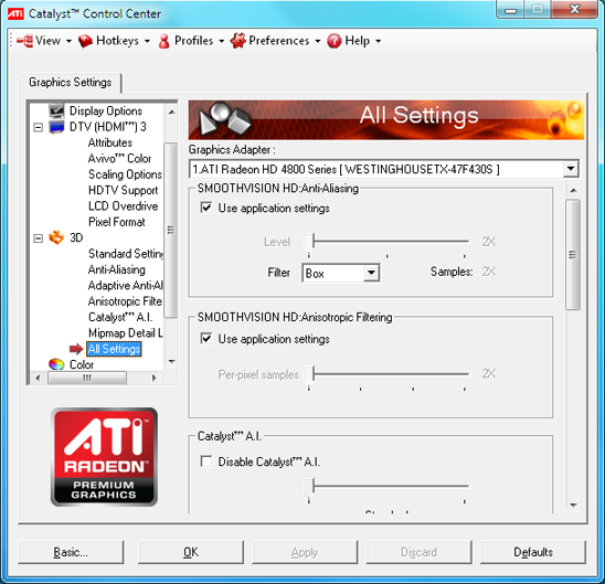
Say goodbye to the Catalyst 9.6 interface pictured above.
The first change we notice is that the left menu tree structure is now gone. It is hidden in the Graphics menu option at the top left of the window.
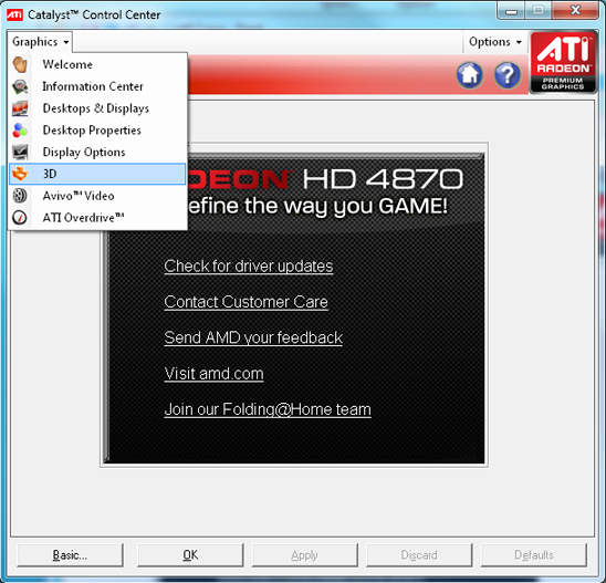
For the most part, individual subsections are unchanged. But the new Desktops & Displays page pulls a bunch of related options into one place. All the desktop resolution and color settings, monitor specific settings, and multi-monitor layout adjustments for all desktops and monitors are combined in one place.
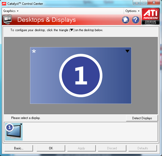
To access all the aforementioned settings, users will need to click on the appropriate upside down triangle for either the desktop or the display they wish to adjust. Unfortunately, despite the fact that organization is arguably improved, it seems to take more clicks to get where we want to go. It is no longer possible just to click directly to the desired page in an expanded tree menu. Now we have to click on the Graphics menu, select our major section, and then click on the tab that corresponds with the subsection we could have jumped straight to.
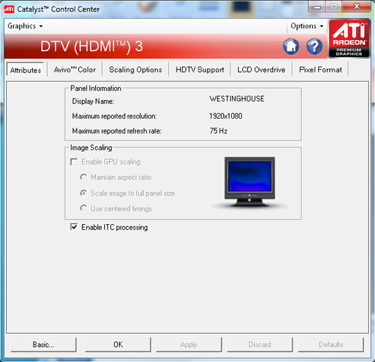
This appears when we click the triangle on the monitor and select "settings."
The Desktops & Displays section is easier to use with multiple monitors, but if you've only got one display then it is still an extra click or even two to adjust the settings for that display.
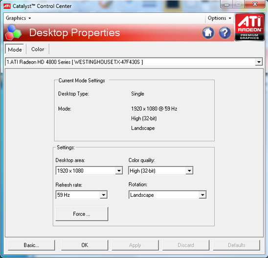
And here is what we get if we click the triangle for a desktop and select "properties."
The page we use most, the "All Settings" section of the 3D menu, used to be accessible in one click when the 3D menu was expanded. Thankfully, AMD kept one very useful feature intact: the first page that opens up is the last page that was visited. This means that we can go to the page we use most once and expect it to pop up every time we run the Catalyst Control Center. Most of the time we still have zero clicks to get where we are going.
Everything functions the same as it used to, provided you can find it now that things have changed. We do tend to complain most of the time when driver interfaces change. In fact, I'm still pining for the days of NVIDIA's 40 series Detonator interface. But we understand the value of most of the changes that AMD and NVIDIA have made over the years. Organizational changes to driver interfaces are designed to help direct users who don't already know exactly what they need.
Making adjustment of graphics driver settings easier for novice users is still a stated goal, but we feel the changes AMD has made in hiding whole sets of options behind upside down triangles on graphically represented desktops and displays is not going to make it any easier on end users. If anything, in our eyes, it complicates things even more.
We would really love the option to fully customize the UI and opt to have either the tree interface or this new version. But we've asked for such things before and are typically disappointed.


28 Comments
View All Comments
Kaleid - Friday, July 31, 2009 - link
" Unfortunately, despite the fact that organization is arguably improved, it seems to take more clicks to get where we want to go"Well..then its not an improvement. Less clicking and a larger window please so there is less of a need to even scroll.
Hopefully image scaling will be fixed soon on Win7 x64 (don't know about 32bit) and don't hide the functions so well.
monkeyman1140 - Monday, July 27, 2009 - link
Thats an interesting point of view for commenters here.karhill - Saturday, July 25, 2009 - link
The catalyst 9.7 driver version crashed on install on my Vista SP2 system (with a newly installed 4830 card). Turned out to be a problem with Visual Studio 2005 runtime redistributible. Had to install Microsoft hotfix KB961894 to get it to work.royalcrown - Saturday, July 25, 2009 - link
Derek, I am surprised at the lack of facts in this "review". Just received my brand new XFX 4890 on wed and got it running on thursday under a clean install of Vista 64 SP2.The game H.A.W.X. constantly crases (included in box btw), locks up my system, Older games like Company of heroes, crashes, glitches or locks up. ATI overdrive (auto) won't finish properly.
Rolled back to the catalyst 9.6 package and stuff works fine.
Now before you say it's my ps or ram, Mushkin replaced 1 bad stick that made my EP45-ud3r act up. PS is a Corsair 650TX, stock settings on my e8500 rig, no OC on it or the card. These included drivers with 9.7 are SH!7, and how did you manage to miss that ?!?!
mmntech - Friday, July 24, 2009 - link
Is it just me or does the new Catalyst Control Centre in 9.7 have fewer options than it did in 9.6. It's also harder to navigate than previously. What was wrong with having the quick nav bar at the side? Now I have to scroll through menus?Trailmixxx - Friday, July 24, 2009 - link
Dell XPS Studio 1640, feels noticeably cooler, with the powerplay option set to performance. I dont have numbers, It's only what I feel with my hands.zhilik - Friday, July 24, 2009 - link
A stupid change.Now you need to do EVEN MORE clicks to get somewhere.
Pointless.
ATI need to drop the uberugly stardock skinned controls and use the windows default controls. It's amazing how ugly the CCC looks in XP and Vista with the "old 9x" butttons at the bottom. Or at least they should give the option of using the default system controls.
SiliconDoc - Thursday, July 30, 2009 - link
Par for the course for ATI, and par for the mindset that drives the programmers or whomever is making those kinds of decisions on more than just ATI software (Windows comes to mind - with their " buried deep within" "intuitive and conveneince improvements" - which are of course EXACTLY THE OPPOSITE.)I suspect ATI hired a gaggle of ex-mfst geeks.
Stas - Friday, July 24, 2009 - link
Wait, people use CCC? O.O damn, feel sorry for you guys. ATI Tray Tools FTW!jonup - Thursday, July 23, 2009 - link
Do you plan reviewing the new nVidia driveres. Judging by the version number change 186.x to 190.x there needs to be a significant change. I read the resease notes but nothing caught my eye. I just put it on one of my desktops this morning but I haven't had time to mess around with it. I would appreciate it if you save me the time and tell us what good it is.