Google Nexus 4 Review - Google's new Flagship
by Brian Klug on November 13, 2012 8:45 AM EST- Posted in
- Smartphones
- LG
- Android
- Mobile
- APQ8064
- Nexus 4
- Android 4.2
- MDM9215
Part of each Nexus release is the simultaneous unveiling of the latest and greatest version of Android. Google picks an SoC vendor, an OEM, and tailors the next version of Android to that combination of things. This time around the revision isn’t quite as huge as previous jumps, it’s still Android Jelly Bean, but gets a bump from 4.1 to 4.2 — Google calls it a new flavor of Jelly Bean, which is pretty apropos since it’s largely the same thing but with some notable improvements and new features.
Notifications - More expandable
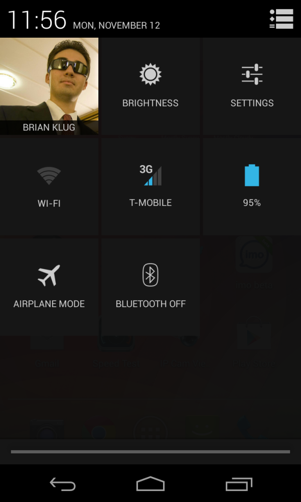
Probably the single most relevant new feature for me are the improvements which have been made with the notifications shade and notifications themselves. First, Android 4.2 now integrates a quick settings page in the notifications shade. To the right of the dismiss all button is a new one which gives access to this settings quick access view — tap it and the whole thing flips over revealing toggles for brightness, WiFi, bluetooth, and other shortcuts into the appropriate settings pages.
I like how Android 4.2 has struck the right balance here and not taken up vertical space on the notifications shade with toggles, which is how all the other OEM-custom implementations integrate settings toggles. It’s hidden behind an additional tap, but still gets the job done and includes pretty much everything I find myself wanting to access frequently.
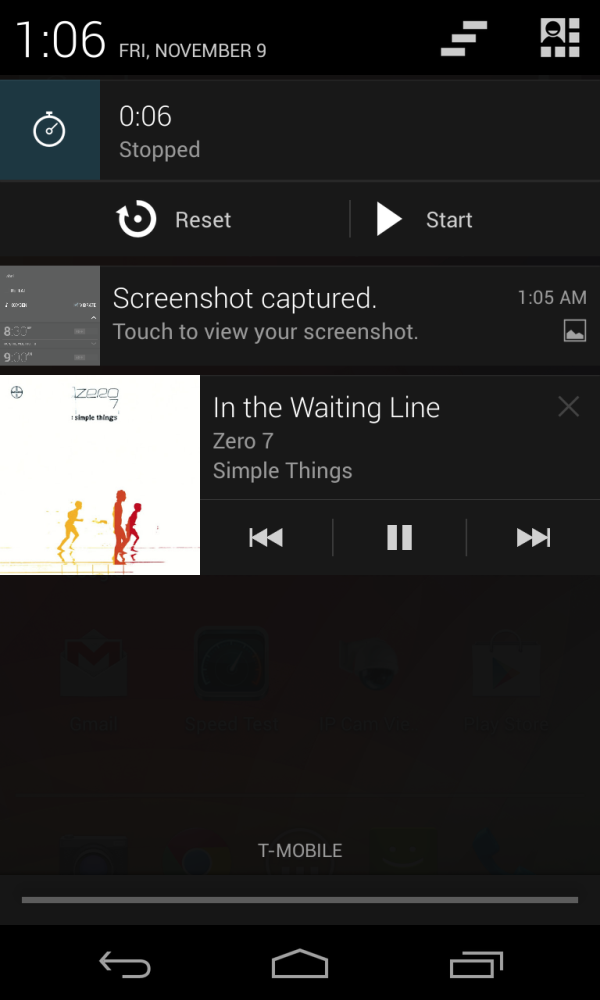
In Android 4.1 Google introduced notifications that could be expanded and reveal more information, in Android 4.2 this is further improved upon with more first party notifications that can be expanded. The pinch to zoom gesture shrinks or expands these items in the list. You have to experiment around to find whether a particular notification can be expanded, but mostly this exposes some toggles or other options. For example Google Play Music exposes more playback controls, and the new Android 4.2 clock will give you controls if you’re using stopwatch.
I think Android has notifications executed better than the rest of the competition, and including these settings access shortcuts is an extremely functional bonus.
Daydream - Screensavers
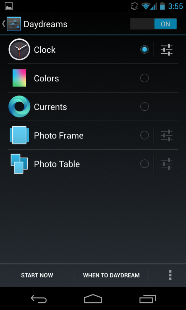
A curious new feature is the inclusion of Daydream, which is essentially a set of screensavers for Android. This is also what has become of the docked mode as far as I can tell, as you can toggle Daydream to come on when the device is docked or charging or both.
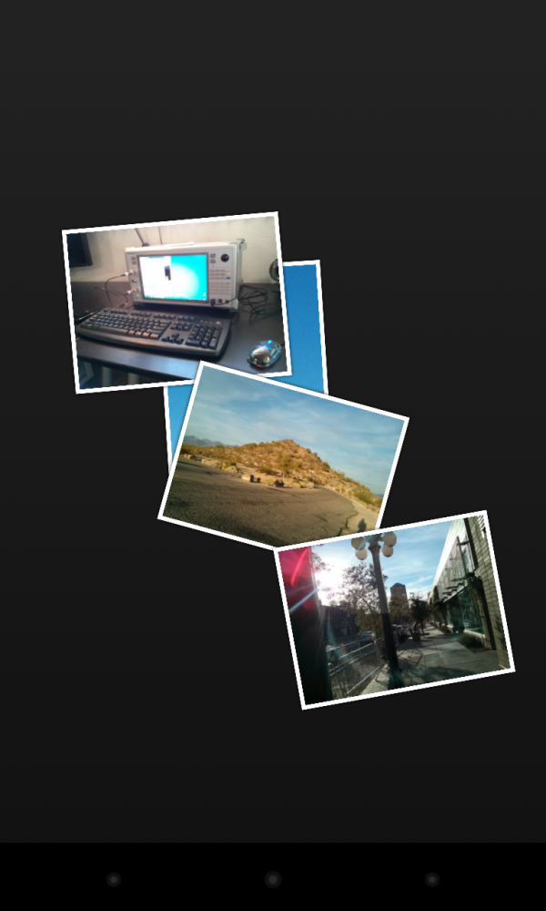
I can see this maybe being useful with the Nexus 10 on its gorgeous display, but on the Nexus 4 it isn’t immediately obvious why you’d want this. In fact having the photo table daydream going will slow down charging on that device somewhat dramatically if you’re not careful. The photo table daydream reminds me a lot of one of the Playstation 3 slideshow views.
Improved Google Now
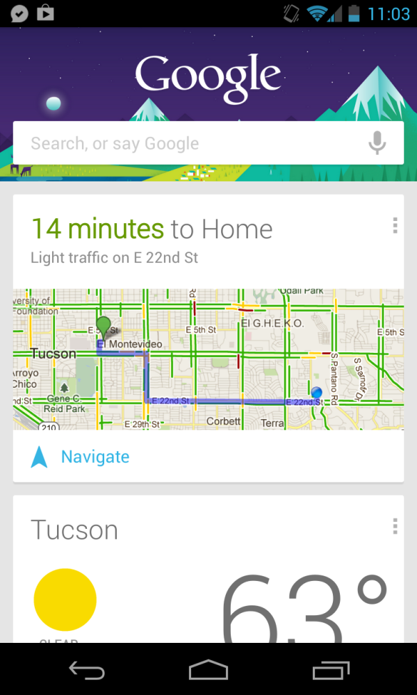
Google Now gets some improvements in Android 4.2, which is part text to speech with Google search for Android and part prescient Google assistant. If you’re familiar with what Siri does, Google Now is a rough equivalent that arguably does better when it comes to voice recognition and nailing queries. Google Now silently parses everything from Chrome to Gmail and pops up cards with relevant information pertaining to what it thinks you’re going to be doing in the future or is relevant to your interests.
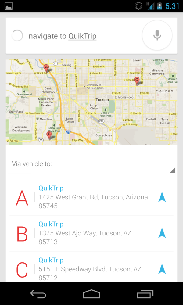
Depending on how much you live in Google’s domain, the information that pops up in Google Now tiles (and as notifications) can go from uncannily useful to downright prescient. For example, Google Now will tell you the time it will take from your current location to drive to your home, when weather events are going on that are noteworthy. Examples of more interesting things include reminders to go to the airport if it parses a flight confirmation email in your inbox, or information about points of interest near you or from your previous search queries. Vivek mentioned a number of scenarios on the podcast where Google Now has brought down relevant cards based on information from Gmail and Google Chrome. Again, how useful this ends up being is a function of how much you live in Google’s domain.
I’m continually impressed with Google Now’s voice recognition accuracy, at a high level as an ASR (Automatic Speech Recognition) engine, it’s shockingly good. As a tie-in with the corpus of data Google already has through “Knowledge Graph” (semantic web) and through things like Maps, it’s second to none. Nailing this kind of data problem is really Google’s core competency, and voice search in previous version of Android pre–4.1 was already shockingly good, so Google Now being as polished as it is isn’t a surprise.
Gesture Typing
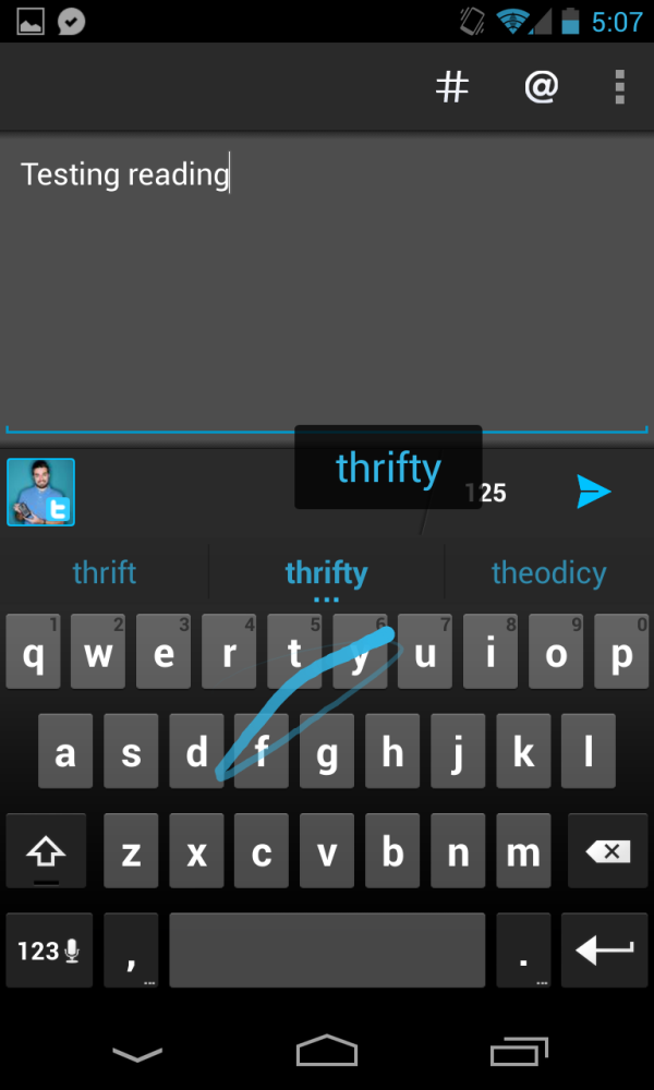
Google has been making steady improvements to its stock keyboard since the earliest Android days, and while recently I’ve switched to using Swiftkey almost exclusively, the improvements with Gesture Type are pretty compelling. Gesture Type in Android 4.2 is essentially Google’s implementation of the very popular Swype keyboard. The concept is simple — slide your fingers over the keys used to spell the word you’re typing instead of lifting and tapping. Above the swyped trace is the word the keyboard is guessing you mean, and releasing selects it.
At the same time you can still tap type normally like prior keyboards. I have no complaints with Gesture Typing in Android 4.2, it is compellingly smooth and Google seems to have expanded the stock dictionary for US English with additional words requisite for prediction to work well. The previews above the gesture work well, and the trail behind characters is smooth and useful. I’ve found myself using Gesture Type a surprising amount on the Nexus 4, and on Nexus 10. I still wish that there was a better stock keyboard option for 10-inch tablets, similar to the split thumb keyboard that iOS has now.
Wi-Fi Display - Miracast
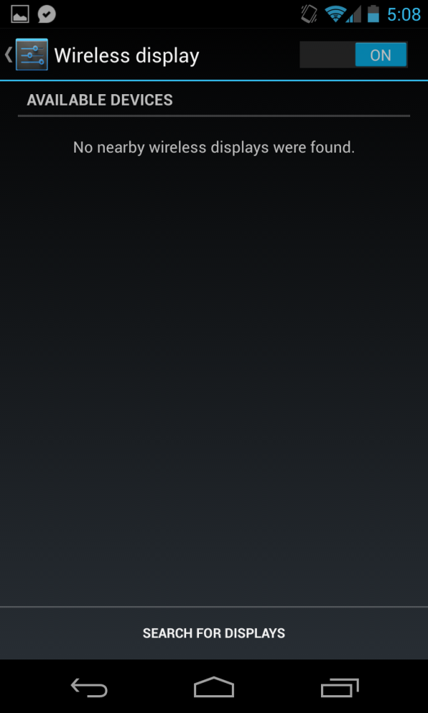
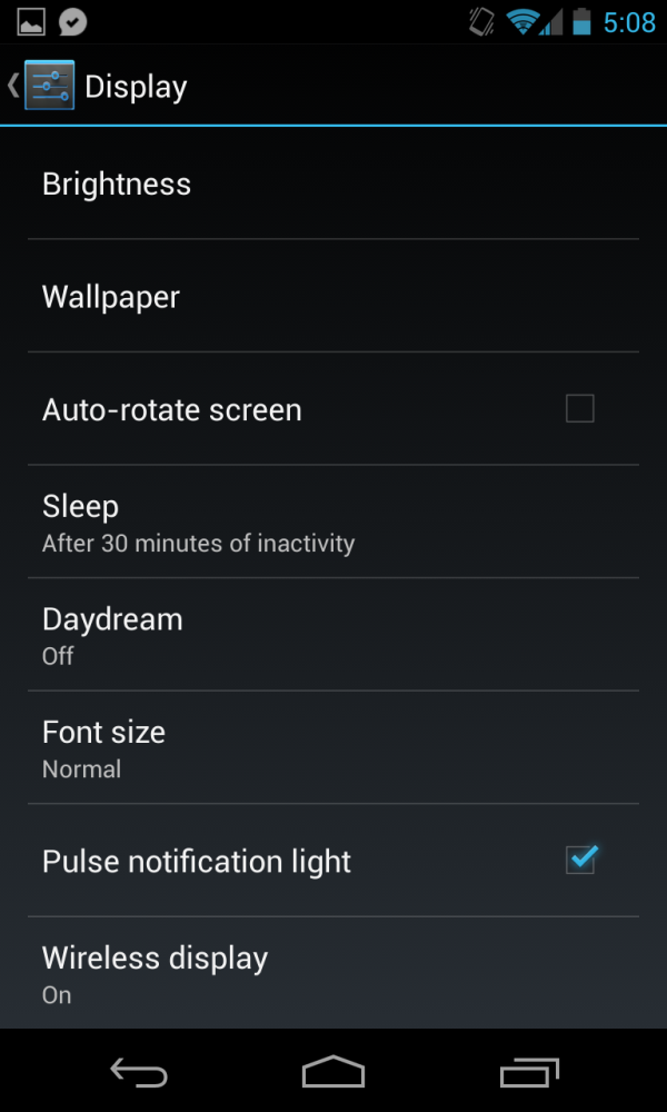
Miracast is essentially the open alternative to Apple AirPlay, and is a Wi-Fi Alliance standardized version of Intel’s WiFi Wi-Di. Android 4.2 now includes first party support for Miracast, and there’s a relevant toggle for it under Display in Settings as well as a shortcut that appears under the quick access Settings page from Notifications. Miracast hopefully will gain traction as that open analogue of AirPlay for Android, though at present there really aren’t any Miracast standardized receivers. I tried a Netgear model which was pre-certification but couldn’t get the Nexus 4 to attach, although I’m told Netgear will update the NTV300SL to support Miracast by mid-December. I’d expect that the rest of their lineup will be ready around then.
Until we have Miracast sinks everywhere there’s really no way for me to test how this works on the Nexus 4. The Nexus 10 doesn’t include Miracast support, I’m guessing because of memory bandwidth reasons possibly involved in scaling and encoding 2560x1600.
I find myself wondering why Google doesn’t turn the ill-fated Nexus Q into a combination Miracast sink and Google Play endpoint. It seems like the obvious thing to do with a product that never fulfilled its promise as the home entertainment anchor for Google Play but already is out in the wild — my Google I/O Nexus Q sits completely idle. OMAP4460 would have no issue handling the decode of formats for Miracast.
Gmail - zoom and swipe
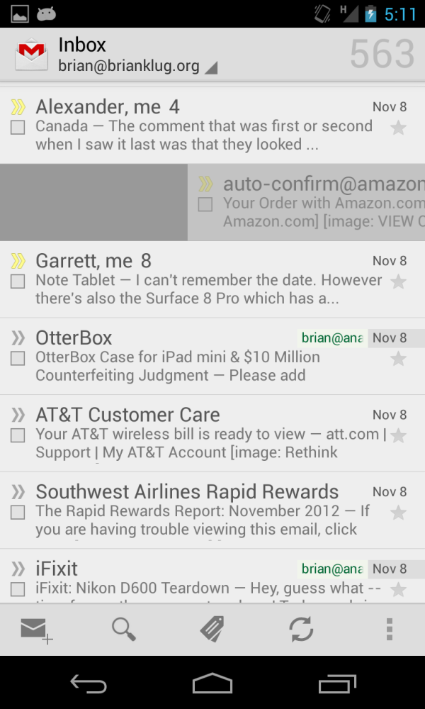
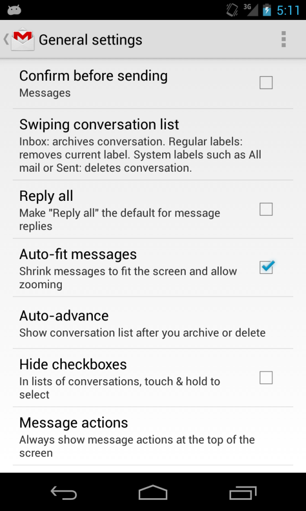
Although it isn’t necessarily strictly a part of Android 4.2, Gmail gets a hugely-requested and needed new feature with Android 4.2 — ability to use pinch to zoom and swipe/translation inside Gmail messages. Interestingly enough this doesn’t actually ship enabled, you have to go into settings inside Gmail and tick “Auto-fit messages” to turn this on.
There’s also the ability to swipe messages to delete or archive them in the setting just above.
Photo Sphere
I’m going to go over the bulk of camera UI changes in the camera section, but another huge change in Android 4.2 is yet another revision of Google’s camera, and one new feature is a revamped panorama shooting mode called Photo Sphere.
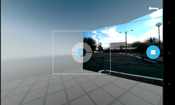
As the name implies, Photo Sphere lets you take photos which can then be mapped as a 2D JPEG or viewed in the gallery in a 3D viewer. The panorama interface guides you through capture by giving you a series of targets to aim at in preview and captures photos at those appropriate points automatically. This interface is very responsive and no doubt leverages a lot of MEMS sensor fusion. After you’ve captured as much or as little of what’s around you as you want, you can stop capture and the stitched panorama 2D and 3D views will render in the background.
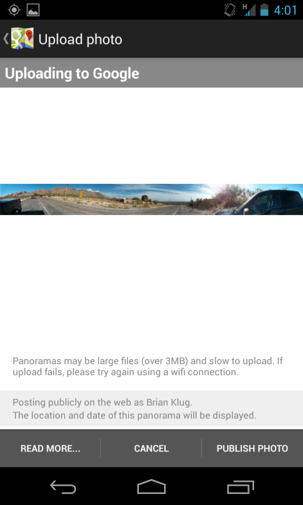
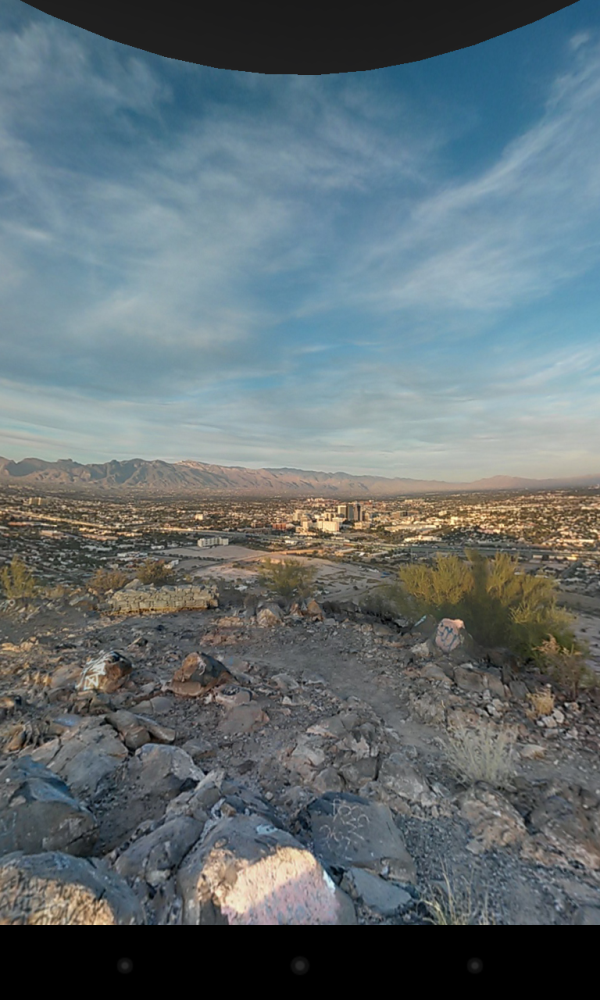
What’s cool from there is that in addition to sharing the 2D image, you can also share the 3D perspective for viewing online as part of Google Maps and Google Plus. I’ve already shared one taken on Sentinel Peak in Tucson, another at the video bench location, and at the northernmost end of Campbell avenue. It’s actually pretty neat being able to share these from the device and view them in the browser in a 3D viewer rather than just share a 2D projection with weird perspective correction.
Functionally, Photo Sphere is great and the tie-in to Google services like Plus and Maps is admirable. The resulting resolution of the resulting images however leaves a lot to be desired, and I find myself wishing that this was much, much higher both in the 3D viewer on the web and 2D rendered projections. The stitching and exposure matching that Photo Sphere does is actually pretty good unless you’re confronted with hugely different exposure regions (like the sunset and terrain in my Sentinel Peak sample), the end result just needs to be higher res than the roughly 4700 x 1500 (for one-high) that it ends up being.
Developer Options
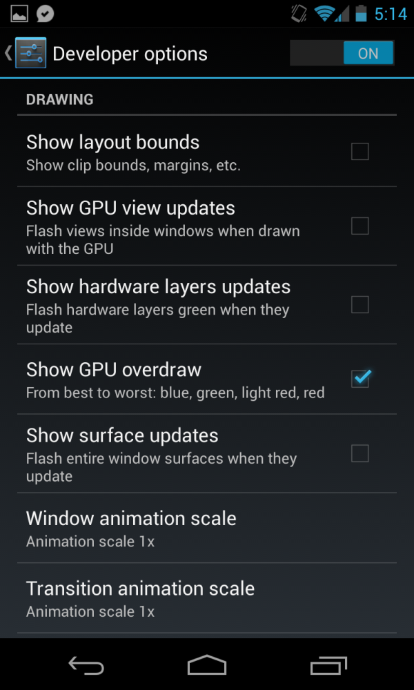
Developer options is no longer visible by default in Settings, unless you un-hide it. To do this, tap 7 times quickly on the build number under About which will let you know you are now a developer with access to the pane. This has slowly been getting more and more toggles with new features over time, and hiding it makes a lot of sense for minimizing potential damage that regular uses can cause by enabling debugging or turning off the new app verification policies for apps installed over adb.
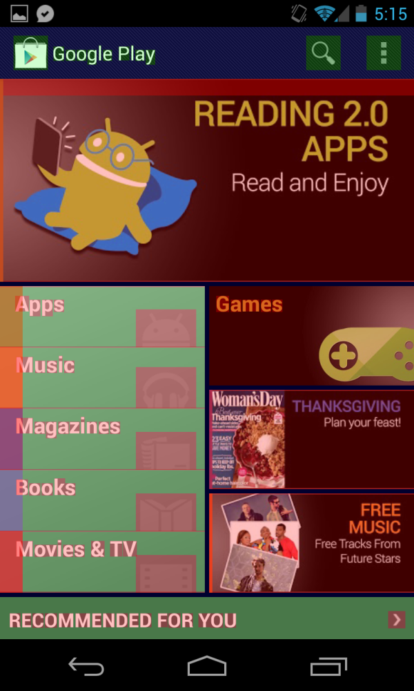
I bring this section up because there are some new features in here I find extremely useful. First among those is a new overdraw visualization option. Check this and you’ll see blue, green, light red, or red for minimal to worst overdraw in Android applications. Combatting overdraw is a huge deal on mobile devices and especially for high resolution devices like the Nexus 10 where memory bandwidth is at a premium. This is a hugely important debugging and performance optimization tool for developers and really illustrates for me the overdraw issues in some applications with subjectively lacking performance. For example the Play Store performance in my opinion still is lacking, and unsurprisingly in many views is awash with red. In Plume you can also see that they’re drawing the left bar underneath all their views and taking an overdraw penalty there as well. There are just a lot of interesting observations you can make with this enabled, and giving developers better tools to visualize performance problems is a big part of Project Butter with 4.x.
Another new toggle is a force 4x MSAA checkbox for OpenGL ES 2.0 games. Tick this and, no surprise, you’ll get 4x MSAA forced in OpenGL ES 2.0 apps if the GPU on your SoC supports it.
Odds and Ends
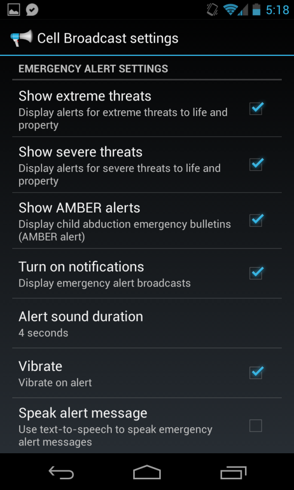
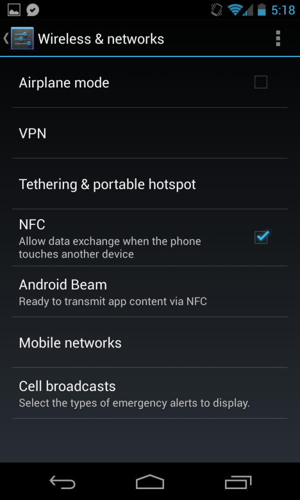
Inside wireless and networks is a new menu titled Cell broadcasts which allows you to customize which emergency broadcast alerts the handset can receive. These are essentially broadcast SMS (SMS-CB) messages that generally contain emergency alert information and other relevant local or national alerts. I’ve been seeing more and more OEMs include this in their handsets, and it was only a matter of time before it appeared in stock Android as well. Users can opt out of every message type except Presidential.
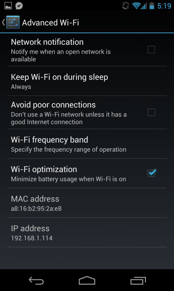
Under Wi-Fi and the Advanced menu is another new checkbox. Under the Wi-Fi frequency band checkbox is a new one called “Wi-Fi Optimization” which purports to minimize battery usage when the interface is turned on.
This is ticked by default at present and changes things like the DTIM interval so the client can sleep more, as well as a few other tweaks. I haven’t noticed any degradation of throughput when the box is checked, however.
Lock Screen Widgets
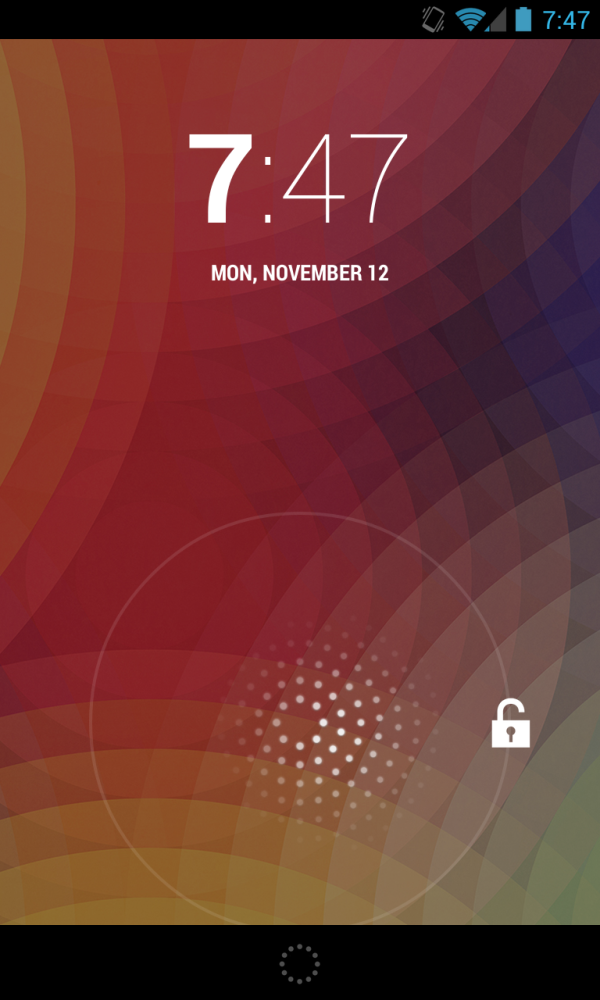
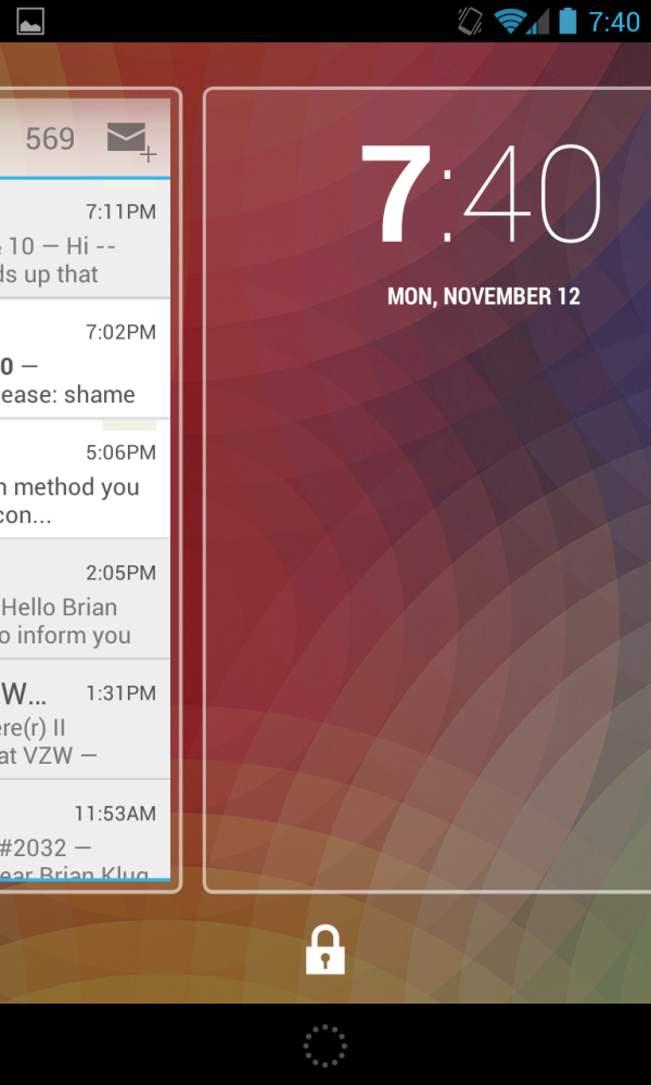
The Nexus 4 lacks multi-user support (that’s reserved for the Nexus 10), but does however include support for lock screen widgets. The entire lock screen actually gets changed in Android 4.2, this isn’t a minor thing. The normal unlock gesture which previously had shortcuts to Google Now, Camera, and unlock, now just becomes unlock. Down below it is a small hatched circle which signals the shortcut to Google Now. Dragging out from that bottom circle brings up Google Now, dragging up from the lock icon unlocks the device.
Getting to the camera from the lock screen now involves dragging to the rightmost hidden pane, where a small preview of the entire camera UI is shown.
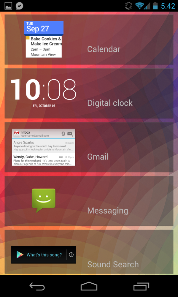
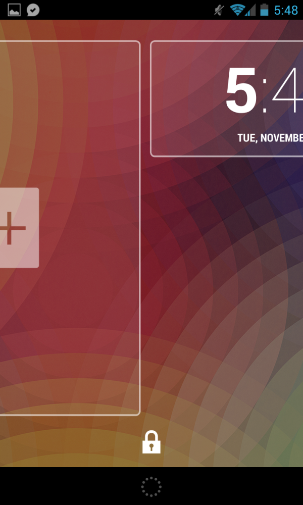
By default there aren't any lockscreen widgets already added, scrolling to the left gets to a menu where you can add widgets, which as of this writing are all stock. Third party developers will be able to make their own widgets as well which will populate this list. The clock for the lock screen now matches the Android 4.2 clock which got a significant typographical overhaul as well, with the hour in a bold font and minutes in a much slimmer style. I have to admit I like this new style for both the lock screen and clock application.






188 Comments
View All Comments
dae_aosp_omg - Tuesday, November 13, 2012 - link
Good job seriously.Brian Klug - Tuesday, November 13, 2012 - link
Thanks :)Hopefully minimal errors in here, working on no sleep this time!
-Brian
WiWavelength - Tuesday, November 13, 2012 - link
Hi Brian...Since the Nexus 4 is a 3GPP only device, shouldn't the entry tag be the MDM9215, instead of the MDM9615?
AJ
Brian Klug - Tuesday, November 13, 2012 - link
Yeah you're right, I just tab-completed and it went with 9615 since we don't have a 9215 tag yet, fixing!-Brian
blanarahul - Sunday, July 7, 2013 - link
"I heard that a smartphone based on the Optimus G would be the next Nexus phone and was quite simply blown away. Nexus has rarely been first to the latest and greatest in terms of hardware platforms, and certainly there was no way that combination would be inexpensive. For Google to nail the next Nexus phone it would have to be a combination of both"The first time I read the article, I agreed with this sentence. But now I don't. HTC J Butterfly was released two months later. And it is the only phone (apart from Nexus 4) which is competitive in 2013. It would have been best if the next Nexus was based on HTC J Butterfly. Even if it ended up costing 50$ more.
chrone - Tuesday, November 13, 2012 - link
thanks for the storage benchmark! nice improvement there over galaxy nexus. :)at80eighty - Tuesday, November 13, 2012 - link
Brian, sorry to threadjack - any clue when you're expecting the Lumia 920 review to happen? just curious what AT's take on the weight is, more than anything elseJedi2155 - Thursday, November 15, 2012 - link
"The other common design element between the Optimus G and Nexus 4 is that nonconductive metallic plastic ring which extends around the perimeter of the device. This is something that comes off as tacky in the US market but (I’m told) is still a somewhat attractive motif in the Korean market."I love how you described a chrome band here...haha.
krumme - Tuesday, November 13, 2012 - link
Agree. The part about the camera is a new benchmark for reviews!I would like som other performance test, but know its difficult.
soccerballtux - Tuesday, November 13, 2012 - link
+1.Going forward, I expect (Freezer) tests added to Anandtech's benchmarks. Please also add this to the benchmark comparison tools.